
Mixing patterns is one of the most expressive tools in fashion, yet it’s often approached with hesitation. Many avoid combining stripes with florals or plaids with geometrics, fearing chaos. But when done thoughtfully, pattern mixing elevates an outfit from predictable to polished and personal. The key lies not in avoiding patterns but in understanding how they interact—through color, scale, rhythm, and proportion. With the right approach, you can layer prints confidently while maintaining visual harmony.
Start with a Unifying Color Palette
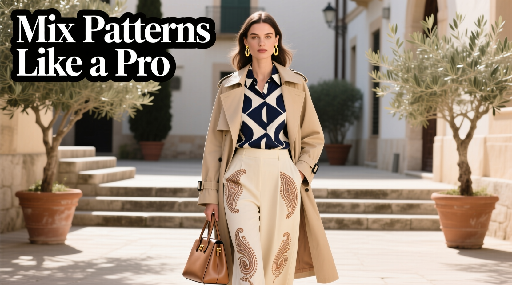
The foundation of successful pattern mixing is color cohesion. Even wildly different prints can coexist if they share at least one common hue. This shared color acts as a visual anchor, creating continuity across otherwise contrasting designs.
For example, pairing a navy-and-white striped shirt with a burgundy-and-navy floral skirt works because navy appears in both pieces. That single connecting thread tells the eye these items belong together. Without it, the look risks appearing disjointed.
When building a multi-patterned outfit, begin by selecting a base garment—such as pants or a dress—and pull out one secondary color from its print. Then find another piece that features that same shade, even if the pattern type differs. This method ensures balance without sacrificing variety.
Neutral tones like black, white, beige, gray, or denim blue are especially effective for grounding bold combinations. Use them as buffers between busy prints. A black blazer over a striped top and polka-dot skirt, for instance, adds structure and prevents sensory overload.
Balance Scale and Proportion
One of the most common mistakes in pattern mixing is using two large-scale prints together. When both patterns dominate the visual field, they compete rather than complement. The solution? Vary the size of the patterns.
Pair a large-scale print (like oversized florals or wide stripes) with a smaller, more subtle one (such as tiny checks, micro-dots, or fine pinstripes). This contrast creates hierarchy and gives the eye a place to rest.
“In fashion, contrast isn’t conflict—it’s clarity. A big floral needs a quiet checkered shirt, not another shout.” — Lena Moretti, Stylist & Creative Director at Atelier Forme
Consider this rule of thumb: if one piece has a bold, attention-grabbing pattern, let the other recede into supporting role. For instance, wear wide-windowpane plaid trousers with a narrow-striped button-down. The larger pattern commands focus, while the smaller one adds texture without overwhelming.
Another way to manage proportion is through coverage. Limit how much of your body is covered in pattern. If you’re wearing a boldly printed dress, opt for solid-colored tights or shoes. Conversely, if your top is heavily patterned, keep your bottom half simple.
Use Classic Pattern Pairings as a Guide
While creativity should be encouraged, starting with proven combinations builds confidence and teaches the principles of harmony. These classic duos work because they naturally balance contrast and cohesion.
| Pattern Combination | Why It Works | How to Wear It |
|---|---|---|
| Stripes + Checks | Geometric contrast with shared linear structure | Navy pinstripe blazer over red gingham shirt |
| Florals + Solids (with accent color) | Solid grounds the busyness; color links them | Floral midi dress with solid green cardigan and shoes |
| Polka Dots + Animal Print | Dots act as neutral; animal print adds edge | Black-and-white dot blouse with leopard-print skirt |
| Plaid + Subtle Stripe | Shared grid-like rhythm; scale difference balances | Tartan pants with thin candy-striped knit |
| Geometric + Textured Solid | Texture mimics pattern without competing | Herringbone coat over ribbed turtleneck and solid pants |
These combinations succeed because they follow design principles rooted in repetition, contrast, and alignment. Once you’ve mastered these pairings, you can begin experimenting with less conventional mixes—like paisley and abstract brushstrokes or tribal motifs and digital prints.
A Step-by-Step Guide to Building a Mixed-Pattern Outfit
Approach pattern mixing systematically. Follow this five-step process to build coordinated, intentional looks every time.
- Choose a dominant pattern. Decide which piece will be the focal point—this could be a jacket, dress, or statement pants. Let this item set the tone.
- Select a complementary color. Pull one color from the dominant pattern to serve as a bridge to the second piece.
- Pick a secondary pattern of different scale. Find a coordinating item with a smaller or simpler design that includes your chosen color.
- Add solids to frame the look. Introduce neutral or tonal solid pieces (shoes, bag, outerwear) to provide breathing room.
- Assess balance in a mirror. Step back and evaluate: does one element overpower the others? Adjust proportions as needed.
This methodical approach removes guesswork and helps you develop an intuitive sense of what works. Over time, you’ll be able to mix patterns on instinct, knowing which combinations feel balanced before you even put them on.
Real-Life Example: Olivia’s Work-to-Weekend Transition
Olivia, a graphic designer in Portland, wanted to express her creativity at work without violating her office’s smart-casual dress code. She loved bold visuals but often felt her outfits looked “too much” when she tried combining prints.
Her breakthrough came when she paired a deep emerald green houndstooth pencil skirt with a soft pink-and-white micro-striped blouse. Both pieces featured white, which tied them together, and the small scale of the stripe balanced the larger houndstooth. She added nude heels and a structured cream blazer to ground the look.
The result was professional yet distinctive. Colleagues complimented her style, and Olivia felt empowered. On weekends, she swapped the blazer for a cropped denim jacket and added gold hoops, transforming the same core pieces into a relaxed brunch ensemble.
This case illustrates how thoughtful pattern mixing can serve both function and self-expression—without tipping into visual noise.
Avoid Common Pitfalls
Even experienced dressers can misstep when mixing patterns. Watch for these frequent errors:
- Matching patterns too closely: Wearing two nearly identical prints (e.g., similar-sized florals) can look costumey or like a mistake.
- Ignoring background color: The base color of a print matters as much as the design. A black-based floral behaves differently than a white-based one.
- Over-accessorizing: Jewelry, scarves, and bags with additional patterns can push a look past its threshold. Stick to solid accessories unless intentionally extending the theme.
- Mixing too many pattern types: Three or more distinct prints usually overwhelm. Two is ideal; three only if one is very subtle (like a textured solid).
- Forgetting fit and silhouette: A well-mixed outfit still fails if clothes don’t fit well. Sharp tailoring enhances any print combination.
“Pattern mixing isn’t about randomness—it’s about rhythm. Think like a composer, not a gambler.” — Marcus Tran, Fashion Editor at *Styleline Quarterly*
Checklist: Your Pattern-Mixing Readiness Guide
Before assembling a mixed-pattern outfit, run through this checklist to ensure cohesion and confidence:
- ✅ Do both patterns share at least one color?
- ✅ Is there a clear difference in scale between the prints?
- ✅ Have I limited bold patterns to two main pieces?
- ✅ Are my accessories mostly solid or minimally patterned?
- ✅ Does the outfit include neutral elements to balance intensity?
- ✅ Does the overall look feel intentional, not accidental?
- ✅ Have I considered the setting—is this appropriate for the occasion?
Using this checklist consistently trains your eye and reduces second-guessing. Over time, these questions become automatic, allowing for bolder experimentation.
Frequently Asked Questions
Can I mix vertical and horizontal stripes?
Yes—but do so deliberately. Vertical stripes elongate, while horizontal ones widen. To avoid distortion, pair a vertically striped top with horizontally striped pants only if there’s a solid-color break (like a belt or tucked-in top). Alternatively, angle one stripe diagonally via a scarf or jacket for dynamic contrast without clash.
Is it okay to mix patterns with logos or text?
Text-heavy graphics behave like bold patterns and should be treated as such. Avoid combining a logo tee with another loud print. Instead, pair it with solid jeans and a neutral jacket. If mixing with another pattern, ensure the text is small or monochrome and the other print is subdued.
What if I love two large-scale prints?
You don’t have to abandon them—you can still use both, just not together on top and bottom. Try wearing one as outerwear (like a bold printed coat) over a solid outfit, or use one in your bag or shoes while keeping clothing simpler. Alternatively, separate them across days or layers with a long solid cardigan in between.
Conclusion: Own Your Style with Confidence
Mixing patterns isn’t reserved for fashion insiders or risk-takers. It’s a learnable skill grounded in design principles anyone can master. By anchoring combinations in shared colors, varying scale, and respecting proportion, you create outfits that are dynamic yet harmonious. The goal isn’t perfection—it’s expression.
Start small. Try a striped shirt under a subtly checked blazer. Then experiment with bolder contrasts. Keep what feels authentic and discard rigid rules that don’t serve you. Fashion thrives on individuality, and pattern mixing is one of the most joyful ways to assert yours.


 浙公网安备
33010002000092号
浙公网安备
33010002000092号 浙B2-20120091-4
Comments
No comments yet. Why don't you start the discussion?