
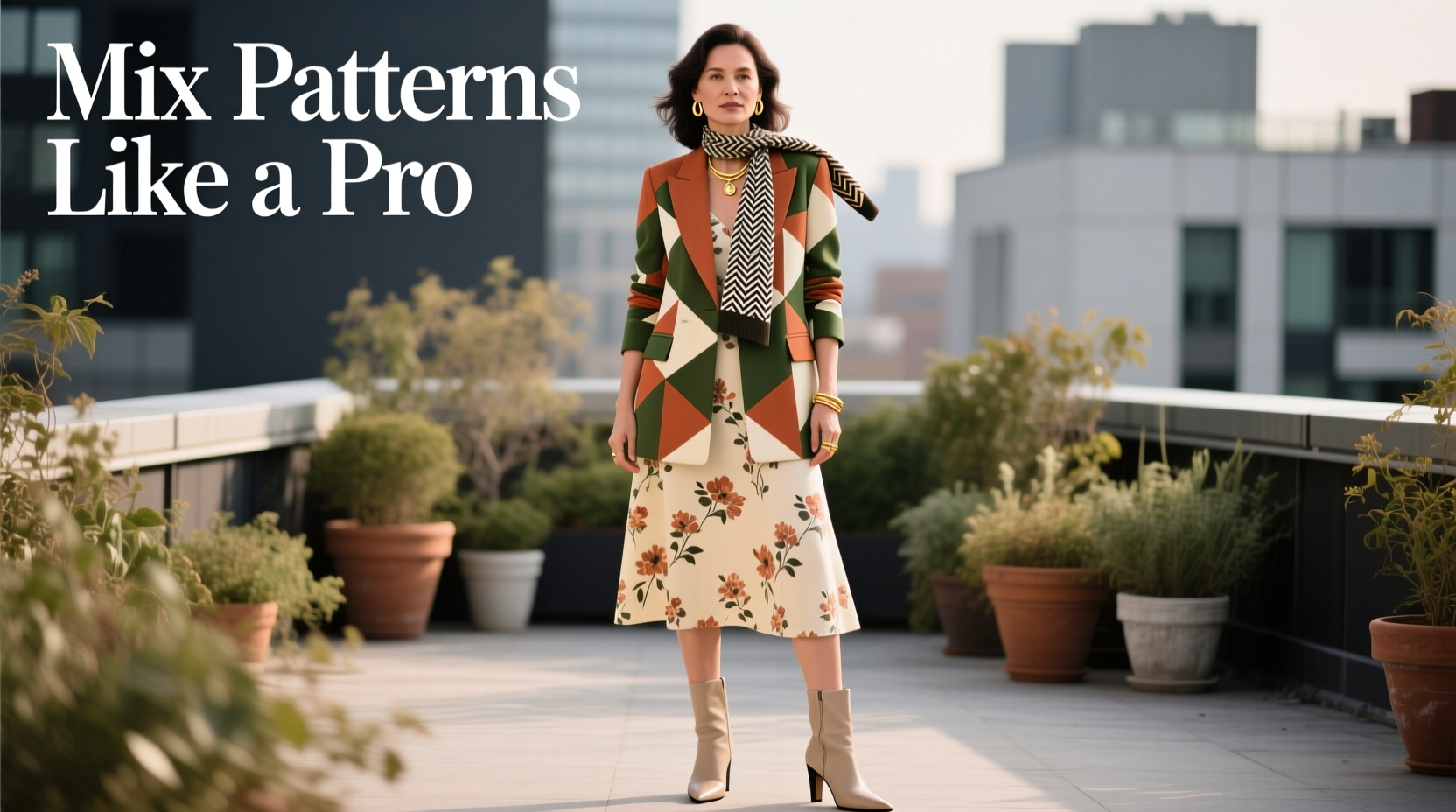
Pattern mixing is one of the most expressive tools in fashion, yet it’s often avoided out of fear. Many people love bold prints but hesitate to combine them, worried they’ll end up looking chaotic or mismatched. The truth? When done thoughtfully, mixing patterns elevates an outfit from ordinary to editorial. It’s not about luck—it’s about strategy. With the right principles, anyone can master this skill and wear it with confidence.
The key lies in understanding balance, proportion, color theory, and scale. Fashion icons from Iris Apfel to Harry Styles have built reputations on fearless print layering. But behind every striking ensemble is intentionality. This guide breaks down the exact methods professionals use to pair stripes with florals, plaids with geometrics, and polka dots with animal prints—without a single clash.
Understand Pattern Scale and Proportion
One of the most common mistakes in pattern mixing is pairing two prints of similar size. When both patterns are large—or both small—they compete for attention, creating visual noise. The solution is contrast in scale.
Think of your outfit as a visual composition. A large floral blouse paired with wide-striped pants overwhelms the eye. Instead, combine a dominant large-scale print with a smaller complementary one. For example: a bold tropical shirt with narrow pinstripe trousers. The difference in scale creates hierarchy, allowing one pattern to lead while the other supports.
This principle applies across garments. If you’re wearing a busy windowpane blazer, opt for a subtly patterned tie or pocket square. In casual wear, try a micro-check shirt under a chunky knit with faint geometric lines. The contrast gives structure to your look and keeps it cohesive.
Harmonize Colors Across Patterns
Color is the invisible thread that ties mixed patterns together. Even wildly different prints can coexist if they share a common color palette. Choose one base color—such as navy, camel, or black—and build from there.
For instance, a navy-and-white striped shirt pairs effortlessly with rust-and-navy plaid chinos because navy acts as the unifying hue. Similarly, a black-and-gold brocade skirt can work with a teal-and-black geometric top when black anchors both pieces.
A practical method is to select a three-color scheme: one neutral (black, white, beige, gray), one accent, and one pop. Then ensure each pattern includes at least one of these colors. This creates continuity even when motifs differ.
“Color harmony overrides pattern conflict. If the hues sing together, the prints will follow.” — Lena Moreau, Stylist & Creative Director at Mode Collective
Creating a Cohesive Palette: Step-by-Step
- Pick a base neutral (e.g., charcoal gray).
- Select one primary accent (e.g., terracotta).
- Add a secondary accent or metallic (e.g., cream or gold).
- Find patterns where at least two of these colors appear.
- Lay them side by side under natural light to test compatibility.
This process minimizes guesswork and ensures cohesion before you even put the outfit on.
Pair Different Pattern Types Strategically
Not all patterns are created equal. Some are bold and directional; others are subtle and organic. Knowing how to classify and combine them is essential.
Here are six common pattern types and how to pair them:
- Stripes: Classic and linear. Work well with checks, florals, and geometrics.
- Checks/Plaids: Structured and repetitive. Best balanced with organic prints like florals or abstract designs.
- Florals: Organic and flowing. Pair with stripes or small dots for contrast.
- Polka Dots: Playful and rhythmic. Mix with stripes or animal prints using shared colors.
- Animal Prints: Bold and textured (leopard, snake). Use as a neutral base and layer with simpler patterns.
- Geometrics: Angular and modern. Combine with softer prints like watercolor florals or fine stripes.
| Pattern Combo | Success Rate | Pro Tip |
|---|---|---|
| Stripes + Florals | High | Use same color family; vary scale |
| Plaid + Polka Dots | Moderate | Limit dots to accessories; keep plaid dominant |
| Leopard + Pinstripes | High | Treat leopard as a neutral; anchor with black or tan |
| Floral + Geometric | Moderate | Choose one soft, one sharp; align on color |
| Check + Check | Low | Avoid unless scales and colors differ drastically |
The most successful combinations often involve pairing structured patterns (like stripes or plaids) with organic ones (like florals or abstract prints). This contrast mimics nature—think of a zebra walking through tall grass—and feels intuitively balanced.
Use Solids and Textures as Buffers
Sometimes, the best way to mix patterns is to not mix them directly. Introduce solid-colored pieces or textured fabrics to create breathing room between prints.
For example, if you’re wearing a floral shirt and houndstooth trousers, add a solid navy sweater tied over your shoulders or a beige blazer. These neutrals act as visual pauses, preventing sensory overload.
Textures also serve as subtle pattern alternatives. A cable-knit sweater, suede jacket, or linen shirt adds depth without competing visually. They function like “quiet” elements in an otherwise dynamic composition.
In professional settings, this technique is especially useful. A printed dress can be grounded with a solid wool coat and leather tote. The result is polished, intentional, and far from chaotic.
Real-Life Example: The Confident Commuter
Take James, a 34-year-old architect who wanted to stand out during client meetings without appearing costumey. He loved bold shirts but usually defaulted to solids out of caution. After learning pattern principles, he experimented.
He started with a deep blue micro-check dress shirt, then added taupe trousers with a subtle herringbone weave. For his jacket, he chose a navy blazer with faint flecks of rust—a nod to the rust-colored paisley pocket square he carried. His tie was a diagonal stripe incorporating navy, rust, and cream.
At first, he worried it was too much. But under office lighting, the outfit read as sophisticated, not loud. Clients complimented his style, and his confidence grew. Within weeks, he added a floral silk scarf to his weekend looks and wore a leopard-print loafers with pinstripe suits.
James didn’t change his wardrobe overnight—he applied the rules gradually. He used color as glue, varied scale, and let solids frame the bolder choices. The transformation wasn’t just in his clothes; it reflected in his posture, speech, and presence.
“You don’t need permission to be stylish. You need a system. Once I had one, mixing patterns felt less like risk and more like rhythm.” — James R., Client Relations Specialist
Essential Checklist: Mix Patterns Like a Pro
Before finalizing your outfit, run through this checklist to ensure harmony:
- ✅ One dominant pattern, one secondary
- ✅ Shared color(s) across all pieces
- ✅ Contrasting scales (large + small)
- ✅ At least one solid or neutral buffer
- ✅ Balanced distribution (top/bottom, inner/outer layers)
- ✅ Fabric weight and formality aligned
- ✅ Tested under natural light
This checklist prevents common pitfalls and builds confidence. Over time, it becomes second nature.
Frequently Asked Questions
Can I mix more than two patterns?
Absolutely—but only if you maintain control. Limit yourself to one dominant print, one secondary, and a third subtle one (like a pocket square or socks). Ensure all share a color, and use solid layers to separate them. Three patterns work best when one is very small or textural.
Is black-and-white print mixing safe?
Yes, but with caveats. Black-and-white combinations (stripes, checks, polka dots) can look graphic and modern, but they risk appearing like a costume if not grounded. Add a solid color piece—like a red bag or navy coat—to break the monotony and add warmth.
How do I start if I’m new to pattern mixing?
Begin small. Pair a striped shirt with a subtly patterned tie. Or wear a floral scarf with a gingham dress. Use accessories to test combinations before committing to full outfits. Keep a capsule of neutral separates (black, navy, beige) to balance bolder experiments.
Final Thoughts: Own Your Style with Confidence
Mixing patterns isn’t about following trends—it’s about expressing individuality with intelligence. The most stylish people aren’t those who wear the most expensive clothes, but those who wear their choices with conviction. When you understand the mechanics behind harmony—scale, color, texture, balance—you free yourself from hesitation.
Start with one rule at a time. Try contrasting scales. Then focus on color matching. Gradually layer in more complexity. Every outfit is a chance to refine your eye and deepen your personal aesthetic.


 浙公网安备
33010002000092号
浙公网安备
33010002000092号 浙B2-20120091-4
Comments
No comments yet. Why don't you start the discussion?