
Mixing patterns is one of the most expressive ways to elevate a wardrobe. When done well, combining florals and stripes creates visual interest, depth, and personality. But when executed poorly, it can look chaotic or mismatched. The key lies not in avoiding pattern mixing altogether, but in understanding the principles that allow contrasting designs to coexist harmoniously. With attention to color, scale, proportion, and context, anyone can confidently pair florals with stripes—and even go beyond.
Understanding Pattern Fundamentals
Before attempting to mix patterns, it’s essential to understand what makes each design unique. Florals and stripes are two of the most common print types, but they behave very differently visually.
Florals are organic, irregular, and often asymmetrical. They vary widely in density, color range, and motif size—from delicate vintage rose prints to bold tropical blooms. Because of their natural inspiration, florals tend to feel softer and more romantic.
Stripes, on the other hand, are structured, geometric, and rhythmic. Whether pinstripes, wide bands, or nautical lines, they bring order and directionality to an outfit. Stripes can be horizontal, vertical, or diagonal, and each orientation affects silhouette perception—vertical stripes elongate, while horizontal ones widen.
The contrast between these two patterns is precisely what makes them compelling when paired: the spontaneity of florals meets the precision of stripes. The challenge is balancing their opposing energies so neither overwhelms the other.
“Pattern mixing isn’t about matching—it’s about conversation. Let your prints speak to each other through shared colors and thoughtful proportions.” — Lila Monroe, Fashion Stylist & Print Consultant
Step-by-Step Guide to Combining Florals and Stripes
Successfully pairing florals and stripes follows a logical sequence. Follow these steps to create cohesive, stylish ensembles:
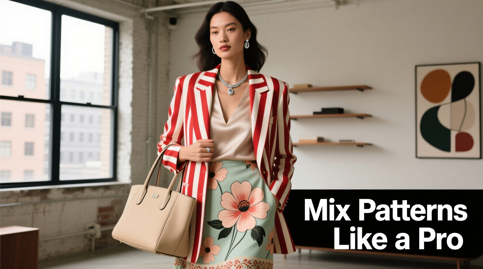
- Start with a dominant pattern: Choose one piece as the focal point—usually the larger or bolder of the two. For example, if wearing a floral dress, let that be the star and use striped accessories or a blazer to complement it.
- Select a unifying color palette: Identify 1–3 core colors present in both patterns. Even if the prints appear different at first glance, they likely share a neutral (like navy, cream, or black) or accent hue. This shared color acts as a bridge.
- Vary the scale: Pair a large-scale floral with narrow pinstripes, or a small ditsy floral with wide horizontal bands. Avoid matching scales, which can cause visual vibration.
- Balance placement: If the floral is on top, keep the stripe on the bottom—or vice versa. Limit patterned pieces to two per outfit to maintain clarity.
- Add solid neutrals: Use solid-colored belts, shoes, or outerwear to break up busy areas and give the eye a resting point.
- Test in natural light: Step outside or near a window before finalizing your look. Artificial lighting can distort how patterns interact.
Color and Scale: The Hidden Architects of Harmony
Color coordination is more critical than print type when mixing patterns. Two wildly different designs can work together if they share a consistent color story. For instance, a coral-and-teal floral blouse pairs effortlessly with teal-and-white striped pants because teal anchors both pieces.
Equally important is scale—the size of the individual motifs within a pattern. A successful mix typically includes:
- One large-scale pattern (e.g., oversized roses)
- One medium or small-scale pattern (e.g., thin pin stripes)
- Avoid pairing two large-scale prints—they compete for attention
Consider this real-world scenario: Sarah wanted to wear her favorite bold peony-print skirt with a navy-and-white striped sweater. At first, the combination felt jarring. She realized the issue wasn’t the patterns themselves, but their competing scales—both were large and dominant. By switching to a fine-gauge striped top with narrower lines, the outfit balanced. The peonies remained the centerpiece, while the subtle stripes provided structure without fighting for focus.
In another case, James paired a micro-floral button-down with wide navy pinstripe trousers. The result? A polished yet dynamic look suitable for a summer wedding. The secret? Both pieces shared a crisp white base and navy accents, and the tiny florals didn’t compete with the strong vertical lines of the pants.
Do’s and Don’ts of Pattern Mixing
| Do | Don’t |
|---|---|
| Use a shared color to connect patterns | Mix two large-scale prints without a neutral buffer |
| Pair small florals with wide stripes (or vice versa) | Wear clashing color families (e.g., warm reds with cool blues unless intentionally contrasted) |
| Anchor with solid accessories (shoes, bag, belt) | Overload with more than two patterned garments |
| Use texture (linen, silk, knit) to add depth without visual clutter | Ignore the occasion—bold mixes suit casual or creative settings more than conservative environments |
Advanced Techniques for Confident Styling
Once you’ve mastered the basics, experiment with bolder combinations. Here are three advanced strategies:
1. Use a Third Neutral as a Buffer
When two patterns resist blending, insert a solid neutral layer. A camel cardigan between a floral blouse and striped skirt softens the transition. Similarly, a black belt or denim jacket can separate top and bottom patterns effectively.
2. Play with Directionality
Stripes have direction; florals usually don’t. Use this to your advantage. Vertical stripes paired with a scattered floral create upward movement, ideal for petite frames. Horizontal stripes with a centered floral motif can create symmetry and balance.
3. Layer Through Proportion
Try wearing a striped shirt under a floral dress or tunic. The stripes peeking out at the sleeves and hem create intentional layering. Just ensure the underlying stripe is simpler—thin lines on a light background work best.
Frequently Asked Questions
Can I mix floral skirts with striped tops?
Yes, but consider proportion. A full, busy floral skirt works best with a simple, narrow-striped top in a matching color family. Keep the top tucked or fitted to avoid overwhelming the silhouette.
What if the colors don’t match exactly?
Exact matches aren’t necessary—close tonal harmony is sufficient. A rust floral can pair with terracotta stripes if both fall within the same earthy spectrum. Neutrals like ivory, gray, or denim blue also help mediate slight color mismatches.
Is it okay to mix patterns in formal settings?
With restraint, yes. Opt for subtle combinations—micro-florals with fine pencil stripes in conservative colors like navy, gray, or burgundy. Avoid loud contrasts in boardrooms or traditional events, but creative industries welcome tasteful print layering.
Essential Checklist for Safe Pattern Mixing
- ✅ Identify at least one shared color between the floral and stripe
- ✅ Choose different scales—one large, one small or medium
- ✅ Limit patterned items to two per outfit
- ✅ Use solid-color shoes, bag, or outerwear to ground the look
- ✅ Test the combination in natural light before going out
- ✅ Start with one bold piece and build around it
- ✅ Adjust based on body shape—vertical stripes can elongate, while large florals draw attention
Conclusion: Confidence Is the Final Accessory
Mixing florals and stripes isn’t about rigid rules—it’s about intention, awareness, and personal expression. Once you understand how color, scale, and proportion influence visual harmony, you gain the freedom to experiment. The most stylish people aren’t those who follow trends perfectly, but those who wear their choices with confidence.
Start small: try a striped tie with a floral shirt, or a scarf with complementary prints layered over a patterned dress. Each attempt builds intuition. Over time, you’ll develop an instinct for what works—not just according to theory, but according to *you*.


 浙公网安备
33010002000092号
浙公网安备
33010002000092号 浙B2-20120091-4
Comments
No comments yet. Why don't you start the discussion?