
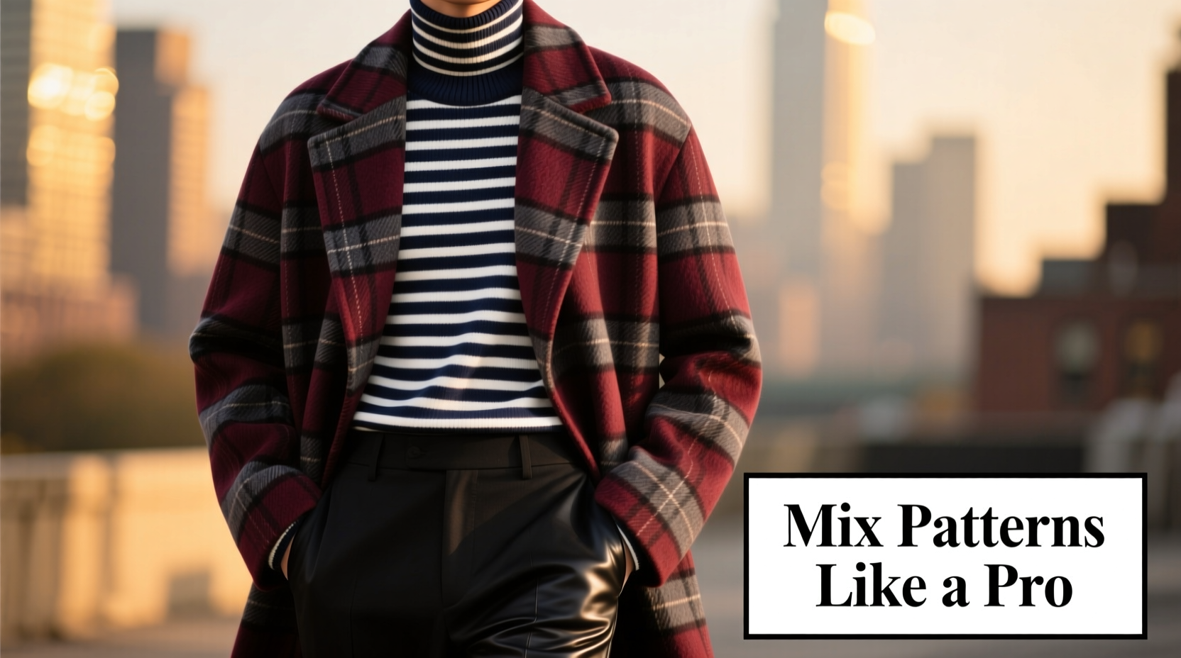
Mixing patterns—especially bold ones like plaids and stripes—can elevate an outfit from predictable to polished and dynamic. Yet many hesitate, fearing the result will look chaotic or mismatched. The truth is, when done thoughtfully, combining plaids and stripes adds depth, personality, and visual interest to any ensemble. The key lies not in avoiding contrast but in mastering balance. With attention to color harmony, scale, proportion, and grounding elements, even the boldest combinations can coexist in stylish harmony.
Understanding Pattern Fundamentals
Before attempting to pair plaids and stripes, it's essential to understand what defines each pattern and how they interact visually. Plaids are typically characterized by intersecting horizontal and vertical bands of color that form a grid-like structure. They range from subtle windowpanes to loud tartans. Stripes, on the other hand, run in parallel lines—either vertically, horizontally, or diagonally—and vary in width and spacing.
The potential for clash arises when both patterns compete for attention due to similar scale, conflicting colors, or lack of a unifying element. However, when approached with intention, these patterns can complement each other beautifully. For example, a fine pinstripe paired with a large-scale plaid creates visual rhythm without overwhelming the eye.
Step-by-Step Guide to Mixing Plaids and Stripes
Successfully pairing plaids and stripes isn’t guesswork—it’s a process grounded in design principles. Follow this five-step method to build confidence and achieve cohesive results.
- Choose a unifying color palette. Select two to three shared hues between the plaid and stripe. This creates cohesion even if the patterns differ drastically in style.
- Vary the scale of the patterns. Pair a small-scale stripe (like pinstripes) with a large plaid (such as a classic tartan), or vice versa. Avoid matching similar sizes, which can create a vibrating effect.
- Control dominance with proportion. Wear the bolder pattern as a larger garment (e.g., a plaid blazer) and the secondary pattern on a smaller piece (e.g., striped tie or shirt).
- Use solids as buffers. Introduce neutral-toned pieces—like a white shirt, beige trousers, or black belt—to separate busy patterns and give the eye resting points.
- Anchor the look with texture or accessories. A wool coat, leather shoes, or a knit scarf can ground the outfit and prevent it from feeling too busy.
This structured approach ensures that your outfit remains intentional rather than haphazard. Over time, you’ll develop an instinct for which combinations work and why.
Color Coordination: The Secret Glue
Color is the most powerful tool in harmonizing disparate patterns. Even if the shapes differ, a shared color thread ties them together seamlessly. For instance, a navy-and-red plaid flannel shirt can pair effortlessly with navy pinstripe chinos if red appears subtly in the stripe or is echoed in a pocket square.
When selecting colors, consider the undertones. A warm-toned plaid (with rust, mustard, or brick red) may clash with a cool-toned stripe (featuring icy blue or gray), even if both contain “blue” or “red.” Stick to palettes within the same temperature family unless you’re intentionally creating contrast.
| Plaid Example | Stripe Example | Shared Color | Recommended Use |
|---|---|---|---|
| Red/black/green tartan shirt | Navy/white pinstripe trousers | None – high contrast | Avoid direct pairing; use navy blazer or green tie to bridge |
| Gray/burgundy windowpane blazer | Burgundy/charcoal stripe dress shirt | Burgundy + charcoal | Ideal match; layer with solid gray trousers |
| Blue/white gingham shirt | Teal/navy pinstripe suit | Blue family (cool tones) | Pair confidently; add white pocket square |
In the first example, the lack of shared color makes the combination risky. But introducing a burgundy tie or brown leather belt could create the necessary link. In the second and third examples, overlapping hues make the pairing inherently balanced.
Real-World Example: Office to Evening Look
Consider James, a marketing executive preparing for a client dinner after work. His goal: transition from office-appropriate to stylishly refined without changing entirely.
He starts with a navy pinstripe suit—classic and professional. Instead of a plain white shirt, he opts for a light blue micro-check (a subtle plaid). The tiny checks are close enough in scale to mimic texture rather than compete. He tops it with a burgundy silk tie featuring a faint diagonal stripe that picks up the warmth in the suit’s lining.
The result? A layered, sophisticated look where patterns enhance rather than distract. The shared cool-blue base between shirt and suit, combined with the warm accent in the tie, creates depth. At dinner, he removes his jacket to reveal a navy-and-burgundy argyle vest—a bolder plaid—that still aligns with the color story. Because the rest of the outfit is anchored in restraint, the added pattern feels intentional, not excessive.
This scenario illustrates how understanding context, audience, and progression allows for creative risk-taking within safe boundaries.
Expert Insight: What Designers Say
Fashion stylists and designers routinely use pattern mixing as a signature technique. Their advice centers on discipline and intentionality.
“Pattern mixing isn’t about randomness—it’s about editing. You can wear plaid pants and a striped shirt, but only if they speak the same color language.” — Lena Torres, Fashion Stylist & Contributor, *Vogue Living*
“The worst mistake? Matching patterns exactly. That’s costume territory. Real style comes from contrast that still feels connected.” — Marcus Reed, Menswear Creative Director at Alden & Rowe
These insights reinforce that successful pattern pairing is less about rules and more about thoughtful curation. It’s not about hiding patterns but allowing them to dialogue with one another through color, scale, and placement.
Common Mistakes and How to Avoid Them
Even seasoned dressers occasionally misstep when combining patterns. Recognizing these pitfalls can save time and embarrassment.
- Matching scales too closely. A medium-width stripe next to a medium-check plaid creates visual vibration. Solution: increase contrast in size.
- Ignoring background color. A black-based plaid and a white-based stripe may share red lines but feel disconnected due to opposing grounds. Choose a common base tone.
- Over-accessorizing. Adding a patterned pocket square, socks, and watch strap to already busy clothing compounds chaos. Limit secondary patterns to one accent.
- Forgetting fit and fabric. Ill-fitting clothes undermine even the best-curated patterns. Ensure garments are tailored and fabrics coordinate in weight and sheen.
Checklist: Your Pattern-Mixing Game Plan
Use this checklist before assembling any outfit with plaids and stripes:
- ✅ Do both patterns share at least one true color (not just a similar shade)?
- ✅ Is there a clear difference in scale between the two patterns?
- ✅ Am I using a solid-colored piece (shirt, trousers, jacket) to separate or buffer the patterns?
- ✅ Are the color temperatures (warm vs. cool) compatible?
- ✅ Does one pattern dominate while the other supports?
- ✅ Are my shoes and outer layers neutral or complementary, not competing?
- ✅ Does the overall look suit the occasion and setting?
Running through these questions takes less than a minute but dramatically increases the likelihood of a polished outcome.
FAQ: Common Questions About Mixing Patterns
Can I wear a plaid shirt with striped trousers?
Yes, provided you manage scale and color. Try a small check shirt (like gingham) with wide navy/red stripes, or a large buffalo plaid with narrow pencil stripes in a matching hue. Separate them with a solid belt and shoes to break up the busyness.
Is it okay to mix plaids and stripes in the same fabric type?
Cautiously. Two cotton pieces—one plaid, one striped—can look costumey if not differentiated by cut or context. Instead, vary textures: a flannel plaid shirt with silk-striped tie, or a wool plaid blazer over a cotton-striped shirt.
What if I want to mix multiple patterns beyond just two?
Limited to advanced styling. If adding a third pattern (e.g., polka dot tie or houndstooth shoes), ensure it shares color with the primary two and occupies minimal visual space. One dominant, one secondary, one accent is the ideal hierarchy.
Conclusion: Confidence Through Practice
Mixing plaids and stripes without clashing isn’t magic—it’s methodology. By anchoring combinations in shared color, varying scale, and balancing proportions, you transform what seems risky into a signature style statement. The most memorable looks aren’t those that play it safe but the ones that demonstrate intention and self-awareness.
Start small: try a striped tie over a subtly checked shirt. Then experiment with bolder contrasts. Keep a mirror and smartphone handy to review full-outfit photos from a distance—what looks busy up close might read as texture from afar.


 浙公网安备
33010002000092号
浙公网安备
33010002000092号 浙B2-20120091-4
Comments
No comments yet. Why don't you start the discussion?