
Mastering the art of mixing prints is one of the most expressive skills in modern fashion. Done well, it projects confidence, creativity, and a sharp eye for detail. Done poorly, it can appear haphazard—like a wardrobe explosion after a power outage. The good news? There’s method behind the madness. With a few guiding principles, anyone can blend stripes with florals, checks with animal prints, or geometrics with abstracts in a way that looks intentional, stylish, and effortlessly cool.
The key isn’t avoiding clashing—it’s orchestrating contrast. Think of your outfit as a curated composition, where each print plays a role in a balanced visual story. Whether you're dressing for a brunch date, a creative office, or a weekend gallery hop, understanding how to layer patterns elevates your personal style from predictable to polished.
Start with a Common Color Palette
The easiest and most effective way to harmonize multiple prints is to anchor them with shared colors. Even if the patterns differ wildly—one a micro-checkered shirt, another a painterly floral skirt—the presence of one or two matching hues creates cohesion.
For example, pairing a navy-and-white striped blouse with a skirt featuring navy polka dots on a white background instantly reads as coordinated. The brain latches onto the repeated color, interpreting the ensemble as unified rather than chaotic.
This doesn’t mean every piece must match exactly. A dusty rose in one pattern can pair beautifully with a deeper burgundy in another. The goal is tonal resonance—not perfection. Neutral bases (black, white, beige, gray) also act as universal bridges, allowing bolder prints to coexist without competing.
Balance Scale and Proportion
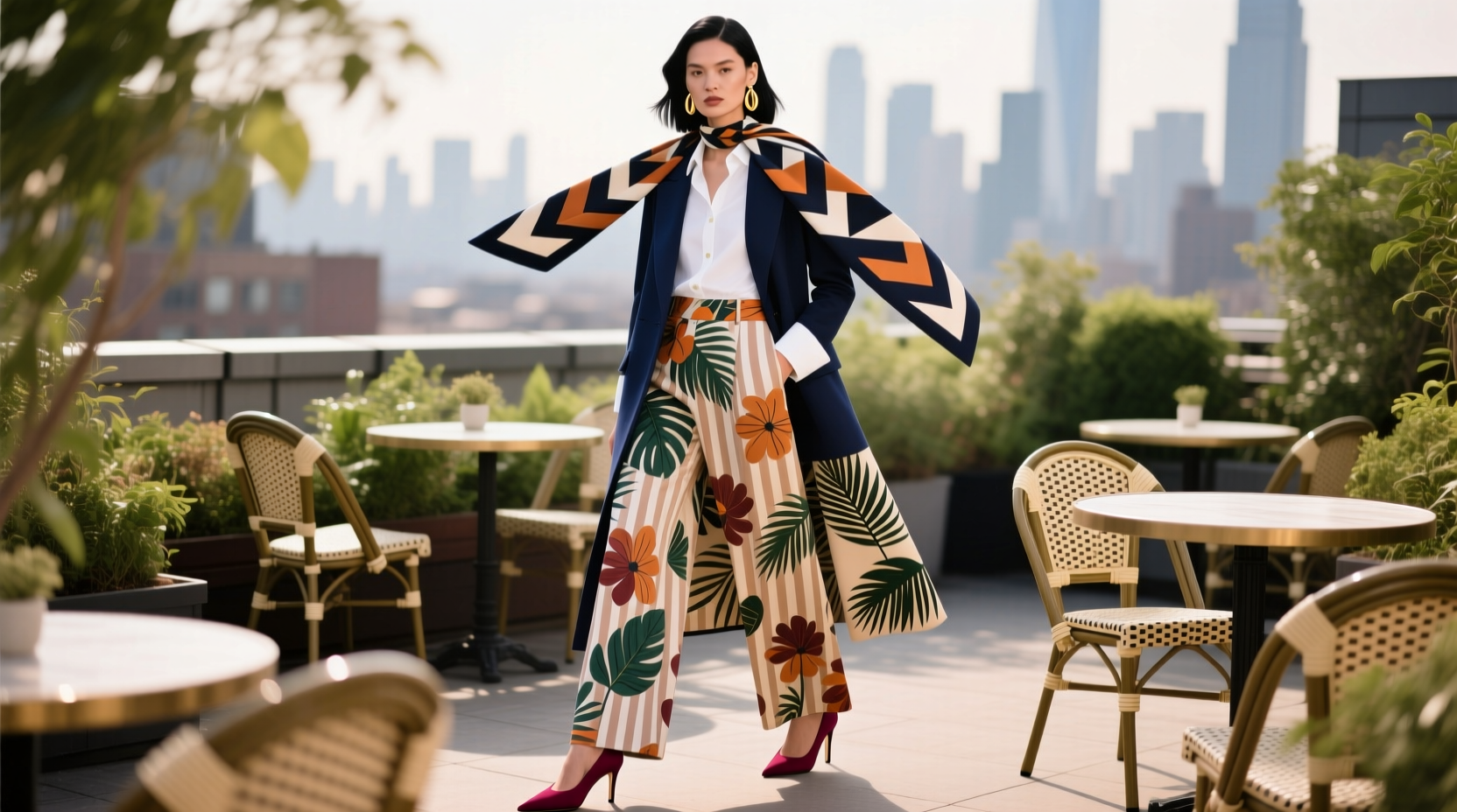
One of the most common mistakes in print mixing is using two large-scale patterns together. Two bold florals or oversized plaids side by side create visual noise, overwhelming the eye. Instead, vary the scale: pair a large print with a small or medium one.
For instance, a maxi dress with broad tropical leaves can be layered under a fine-pinstripe blazer. The contrast in size gives the brain a focal point (the large print) while the smaller pattern adds texture without stealing attention.
Think of scale like volume in music. You wouldn’t play two instruments at full blast simultaneously and expect harmony. In fashion, dominance matters. Let one print lead; the other should support.
“Mixing prints isn’t about randomness—it’s about rhythm. One strong beat, subtle accents, and space to breathe.” — Lena Torres, Fashion Stylist & Creative Director at Studio Forme
Print Scale Guide
| Scale Type | Characteristics | Best Paired With |
|---|---|---|
| Large/Statement | Bold motifs, wide spacing (e.g., big florals, animal prints) | Small-scale prints or solids |
| Medium | Balanced density (e.g., windowpane checks, ditsy florals) | Large or small prints |
| Small/Detailed | Tight repetition (e.g., micro-polka dots, fine stripes) | Large prints or neutral solids |
Combine Different Pattern Types Strategically
Not all prints are created equal. Some are inherently more disruptive than others. To mix effectively, understand the personality of each pattern type and how they interact.
Here’s a breakdown of common print families and how to pair them:
- Stripes: Classic and structured. Work well with geometric prints or small florals. Avoid pairing with other linear patterns (like pinstripes with pinstripes).
- Florals: Organic and fluid. Mix best with small checks, dots, or even subtle animal prints. Anchor with a solid color to prevent overwhelm.
- Geometrics (plaids, checks, houndstooth): Angular and architectural. Pair with stripes or abstract prints for a modern edge.
- Animal prints (leopard, snake): Wildcard pieces. Treat them like neutrals—especially in black and tan—and use them as accent layers over simpler prints.
- Abstract/artistic prints: Freeform and expressive. Best grounded with a solid or a simple stripe to avoid visual chaos.
A winning combination might be a leopard-print scarf tied over a blue gingham shirt and cream trousers. The leopard acts as a textured neutral, the gingham adds retro charm, and the solid trousers provide breathing room.
Use Solids as Anchors
Even when mixing multiple prints, including a solid element stabilizes the look. This could be a jacket, pants, shoes, or bag in a solid color pulled from one of the prints.
For example, wearing a floral blouse and striped skirt? Add a belt or cardigan in one of the shared colors. This creates continuity and gives the eye a resting point.
Solids don’t have to be boring. A deep emerald blazer over a multi-print ensemble can tie everything together while adding sophistication. The rule isn’t “avoid solids”—it’s “use them intentionally.”
Do’s and Don’ts of Print Mixing
| Action | Do | Don't |
|---|---|---|
| Color Matching | Share at least one color between prints | Use completely unrelated palettes |
| Scale Variation | Mix large with small prints | Pair two large-scale patterns |
| Pattern Type | Combine different families (e.g., floral + stripe) | Layer similar prints (e.g., plaid + check) |
| Proportion | Let one print dominate | Distribute prints evenly across the body |
| Accessories | Use solid-toned bags/shoes to ground the look | Add a printed bag to an already busy outfit |
Step-by-Step Guide to Confident Print Mixing
Ready to experiment? Follow this five-step process to build a cohesive, stylish outfit with mixed prints.
- Pick a base print. Start with one garment that features a print you love—this will be your focal point. It could be a floral dress, a striped shirt, or a plaid skirt.
- Select a secondary print with a shared color. Look through your closet for another printed piece that includes at least one hue from the base. Check scarves, jackets, or even socks.
- Vary the scale. If your base is a large floral, choose a small polka dot or narrow stripe for the second piece. Avoid matching scales.
- Add a solid anchor. Introduce a third piece—a cardigan, blazer, or bottom—in a solid color from either print. This grounds the look.
- Accessorize minimally. Stick to solid-colored shoes and bags. A metallic or neutral accessory keeps focus on the prints without adding clutter.
Example: A red-and-white gingham shirt (base) paired with a navy-and-red abstract-print skirt (secondary). Layer with a solid navy blazer and finish with nude heels. The red links the two prints, the navy blazer anchors the lower half, and the variation in pattern type (check + abstract) adds interest without conflict.
Real-Life Example: Olivia’s Office-to-Evening Look
Olivia, a graphic designer in Portland, wanted to wear her favorite zebra-print tunic to work but didn’t want to look “too much.” She layered it over a slim-fit pencil skirt with a subtle pinstripe in black and cream. The shared black-and-white palette created harmony, while the difference in scale (bold zebra vs. thin stripe) kept balance.
To transition to dinner, she swapped her flats for pointed-toe pumps and added a solid camel trench coat. The coat acted as a visual reset, making the entire ensemble feel deliberate rather than random. Colleagues complimented her “bold but put-together” look—proof that print mixing, when done right, commands attention in the best way.
Common Mistakes and How to Avoid Them
Even seasoned fashion lovers misstep when mixing prints. Here are three frequent errors and their fixes:
- Mistake: Overloading the upper and lower body. Wearing a busy top and equally busy bottom overwhelms. Solution: Keep one half simple. Try a printed blouse with solid pants, or vice versa.
- Mistake: Ignoring fabric weight and texture. A silk floral blouse with a stiff tartan skirt can feel disjointed. Solution: Match textures where possible—soft with soft, structured with structured.
- Mistake: Forgetting about fit. Ill-fitting clothes undermine even the best print combinations. Solution: Ensure each piece fits well. A tailored silhouette makes any print combo look intentional.
Frequently Asked Questions
Can I mix more than two prints?
Yes—but only if you follow the rules of color, scale, and proportion. Three prints work when one is dominant, one is supporting, and the third is subtle (like a pocket square or sock). More than three becomes risky unless you're highly experienced.
Are there any forbidden print combinations?
There are no absolute bans, but some pairings require extra care. Florals with animal prints can work if scaled and colored thoughtfully. Plaids with checks are tricky because they’re too similar—unless one is much smaller or rotated at an angle (a technique used in advanced tailoring).
How do I know if my outfit looks “off”?
If your eyes don’t know where to land, or if the outfit feels visually heavy, something’s unbalanced. Step back and ask: Is one print clearly leading? Do the colors connect? Is there a solid anchor? Adjust accordingly.
Your Print-Mixing Checklist
Before stepping out, run through this checklist to ensure your mixed prints look intentional:
- ✅ At least one color is shared between prints
- ✅ Print scales are varied (one large, one small)
- ✅ Patterns come from different families (e.g., not two florals)
- ✅ One solid piece (top, bottom, or outerwear) anchors the look
- ✅ Accessories are simple and in coordinating solids
- ✅ Fit is flattering and intentional
- ✅ You feel confident wearing it
Conclusion: Own Your Style with Confidence
Mixing prints isn’t about following rigid rules—it’s about understanding the language of design and speaking it with intention. Once you grasp the principles of color, scale, and balance, you’re no longer guessing. You’re composing.
The most stylish people aren’t those who avoid risk, but those who take it with purpose. So pull out that floral jacket, dig up the striped pants, and try combining them with a solid in between. Start small, observe what works, and gradually expand your range.


 浙公网安备
33010002000092号
浙公网安备
33010002000092号 浙B2-20120091-4
Comments
No comments yet. Why don't you start the discussion?