
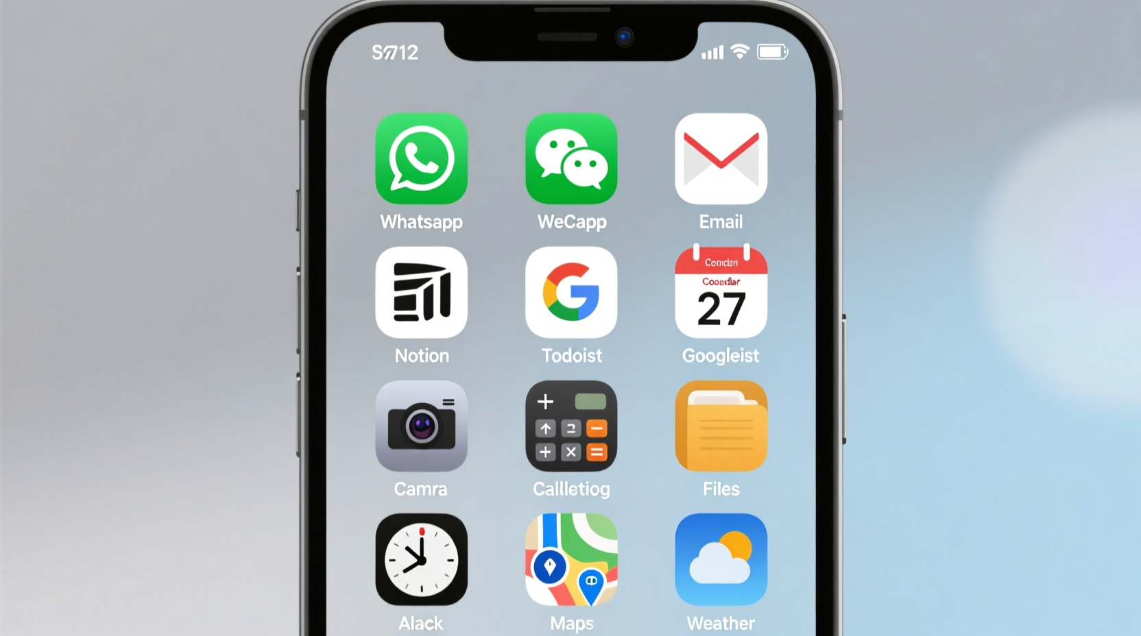
Your smartphone is likely the central hub of your daily life—managing communication, work tasks, fitness goals, and personal organization. Yet, most people treat their home screen as a dumping ground for every app they’ve ever downloaded. A cluttered interface doesn’t just look messy; it actively hinders focus, slows decision-making, and fragments attention. Intentionally organizing your apps can transform your device from a distraction engine into a streamlined productivity tool. This guide breaks down actionable methods, backed by behavioral psychology and digital wellness principles, to help you build a home screen that supports efficiency, reduces cognitive load, and keeps you aligned with your priorities.
1. Audit Your App Usage and Identify Core Functions
Before rearranging icons, understand what you actually use—and why. Most users have between 80 and 120 apps installed but regularly interact with fewer than 30. The first step toward an optimized home screen is eliminating noise.
Start by reviewing your device’s built-in screen time or digital wellbeing dashboard. Look at usage patterns over the past week: Which apps consume the most time? Are any frequently opened but not essential? Categorize each app based on function:
- Essential Tools: Calendar, email, messaging, banking, health tracking
- Work & Productivity: Notion, Slack, Google Drive, Trello
- Communication: WhatsApp, FaceTime, Instagram DMs
- Entertainment & Distraction: TikTok, YouTube, games
- Rarely Used: Seasonal apps, one-time services, outdated tools
Once categorized, decide which functions deserve immediate access. Reserve your home screen only for high-value, high-frequency tools. Everything else belongs in folders or the app library.
2. Apply the Zone-Based Layout System
Instead of organizing apps alphabetically or by frequency alone, adopt a “zone” approach. This method groups functionality spatially, reducing mental effort when switching tasks. Think of your home screen as a workspace divided into zones—like a desk with labeled trays.
The most effective layout uses four primary zones:
- Top Left – Focus Zone: Apps critical for deep work (e.g., task manager, calendar, focus timer)
- Top Right – Communication Hub: Messaging, email, calling apps
- Bottom Left – Personal Management: Health, finance, notes
- Bottom Right – Quick Actions: Camera, flashlight, wallet, QR scanner
This quadrant model leverages natural eye movement and thumb reachability. Research from the University of Glasgow shows that users access the bottom corners of smartphones 73% faster than top edges, especially on larger devices.
| Zone | Purpose | Recommended Apps |
|---|---|---|
| Top Left | Deep Work & Planning | Todoist, Google Calendar, Forest |
| Top Right | Real-Time Interaction | Gmail, Signal, Slack |
| Bottom Left | Life Admin | Mint, Evernote, MyFitnessPal |
| Bottom Right | Instant Utilities | Camera, Wallet, Flashlight |
Keep no more than nine apps visible per screen. Excess visibility increases choice fatigue—a phenomenon where too many options lead to indecision and procrastination.
3. Use Smart Folder Hierarchies and Naming Conventions
Folders are not just for hiding apps—they’re powerful organizational units when designed intentionally. Avoid generic names like “Utilities” or “Misc.” Instead, use action-oriented labels that reflect purpose.
Examples of effective folder names:
- “Pay & Track” – Banking, budgeting, tax apps
- “Learn Daily” – Duolingo, Coursera, podcast players
- “Move Body” – Workout plans, yoga, step tracker
- “Create Now” – Photo editing, voice recorder, design tools
Place folders on secondary home screens or within the app library. Only the most critical folder—such as “Work Projects” or “Urgent Tasks”—should appear on the primary screen.
On iOS, place the most important app in the top-left position within a folder—it loads fastest when opened. On Android, consider using smart folders that auto-sort by usage (available via third-party launchers like Nova).
4. Reduce Cognitive Load with Visual Design Principles
Visual clarity directly impacts usability. A chaotic mix of colors, shapes, and icon styles creates subconscious friction. Apply minimalist design principles to reduce mental strain.
Standardize your icon aesthetic:
- Use uniform icon packs (Android) or apply consistent widgets (iOS)
- Adopt a monochrome theme to minimize visual noise
- Align app icons to a grid—avoid irregular spacing
Consider using blank spacer icons to create breathing room between functional zones. Negative space isn't wasted space—it improves focus.
“The fewer visual decisions you make at the start of a task, the more mental energy you preserve for meaningful work.” — Dr. Lena Torres, Cognitive Psychologist specializing in digital behavior
Avoid animated wallpapers or busy backgrounds. Solid dark or neutral tones improve readability and reduce battery drain on OLED screens. If you use widgets, limit them to one per screen and choose only those providing real-time value—e.g., today’s schedule, step count, or unread messages.
5. Implement a Maintenance Routine and Accountability System
An optimized home screen degrades over time without upkeep. New apps install automatically, promotions add shortcuts, and habits shift. Build a maintenance rhythm to sustain order.
Weekly Reset Protocol
- Review screen time data every Sunday evening
- Remove any app shortcut added impulsively during the week
- Reposition misaligned icons or overloaded folders
- Ask: “Does this app support my current goals?” If not, move it to the app library
Monthly Audit Checklist
- ✅ Delete unused apps (target 5–10 per month)
- ✅ Rename outdated folders
- ✅ Update widget content (e.g., swap reading list for project tracker)
- ✅ Test new organizational layout for one week
- ✅ Backup home screen layout (via iCloud or launcher settings)
Treat your home screen like a physical desk: if it gets cluttered, performance drops. Scheduling regular resets ensures alignment with evolving priorities.
Real Example: From Distracted to Focused – A Case Study
Mark, a freelance graphic designer, struggled with constant context-switching. His iPhone had 117 apps, with social media, client tools, and personal utilities scattered across four chaotic home screens. He averaged 142 pickups per day and often lost hours to unplanned scrolling.
Over two weeks, he applied the zone-based system:
- Reduced home screen to one page with only 8 core apps
- Created folders: “Client Work,” “Invoices,” “Design Tools,” “Learn,” and “Social (Limited)”
- Moved all entertainment apps to the final app library page
- Set grayscale mode after 8 PM to reduce visual appeal of distracting apps
After one month, Mark reported a 40% reduction in screen time, faster response times to client messages, and improved ability to enter flow states during creative work. His phone became a tool again—not a trap.
Do’s and Don’ts of Home Screen Organization
| Do | Don’t |
|---|---|
| Limit home screen to 1–2 pages max | Allow more than three home screens |
| Place high-priority apps in easy-thumb zones | Put critical tools on hard-to-reach pages |
| Name folders by action or goal | Use vague labels like “Stuff” or “Apps” |
| Update layout quarterly based on goals | Never revisit your setup after initial organization |
| Use grayscale or minimalist themes | Enable autoplay videos or flashy widgets |
Frequently Asked Questions
How many apps should be on my home screen?
Aim for 8–12 apps total across one or two screens. More than that introduces decision fatigue. Prioritize tools you use daily and need instant access to. Everything else can live in folders or the app library.
Should I hide my app library on iOS?
If you're prone to mindless browsing, yes. On iPhone, go to Settings > Home Screen > App Library and disable “Show App Library.” This forces intentional app installation and retrieval, reducing impulsive downloads.
Is it better to use folders or app groups by category?
Folders are more efficient for storage, but app groups (as seen in Android launchers or iOS widgets) offer faster access. Combine both: use folders for archival purposes and small app groups for active projects. For example, a “Q3 Campaign” widget stack could include Asana, Canva, and Google Sheets.
Conclusion: Design Your Phone Like a Productivity Workspace
Your home screen shouldn’t reflect your app history—it should reflect your intentions. Every icon, folder, and blank space sends a signal about what deserves your attention. By auditing usage, applying spatial logic, standardizing visuals, and maintaining discipline, you turn your phone into an extension of your workflow rather than a source of interruption.
Start today: delete five unused apps, define your four functional zones, and rebuild one screen with purpose. Small changes compound. In a week, you’ll notice fewer distractions. In a month, you’ll reclaim hours. In six months, you may find you’ve fundamentally reshaped your relationship with technology—not by fighting it, but by designing it wisely.


 浙公网安备
33010002000092号
浙公网安备
33010002000092号 浙B2-20120091-4
Comments
No comments yet. Why don't you start the discussion?