
Your home screen is the control center of your digital life. Every time you unlock your phone, it’s the first interface you interact with—so its layout directly influences your focus, efficiency, and mental clarity. Yet most people treat it like a dumping ground for every app they’ve ever downloaded. Cluttered icons, buried tools, and distracting notifications erode attention and make simple tasks take longer than necessary.
A well-organized home screen isn’t about aesthetics alone; it’s about designing an environment that supports deep work, reduces decision fatigue, and aligns with your daily priorities. By applying principles from behavioral psychology, minimalism, and user experience design, you can transform your device into a productivity engine rather than a distraction machine.
1. Start with a Purpose-Driven Audit
Before moving a single icon, conduct a full audit of your current app ecosystem. The goal is not just to delete unused apps, but to understand which ones serve your goals—and which ones sabotage them.
Spend 48 hours observing your usage patterns. Note:
- Which apps you open most frequently
- What triggers each app use (habit, need, boredom)
- How long you spend in each session
- Which apps leave you feeling drained or distracted afterward
This awareness phase helps distinguish between utility and habit. For example, checking email five times a day may feel productive, but if those sessions are short, reactive, and lead to fragmented attention, they’re likely counterproductive.
After gathering data, categorize apps into three groups:
- Essential – Used daily for work, communication, or health (e.g., Calendar, Notes, Messages).
- Occasional – Needed weekly or situationally (e.g., Banking, Maps, Weather).
- Distraction – High-engagement apps that don’t contribute to core goals (e.g., Social Media, Games, Streaming).
Delete anything in the third category unless it serves a clear recreational purpose you’ve consciously chosen. The fewer automatic pulls on your attention, the more mental space you reclaim.
2. Apply the “One-Touch Rule” to App Placement
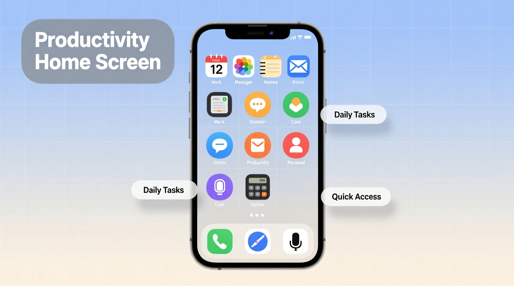
The most effective home screens follow a principle borrowed from productivity systems: every essential action should require one touch, no more.
If accessing your calendar involves swiping twice and tapping through folders, you’re adding friction where speed matters. Structure your primary screen so that high-priority tools are immediately accessible.
Reserve the first page of your home screen exclusively for:
- Communication (Messages, Phone, Email)
- Task Management (To-Do List, Calendar)
- Navigation & Transit (Maps, Ride Apps)
- Health & Wellness (Water Tracker, Meditation)
- Emergency Tools (Flashlight, Wallet, Notes)
These should appear in a logical order based on your morning routine or workflow. If you start your day by reviewing your schedule, place Calendar front and center. If you commute, prioritize Maps or transit apps.
“Your phone should reduce cognitive load, not add to it. Every tap required is a micro-decision that drains energy.” — Dr. Lena Patel, Cognitive Behavioral Technologist
Use widgets strategically. A calendar widget showing today’s events, a to-do list preview, or a focused countdown timer adds value without requiring navigation. But avoid cluttering the screen with redundant or decorative widgets—they defeat the purpose.
3. Design a Zoned Layout for Mental Clarity
Just as offices have separate areas for different functions—desks for work, lounges for breaks—your home screen should reflect functional zones. This spatial organization trains your brain to associate specific areas with certain behaviors.
Create up to three distinct zones:
| Zone | Purpose | Recommended Apps |
|---|---|---|
| Focus Zone (Top Left) | Deep work & concentration | Notion, Focus Timer, Calendar, Docs |
| Connect Zone (Top Right) | Communication & collaboration | Messages, Slack, Email, Zoom |
| Maintenance Zone (Bottom Row) | Daily essentials | Phone, Camera, Wallet, Settings |
This grid-based approach leverages muscle memory. Over time, you’ll reach for apps instinctively, reducing visual scanning and hesitation. Avoid placing social media or entertainment apps in these zones unless they’re part of your professional toolkit (e.g., a marketer using Instagram for business).
Secondary screens should house grouped folders for occasional-use apps. Label them clearly: “Finance,” “Travel,” “Utilities,” “Learning.” Keep folder depth to one level—nesting folders inside folders creates unnecessary complexity.
4. Implement a Minimalist Visual Hierarchy
Visual clutter is just as damaging as functional disorganization. A screen packed with colorful icons competes for attention and increases cognitive strain.
To create visual calm:
- Use consistent icon shapes—either all round or all square.
- Apply a uniform color scheme using custom icon packs or built-in themes.
- Limit the number of apps on the first screen to 12–16 max.
- Align icons to a grid; avoid random placement.
Consider using blank spacers to create breathing room between functional groups. Empty space isn’t wasted space—it’s a design feature that enhances readability and focus.
Change wallpapers intentionally. Use dark, neutral backgrounds to reduce visual stimulation. Avoid animated or busy wallpapers—they pull attention away from functionality.
5. Build a Sustainable Maintenance Routine
An organized home screen degrades over time. New apps install, updates shift layouts, and habits evolve. Without maintenance, entropy sets in.
Establish a monthly reset ritual:
- Review app usage statistics.
- Delete any app not used in the past 30 days.
- Re-evaluate folder categories—are they still relevant?
- Adjust widget placements based on seasonal needs (e.g., weather during winter).
- Backup your layout (via screenshot or configuration tool) before making changes.
This prevents slow decay and keeps your system aligned with current priorities. Think of it like tidying your physical workspace at the end of each week—small efforts prevent larger overhauls later.
Mini Case Study: From Chaos to Control
Mark, a project manager at a tech startup, used to spend 15–20 minutes daily searching for files, replying to delayed messages, and navigating between overlapping apps. His home screen had four pages: two filled with social media, one with games, and the last with a chaotic mix of utilities.
After a productivity workshop, he applied the zoned layout method. He cleared all non-essential apps, placed his task manager and calendar front and center, and created a “Team Hub” folder for Slack, email, and video calls. He also set up a daily checklist widget.
Within two weeks, Mark reported a 30% reduction in meeting prep time and fewer missed deadlines. More importantly, he felt less mentally fatigued at the end of the day. “I’m not fighting my phone anymore,” he said. “It works for me now, not against me.”
Checklist: Optimize Your Home Screen in One Hour
Follow this step-by-step guide to reorganize your home screen efficiently:
- ✅ Enable Screen Time / Digital Wellbeing tracking
- ✅ Delete all unused or distracting apps
- ✅ Identify your top 6–8 daily-use apps
- ✅ Place essential apps on the first home screen
- ✅ Group remaining apps into labeled folders
- ✅ Add 1–2 high-value widgets (calendar, to-do, clock)
- ✅ Choose a neutral wallpaper and consistent icon style
- ✅ Test accessibility: Can you reach key apps within 3 seconds?
- ✅ Schedule a monthly review reminder
FAQ
Should I hide all my apps in folders or keep some visible?
Keep only your most critical apps visible on the first screen. Folders are ideal for secondary tools. The goal is to minimize visual noise while maximizing access speed for what matters most.
Is it better to use the app drawer (Android) or keep everything on home screens?
The app drawer supports cleaner home screens by default, which aligns with minimalist design. Use it to store everything except your top-tier apps. This way, your home screen remains a curated command center, not a full inventory.
Can organizing my home screen really improve productivity?
Yes—when done intentionally. Studies show that reducing decision points and visual distractions lowers cognitive load, leading to faster task initiation and improved focus. It’s not just about convenience; it’s about shaping behavior through environment design.
Final Thoughts: Design Your Digital Environment Like a Pro
Your home screen is not a passive reflection of your app collection—it’s an active tool for shaping your attention and actions. Most people accept default settings and accumulate digital clutter until their devices become sources of stress. But by taking deliberate control, you turn your phone into an ally for productivity.
The best systems are simple, sustainable, and personalized. They don’t follow trends; they follow function. Whether you’re a student, entrepreneur, or remote worker, a streamlined home screen gives you back time, focus, and peace of mind.


 浙公网安备
33010002000092号
浙公网安备
33010002000092号 浙B2-20120091-4
Comments
No comments yet. Why don't you start the discussion?