
A cluttered home screen slows you down. Every unnecessary tap, misplaced app, or missed notification chips away at productivity. Yet most people treat their smartphone’s home screen as a default landing zone—accepting the manufacturer’s layout without question. The truth is, a thoughtfully personalized home screen can become a command center tailored to your daily rhythms, reducing friction and amplifying focus.
Efficiency isn’t about doing more—it’s about reducing effort. When your most-used tools are instantly accessible, when distractions are minimized, and when context matters, you reclaim minutes each day that add up to hours over time. This guide walks through how to transform your home screen from a digital junk drawer into a streamlined interface designed around your real-life workflow.
Understand Your Daily Digital Behavior
Before moving a single icon, observe how you use your phone. Spend three days noting: which apps you open most, what tasks take multiple steps, and where frustration arises. You might discover patterns—like checking email first thing, using maps during commutes, or relying heavily on calendar alerts.
This awareness informs structure. For example, if fitness tracking is central to your routine, placing health apps and step-count widgets front and center makes sense. If work dominates your day, grouping communication tools (Slack, email, Zoom) together reduces cognitive load.
“Your phone should reflect your priorities, not your download history.” — David Pogue, Tech Journalist and Author
Design a Logical Layout Structure
Efficient home screens follow intentional spatial logic. Random placement leads to hunting; structured zones enable muscle memory. Consider dividing your screen into functional areas:
- Primary Zone (Center or Bottom): High-frequency apps like Messages, Phone, Camera, or Wallet.
- Productivity Hub: Email, Calendar, Notes, Task Manager.
- Quick Access Dock: Always visible, reserved for 4 essential apps.
- Contextual Pages: Secondary screens for less frequent needs—travel, finance, entertainment.
On iPhones, swipe left from the first page to access widgets. Reserve this space for glanceable info: weather, upcoming events, reminders. Android users can place widgets directly on main pages, allowing richer integration.
Recommended Home Screen Layout (Three-Page Model)
| Page | Purpose | Contents |
|---|---|---|
| Page 1 | Immediate Actions | Dock: Messages, Phone, Email, Browser. Top row: Calendar, Clock, Weather widget. |
| Page 2 | Work & Focus | Folders: Work Apps, Finance, Health. Widget: To-do list, step count. |
| Page 3 | Lifestyle & Leisure | Folders: Social Media, Entertainment, Travel. Minimal icons, no notifications. |
This model separates urgency from leisure, minimizing distraction while ensuring critical functions remain one tap away.
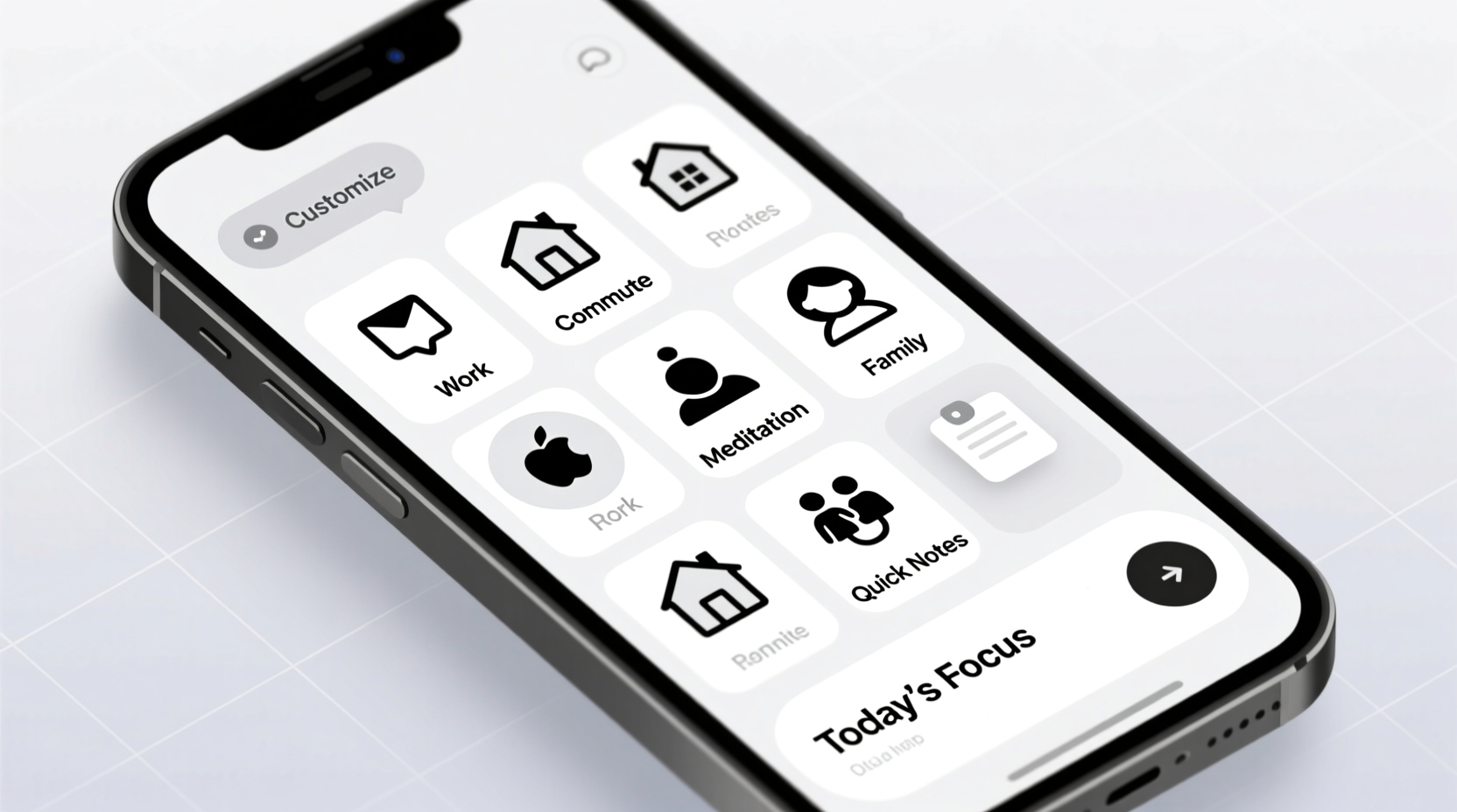
Optimize Widgets and Shortcuts
Widgets are underused power tools. Unlike static icons, they display live data—eliminating the need to open apps just to check status. A well-placed widget saves time; a poorly chosen one adds visual noise.
Select widgets based on frequency and value:
- Weather: 6-hour forecast at a glance.
- Calendar: Today’s agenda without launching the app.
- Reminders: Shows pending tasks, synced across devices.
- Music/Playback: Control current track without unlocking.
- Health: Step count, heart rate, water intake (iOS).
Android offers even deeper customization. Long-pressing an app icon often reveals “shortcuts” to specific actions—like creating a new note in Evernote or starting a timer in Clock. These bypass the app entirely, cutting steps.
“Shortcuts turn five-tap processes into one-tap actions. That’s where real efficiency lives.” — Marques Brownlee, Tech Reviewer
Apply Visual Hierarchy and Minimalism
Your eyes scan before your brain interprets. A chaotic layout forces constant reevaluation. Apply design principles used in user interface (UI) theory:
- Group by function: Use labeled folders—e.g., “Finance,” “Travel,” “Utilities.”
- Limit color overload: Stick to a consistent icon pack or grayscale theme to reduce visual noise.
- White space matters: Don’t fill every grid. Empty space improves readability.
- Font size: Increase text slightly if it improves legibility without sacrificing space.
Minimalism doesn’t mean bare—it means intentional. Remove anything that doesn’t serve a purpose. Uninstall unused apps or tuck them into the App Library (iOS) or app drawer (Android).
Do’s and Don’ts of Visual Design
| Do | Don't |
|---|---|
| Use uniform icon shapes and sizes | Mix round, square, and themed icons randomly |
| Place high-priority items in thumb-reach zones | Put essential apps in top corners on large phones |
| Label folders clearly (“Bills,” “Learning,” “Workouts”) | Use vague names like “Stuff” or “Misc” |
| Keep dock apps consistent across days | Rotate dock contents frequently |
Consistency trains your brain. Over time, reaching for Messages becomes automatic because it’s always in the same spot—no thinking required.
Step-by-Step Guide: Rebuild Your Home Screen in One Hour
Follow this timeline to redesign your home screen efficiently:
- Step 1: Audit (10 min)
Open digital wellbeing settings. List your top 5 most-used apps. Note which ones lack widgets or shortcuts. - Step 2: Plan (15 min)
Sketch a rough layout on paper or notes app. Assign zones: primary, secondary, reference. - Step 3: Declutter (10 min)
Delete unused apps. Move infrequent ones to App Library or second page. - Step 4: Organize (10 min)
Create folders. Group similar apps. Name them clearly. - Step 5: Add Widgets (5 min)
Choose 2–3 high-value widgets. Position for visibility without crowding. - Step 6: Test & Refine (10 min)
Use the new layout. Try common tasks. Adjust placements based on friction.
After implementation, revisit weekly for two weeks. Small tweaks—relocating one app, removing a widget—can significantly improve flow.
Mini Case Study: From Chaos to Clarity
Sophie, a project manager in Toronto, used her phone constantly but felt overwhelmed. Her home screen had 7 pages: social media apps mixed with work tools, duplicate icons, and outdated promotions. She checked email 20+ times a day but often missed deadlines buried in notifications.
She followed the three-page model:
- Page 1: Only communication—Messages, Slack, Email, Calendar widget.
- Page 2: Productivity folder with Trello, Notion, Google Drive, and a to-do widget.
- Page 3: Personal—banking, recipes, Spotify, family photos.
Within a week, Sophie reported fewer distractions and faster task initiation. By moving social apps off the first page, she reduced pickups by 30%. Placing her calendar widget front and center helped her catch meetings earlier. “It’s not that I’m busier,” she said. “It’s that I’m calmer.”
Advanced Tips for Power Users
For those seeking deeper control:
- iOS Shortcuts Automation: Create automations that trigger based on time, location, or action. Example: “Arrive at Work” automation turns on Do Not Disturb, opens Calendar, and starts music playlist.
- Android Launchers: Use Action Launcher or Microsoft Launcher to customize gestures, icon scaling, and search bars.
- Dynamic Island (iPhone 14 Pro+): Leverage real-time activity display for timers, navigation, or music.
- Dark Mode Scheduling: Sync dark mode with sunset/sunrise to reduce eye strain and signal focus time.
FAQ
How many widgets should I use?
Limit to 2–3 per page. More than that creates clutter. Prioritize widgets that show actionable data—upcoming events, unread messages, health stats.
Should I hide the App Library on iPhone?
No. The App Library automatically organizes all apps. Use it as an archive. Keep only essentials on home pages, and let the library handle the rest.
Is it better to have apps on the home screen or in folders?
Balance accessibility and cleanliness. Frequently used apps (daily or multiple times a day) should be visible. Others belong in folders. If opening a folder takes more than two taps, reconsider its placement.
Checklist: Optimize Your Home Screen in One Session
- Review screen time/digital wellbeing report
- Delete or archive unused apps
- Group apps into labeled folders
- Select 2–3 high-value widgets
- Set dock with 4 core apps
- Apply consistent icon theme (optional)
- Test navigation for key tasks
- Enable focus modes (e.g., Work, Sleep, Personal)
- Schedule a 5-minute weekly review for adjustments
Conclusion
Your smartphone home screen is more than a launchpad—it’s a reflection of how you engage with technology. A personalized setup aligned with your habits reduces decision fatigue, minimizes distractions, and accelerates daily tasks. Efficiency isn’t found in more features, but in fewer obstacles.
The best home screen evolves. As your life changes—new job, fitness goal, travel plans—your interface should adapt. Treat it like a workspace: clean, organized, and optimized for performance. Start today with one change—move an app, add a widget, delete clutter. Small shifts compound into lasting gains.


 浙公网安备
33010002000092号
浙公网安备
33010002000092号 浙B2-20120091-4
Comments
No comments yet. Why don't you start the discussion?