
Selecting the right pillowcases goes beyond comfort—it's a subtle yet powerful way to refine your bedroom’s atmosphere. Plush pillowcases, known for their softness and luxurious feel, become even more impactful when paired with thoughtful pattern choices. The right design can tie together color schemes, reflect personal taste, and elevate the overall cohesion of your space. With countless options available, knowing how to choose patterns that complement—not clash with—your decor is essential.
Understand Your Existing Decor Style
Before browsing fabric swatches or pattern catalogs, take stock of your current bedroom aesthetic. Is your room modern minimalist, bohemian eclectic, traditional farmhouse, or coastal cottage? Each style responds best to certain types of patterns and textures. For instance, geometric prints suit contemporary spaces, while floral motifs often enhance vintage or romantic themes.
Begin by identifying dominant colors in your bedding, curtains, walls, and furniture. Use these as anchors when selecting a pillowcase pattern. A cohesive look emerges when the new piece shares at least one key hue from the existing palette. This doesn’t mean matching exactly; tonal variations or complementary shades work just as well.
Choose Patterns That Balance Texture and Visual Weight
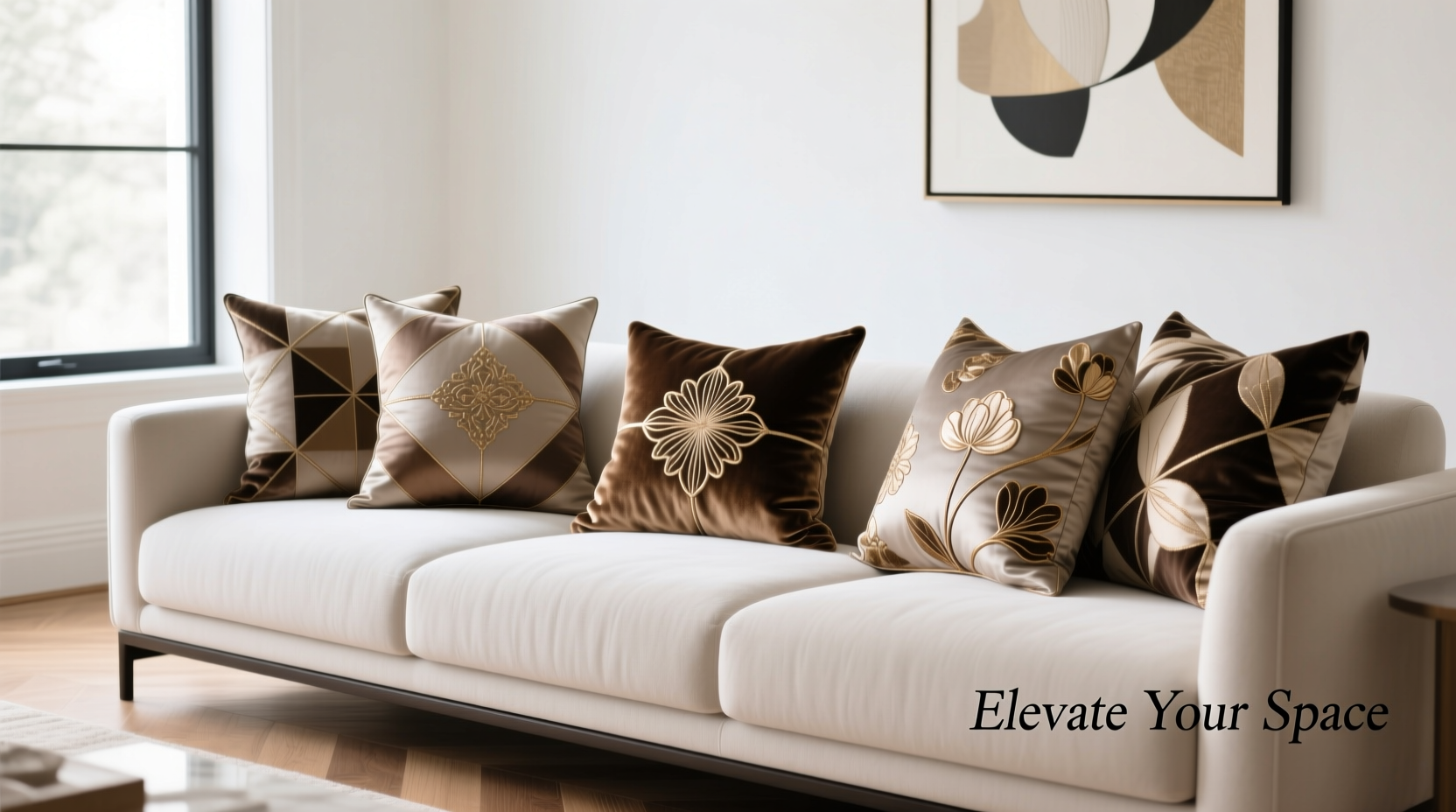
Plush pillowcases already add tactile depth due to their raised weave or velvety finish. When introducing patterns, consider how much visual “weight” they carry. Busy prints on textured fabrics can overwhelm a small space, while overly simple designs might get lost against rich materials.
For rooms with minimal décor, medium-scale patterns like trellis, abstract brushstrokes, or stylized botanicals offer interest without clutter. In larger bedrooms with layered furnishings, bolder options such as damask, large florals, or tribal motifs can serve as statement pieces.
Scale matters. A tiny print may appear muddy on a thick fabric, while an oversized design could dominate the bed. Aim for proportionality: smaller patterns for accent pillows, larger ones for centerpiece arrangements.
“Pattern selection should support the room’s rhythm, not disrupt it. Harmony between texture and design creates sophistication.” — Lena Torres, Interior Stylist & Textile Consultant
Match Pattern Type to Room Function and Mood
The purpose of the room influences the emotional tone you want to create. A master bedroom should promote relaxation; a guest room might aim for warmth and welcome; a child’s room may embrace playfulness.
- Calming spaces: Opt for soft organic patterns—watercolor florals, gentle waves, or cloud-like marbling.
- Energetic environments: Introduce dynamic geometrics, zigzags, or asymmetric prints in vibrant hues.
- Luxury-focused areas: Consider classic damask, toile, or subtle metallic-thread embroidery for refined elegance.
Avoid high-contrast patterns in rooms meant for sleep unless balanced with neutral surroundings. Stripes, checks, and optical illusions can be stimulating—use them sparingly if restful energy is the goal.
Step-by-Step Guide: Choosing the Right Pattern
- Assess your room’s current color scheme. Note primary, secondary, and accent colors.
- Determine your decor style. Label it (e.g., Scandinavian, maximalist, transitional) to narrow suitable patterns.
- Feel the fabric. Ensure the plushness aligns with both comfort needs and visual texture balance.
- Test scale. Hold a sample (or digital mockup) against your bed to see how the pattern reads from three feet away.
- Limit pattern mixing. Combine no more than two distinct patterns per bed, using solids as buffers.
- Review under lighting. Check how the pattern appears in morning, evening, and artificial light.
Do’s and Don’ts: Pattern Selection Checklist
| Do | Don't |
|---|---|
| Use a unifying color across mixed patterns | Mix too many competing scales (e.g., large floral + micro-dot) |
| Pair bold patterns with solid plush shams | Ignore fabric texture—plush + heavy print = visual overload |
| Align pattern theme with room personality (e.g., nautical for coastal) | Choose trends over timelessness unless easily replaceable |
| Wash test samples to check colorfastness | Overlook maintenance—some intricate prints fade faster |
Real Example: Transforming a Dated Bedroom
Sarah, a homeowner in Portland, wanted to refresh her outdated master suite without replacing all the furniture. The room had beige walls, dark wood furniture, and cream-colored bedding that felt flat. She introduced plush pillowcases in a soft sage green with a subtle leaf-print jacquard weave.
The organic pattern echoed the ferns on her balcony, tying indoor and outdoor spaces together. Because the base bedding remained neutral, the pillowcases became quiet focal points rather than distractions. By adding only two patterned plush shams, she elevated the entire mood of the room—making it feel curated and intentional.
This case illustrates how minimal changes, guided by thoughtful pattern selection, can produce maximum impact.
Frequently Asked Questions
Can I mix different plush pillowcase patterns?
Yes, but maintain cohesion through shared color, scale hierarchy, or theme. For example, pair a small-scale dot with a large-scale floral if both use the same green tone. Always anchor the combination with solid-texture elements like a duvet cover or throw blanket.
Are printed plush pillowcases harder to care for?
Not necessarily. High-quality printed plush fabrics are designed for durability. However, always follow care instructions—turn inside out before washing, use cold water, and avoid bleach to preserve both color and softness. Some digitally printed textiles may require gentler cycles.
How do I know if a pattern will go out of style quickly?
Trend-driven motifs (like neon animal prints or viral social media aesthetics) tend to date faster. If longevity matters, opt for classic structures—stripes, paisley, medallions—or nature-inspired designs with timeless appeal. These adapt better to evolving tastes.
Final Thoughts and Action Steps
Selecting plush pillowcase patterns isn’t just about aesthetics—it’s an exercise in spatial storytelling. Every choice contributes to the narrative of your home: serene, bold, inviting, or refined. When done intentionally, even small details like a thoughtfully chosen print can shift the entire perception of a room.
Start today by removing one plain pillowcase and replacing it with a patterned plush alternative that echoes a color or theme already present. Observe how it changes the energy of the space. Then build gradually, using pattern as a tool—not an afterthought.


 浙公网安备
33010002000092号
浙公网安备
33010002000092号 浙B2-20120091-4
Comments
No comments yet. Why don't you start the discussion?