
Selecting the right playing cards goes far beyond aesthetics. Whether you're a magician, poker enthusiast, collector, or casual player, the design of your deck influences grip, readability, durability, and even performance. The best playing card patterns combine visual appeal with practical function—offering clarity during fast-paced games, ease of handling for sleight-of-hand tricks, and long-term resilience. With thousands of designs available, from minimalist classics to artist-crafted editions, making an informed choice is essential.
Understanding the Role of Design in Performance
The pattern of a playing card—commonly referred to as its \"back design\" and \"face layout\"—affects more than just appearance. It impacts how easily you can spot suits and values, maintain control during shuffles, and conceal information from opponents. A poorly designed back pattern may reveal subtle marks after wear, while a cluttered face design can slow down gameplay.
Professional card handlers emphasize that a well-balanced design should prioritize legibility without sacrificing elegance. For example, bridge-sized cards with standard indices (the numbers/symbols in the corners) allow quick identification, while larger poker-sized decks offer better handling for fans and spreads.
“Design isn’t just about looking good—it’s about enabling precision. In magic, a distracting back design can ruin misdirection.” — Daniel Rossi, Professional Magician & Cardistry Artist
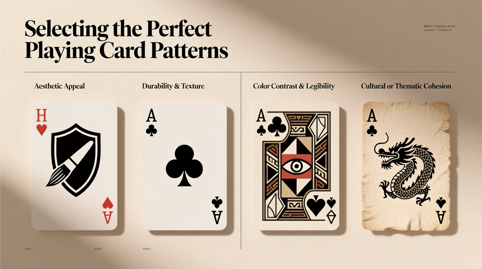
Key Factors When Choosing a Playing Card Pattern
To find the ideal deck, evaluate these core elements:
- Back Design Complexity: Overly intricate patterns may look impressive but can make it difficult to spot wear or alignment issues. Simpler, symmetrical backs are often preferred for serious play.
- Index Clarity: Large, bold indices help players read cards quickly, especially in dim lighting or large groups.
- Suit Symbol Recognition: Hearts, diamonds, clubs, and spades should be instantly distinguishable. Some artistic decks stylize suits so much that they become ambiguous mid-game.
- Color Contrast: High contrast between red and black suits improves visibility. Avoid decks where colors bleed into one another or use non-traditional hues unless you’re certain of their usability.
- Border and Margin Balance: Too much border reduces usable space; too little risks cutting off critical details during manufacturing or wear.
Matching Patterns to Your Purpose
Not all decks serve every purpose equally. What works for a magic routine might hinder a competitive poker night. Here’s how different uses influence design needs:
| Use Case | Ideal Pattern Traits | Potential Pitfalls |
|---|---|---|
| Card Magic | Minimalist backs, consistent symmetry, no flashy distractions | Busy designs break audience focus; asymmetrical patterns reveal orientation |
| Cardistry | Vibrant colors, dynamic symmetry, high visual impact when fanned or flipped | Overly complex art can obscure movement flow |
| Poker & Casino Games | Standard indices, clear suit symbols, durable finish | Custom fonts or small print reduce readability under pressure |
| Collecting | Unique artwork, limited editions, thematic depth | Collector’s items often sacrifice playability for beauty |
| Travel & Outdoor Play | Durable plastic or hybrid stock, weather-resistant coating | Paper-based luxury decks degrade quickly in humidity |
A Real Example: From Frustration to Functionality
Mark, an amateur magician from Chicago, once purchased a beautifully illustrated deck featuring ornate dragons wrapping around each card. While stunning on display, he struggled during performances—the dark background made corner indices hard to see, and the glossy finish caused glare under stage lights. After switching to a classic rider-back design with matte lamination, his confidence improved dramatically. The simpler pattern allowed him to focus on technique rather than compensating for poor visibility.
This shift highlights a common mistake: prioritizing novelty over usability. Artistic value matters, but not at the expense of performance.
Step-by-Step Guide to Selecting Your Ideal Deck
Follow this process to ensure your next deck meets both aesthetic and functional standards:
- Define Your Primary Use: Are you using the cards for magic, gaming, display, or stunts? This determines which features matter most.
- Choose the Right Size: Poker size (2.5\" x 3.5\") is standard for most games. Bridge size (2.25\" x 3.5\") fits smaller hands better and is popular among magicians.
- Evaluate Stock and Finish: Linen finish provides grip; air-cushion offers smooth glide. Plastic decks last longer but feel different than paper.
- Analyze the Back Design: Look for symmetry, lack of directionality, and resistance to marking. Avoid designs with obvious centers or gradients.
- Test Face Layout: Check if indices are large enough and whether pips (suit symbols) are positioned intuitively. Can you tell the difference between the 6 and 9 of hearts at a glance?
- Assess Durability: Read reviews about how the ink holds up over time. Do colors fade? Do edges chip quickly?
- Buy a Sample First: Especially for premium brands, test one deck before investing in multiples.
Checklist: Before You Buy Any Deck
- ✅ Is the index readable from across a table?
- ✅ Are the suits clearly differentiated in color and shape?
- ✅ Does the back design have rotational symmetry?
- ✅ Is the card stock appropriate for my intended use?
- ✅ Has the brand earned trust through quality control?
- ✅ Am I buying for looks alone, or actual performance?
Frequently Asked Questions
Can I use artistic decks for serious games?
Some artistic decks work well, but many sacrifice functionality. Always check user reviews focused on gameplay before using them in tournaments or frequent sessions. Look for editions that maintain standard indices and suit placements despite creative visuals.
Why do some magicians prefer blank backs?
Blank or ultra-minimalist backs eliminate any possibility of spotting wear patterns or directional clues. They also prevent audience distraction during routines requiring precise timing and misdirection.
Are custom-designed decks harder to shuffle?
Not inherently—but texture and thickness matter more than design. A thick, sticky finish will impede riffle shuffles regardless of the pattern. Always consider material alongside visuals.
Final Thoughts: Style Meets Substance
The perfect playing card pattern doesn’t have to choose between beauty and utility. Today’s market offers countless options that merge striking visuals with thoughtful ergonomics. By understanding your needs—whether it’s crisp readability for game nights or seamless handling for card flourishes—you can make selections that enhance both experience and expression.
Don’t let dazzling artwork blind you to flawed fundamentals. Prioritize clarity, consistency, and comfort. Then, layer in personal taste. Whether you favor vintage elegance, modern minimalism, or bold avant-garde statements, the right deck should feel like an extension of your hand—not a compromise.


 浙公网安备
33010002000092号
浙公网安备
33010002000092号 浙B2-20120091-4
Comments
No comments yet. Why don't you start the discussion?