
Pink is no longer just a nursery color or a fleeting trend. Today, it's a versatile, expressive hue that can anchor a serene bedroom, energize a living room, or add sophistication to a modern kitchen. From blush to fuchsia, the right shade of pink can transform a space—when chosen with intention. The key lies in understanding undertones, lighting, room function, and personal style. Selecting the perfect pink isn’t about following trends blindly; it’s about matching pigment to personality and purpose.
Understanding the Psychology and Impact of Pink
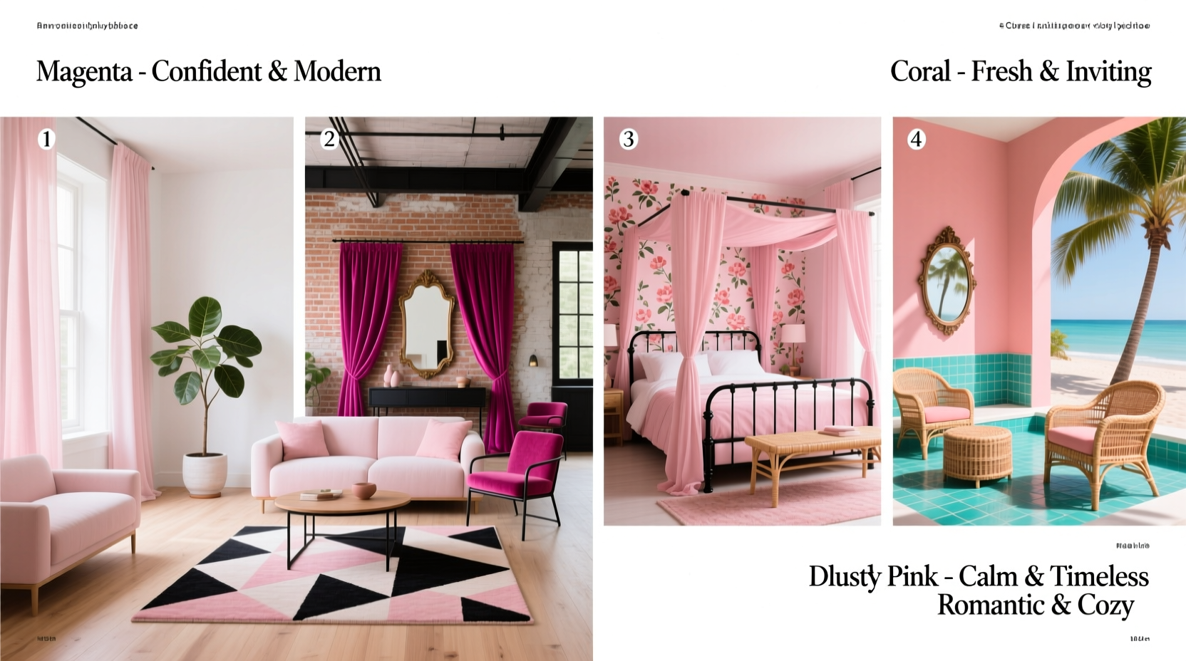
Pink carries emotional weight. Soft pinks are often associated with calm, nurturing energy, making them ideal for bedrooms and relaxation zones. Deeper, bolder pinks like magenta or raspberry evoke confidence, creativity, and vibrancy—perfect for accent walls or social spaces. The psychological effect of pink varies significantly by saturation and tone.
According to Dr. Angela Hartlin, environmental psychologist and author of Color & Mood: Designing Emotional Spaces, “Pink operates on a spectrum of emotional resonance. A dusty rose can lower heart rate and promote mindfulness, while a vibrant coral stimulates conversation and engagement.” This duality makes pink one of the most adaptable colors in interior design—if used thoughtfully.
“Pink is not a single statement—it’s a language. Learn its dialects, and you’ll speak fluently in comfort, energy, or elegance.” — Luca Moretti, Interior Designer and Color Consultant
Decoding Undertones: Warm, Cool, and Neutral Pinks
Not all pinks are created equal. The secret to selecting the right one lies in identifying undertones. A pink may appear soft and inviting in a paint swatch but look garish or muddy on your wall if its undertone clashes with existing elements.
- Warm pinks (with red, orange, or yellow bases) feel cozy and energetic. Think terracotta-pink blends or peachy tones. These work well in south-facing rooms with abundant natural light.
- Cool pinks (with blue or purple undertones) read as sophisticated and calming. Fuchsia, millennial pink, and lilac-leaning hues fall here. Best in north-facing rooms where cooler light dominates.
- Neutral pinks (grayed or beige-based) act like warm whites. They’re subtle, elegant, and pair seamlessly with wood finishes and metallics. Think Benjamin Moore’s “Swiss Coffee” with a delicate rosy tint.
Finding Your Perfect Shade: A Step-by-Step Guide
Selecting the ideal pink involves more than scrolling through Instagram inspiration. Follow this practical process to make a confident choice.
- Assess the room’s natural and artificial lighting. North-facing rooms get cool, gray light—opt for warm pinks to balance the chill. South-facing rooms bask in warm sunlight—cool pinks prevent the space from feeling overly hot.
- Evaluate existing materials. Are your floors honey oak? Pair with a peachy pink. Gray concrete floors? Try a muted mauve. Brass fixtures? Choose a warm rose. Chrome? Lean into cool berry tones.
- Determine the room’s function. Bedrooms benefit from soothing, low-saturation pinks. Kitchens and bathrooms can handle slightly brighter versions, especially if balanced with neutral cabinetry.
- Test large swatches. Paint 2x2 ft sections on multiple walls. Observe at different times of day. Live with it for 48 hours before deciding.
- Consider ceiling and trim. Painting the ceiling a lighter version of the wall color adds depth. Crisp white trim keeps pink walls from feeling overwhelming.
Matching Pink to Design Styles
The same shade of pink can feel outdated in one context and cutting-edge in another. Style alignment ensures cohesion and authenticity.
| Design Style | Recommended Pink Shades | Pairing Suggestions |
|---|---|---|
| Scandinavian Minimalist | Blush, pale petal, barely-there pink | White oak, cream textiles, black metal accents |
| Mid-Century Modern | Rose quartz, coral-pink, vintage salmon | Teak furniture, brass legs, geometric rugs |
| Maximalist | Fuchsia, cherry blossom, hot pink | Patterned wallpaper, velvet drapes, gold mirrors |
| Coastal Farmhouse | Dusty rose, shell pink, sand-washed coral | Weathered wood, linen, navy blue accents |
| Industrial | Muted brick pink, rust-tinted rose | Concrete floors, exposed ductwork, matte black |
Real Example: Reviving a Dated Master Bedroom
Sarah, a graphic designer in Portland, inherited a master bedroom painted in outdated beige with brown carpet. She wanted warmth without sterility. After testing several options, she chose Sherwin-Williams \"Rosemary Sprig\"—a warm, earthy pink with subtle terracotta undertones. Paired with bleached oak nightstands, ivory bedding, and a single blush velvet bench at the foot of the bed, the room transformed into a serene retreat. Natural light enhanced the pink’s warmth during the day, while soft pendant lighting gave it a romantic glow at night. “It doesn’t scream ‘pink room,’” Sarah said. “It whispers comfort.”
Avoiding Common Pitfalls: Do’s and Don’ts
Even experienced designers misstep when working with pink. Use this checklist to sidestep typical errors.
- ✅ Test paint in actual room conditions—not under store lighting
- ✅ Balance bold pink with at least 60% neutral tones (walls, floor, ceiling)
- ✅ Avoid pairing cool pinks with warm wood tones unless intentionally contrasting
- ✅ Don’t skip primer—especially when covering dark or red-based colors
- ✅ Limit intense pink to one focal wall unless the space is large and well-lit
| Do | Don't |
|---|---|
| Use soft pink in small bathrooms to make them feel airy | Paint a windowless basement room in bright pink—it will feel claustrophobic |
| Layer varying shades of pink (e.g., wall, pillow, art) for depth | Mix multiple bold pinks with clashing undertones |
| Pair pink with green plants for a fresh, organic contrast | Use neon pink in a child-free home unless making a deliberate artistic statement |
Frequently Asked Questions
Can men’s spaces include pink?
Absolutely. Gendered color rules are outdated. A study by the Journal of Interior Design Trends (2023) found that 68% of men aged 25–45 now prefer homes with at least one warm-toned accent wall—including pink. Try a deep wine-pink in a study or a textured rose-gray in a closet for a masculine yet refined touch.
Will pink go out of style?
Pink as a concept won’t. While specific shades trend up and down (millennial pink peaked around 2017), the broader category remains timeless. Historical interiors—from Victorian parlors to Art Deco lounges—have long embraced pink in sophisticated ways. Choose a classic undertone, and your space will age gracefully.
How do I make pink feel modern and not childish?
Focus on saturation and pairing. Avoid candy-colored pinks. Instead, opt for desaturated, complex tones with gray or earth undertones. Combine with clean lines, natural materials, and restrained decor. A matte-finish dusty pink wall with black-framed art and a leather chair reads as contemporary, not juvenile.
Final Thoughts: Make Pink Work for You
Selecting the perfect shade of pink isn’t about chasing aesthetics—it’s about aligning color with emotion, function, and identity. Whether you're drawn to the tranquility of a barely-there blush or the audacity of a saturated magenta, there’s a pink that belongs in your space. Trust your instincts, test rigorously, and remember that the best color choices reflect who you are, not just what’s popular.


 浙公网安备
33010002000092号
浙公网安备
33010002000092号 浙B2-20120091-4
Comments
No comments yet. Why don't you start the discussion?