
A black Christmas tree is not a trend—it’s a design statement. Once considered daring, matte-black or charcoal artificial trees now anchor sophisticated holiday interiors in apartments, lofts, and modern homes worldwide. But their power lies not in the void of color, but in their ability to act as a dramatic canvas: deep, neutral, and endlessly receptive. The real artistry begins when you layer on bold color or reflective metal—not as afterthoughts, but as intentional, curated counterpoints. This isn’t about covering darkness; it’s about commanding contrast. Done well, a black tree transforms from minimalist curiosity into a luminous centerpiece that feels both contemporary and deeply festive.
Why Black Works—and Why It Demands Intentional Styling
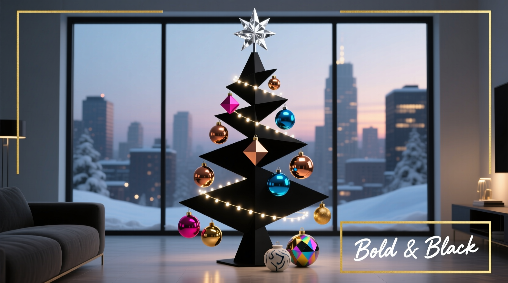
Unlike traditional green, which recedes naturally into seasonal context, black absorbs light and asserts presence. Interior designer Lena Torres explains:
“A black tree doesn’t blend—it defines space. That means every ornament, ribbon, and light must earn its place. There’s no hiding behind foliage density or chromatic camouflage. You’re designing with negative space as an active element.”This shifts the styling paradigm: instead of building *up* layers of texture and tone (as with green), you build *out* from a singular, grounding silhouette. The result is higher visual payoff—but only if each accent serves a deliberate role in rhythm, scale, reflection, or saturation.
Color Strategy: Bold ≠ Clashing
“Bold” doesn’t mean throwing every bright hue at the tree. It means selecting a focused palette where saturation works *with* the black base—not against it. High-contrast colors pop most effectively because they reflect light sharply off the dark backdrop. Think crimson rather than rose, cobalt over sky blue, emerald instead of mint. Metallics—especially polished gold, antique brass, and brushed nickel—gain depth and warmth when suspended against black, behaving less like shiny objects and more like captured light sources.
Here’s how primary color families perform against black:
| Color Family | Effect on Black Tree | Best Pairing Metal | Caution |
|---|---|---|---|
| Warm Reds & Burgundies | Rich, luxurious, and timeless—evokes velvet drapery and vintage glamour | Aged gold, copper | Avoid neon reds; they read synthetic and ungrounded |
| Cool Blues & Teals | Striking, modern, and unexpectedly serene—creates a winter-night clarity | Brushed nickel, polished silver | Steer clear of pastel blues; they lack contrast and fade visually |
| Vivid Yellows & Mustards | Energetic, sunlit, and surprisingly elegant—adds warmth without sweetness | Brass, matte gold | Don’t pair with white lights; yellow + cool white creates visual vibration |
| Deep Greens (Forest, Hunter) | Unexpected sophistication—feels grounded, earthy, and quietly opulent | Antique bronze, gunmetal | Avoid lime or kelly green—they compete tonally with black’s depth |
| Purple & Plum | Dramatic, regal, and rich—ideal for moody, layered spaces | Amethyst glass + brushed copper | Limit lavender or lilac—low saturation loses definition against black |
The 5-Step Ornament Layering System
Styling a black tree successfully relies less on quantity and more on strategic placement and dimensional variety. Follow this proven sequence—designed by stylist Marco Chen, who has styled over 200 black trees for editorial and residential clients:
- Anchor with Structure: Begin by hanging 3–5 large-scale ornaments (4–6 inches) evenly spaced across the lower and middle thirds. Use matte ceramic, heavy glass, or textured resin in your dominant color. These create visual weight and establish rhythm.
- Add Light Reflection: Next, place 8–12 medium metallic ornaments (2.5–3.5 inches) at eye level and just above. Vary finishes—some highly polished, some hammered or antiqued—to catch light from multiple angles. Avoid uniformity: mix round, teardrop, and geometric shapes.
- Introduce Texture & Depth: Weave in 15–20 smaller ornaments (1–2 inches) made from non-reflective materials—velvet-wrapped balls, felted wool, matte ceramic, or wood. These break up shine and add tactile interest without competing for attention.
- Define Negative Space: Leave deliberate gaps—especially near branch tips and upper third. A black tree breathes best when it’s not fully covered. Use these zones to highlight lighting or let the silhouette shine through.
- Finalize with Movement & Line: Drape 2–3 coordinated ribbons (2–3 inches wide) asymmetrically from top to bottom, allowing them to cascade naturally—not wrapped tightly. Finish with 3–5 hand-tied bows placed at varying heights, using wired-edge ribbon for control and dimension.
Lighting: The Invisible Architect
With black foliage, lighting isn’t decorative—it’s structural. Warm-white LEDs (2700K–3000K) are non-negotiable. Cool white or daylight bulbs flatten the tree’s dimensionality and mute metallic reflections. Opt for micro LED strings with spaced-out bulbs (not clustered) to avoid visual noise. For maximum impact, use two lighting layers:
- Base Layer: One string of warm-white micro LEDs wound tightly from trunk outward, following branch structure—providing even, subtle illumination.
- Accent Layer: A second string of slightly larger, warm-white bulbs (or amber-tinted LEDs) placed *only* on outer branch tips and mid-level focal points—creating intentional highlights and depth.
Never use multicolor lights unless they’re part of a tightly edited, monochromatic scheme (e.g., all deep amethyst bulbs). Random rainbows fracture the tree’s authority and dilute contrast. As lighting consultant Anya Patel notes:
“On a black tree, light doesn’t illuminate—it sculpts. Every bulb should function like a stage spotlight: precise, directional, and purposeful.”
Real-World Example: The Brooklyn Loft Transformation
In a 900-square-foot industrial loft with exposed brick, black steel beams, and concrete floors, interior stylist Diego Reyes faced a challenge: make the holidays feel warm and human—not cold or austere. He selected a 7.5-foot matte-black PVC tree with sparse, upward-sweeping branches. His palette? Deep cranberry (Pantone 19-1663) and burnished brass.
He began by anchoring with six oversized cranberry velvet orbs—three at base level, three mid-height—each filled with polyester fiber for soft volume. Then came 14 hand-blown brass ornaments: some smooth and reflective, others sand-cast with visible grain. To soften shine, he added 18 matte black ceramic pinecones and 12 cranberry-felted stars. Ribbon was key: 2.5-inch-wide burnt-orange silk, cut in asymmetrical lengths (24”, 36”, and 48”) and draped from the apex down the left side only—creating dynamic line and intentional imbalance. Lighting consisted of two warm-white micro-LED strings: one embedded, one tip-focused. The final touch? Three brass wire-wrapped eucalyptus sprigs tucked near the base, their silvery-green leaves echoing the metallics while adding organic texture.
The result wasn’t “Christmassy” in a traditional sense—it was atmospheric, anchored, and deeply personal. Visitors consistently remarked that the tree felt “alive,” not static—a testament to how thoughtful contrast can generate warmth without relying on conventional cues.
Do’s and Don’ts: The Black Tree Styling Checklist
- ✅ Do test your palette on a small black surface first—hold swatches under your actual room lighting.
- ✅ Do vary ornament scale: include at least one “hero” piece per 2 feet of tree height.
- ✅ Do use wired ribbon for precise bow shaping and controlled drape.
- ✅ Do incorporate at least one natural-texture element (dried orange slices, cinnamon sticks, preserved eucalyptus) to balance manufactured finishes.
- ✅ Do step back every 15 minutes while styling—black trees reveal imbalances faster than green ones.
- ❌ Don’t overload the top third—let the apex breathe and define shape.
- ❌ Don’t mix more than two metallic finishes (e.g., gold + silver = visual conflict).
- ❌ Don’t use glossy plastic ornaments—they read cheap against black’s sophistication.
- ❌ Don’t forget the trunk: wrap it in burlap, velvet, or a coordinating ribbon to ground the composition.
- ❌ Don’t rush lighting placement—map bulb positions before plugging in.
FAQ
Can I use white ornaments on a black tree?
Yes—but only if they’re textured, matte, or dimensional. Glossy white balls create a sterile, clinical effect. Instead, choose crackled ceramic, frosted glass, raw porcelain, or ivory velvet. Pair them with warm metallics (brass, bronze) to avoid looking like a dentist’s office.
How do I keep the look from feeling too “goth” or somber?
Balance is everything. Counteract black’s intensity with high-luminance elements: warm-white lights, reflective metals, saturated jewel tones, and organic textures (wood, dried citrus, wool). Avoid monochrome black-and-gray schemes—introduce at least one warm-toned accent (mustard, rust, cranberry) or biophilic element (greenery, seed pods) to signal celebration, not austerity.
What’s the best way to store black tree ornaments long-term?
Store in compartmentalized, acid-free boxes lined with black or charcoal tissue paper—never clear plastic bins, which allow dust accumulation and static cling on matte surfaces. Separate metallics from colored glass to prevent scratching. Label boxes by palette (e.g., “Cranberry + Brass”) rather than by ornament type—this supports future re-styling efficiency.
Conclusion: Your Tree, Your Statement
A black Christmas tree doesn’t ask for permission—it invites intention. It’s a quiet rebellion against expectation, a chance to treat holiday decor not as ritual repetition but as expressive curation. When you choose bold color or gleaming metal against that deep, silent base, you’re not just decorating—you’re editing, refining, and asserting visual confidence. Every ornament placed, every ribbon draped, every light positioned becomes a deliberate stroke in a composition that says something unmistakable about your taste, your space, and your spirit.
You don’t need a designer’s budget or a decorator’s degree. You need clarity of vision, respect for contrast, and the willingness to edit fearlessly. Start small: pick one color, one metal, one ribbon. Style one branch. Step back. Adjust. Repeat. Let the black tree teach you how much power lies in restraint—and how brilliantly life bursts forth when given the right frame.


 浙公网安备
33010002000092号
浙公网安备
33010002000092号 浙B2-20120091-4
Comments
No comments yet. Why don't you start the discussion?