
Creating a visually striking Christmas tree doesn’t require an explosion of colors. In fact, some of the most memorable and sophisticated holiday displays rely on a single, thoughtfully executed color palette. A monochromatic or single-color theme can elevate your decor from cluttered to curated, transforming your tree into a focal point of elegance and intentionality. Whether you're drawn to icy silver, deep emerald green, warm cranberry red, or soft blush pink, mastering the art of styling with just one color demands attention to texture, tone variation, lighting, and proportion.
The secret lies not in repetition, but in layering—using different shades, finishes, and materials within the same color family to create depth and interest. When done well, a one-color tree feels luxurious, harmonious, and modern, without sacrificing the festive spirit. This guide walks through how to achieve that balance with precision and creativity.
Why Choose a Single Color Scheme?
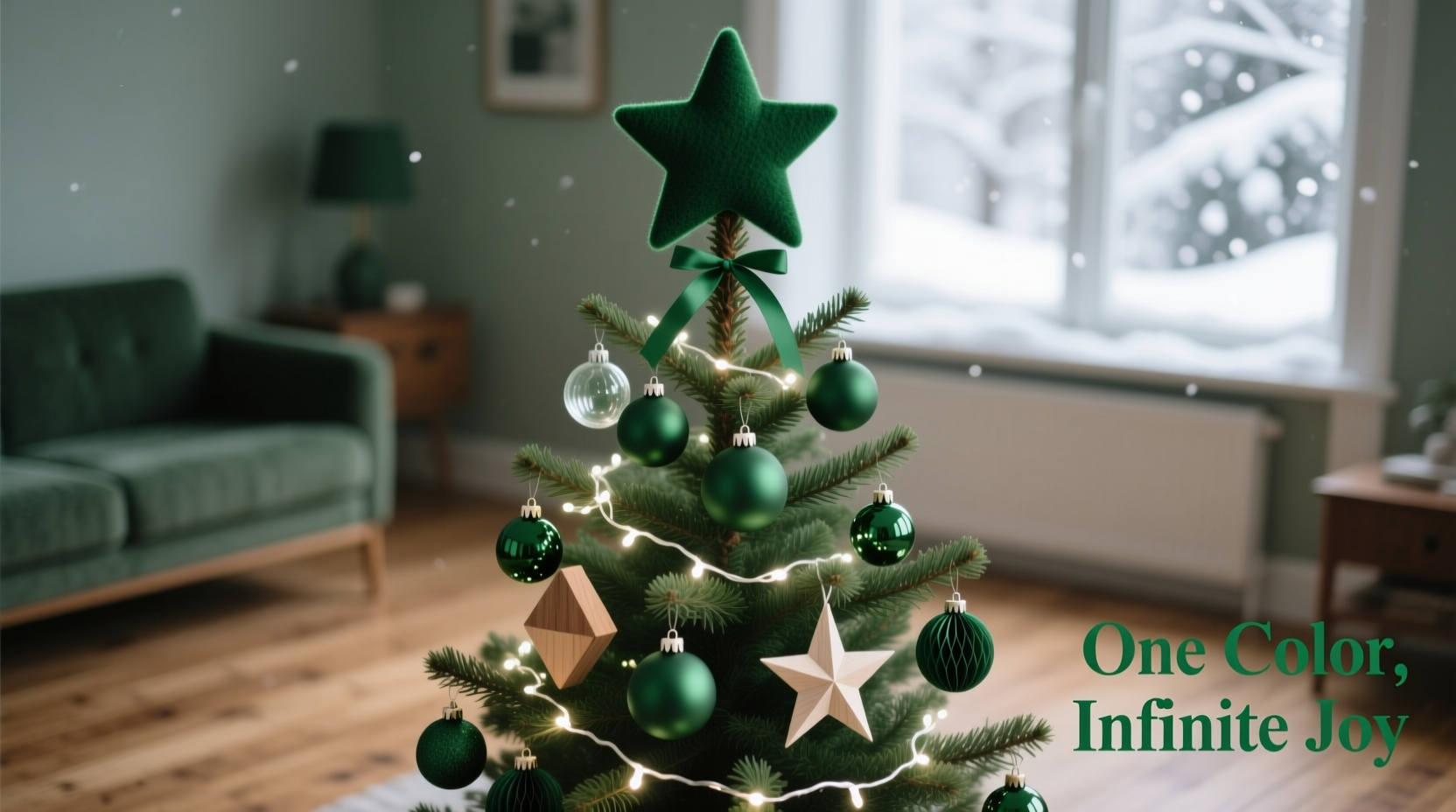
A single-color Christmas tree is more than a design trend—it's a deliberate aesthetic choice rooted in interior design principles. Monochromatic schemes use varying tints, tones, and saturations of one hue to build visual interest while maintaining unity. In holiday decorating, this approach eliminates visual noise and allows individual elements to shine.
Designers often favor single-color trees because they adapt seamlessly to existing home decor. They work especially well in minimalist, Scandinavian, or modern interiors where cohesion matters. But even in traditional homes, a unified color story brings sophistication and focus to the season’s centerpiece.
“Restriction breeds creativity. Limiting your palette forces you to think deeper about texture, light, and form—elements most overlook in holiday decor.” — Lena Torres, Interior Stylist & Holiday Design Consultant
Moreover, a one-color tree simplifies shopping and storage. You’re not juggling multiple ornament sets or trying to “make things match.” Instead, every addition supports a clear vision, making both setup and takedown more efficient.
Step-by-Step: Building Your One-Color Tree
Styling a single-color tree isn’t about hanging ornaments randomly until it looks full. It’s a structured process that begins long before the first bulb goes on. Follow these steps to ensure a polished, professional result.
- Choose your primary color wisely. Consider your room’s existing palette, lighting, and emotional tone. Cool tones like silver, blue, or white evoke calm and elegance; warm hues like red, gold, or burgundy feel festive and inviting.
- Select 3–5 variations within that color family. For example, if choosing blue, include navy, cobalt, sky blue, and iridescent teal. This range prevents flatness.
- Pick a finish strategy: matte, glossy, metallic, or mixed. Consistent finishes create serenity; mixing them adds dimension. Avoid overusing glitter unless balanced with matte elements.
- Start with lights. Use white or warm white LED string lights as a base—they enhance your chosen color without competing with it.
- Add ribbon or garland. A wide satin ribbon in your main color, looped evenly around the tree, creates vertical flow and structure.
- Hang ornaments by size and weight. Place larger, heavier pieces near the trunk and lower branches. Gradually move to smaller, lighter ones toward the tips.
- Layer textures deliberately. Combine velvet, glass, wood, ceramic, and fabric ornaments—even within the same color—to add tactile contrast.
- Top the tree with a complementary finial. This could be a star, bow, angel, or abstract shape—all in your color scheme.
- Step back frequently. Rotate the tree and view it from multiple angles to ensure even distribution.
- Finish with a tree skirt. Choose one that echoes your color and material theme—faux fur, linen, or sequined fabric all work.
Texture and Finish: The Hidden Keys to Depth
When color is limited, other sensory qualities take center stage. Texture becomes your most powerful tool for preventing a flat or dull appearance. A tree dressed entirely in shiny blue balls may look like a disco ball gone wrong. But introduce matte-finish baubles, woven fabric stars, frosted glass icicles, and felt snowflakes, and suddenly the eye has places to linger.
Consider this real-life example: Sarah, a graphic designer in Portland, opted for an all-white tree in her sunlit living room. At first, it looked sterile. She added cotton batting \"snow drifts\" on lower branches, hung hand-crocheted doilies as ornaments, wrapped birch logs with twine, and included mercury glass orbs. The transformation was immediate—what was once clinical now felt cozy and artisanal.
Mixing finishes also affects how light interacts with your tree. Glossy surfaces reflect light dramatically, drawing attention. Matte finishes absorb light, creating softness. Metallics—gold, silver, copper—can technically fall outside your color if used sparingly as accents, especially if they appear in trim, ribbon edges, or ornament hangers.
| Texture Type | Effect on Tree | Best Paired With |
|---|---|---|
| Glossy | High shine, reflective, bold | Matte finishes, dark backgrounds |
| Matte | Soft, subtle, elegant | Textured fabrics, natural elements |
| Metallic | Luxurious, luminous, dynamic | Neutral or deep-tone bases |
| Fabric (felt, velvet) | Cozy, handmade, warm | Wood, paper, rustic elements |
| Natural (wood, pinecone, dried citrus) | Earthy, organic, vintage | Neutral palettes, green or cream schemes |
The goal is balance. Too much gloss overwhelms. Too much matte recedes. Aim for a ratio of roughly 60% dominant finish (e.g., matte) with 40% contrast (e.g., glossy or metallic).
Do’s and Don’ts of One-Color Tree Styling
To avoid common pitfalls, refer to this practical checklist of best practices and missteps.
| Do’s | Don’ts |
|---|---|
| Use at least three shades of your main color | Use only one exact shade throughout |
| Incorporate different ornament shapes and sizes | Hang only round ornaments |
| Include natural elements like pinecones or cinnamon sticks | Overload on plastic or mass-produced items |
| Balance top-heavy designs with weighted lower ornaments | Cluster all large pieces at the bottom |
| Use warm white lights to enhance color warmth | Use colored lights that clash with your scheme |
| Step back and assess symmetry regularly | Work on one side and ignore the rest |
Real Example: A Monochrome Gold Tree That Wowed Guests
Jessica, a boutique hotel owner in Asheville, NC, wanted a showstopper tree for her lobby—one that felt opulent yet timeless. She chose a gold-only theme. Her process began with a fresh Fraser fir, which she pre-lit with warm white LEDs. Then, she layered in over 150 gold-toned ornaments in various forms: hammered metal spheres, faceted glass drops, gilded pinecones, and hand-beaded stars.
To prevent monotony, she varied finishes—matte antique gold, high-gloss champagne, and brushed brass. She wove in thin strands of golden tinsel garland and tied large velvet bows at major branch junctions. The tree skirt was a deep bronze brocade, grounding the shimmer above. From a distance, the tree glowed like captured sunlight. Up close, guests noticed the craftsmanship in each piece.
“People assumed we spent thousands,” Jessica said. “But half the ornaments were repurposed from old sets, spray-painted and re-trimmed. The magic wasn’t in the price tag—it was in the consistency.”
Checklist: Preparing Your One-Color Tree
- ☐ Decide on a primary color and 3–5 supporting shades
- ☐ Gather lights (white or warm white recommended)
- ☐ Select ribbon or garland in coordinating tones
- ☐ Sort ornaments by size, texture, and finish
- ☐ Prepare tools: ornament hooks, step ladder, extension cord
- ☐ Set up tree stand and secure tree upright
- ☐ String lights evenly, testing as you go
- ☐ Add ribbon in cascading loops or spirals
- ☐ Hang largest ornaments first, spacing them throughout
- ☐ Fill in with medium and small ornaments, varying textures
- ☐ Tuck in natural or handmade elements for character
- ☐ Place tree topper securely
- ☐ Add tree skirt and any floor-level decor (gifts, faux snow)
- ☐ View from all angles and adjust imbalances
- ☐ Take a photo—sometimes the camera reveals what the eye misses
Frequently Asked Questions
Can I include white or neutral elements in my one-color tree?
Yes—white, cream, beige, gray, or black can act as neutrals that support your main color without breaking the scheme. For example, white snowflake ornaments on a blue tree enhance the winter theme. Just ensure they don’t dominate; keep them under 15% of total decor.
What if I run out of ornaments in my color?
Don’t compromise with off-tone pieces. Instead, make your own. Use plain glass bulbs and paint them with acrylics or spray paint. Craft stores sell unfinished wooden shapes ideal for customization. You can also dye fabric ornaments or wrap small boxes in coordinating paper.
How do I keep a one-color tree from looking boring?
Variety within unity is key. Use diverse ornament shapes (stars, bells, animals), sizes (from 1-inch beads to 6-inch statement pieces), and hanging methods (some dangling, some nestled deep in branches). Introduce movement with lightweight pieces that sway slightly. And never underestimate the power of candle-like flicker—consider adding flameless LED candles among the branches.
Final Thoughts: Less Can Be More
A single-color Christmas tree is not a limitation—it’s an invitation to refine your aesthetic and celebrate details. By focusing on one hue, you shift attention to craftsmanship, arrangement, and atmosphere. You learn to see color not as a label, but as a spectrum. A crimson ribbon isn’t just “red”—it’s wine, cherry, rust, or rose, each evoking a different mood.
This holiday season, resist the urge to collect every color under the sun. Instead, choose one. Commit to it. Explore its depths. Let it guide your choices from lights to topper. When you step back and see your tree glowing with harmony and intention, you’ll realize that sometimes, the most joyful statements are the quietest ones.


 浙公网安备
33010002000092号
浙公网安备
33010002000092号 浙B2-20120091-4
Comments
No comments yet. Why don't you start the discussion?