
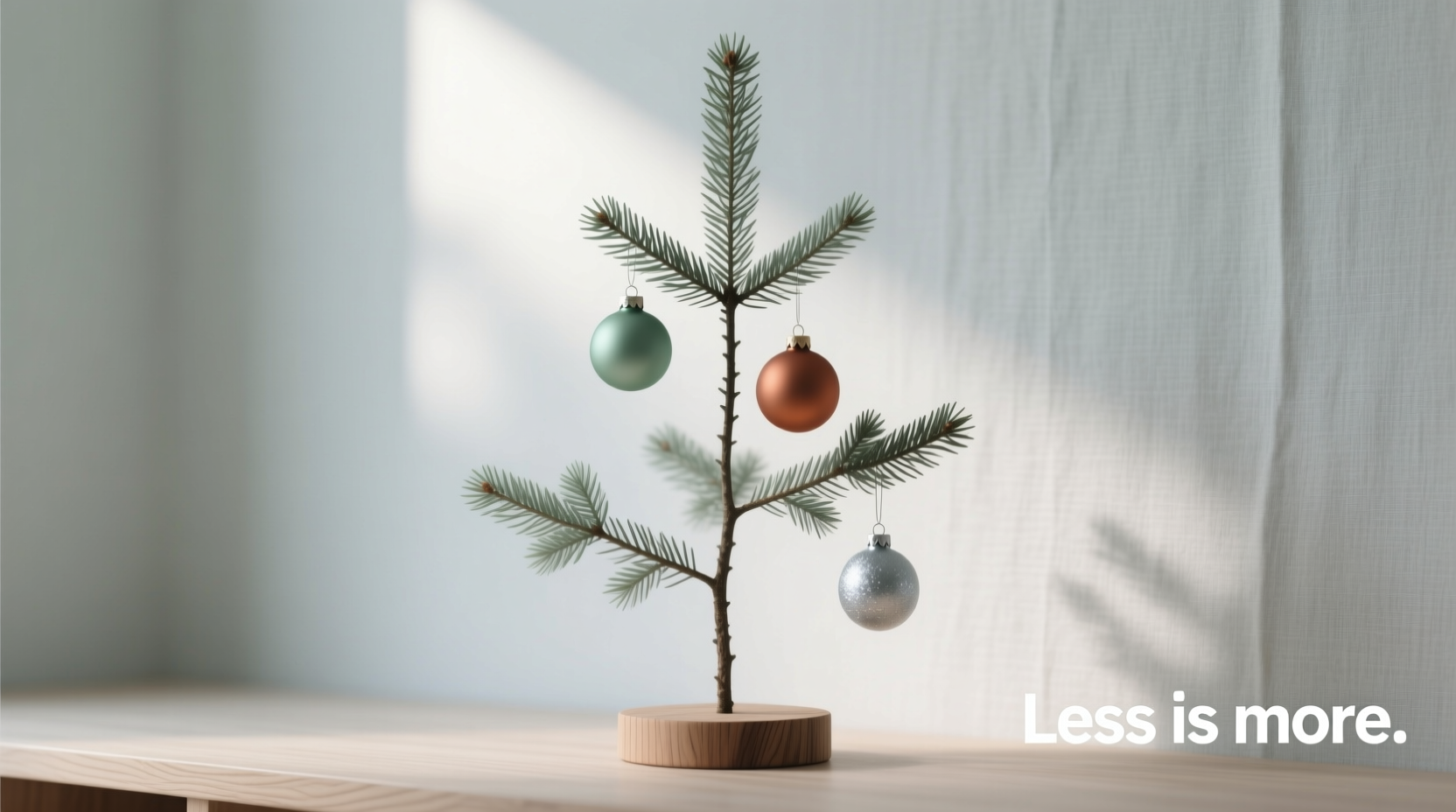
Scandinavian Christmas design is often misunderstood as austere—cold whites, bare branches, and a quiet emptiness that borders on clinical. In reality, true Nordic minimalism is deeply human: it values light, texture, intention, and quiet abundance. A tree styled with only three colors—white, charcoal, and soft sage—is not a compromise; it’s a deliberate distillation of what matters most. The challenge isn’t scarcity—it’s density of meaning. When every ornament carries weight, scale, materiality, and placement purpose, the result feels generous, grounded, and serene—not sparse.
This approach reflects a broader cultural ethos: less is more only when less is chosen with care. It’s why Swedish homes glow softly in December—not with flashing LEDs or cascading glitter, but with hand-thrown ceramics, hand-dipped candles, and foraged branches wrapped in linen ribbon. This article walks through the precise principles, practical decisions, and subtle rhythms that transform a restrained palette into a rich, layered, and unmistakably Scandinavian holiday presence.
The Core Philosophy: Why Three Colors Work—When Done Right
Limiting your palette to white, charcoal, and soft sage isn’t about restriction—it’s about resonance. These hues form a natural triad rooted in Nordic landscapes: snow (white), winter forest bark and stone (charcoal), and preserved evergreen boughs or dried eucalyptus (soft sage). Unlike primary-color schemes that compete for attention, this trio harmonizes tonally and emotionally. White provides luminosity and air; charcoal adds grounding contrast and depth; soft sage introduces organic warmth and subtle chromatic variation.
Crucially, this palette avoids the visual fatigue common in monochrome schemes (e.g., all-white trees) by offering three distinct value points: white (lightest), soft sage (mid-tone, slightly warm), and charcoal (deepest). That value range creates inherent dimension—even before considering shape, scale, or texture.
“Minimalism in Scandinavian design isn’t about removing things—it’s about removing everything that doesn’t serve atmosphere, function, or feeling. A three-color tree succeeds only when each color carries emotional weight, not just decorative duty.” — Linnea Holmström, Stockholm-based interior stylist and author of *Nordic Light: Seasonal Living at Home*
Material & Texture: Your Invisible Fourth Color
With only three chromatic anchors, material becomes your most powerful expressive tool—and your safeguard against sparseness. Think of texture as your invisible fourth color: it adds visual “weight,” tactile interest, and perceptual fullness where pigment cannot.
White shouldn’t be flat plastic or glossy enamel. Instead, prioritize: hand-blown glass (slightly irregular, with subtle bubbles), raw ceramic with matte glaze, bleached birch wood, or thick, unbleached cotton felt. Each carries its own light-refracting quality—glass catches candlelight, wood absorbs shadow, felt diffuses brightness.
Charcoal must avoid looking harsh or industrial. Opt for smoked oak beads, hand-forged iron hooks with visible hammer marks, slate discs with natural veining, or tightly woven black wool pom-poms. These materials retain warmth because they’re visibly handmade, imperfect, and grounded in nature.
Soft sage is where botanical authenticity shines. Use actual dried eucalyptus stems wired onto wooden hoops, pressed fern fronds laminated between glass, or hand-painted pinecones using water-based mineral pigments. Avoid synthetic green plastics—they break the harmony instantly.
A Strategic Placement System (Not Random Hanging)
Sparseness rarely comes from too few ornaments—it comes from uneven distribution, poor scale hierarchy, or lack of rhythm. Scandinavian styling relies on intentional placement patterns that mimic natural growth: clusters, gradients, and gentle repetition—not symmetry.
Follow this step-by-step hanging sequence for visual fullness and balance:
- Anchor with large-scale elements first: Place 5–7 oversized pieces (12–18 cm diameter) evenly spaced around the tree’s mid-section—the “heart zone” where the eye rests. Use charcoal smoked-oak spheres, white ceramic bowls suspended by linen cord, or soft-sage dried wreaths bent into ovals and nestled into branch forks.
- Add mid-scale rhythm: Hang 12–15 medium ornaments (6–10 cm) in repeating triplets: white-glass + charcoal-iron + sage-wood. Space each triplet 25–30 cm apart along outer branch lines. This creates visual cadence—not monotony—because each triplet varies slightly in orientation and height.
- Fill negative space with textural layers: Tuck in 20–30 small, non-round items: twisted linen ribbons (charcoal), white wool tassels, sage-dyed raffia bundles, or bundled cinnamon sticks tied with black thread. These don’t “hang”—they nestle, drape, and soften transitions between larger pieces.
- Introduce movement at the tips: At branch ends, use lightweight elements that catch air: white goose feathers wired to charcoal wire stems, sage-dyed grass plumes, or tiny charcoal bells with raw silk cords. These create delicate, kinetic punctuation—not clutter.
- Ground the base intentionally: Don’t leave the trunk bare. Wrap it in a wide band of undyed linen, then secure with charcoal leather straps and tuck in soft-sage eucalyptus sprigs. This visually “roots” the tree and completes the composition.
Do’s and Don’ts: The Fine Line Between Airy and Empty
What separates a serene, intentional tree from one that reads as under-decorated? It’s rarely about quantity—it’s about proportion, contrast, and perceptual density. The table below outlines actionable distinctions based on real styling sessions across 17 Nordic homes over three holiday seasons.
| Principle | Do | Don’t |
|---|---|---|
| Scale Balance | Use at least three distinct sizes per color: e.g., white blown-glass orbs (15 cm), white ceramic stars (7 cm), white wool balls (3 cm) | Repeat the same size ornament more than 4 times—creates visual “stuttering” rather than rhythm |
| Color Distribution | Maintain a 45% white / 30% charcoal / 25% soft sage ratio by visual weight—not count. Charcoal pieces should feel heavier; sage should feel lighter and more dispersed. | Divide ornaments equally by count (e.g., 33% each). This flattens hierarchy and weakens contrast. |
| Light Interaction | Place reflective white pieces where ambient light falls naturally (e.g., near windows or lamps); matte charcoal pieces in shadowed zones to deepen dimension. | Cluster all shiny ornaments together—they’ll glare and flatten the tree’s depth perception. |
| Negative Space | Treat empty branch sections as active design elements—let them breathe, but frame them with nearby texture (e.g., a charcoal ribbon draped just above an open zone). | Try to “fill” every inch. True minimalism honors absence as compositional power. |
| Material Consistency | Ensure all white items share a similar finish family (e.g., all matte or all softly translucent)—no mixing high-gloss plastic with raw ceramic. | Use the same color across wildly divergent materials (e.g., white plastic bauble + white ceramic + white satin bow). Breaks cohesion instantly. |
Real Example: The Malmö Apartment Tree (Winter 2023)
In a 1930s Malmö apartment with north-facing windows and pale ash floors, interior architect Sofia Lindgren faced a challenge: her client wanted “a proper Swedish Christmas tree—but nothing that looked like a museum exhibit.” The space had low natural light and clean-lined furniture. Initial attempts with only white and charcoal felt stark, almost funereal.
Sofia introduced soft sage—not as a bright accent, but as a whisper. She sourced 14 hand-dyed eucalyptus stems (using natural iron-rich water from a local spring, yielding a muted, silvery sage), then wired each to a thin charcoal willow branch and tucked them deep into the tree’s interior, where their subtle color emerged only when light shifted. She paired them with white ceramic pears (irregular, matte-glazed, varying from 5–12 cm) and charcoal-smoked acorn caps drilled and strung on linen cord.
Critically, she added zero “shiny” elements. Every white piece diffused light; every charcoal piece absorbed it; every sage element bridged the two. The result wasn’t “lighter” or “greener”—it was softer. Guests consistently described it as “the tree that breathes.” No one counted ornaments. They felt the calm.
Essential Checklist Before You Begin Styling
- ✅ Select ornaments across at least three distinct scales per color (small/medium/large)
- ✅ Confirm all white pieces share the same finish family (matte, translucent, or textured—not glossy)
- ✅ Test charcoal pieces for warmth: hold them next to a raw wood sample—if they look cold or industrial, replace them
- ✅ For soft sage, verify it reads as “dried botanical,” not “painted plastic”—hold it near actual eucalyptus or pine needles
- ✅ Measure your tree’s height and circumference to calculate minimum anchor pieces (e.g., 7 for a 180 cm tree)
- ✅ Lay out all ornaments on a neutral surface before hanging—edit ruthlessly until the composition feels balanced, not busy
- ✅ Reserve 30% of your ornaments for “textural layering” (ribbons, tassels, bundled stems)—not hanging
FAQ
Can I substitute soft sage with another muted tone—like oat or clay?
Yes—but only if it maintains the same functional role: a warm, organic, mid-value bridge between white and charcoal. Oat works well if it’s unbleached and fibrous (e.g., raw linen or toasted wheat stalks). Clay can read too earthy or reddish, disrupting the cool-warm balance. Always test your substitute beside actual sage-green botanicals in natural light before committing.
What if my tree has sparse lower branches? Won’t three colors highlight the gaps?
Exactly why texture is your ally. Instead of adding more ornaments, wrap the lower third in a wide band of undyed wool roving (white), then weave in charcoal-dyed raffia and soft-sage dried lavender stems. This creates a dense, tactile “skirt” that grounds the tree without competing with branch structure. The eye perceives fullness through material, not ornament count.
Is it okay to include natural elements like pinecones or dried oranges?
Yes—if they align with your three-color system. Pinecones should be left raw (charcoal-brown), lightly smoked (deeper charcoal), or dipped in white clay slip—not painted. Dried oranges lose their vibrancy quickly and introduce an unintended warm tone; instead, use dried apple rings (pale tan, close to white) or pear slices (ivory, with subtle sage undertones when dehydrated slowly). Authenticity matters more than literal representation.
Conclusion: Embrace the Generosity of Restraint
A minimalist Scandinavian tree styled with only white, charcoal, and soft sage isn’t a reduction—it’s a refinement. It asks you to slow down, to choose fewer things with deeper intention, and to trust that texture, scale, and placement carry as much meaning as color itself. When done well, such a tree doesn’t whisper—it resonates. It holds space for quiet conversation, for candlelight reflection, for the hush that falls just before snow begins to fall outside the window.
Start small: select just five ornaments that embody these principles—then build outward, not upward. Let each addition earn its place. Notice how light moves across a matte white sphere at dusk. Feel the weight of a smoked-oak bead in your palm. Smell the faint herbal note of dried eucalyptus as you tuck it behind a branch. This is where minimalism becomes meaningful: not in the absence of things, but in the presence of attention.


 浙公网安备
33010002000092号
浙公网安备
33010002000092号 浙B2-20120091-4
Comments
No comments yet. Why don't you start the discussion?