
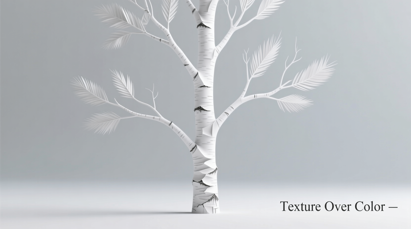
A minimalist white tree—whether artificial or real—is more than just a seasonal centerpiece. When stripped of traditional ornaments and vibrant hues, it becomes a sculptural statement, a blank canvas for tactile exploration. The absence of color shifts focus to form, materiality, and spatial rhythm. Styling such a tree isn’t about decoration in the conventional sense; it’s about curation. It demands attention to detail, contrast in surfaces, and an understanding of how light interacts with different textures. Done well, a monochromatic white tree can become the most compelling piece in a room—not because it shouts, but because it whispers with sophistication.
The Philosophy Behind a Colorless Tree
Minimalism in interior design is often misunderstood as emptiness. In truth, it’s precision. A white tree without color challenges the decorator to find beauty in subtlety: the sheen of glass, the softness of linen, the roughness of bleached wood. This approach aligns with the Japanese concept of *wabi-sabi*, where imperfection and transience are celebrated. The goal isn’t to fill space but to define it through contrast and composition.
When color is removed from the equation, other sensory qualities rise to prominence. Texture becomes the primary language. Dimension emerges not from bold red balls or golden tinsel, but from variations in height, reflectivity, density, and negative space. The result is a display that feels intentional, serene, and deeply modern.
“Designing without color forces you to see deeper. You begin to notice what was always there—the way light catches a curve, how shadow defines shape.” — Lila Nguyen, Interior Architect & Minimalist Design Advocate
Core Principles for Building Texture and Dimension
To create visual interest on a white tree without introducing color, adhere to these foundational principles:
- Vary Materiality: Combine glossy, matte, fibrous, metallic, and organic materials to stimulate visual touch.
- Play with Scale: Mix oversized elements with delicate details to avoid monotony.
- Layer Depth: Place items at different depths within the branches—some flush, some protruding—to create a three-dimensional effect.
- Control Light Interaction: Use reflective and translucent objects to catch ambient light and cast soft shadows.
- Respect Negative Space: Allow breathing room between elements. Clutter negates minimalism.
Step-by-Step Guide: Styling Your White Tree
Follow this structured process to build depth and tactile richness without relying on a single splash of color.
- Start with the Base: Choose the Right Tree
Select a white tree with realistic branch structure—slightly irregular silhouettes add character. If using an artificial model, opt for one with varied tip finishes (matte and semi-gloss) to introduce subtle contrast from the start. - Prep the Lighting Environment
Position the tree near a natural light source or install focused spotlights. Uplighting from the base can dramatically enhance texture by casting upward shadows through the branches. - Anchor with Structural Elements
Begin by placing larger, sculptural pieces deep within the canopy. Think white ceramic orbs, bleached coral fragments, or hand-thrown porcelain pods. These act as anchors, giving weight to the composition. - Add Mid-Layer Textures
Introduce woven elements: linen-wrapped spheres, coiled jute spirals, or felted wool pendants. These absorb light differently than smooth surfaces, creating tonal variation even within the same hue. - Incorporate Reflective Touches
Hang faceted crystal prisms, mirrored cubes, or brushed nickel teardrops. These catch light dynamically throughout the day, adding movement without color. - Introduce Organic Imperfections
Tuck in dried botanicals: bleached eucalyptus, ghost pinecones, preserved lichen, or feather sprigs. Their natural asymmetry breaks rigidity and adds warmth. - Finalize with Delicate Details
Weave in fine silver wire spirals, glass beads on transparent thread, or tiny folded paper cranes made from handmade abaca. These should appear almost accidental—like snowflakes caught mid-fall. - Step Back and Edit
Remove at least three items. Minimalism thrives on restraint. If every branch feels “done,” it’s overdone.
Material Palette: What Works Best in Monochrome
Careful selection of materials ensures your tree remains engaging without chromatic support. Below is a comparison of effective textural components and their visual roles.
| Material | Texture Type | Light Behavior | Best Placement |
|---|---|---|---|
| Frosted Glass | Smooth, slightly granular | Diffuses light softly | Middle to outer branches |
| Linen-Wrapped Wood | Fibrous, tactile | Matte, absorbs light | Inner canopy, lower tiers |
| Bleached Driftwood | Rough, uneven | Casts strong shadows | Deep within structure |
| Brushed Nickel | Soft metallic, non-reflective | Subtle shimmer | Scattered mid-level |
| Dried Seed Pods | Brittle, intricate | Creates dappled shadow patterns | Near light source |
| Handmade Paper | Delicate, fibrous | Translucent when backlit | Outer tips, high points |
Real Example: A Gallery-Style Living Room Installation
In a downtown Vancouver loft, designer Mara Ellison replaced the traditional holiday tree with a 7-foot white spruce adorned exclusively in neutral textures. The tree stood in a corner illuminated by a single track light above and a floor lamp to the side. Instead of ornaments, she used:
- Three large, hand-blown milk glass spheres suspended at varying heights
- Twelve linen pouches filled with dried lavender (scent as subtle enhancement)
- Thin birch branches wired into the upper crown to extend silhouette
- Five antique silver candleholders clipped to sturdy limbs, holding unscented white tapers
- A cascading strand of recycled glass beads, mimicking icicles
The effect was gallery-like—a living sculpture. Visitors often mistook it for an art installation rather than a seasonal piece. The absence of color allowed the architecture of the room and the craftsmanship of each element to take center stage. By New Year’s, the tree remained in place, recontextualized as a winter centerpiece.
Checklist: Pre-Styling Preparation
Before hanging a single ornament, ensure you’re ready with this checklist:
- ✅ Tree is securely anchored and fluffed to maximize volume
- ✅ Lighting plan is in place (natural and/or artificial)
- ✅ All decorative elements are cleaned and free of dust
- ✅ Materials are sorted by texture and size for easy access
- ✅ You have tools: floral wire, clear fishing line, needle-nose pliers
- ✅ A mirror or second viewpoint is available to check rear visibility
- ✅ You’ve set aside time for multiple passes—styling is iterative
Common Mistakes and How to Avoid Them
Even experienced decorators can misstep when working in monochrome. Here’s what to watch for:
| Mistake | Why It Fails | Solution |
|---|---|---|
| Using only one texture (e.g., all glass) | Creates visual flatness, lacks contrast | Mix at least four distinct material types |
| Overloading the outer tips | Draws eye to periphery, loses depth | Weight the inner structure first |
| Ignoring vertical rhythm | Feels chaotic or bottom-heavy | Place key pieces at high, mid, and low levels |
| Forgetting maintenance | Dust dulls texture and kills dimension | Use a microfiber cloth weekly; store elements properly off-season |
Frequently Asked Questions
Can I use a colored light bulb to enhance a white tree?
Yes—but sparingly. A cool-white LED maintains neutrality, while a faint warm glow can add coziness without introducing visible color. Avoid tinted bulbs, as they break the monochrome intent. The goal is to enhance texture, not simulate color.
Is it possible to make a white tree feel festive without traditional decor?
Absolutely. Festivity comes from intention and atmosphere, not ornamentation. Pair the tree with crisp linens, quiet music, and a curated scent like frosted pine or rainwater. The experience becomes celebratory through mood, not markers.
How do I keep the tree from looking like it’s unfinished?
Intentionality signals completion. Ensure every piece has a purpose—either structural, textural, or luminous. If someone says, “It’s so simple,” that’s a win. Simplicity, when deliberate, reads as confidence.
Conclusion: Embrace the Silence of Design
Styling a minimalist white tree without color is an exercise in restraint and perception. It asks you to slow down, observe closely, and trust that less can indeed be more. By focusing on texture, light, and form, you create not just a seasonal object, but a lasting design statement. This tree isn’t about tradition—it’s about transformation. It proves that beauty doesn’t require noise, that elegance lives in the spaces between, and that sometimes, the most powerful statement is made in silence.


 浙公网安备
33010002000092号
浙公网安备
33010002000092号 浙B2-20120091-4
Comments
No comments yet. Why don't you start the discussion?