
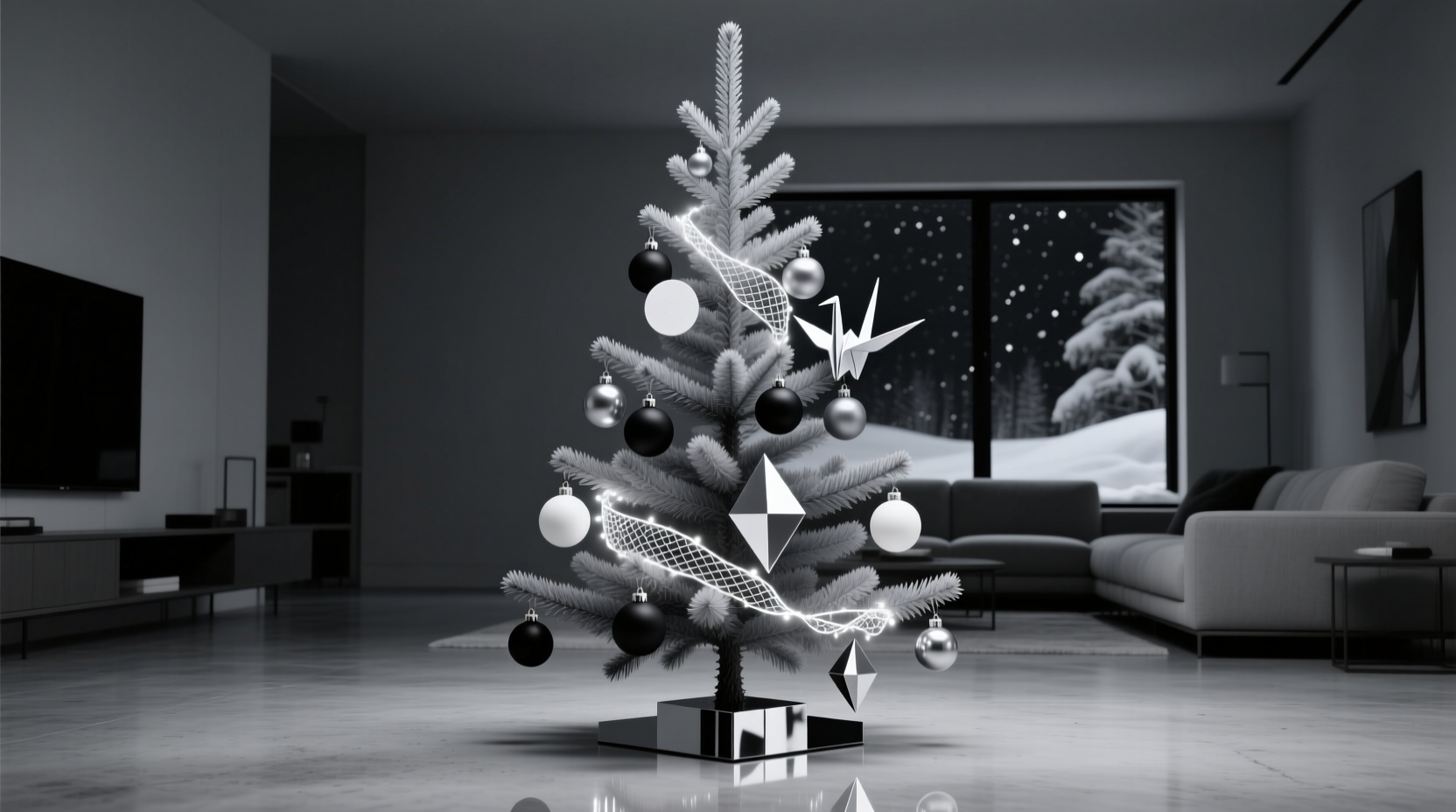
A monochrome Christmas tree—executed thoughtfully—is not an exercise in restraint; it’s a masterclass in intentionality. Stripping away colour doesn’t dilute festive spirit—it distills it. Yet many attempt this elegant approach only to land at “sterile,” “flat,” or “like a dentist’s waiting room.” The truth? Monochrome trees demand more nuance, not less. They rely on contrast, materiality, scale, light, and rhythm to generate visual interest where hue cannot. This isn’t about minimalism as absence—it’s about abundance of texture, variation, and craftsmanship. Below are field-tested strategies used by professional stylists, interior designers, and award-winning holiday set decorators—not theoretical ideals, but real-world methods that transform a single-colour palette into something rich, layered, and deeply evocative.
1. Choose Your Monochrome Palette with Purpose (Not Just “White”)
“Monochrome” is often misread as “white-only.” In practice, true monochrome means variations within a single hue family—shades, tones, and tints—plus its natural complements: black, grey, cream, ivory, charcoal, silver, or even deep slate. A successful monochrome tree begins with a deliberate tonal foundation.
Consider these three high-impact palettes, each with distinct emotional resonance:
- Ivory & Oatmeal: Warm, organic, and inviting. Ideal for heritage homes, farmhouse interiors, or spaces with wood floors and linen textiles. Avoid cool whites—they’ll clash and flatten warmth.
- Charcoal & Slate: Sophisticated, grounded, and quietly dramatic. Works exceptionally well with brass accents, blackened steel ornaments, and matte-finish finishes. Not “gloomy”—when lit well, it feels like midnight velvet.
- Winter White & Bone: Crisp, clean, and architectural. Best paired with glass, acrylic, and polished metal. Requires precision—any yellowed or off-white element will read as dirty, not intentional.
2. Build Depth Through Texture—Not Colour
Without chromatic variation, texture becomes your primary storytelling tool. A monochrome tree fails when every ornament shares the same finish—say, all glossy white baubles. Success lies in juxtaposing at least five distinct tactile qualities across the tree’s surface.
Think in layers:
- Matte surfaces: Unlacquered ceramic, raw plaster, felted wool, or unfinished wood.
- Glossy reflections: Hand-blown glass, lacquered resin, mirrored acrylic.
- Translucency: Frosted glass, thin porcelain, rice paper spheres, or resin with embedded air bubbles.
- Organic grain: Sanded birch slices, walnut veneer ornaments, dried citrus wheels (preserved), or hand-carved cork.
- Textured dimension: Knit wool balls, macramé wraps, embossed leather tags, or laser-cut plywood silhouettes.
Professional stylists follow a 3:2:1 ratio: three textures should dominate (e.g., matte ceramic, frosted glass, knitted wool), two appear moderately (e.g., birch slices, brushed brass), and one serves as an accent (e.g., mirrored acrylic stars). This prevents visual fatigue while maintaining hierarchy.
3. Master Scale, Shape, and Negative Space
Monochrome relies heavily on form. A tree crowded with identical 3-inch round ornaments reads as a single blurred mass—not a composition. Intentional spacing and sculptural diversity create movement and breathability.
| Element | Recommended Range | Why It Matters |
|---|---|---|
| Bauble diameters | 1.5″, 3″, 5″, and one 8–10″ statement piece | Creates rhythm and draws the eye upward and inward. Avoid multiples of the same size. |
| Ornament shapes | Sphere, teardrop, cube, cone, star, feather, spiral, abstract silhouette | Prevents repetition fatigue. Even subtle shape shifts register strongly in monochrome. |
| Negative space | Leave 30–40% of branch tips visibly bare | Allows light to pass through, adds airiness, and makes ornaments feel curated—not applied. |
| Branch density | Use 1–2 fewer ornaments per foot than you would on a multicolour tree | Overcrowding flattens dimension and muffles texture contrast. |
Start at the trunk and work outward: anchor large pieces low and near the interior, medium ones mid-level and slightly forward, small ones toward the tips and outer perimeter. This builds volume—not just coverage.
4. Light Is Your Invisible Colour
In monochrome design, lighting isn’t ambient—it’s chromatic architecture. Since no pigment provides visual temperature, your bulbs do the heavy lifting. Warm white (2700K–3000K) creates intimacy and softness; cool white (4000K+) delivers crisp modernity but risks clinical sterility if unbalanced.
Pro stylists use layered lighting:
- Base layer: Incandescent or LED warm-white fairy lights wound tightly around inner branches (minimum 300 bulbs for a 7-foot tree). These glow *through* translucent ornaments and cast soft shadows.
- Accent layer: 10–15 directional mini-spotlights (battery or plug-in) aimed at key textural elements—e.g., a cluster of matte ceramic orbs or a suspended birch slice. Creates focal points and highlights grain.
- Dynamic layer: One programmable string with gentle fade or twinkle modes—used sparingly, only on the top third of the tree. Never full-tree twinkle: it competes with texture and blurs form.
“Light doesn’t illuminate a monochrome tree—it sculpts it. Where shadow falls, texture emerges. Where light pools, material sings. You’re not decorating a tree—you’re curating a light installation.” — Lena Voss, Set Designer & Holiday Stylist, featured in Architectural Digest Holiday Editions (2021–2023)
5. Anchor with Narrative Elements (Beyond Ornaments)
A truly compelling monochrome tree tells a story—whether quiet nostalgia, modern craft, or seasonal reverence. This narrative lives in non-ornamental anchors: the tree skirt, garlands, topper, and base styling. These elements provide grounding, context, and emotional weight.
Real Example: The “Library Tree” in Portland, OR
In December 2022, designer Mara Chen styled a monochrome tree for a historic 1920s Craftsman home with floor-to-ceiling bookshelves. Her palette: charcoal, ash grey, and parchment. Instead of traditional ornaments, she used miniature antique book spines (reproduced in archival-quality matte paper), rolled parchment scrolls tied with hemp twine, and tiny brass magnifying glasses suspended from clear monofilament. The skirt was a vintage Persian rug fragment in faded charcoal and ivory. The garland? Dried bay leaves and black peppercorns strung on black silk thread—subtle, aromatic, and texturally complex. Guests didn’t notice the absence of colour—they commented on how “deeply familiar and warmly scholarly” the tree felt. The monochrome wasn’t a limitation; it focused attention on meaning, material, and memory.
This illustrates a core principle: monochrome invites symbolism. Consider what resonates with your household—a shared passion, a family tradition, a place you love—and translate it into tactile, tonal form.
Essential Anchors Checklist
- ✅ Tree skirt: Linen, wool, burlap, or hand-dyed cotton—not polyester. Must contrast *in texture*, not tone (e.g., nubby wool over smooth satin ribbon).
- ✅ Garland: Mix at least two organic materials (e.g., dried orange slices + cinnamon sticks + black walnuts) or two crafted ones (e.g., ceramic beads + knotted rope + brushed brass rings).
- ✅ Topper: Avoid generic stars. Choose sculptural: a minimalist brass crescent, a hand-thrown ceramic dove, a single preserved white peony bloom under glass, or a folded origami crane in heavyweight paper.
- ✅ Base styling: Place 3–5 curated objects beside the stand: a stack of hardcover books in matching spine tones, a ceramic candle vessel, a vintage brass telescope, or a framed black-and-white photo in a thin charcoal frame.
- ✅ Unifying thread: Repeat one material or motif across at least three anchors (e.g., brass appears in topper, garland rings, and base object).
6. Step-by-Step Styling Timeline (90 Minutes Total)
Follow this sequence—not chronologically, but by priority—to avoid common pitfalls:
- Minute 0–10: Prep & Plan
Fluff tree branches fully. Lay out all ornaments, lights, and anchors on a clean floor. Group by texture, then by size. Identify your 3 dominant textures and 1 accent texture. - Minute 10–25: Light First
Wind base fairy lights *deep* into the tree—starting at the trunk, spiraling outward and upward. Hide plugs and wires inside. Test before proceeding. - Minute 25–45: Anchor Placement
Secure topper. Drape garland loosely—don’t force it into symmetry. Position tree skirt. Arrange base objects. These define the tree’s “personality” before any ornament touches a branch. - Minute 45–75: Ornament Layering
Work in passes: first, place all large (5″+) ornaments near the trunk and lower third. Second, add medium (3″) along mid-branches, rotating orientation (some face front, some tilt up/down). Third, place small (1.5″) and textural accents (feathers, cones, spirals) at tips and gaps. Step back every 10 minutes. - Minute 75–90: Refinement & Light Tuning
Remove any ornament that visually “disappears” against its background. Adjust spotlight angles. Add final 2–3 directional mini-lights. Turn off room lights—observe how shadows fall and where light catches texture. Tweak until depth feels palpable.
FAQ
Can I use metallics in a monochrome scheme?
Yes—but only if they align tonally. Brushed brass reads warm and works with ivory/oatmeal palettes. Polished nickel or chrome suits winter white schemes. Matte blackened steel belongs with charcoal. Avoid mixing warm and cool metals (e.g., brass + silver) unless intentionally contrasting them as part of a defined narrative (e.g., “industrial heritage”). Metallics must enhance, not distract from, texture and form.
Won’t a monochrome tree look too formal or cold?
Only if texture and warmth are neglected. Introduce organic irregularities: hand-thrown ceramics with slight glaze variations, unevenly cut birch slices, slightly asymmetrical knitted ornaments, or dried botanicals with natural imperfections. Pair cool palettes (slate, charcoal) with warm lighting (2700K) and plush textiles (velvet skirt, wool garland). Formality comes from rigidity—not monochrome itself.
How do I store monochrome ornaments so they stay cohesive next year?
Store by texture group—not colour—in labelled, compartmentalised boxes lined with acid-free tissue. Keep metallics separate from matte ceramics (to prevent scratching). Include a printed swatch of your core palette (e.g., Pantone 11-0103 “Ivory Pearl”) inside each box to ensure continuity when replenishing. Discard anything that chips, yellows, or loses its tactile integrity—even one compromised piece undermines the entire scheme.
Conclusion
A monochrome Christmas tree is not a compromise. It’s a declaration: that beauty resides in subtlety, richness in restraint, and joy in intention. When you choose ivory over crimson or charcoal over emerald, you aren’t subtracting—you’re clarifying. You’re inviting slower looking, deeper feeling, and more thoughtful presence. Every matte ceramic orb, every frosted glass sphere, every hand-tied bay leaf garland becomes a quiet act of care—not just for your home, but for your own attention. This season, resist the reflex to fill space with colour. Instead, build a tree that breathes, that casts thoughtful shadows, that rewards lingering. Style it not to impress, but to resonate. Then stand back—not to admire, but to feel the calm certainty that comes when every element has earned its place.


 浙公网安备
33010002000092号
浙公网安备
33010002000092号 浙B2-20120091-4
Comments
No comments yet. Why don't you start the discussion?