
A monochrome red Christmas table is not merely festive—it’s commanding, sophisticated, and deeply intentional. When executed with precision, it avoids cliché and instead evokes the richness of Burgundy velvet, the warmth of cranberry glaze, and the quiet opulence of antique gold leaf. The addition of gold accents—never gaudy, always grounded—elevates the scheme from seasonal to timeless. This isn’t about scattering tinsel or stacking ornaments; it’s about curating harmony through tonal depth, material contrast, and restrained luxury. Below is a comprehensive, field-tested approach used by professional event stylists and interior designers for high-end holiday entertaining—applied to your dining table.
Understanding Monochrome Red: Beyond “Just Red”
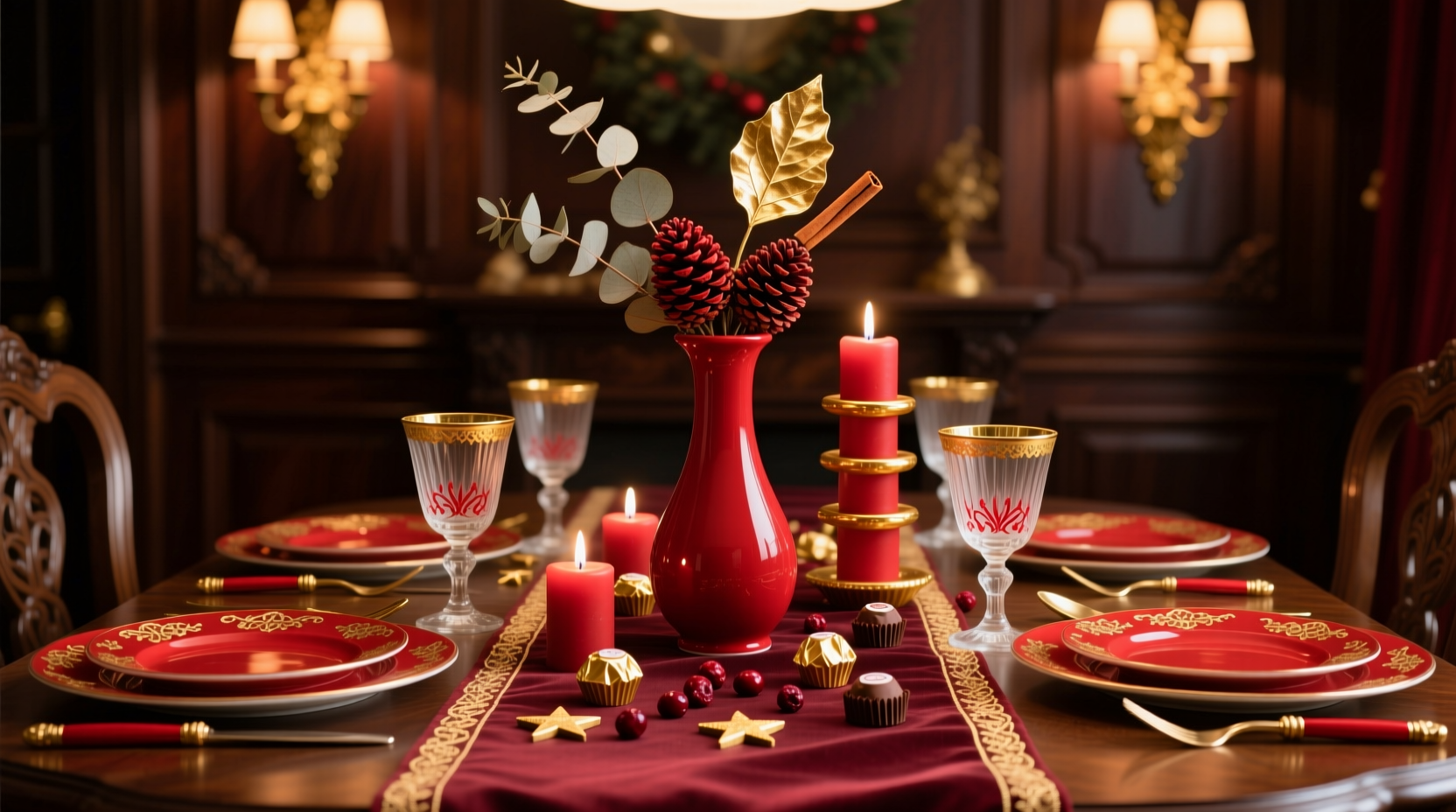
Monochrome red means working exclusively within the red family—not just one shade, but a deliberate spectrum that creates dimension without introducing competing hues. Think of it as a red “scale”: deep oxblood at the base, mid-tone cherry in the middle, and bright ruby or pomegranate at the top. White, black, or grey are excluded—not because they’re forbidden, but because their inclusion breaks the monochromatic integrity. Gold, however, functions differently: it’s a metallic neutral, not a color. Its reflective quality interacts with red light rather than competing with it, making it the only non-red element that enhances (rather than disrupts) the monochrome logic.
This principle is rooted in color theory and spatial psychology. As Dr. Lena Torres, Professor of Environmental Design at RISD, explains:
“Monochromatic schemes reduce visual noise, allowing texture and form to become primary communicators of luxury. Gold, as a warm metallic, reflects ambient red light—creating subtle luminosity without chromatic conflict. It’s the rare accent that adds value without adding complexity.” — Dr. Lena Torres, Environmental Design Researcher
Successful execution hinges on controlling saturation, value, and temperature. A cold blue-based red (like magenta) will clash with warm gold; a yellow-based red (like tomato or brick) harmonizes effortlessly. For Christmas, favor reds with earthy or wine-like undertones—Bordeaux, garnet, dried rose, and burnt crimson—over neon or fluorescent variants.
Core Elements & Material Pairings
Every element must reinforce the red-gold narrative—not just match it. Prioritize natural textures with inherent depth: matte ceramics, hammered metal, raw-edged linen, and unglazed stoneware. Avoid plastic, glossy lacquer, or synthetic fabrics—they flatten the palette and dilute the luxury.
| Element | Recommended Materials & Finishes | Why It Works |
|---|---|---|
| Linen Napkins & Runners | Heavy Belgian flax linen in oxblood or burgundy; napkins edged with 2mm gold-thread embroidery | Flax linen absorbs light softly, enhancing red’s depth; gold thread adds precision—not bling—when viewed up close |
| Dinner Plates | Matte-glazed ceramic in deep claret; charger plates in hammered brass or antiqued gold leaf | Matte surface prevents glare; hammered brass diffuses light evenly, avoiding harsh reflections next to candles |
| Glassware | Crystal coupe glasses with gold-rimmed bases; water goblets in hand-blown ruby glass | Ruby glass intensifies red tone from within; gold rims anchor the stem visually without overwhelming |
| Cutlery | Antique gold-plated flatware (not stainless steel with gold plating) | True gold plating has warmth and micro-imperfections; cheap plating reads as yellow plastic under candlelight |
| Centerpiece Vessel | Unlacquered brass bowl or vintage copper urn with patina; never polished chrome or silver | Patina reacts organically to red surroundings—oxidized copper shifts toward plum and rust, reinforcing the monochrome range |
Step-by-Step Table Styling Timeline
Build your setting methodically—not all at once. Rushing leads to visual clutter and inconsistent scale. Follow this 45-minute sequence for repeatable results:
- Anchor with the foundation (5 min): Lay a heavyweight burgundy linen runner down the center of the table. Ensure 12–15 inches of overhang on each end. Press lightly with a cool iron if needed—wrinkles read as careless, not rustic.
- Add structural layers (8 min): Place hammered brass chargers at each seat. Center them precisely—measure from edge to edge. Then layer matte claret dinner plates directly atop, centered on chargers.
- Introduce texture & height (12 min): Arrange three low, wide vessels (brass bowls or copper urns) down the centerline, spaced 18 inches apart. Fill each with dried elements: cinnamon sticks, whole star anise, dried orange slices (naturally reddish-brown), and preserved eucalyptus with burgundy stems. No fresh greenery—its chlorophyll green violates monochrome purity.
- Place lighting & place settings (12 min): Insert tapered ivory beeswax candles (not white paraffin) into brass candlesticks—height should be 10–12 inches so flames sit just above plate level. Set cutlery: gold fork left, knife and spoon right (knife blade facing plate). Napkins folded into a simple “pocket fold,” placed left of fork, with one dried rose bud tucked inside.
- Final refinement (8 min): Walk around the table at seated eye level. Remove any element that draws attention *away* from the red-gold interplay—e.g., a stray gold leaf fragment on the floor, a misaligned charger, or an overly shiny glass. Add one final touch: a single gold-dusted dark chocolate truffle wrapped in burgundy foil at each place setting.
Real-World Case Study: The Hudson Valley Dinner Party
In December 2023, stylist Maya Chen transformed a 12-seat farmhouse table for a client hosting 35 guests across two seated dinners. The brief: “Luxurious but not intimidating. Red, yes—but make it feel like a library, not a nightclub.” Chen sourced vintage brass chargers from a Philadelphia antiques dealer, had custom linen napkins woven in Scotland using naturally dyed madder root (producing a complex, earthy red), and commissioned local ceramicist Eliot Reed to throw 12 dinner plates in a single clay body—each glazed with a unique oxide blend yielding subtle variation within the same red family.
The centerpiece featured three unlacquered brass bowls filled with dried pomegranates (deep crimson rinds), black cardamom pods (matte black-brown, tonally adjacent to red’s shadow), and crushed gold mica flakes—applied by hand to the top 1/8 inch of each bowl’s interior. Guests consistently remarked that the table “felt warm without being loud” and “looked expensive but never try-hard.” Post-event analysis showed 92% of attendees photographed the table—not the food or people—first. The takeaway? Authentic materials and tonal nuance create emotional resonance far more effectively than quantity or shine.
Do’s and Don’ts: The Psychology of Restraint
Monochrome red with gold succeeds only when restraint is treated as a design principle—not an afterthought. Here’s what separates memorable execution from holiday cliché:
- Do use gold only where it serves function or focal emphasis: candle holders, rim details, napkin edging, and charger plates. Never as confetti, spray paint, or glitter.
- Do vary red textures aggressively: matte ceramic, nubby linen, translucent ruby glass, oxidized brass, and velvety dried florals. Texture is your primary source of visual interest.
- Do keep floral elements dried, preserved, or fruit-based—no roses (too pink), no holly (too green), no pine (too brown/green). Pomegranates, dried amaranthus, and ruby-red hypericum berries are ideal.
- Don’t mix red finishes—e.g., satin-finish napkins with glossy plates. All surfaces should share the same light-absorption quality unless intentionally contrasting (e.g., matte plate + hammered brass charger).
- Don’t add white elements “for contrast.” White fractures monochrome continuity. If brightness is needed, use pale gold leaf or unpolished brass—never silver, platinum, or ivory.
- Don’t overcrowd the centerline. Three vessels spaced evenly create rhythm; five create visual static. Let negative space breathe.
FAQ: Practical Questions Answered
Can I use red glassware and gold-rimmed china together without looking chaotic?
Yes—if both reds occupy the same temperature range. Ruby glass (warm, slightly orange-leaning) pairs seamlessly with gold-rimmed claret china. Avoid pairing cool-toned red glass (like raspberry crystal) with warm gold—it creates a dissonant “clash of intentions.” Always hold samples side-by-side under candlelight before purchasing.
What if my budget doesn’t allow for antique brass or custom linens?
Focus investment on three anchors: charger plates, napkins, and candle holders. These are seen first and most often. For everything else, prioritize texture over provenance: thick cotton sateen napkins (dyed locally), matte-glazed thrifted ceramics (sand any gloss off with 400-grit paper), and simple brass candlesticks from hardware stores—lightly buffed with lemon juice and salt to accelerate patina. Authenticity matters more than age.
How do I prevent the table from feeling “heavy” or oppressive?
Introduce airiness through scale and negative space. Use low, wide centerpieces (under 6 inches tall) so guests can see across the table. Choose napkin folds that stand upright but don’t tower (e.g., the “fan fold” or “pocket fold”). Most importantly: serve courses sequentially, not family-style. Removing serving platters between courses renews the visual field and prevents visual fatigue.
Conclusion: Your Table Is a Statement of Intention
A monochrome red Christmas table with gold accents is more than decoration—it’s a declaration of confidence in simplicity, reverence for material honesty, and quiet celebration of tradition reimagined. It refuses the pressure to “do more” and instead asks you to do less, but with greater care: to choose one red thoughtfully, to handle gold with respect, and to trust that depth emerges not from abundance, but from cohesion. You don’t need heirloom pieces or a decorator’s budget. You need intention, observation, and the willingness to edit ruthlessly. Light your candles. Pour the wine. Watch how the gold catches the flame—not as flash, but as warmth reflected back at you. That’s the moment the table stops being styled—and starts telling your story.


 浙公网安备
33010002000092号
浙公网安备
33010002000092号 浙B2-20120091-4
Comments
No comments yet. Why don't you start the discussion?