
Red and gold is one of the most enduring Christmas color pairings—rich, celebratory, and steeped in tradition. Yet many people hesitate to use it because they fear it will read as “wedding reception,” “hotel lobby,” or “Victorian museum display.” The truth? Red and gold only looks formal when it’s over-controlled: when every ornament matches, every ribbon is perfectly coiled, and the tree feels more like a curated exhibit than a joyful centerpiece in a home where real life happens. Styling this palette with warmth, texture, and personality is entirely possible—and far more rewarding. It starts not with rigid rules, but with intention: choosing pieces that reflect your family’s rhythm, embracing subtle imperfections, and layering materials that invite touch and light. This guide walks through exactly how to build a red-and-gold tree that feels abundant, inviting, and unmistakably *yours*.
1. Start with the right base: tree type, shape, and lighting
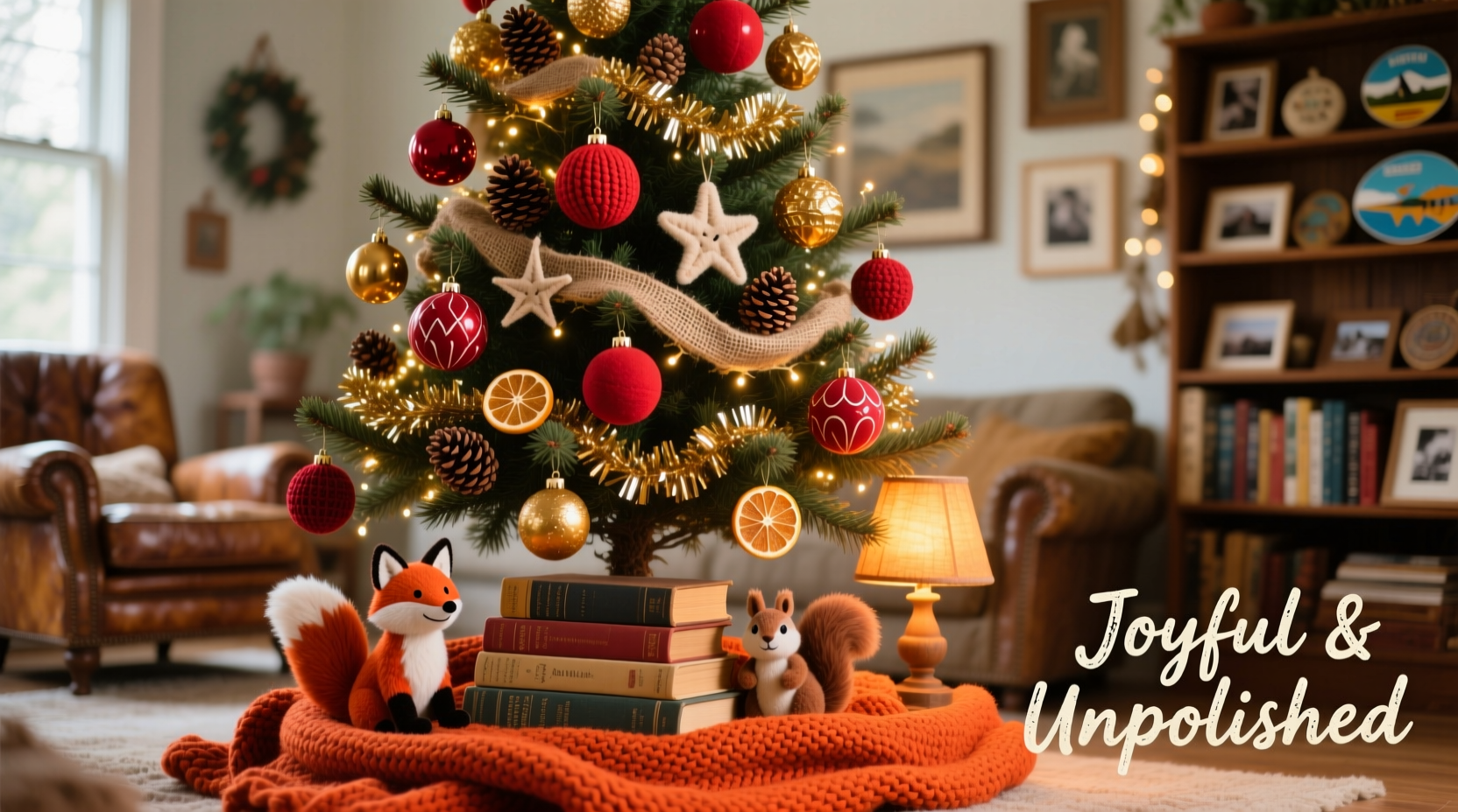
The foundation of any successful red-and-gold scheme isn’t ornament selection—it’s the tree itself. A dense, full Nordmann fir or Fraser fir provides ideal structure for layering; its soft, upward-facing needles hold ornaments without drooping, while its natural dark green creates a deep, grounding contrast against warm metallics and saturated reds. Avoid sparse or narrow trees (like some spruces or pencil firs), which force ornaments into tight clusters and amplify formality. Instead, aim for a slightly irregular silhouette—branches that vary in length, gentle asymmetry, and subtle gaps that allow light to breathe through.
Lighting is non-negotiable. Use warm-white LED string lights—not cool white or multicolor—as the first layer. Wrap them *before* adding any ornaments, starting at the trunk and spiraling outward to ensure even distribution. Use 100 lights per foot of tree height (e.g., 700 lights for a 7-foot tree). Warm-white light softens gold tones and prevents red from appearing harsh or artificial. Skip blinking or chasing lights; steady, gentle illumination supports the cozy, unfussy mood you’re cultivating.
2. Build dimension with three distinct reds and two golds
Formality creeps in when red and gold are treated as monolithic colors—think “one shade of crimson + one foil finish.” To avoid that, deliberately curate variation. Choose three reds with different undertones and textures: one warm (brick or cranberry), one deep (burgundy or oxblood), and one bright (true scarlet or cherry). Similarly, use two gold finishes: a soft, matte antique gold (for wood, ceramic, or fabric ornaments) and a reflective, polished gold (for glass balls or metallic accents). This subtle chromatic range adds visual depth and prevents the tree from reading as a flat, graphic design.
Avoid relying solely on shiny surfaces. Mix in matte red velvet bows, hand-thrown ceramic ornaments with speckled glaze, wool-felt stars, and tarnished brass bells. These textures absorb and diffuse light rather than bouncing it back uniformly—a key factor in softening perceived formality.
| Color/Finish | Ideal Material Examples | Why It Works |
|---|---|---|
| Warm red (brick/cranberry) | Felt berries, wool garlands, linen ribbons | Softens contrast with green; feels handmade and grounded|
| Deep red (burgundy/oxblood) | Matte glass balls, ceramic pomegranates, dried orange slices | Adds richness and shadow; prevents brightness fatigue|
| Bright red (scarlet/cherry) | Hand-blown glass, glossy enamel, vintage tinsel | Provides joyful punctuation—use sparingly (10–15 pieces max)|
| Antique gold (matte, muted) | Wood beads, hammered brass, clay ornaments, burlap tags | Feels tactile, approachable, and timeless—not flashy|
| Polished gold (reflective) | Clear glass balls with gold interior lining, mercury glass, thin wire-wrapped baubles | Creates sparkle without glare; best used on outer branches
3. Layer ornaments using the “3-2-1 rule” (not symmetry)
Forget evenly spaced rows or mirrored left/right placement. Instead, adopt the 3-2-1 layering principle—a method used by professional stylists to create organic density and movement:
- 3 large focal points: Place three oversized ornaments (4–6 inches) at varying heights and depths—never aligned vertically or horizontally. One near the top third, one mid-trunk off-center, one low and slightly forward. Use contrasting textures: a matte burgundy ceramic sphere, a polished gold mercury glass globe, and a bright red velvet-covered pinecone.
- 2 medium clusters: Group two similar-but-not-identical ornaments together (e.g., two hand-painted wooden stars—one red with gold leaf, one gold with red berry detail). Nestle each cluster into branch forks, letting one hang slightly lower than the other. Do this in two locations only—no more.
- 1 scattered accent: Distribute 12–18 small, irregular accents (mini cinnamon sticks wrapped in gold twine, tiny red felt hearts, tarnished brass jingle bells) *by hand*, not by counting. Let your fingers decide spacing—some branches get two, some none, some three clustered loosely. This mimics natural abundance.
This system avoids rigidity while ensuring visual balance. You’ll notice weight and interest distributed throughout—not concentrated at eye level or forced into geometric patterns.
4. Introduce organic elements to break the “perfect” illusion
The single most effective tactic for avoiding formality is introducing botanical and handmade imperfection. Real dried elements bring scent, texture, and quiet irregularity—qualities that instantly signal “home,” not “showroom.” Incorporate at least three of these:
- Dried citrus wheels: Thinly sliced oranges or blood oranges, baked at 200°F for 2–3 hours until leathery. Tie with gold jute twine and hang singly—no more than 8 total. Their muted red-orange hue bridges red and gold beautifully.
- Cinnamon sticks: Bundle 3–5 together with gold thread and tuck into branch junctions. They add warmth, spice aroma, and linear contrast against round ornaments.
- Unpainted pinecones: Lightly dust with matte gold mica powder (not spray paint) for subtle shimmer. Scatter 6–10 among lower branches—never grouped symmetrically.
- Twine-wrapped bundles: Wrap small bunches of dried lavender, rosemary, or eucalyptus in natural jute, then tie with a single red velvet ribbon bow. Hang low and asymmetrically.
These elements do more than add texture—they introduce time, process, and human scale. As interior stylist Maya Lin observes:
“A tree that smells like cinnamon and feels rough under the fingertips tells a story no mass-produced ornament ever could. Formality dissolves the moment you invite the imperfect, the aromatic, the hand-touched into the frame.” — Maya Lin, Founder of Hearth & Hue Studio
5. Real-world example: The Henderson family’s “lived-in luxury” tree
In Portland, Oregon, the Hendersons wanted red and gold for their 7-foot Noble fir—but rejected their first attempt: identical matte-red balls spaced 4 inches apart, gold ribbon coiled precisely around every third branch. “It looked like a department store display,” says Sarah Henderson. “Beautiful, but cold. We didn’t want to take photos *of* it—we wanted to gather *around* it.”
They started over. First, they swapped half the red balls for burgundy matte ceramics and added 12 antique-gold wooden stars made by Sarah’s father. Next, they strung a garland of dried orange slices and cinnamon sticks—hand-tied, uneven lengths. Then came the turning point: they draped a single 10-foot length of thick, nubby red wool roving (leftover from Sarah’s weaving project) loosely around the middle third of the tree, letting it fall naturally in soft loops and tucks. Finally, they hung six mismatched vintage glass ornaments collected over 15 years—two with gold interior lining, three with hand-painted red berries, one with chipped gilding.
The result? A tree that feels generous, layered, and quietly luxurious—not stiff. Guests comment on how “warm” it feels, how “you can almost smell the kitchen.” Most importantly, their two young children treat it as part of the living space: they hang their own lopsided paper stars beside the antique ones, and the dog rests beneath its lowest branches. That’s the hallmark of success—not perfection, but belonging.
6. Do’s and Don’ts: Quick-reference styling checklist
Before stepping back to assess your tree, run through this practical checklist:
- ✅ Do place at least one ornament deeper into the tree (near the trunk) to create depth.
- ✅ Do vary ribbon widths—use 2.5-inch velvet for large bows, ½-inch satin for delicate ties.
- ✅ Do leave 3–5 small gaps (no ornaments) near eye level—these “breathing spaces” prevent visual overwhelm.
- ✅ Do include one unexpected neutral: a single ivory felt dove, a natural birch wood slice, or unbleached muslin pouch.
- ❌ Don’t use more than two types of metallic finish (e.g., avoid mixing gold, copper, and silver).
- ❌ Don’t hang ornaments at uniform heights—intentionally let 3–4 pieces dangle 4–6 inches lower than others.
- ❌ Don’t cover more than 70% of visible branch surface—allow green to show through generously.
- ❌ Don’t match ribbon color to ornament color (e.g., red ribbon on red ball)—contrast creates life.
7. FAQ: Common red-and-gold tree concerns
Can I use red and gold if my living room has cool-toned walls or furniture?
Absolutely—and it’s often the best choice. Cool grays, blues, or whites create a striking, modern backdrop that lets warm red and gold glow without competing. Anchor the scheme with deep red textiles (a wool throw, velvet pillow) and matte gold picture frames or lamp bases to echo the tree. The contrast feels intentional, not accidental.
What if I already own mostly traditional ornaments—can I adapt them?
Yes. Repurpose formal pieces thoughtfully: remove plastic hangers from vintage glass balls and replace them with rustic twine or leather cord. Group ornate gold-plated ornaments with raw wood slices or dried botanicals to ground their shine. Paint the backs of overly glossy red balls with matte sealant to mute reflectivity. The goal isn’t discarding—it’s recontextualizing.
How do I keep the tree from looking “Christmassy” in a dated way?
Modernize through proportion and restraint. Use oversized ornaments (4+ inches) sparingly—no more than 5–7 on a standard tree. Prioritize matte and textured finishes over high-gloss. Limit glitter to one small element (e.g., gold-dusted pinecones, not entire branches). And crucially: edit ruthlessly. If an ornament feels “too much,” set it aside—even if it’s expensive or sentimental. A quieter tree holds attention longer.
Conclusion: Your tree should welcome, not impress
A red-and-gold Christmas tree doesn’t need to be a monument to tradition or a showcase of wealth. At its best, it’s a reflection of generosity—of time spent selecting meaningful pieces, of hands tying knots and arranging branches, of scents that drift into shared meals and quiet evenings. It’s okay if the ribbon isn’t perfectly fluted, if one ornament hangs crooked, if the garland dips lower on the left. Those small deviations aren’t flaws—they’re evidence of presence. They say, “This was made here, by us, for joy—not for scrutiny.” So choose the red that reminds you of your grandmother’s favorite sweater. Select the gold that catches the afternoon light just so. Tuck in that cinnamon stick you roasted yourself. Then step back, turn on the lights, and feel the warmth rise—not from perfection, but from permission. Permission to celebrate abundantly, authentically, and unapologetically.


 浙公网安备
33010002000092号
浙公网安备
33010002000092号 浙B2-20120091-4
Comments
No comments yet. Why don't you start the discussion?