
Color is more than decoration—it’s a silent influencer of mood, behavior, and well-being. When thoughtfully applied, paint colors can transform your living space into a sanctuary of tranquility, reducing anxiety, improving sleep, and fostering mental clarity. This is the power of color psychology: the study of how hues affect human emotions and cognitive function. For homeowners seeking calm energy throughout their homes, understanding this science is essential. By aligning your color choices with psychological principles, you’re not just repainting walls—you’re reshaping your daily experience.
The Science Behind Color and Emotion
Color psychology has long been used in marketing, healthcare, and interior design to guide feelings and behaviors. Warm colors like red and orange stimulate energy and appetite, making them ideal for social spaces—but potentially overwhelming in areas meant for rest. Cool tones such as blue, green, and soft violet, on the other hand, are linked to relaxation, reduced heart rate, and lower cortisol levels. These make them powerful tools for cultivating calm.
Research from the University of British Columbia found that participants working in blue environments demonstrated higher levels of creativity and concentration compared to those in red-lit rooms, which triggered alertness but also increased stress markers. Similarly, a 2018 study published in *Color Research & Application* showed that hospital patients exposed to soft greens and blues reported less pain and shorter recovery times.
“Color is one of the most immediate environmental cues we respond to—often before we even realize it. In residential spaces, it can be a form of passive therapy.” — Dr. Lena Torres, Environmental Psychologist
When selecting paint, consider not only personal preference but also the intended function of each room. A bedroom isn’t just a place to sleep—it’s a recovery zone. A home office should support focus without strain. Each space deserves a color strategy rooted in both aesthetics and neuroscience.
Choosing Calming Colors by Room
Different rooms serve different purposes, so a one-color-fits-all approach rarely works. Strategic use of calming hues means matching color properties—hue, saturation, and value—to room functionality.
Bedrooms: Shades of Blue and Lavender
The bedroom is where restoration happens. Deep blues and muted lavenders are proven to slow breathing and ease the transition into sleep. Navy or slate tones may feel too heavy, but soft periwinkle, powder blue, or grayed lavender offer serenity without coldness.
Bathrooms: Spa-Inspired Greens and Neutrals
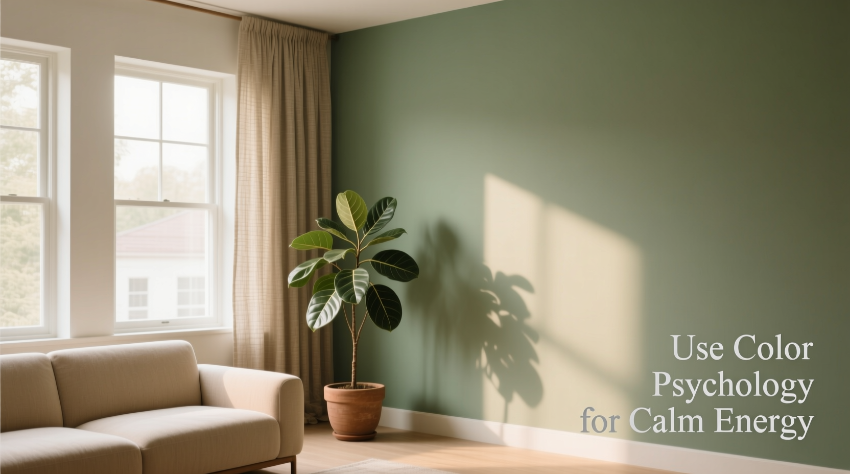
Green symbolizes nature, balance, and renewal—perfect for a space associated with cleansing. Sage, seafoam, and olive tones bring an organic calm. Even pale gray-greens mimic the look of weathered stone, evoking a spa-like retreat.
Living Rooms: Earthy Neutrals and Muted Terracottas
While cool tones dominate for relaxation, warmth still matters in communal areas. A living room benefits from grounded, earth-inspired colors—think warm greige (gray + beige), mushroom brown, or dusty terracotta. These foster connection without overstimulation.
Home Offices: Soft Greens and Balanced Grays
To maintain focus without fatigue, choose green-based grays or sage tones. These support concentration while minimizing visual strain. Avoid stark white, which can create glare and increase mental tension under artificial lighting.
Hallways and Entryways: Gentle Transitions
First impressions matter. The entryway sets the tone for the entire home. Opt for warm taupes or soft sky blue to signal safety and openness. These colors act as emotional buffers between the outside world and your private sanctuary.
Color Properties That Influence Calmness
It’s not just about choosing “blue” or “green”—the specific shade makes all the difference. Understanding three key properties helps refine selections:
- Hue: The base color (e.g., blue, green). Cooler hues generally calm.
- Saturation: The intensity or purity of the color. Highly saturated colors feel more active; desaturated (muted) tones feel peaceful.
- Value: How light or dark the color is. Lighter values open up space; darker values add coziness but can feel oppressive if overused.
For maximum calm, prioritize low-saturation, mid-to-light-value hues. A vivid turquoise may energize, but a grayed aqua whispers tranquility. Paint brands often label these as “greige,” “sage,” “dove,” or “mist” tones.
| Color | Saturation Level | Psychological Effect | Best Use Case |
|---|---|---|---|
| Soft Sky Blue | Low | Promotes mental clarity and ease | Bedroom, bathroom |
| Sage Green | Medium-Low | Encourages balance and renewal | Kitchen, office |
| Greige | Very Low | Creates neutral, grounding atmosphere | Living room, hallway |
| Lavender Gray | Low | Reduces anxiety, supports sleep | Primary bedroom |
| Warm Taupe | Low | Invites comfort and security | Entryway, den |
Step-by-Step Guide: Applying Color Psychology to Your Home Paint Project
Implementing color psychology isn’t guesswork. Follow this structured process to ensure your palette supports calm energy throughout your home.
- Assess Room Function: List each room and its primary purpose (e.g., sleep, work, unwind).
- Identify Emotional Goals: What do you want to feel in each space? Peaceful? Focused? Nurtured?
- Select Base Hues: Match hues to goals—blue/green for rest, earth tones for stability.
- Test Saturation and Value: Choose muted over bold. Request large sample swatches or order peel-and-stick samples.
- Observe in Natural Light: Paint 2x2 ft sections on multiple walls. View at different times of day.
- Balance with Finishes: Matte or eggshell finishes diffuse light softly, enhancing calm. Avoid high-gloss, which creates visual noise.
- Integrate with Existing Elements: Ensure harmony with flooring, furniture, and natural light direction.
- Layer with Textiles: Reinforce calm with linen curtains, wool rugs, and cotton upholstery in complementary tones.
Mini Case Study: Transforming a Chaotic Condo into a Calm Retreat
Sophie, a freelance editor in Portland, lived in a compact two-bedroom condo that felt chaotic despite its size. Her open-plan living area had bright yellow walls—initially cheerful, but now jarring after long workdays. She struggled with insomnia and found herself irritable by evening.
After consulting a color psychologist, she redesigned her space using evidence-based principles. She repainted the living area in Benjamin Moore’s “Revere Pewter”, a warm greige that softened the industrial feel of her kitchen. The primary bedroom became “Pale Oak”, a barely-there beige with subtle pink undertones, promoting warmth without stimulation. The ensuite bathroom shifted from stark white to sage green, instantly evoking a forest bath.
Within two weeks, Sophie reported improved sleep quality and fewer afternoon anxiety spikes. “I didn’t realize how much the yellow was agitating me until it was gone,” she said. “Now I come home and actually feel my shoulders drop.”
Avoiding Common Mistakes
Even with good intentions, homeowners often undermine calm through common errors:
- Overcommitting to Dark Tones: While deep navy or charcoal can feel cozy, they may shrink small rooms and absorb light, creating heaviness.
- Ignoring Undertones: A blue-gray with purple undertones can feel cold, while one with green undertones feels more balanced. Test under your lighting.
- Using Too Many Calming Colors: Uniformity can become monotonous. Introduce gentle contrast through texture or slight hue variation.
- Neglecting Artificial Lighting: LED bulbs with cool (blue) temperature (5000K+) clash with warm palettes. Use 2700K–3000K bulbs for harmony.
| Mistake | Solution |
|---|---|
| Choosing a color solely from a tiny swatch | Paint large test patches on multiple walls |
| Matching paint to furniture that will change | Base color on permanent elements like flooring or cabinetry |
| Skipping primer on bold previous colors | Use tinted primer to ensure true color payoff |
| Ignoring ceiling and trim color | Use slightly lighter version of wall color or crisp white for airiness |
Checklist: Creating a Calm Color Strategy
Before picking up a brush, run through this checklist to ensure your color plan supports emotional well-being:
- ✅ Define the emotional goal for each room (calm, focus, comfort)
- ✅ Choose cool or earth-based hues aligned with those goals
- ✅ Prioritize low-saturation, mid-to-light-value shades
- ✅ Test samples in natural and artificial light at different times
- ✅ Consider undertones and how they interact with furnishings
- ✅ Select paint finish that minimizes glare (matte or eggshell)
- ✅ Plan for continuity across adjacent rooms to avoid visual disruption
- ✅ Incorporate natural materials (wood, stone, linen) to enhance color harmony
Frequently Asked Questions
Can neutral colors like gray really promote calm?
Yes—but only if chosen carefully. Warm grays with beige or taupe undertones create a soothing backdrop. Cool grays with blue or purple bases can feel chilly and clinical, especially under fluorescent lighting. Always test in your space.
Is white a good choice for a calming home?
Pure white can feel sterile and amplify light, increasing visual stress. If you prefer a minimalist look, opt for off-whites with warm undertones—such as ivory, almond, or warm white. These reflect light gently while maintaining a clean aesthetic.
How do I add personality without sacrificing calm?
Use accent walls, artwork, or textiles in deeper or slightly bolder versions of your base palette. A living room in soft greige can feature throw pillows in moss green or cushions with subtle indigo patterns. This adds interest without disrupting serenity.
Final Thoughts: Paint with Purpose
Your home should be more than visually appealing—it should feel like a refuge. By applying color psychology intentionally, you turn paint into a tool for emotional regulation. The right hues don’t just decorate; they decompress, restore, and realign your inner state. Whether you’re refreshing a single room or reimagining your entire layout, remember that every color choice is an opportunity to shape your environment—and your well-being.


 浙公网安备
33010002000092号
浙公网安备
33010002000092号 浙B2-20120091-4
Comments
No comments yet. Why don't you start the discussion?