
Christmas lights are more than illumination—they’re emotional punctuation. A string of warm white LEDs on a flocked pine garland evokes nostalgia; cool blue micro-lights against silver ornaments suggest modern elegance; deep red and forest green clusters radiate traditional warmth. Yet many homeowners default to “what’s in the box” or follow trends without understanding why certain combinations resonate—or clash. The difference between a cohesive, memorable display and one that feels haphazard often lies not in wattage or bulb count, but in foundational color theory: the science and psychology of how hues interact. This isn’t about memorizing Pantone codes—it’s about learning to *see* relationships between light, material, texture, and environment so your holiday spaces feel intentional, balanced, and deeply personal.
Why Color Theory Matters More Than Ever for Holiday Lighting
Contemporary lighting technology has dramatically expanded creative possibilities: RGB smart bulbs offer 16 million colors, tunable-white LEDs shift from 2200K candlelight to 6500K daylight, and programmable sequences introduce rhythm and movement. With such flexibility comes greater responsibility. Without a guiding framework, experimentation leads to visual noise—not harmony. Research in environmental psychology confirms that color consistency across lighting and physical decor reduces cognitive load, increasing perceived comfort and dwell time in a space. In practical terms, mismatched light temperatures (e.g., 2700K warm white lights beside cool-toned metallic ornaments) create subtle dissonance that viewers register subconsciously as “off,” even if they can’t articulate why.
Color theory provides objective tools to navigate this complexity. It moves decisions beyond preference (“I love purple”) into intention (“This violet LED will harmonize with the plum velvet ribbon because it sits adjacent on the analogous wheel and shares the same low saturation and medium value”). When applied deliberately, it transforms lighting from background utility into a unifying design language.
Core Principles: Hue, Value, Saturation & Temperature
Before pairing lights with decor, understand the four dimensions that define any color—and how light behaves differently than pigment.
- Hue: The name of the color (red, teal, amber). Lights emit pure spectral or near-spectral hues; decor materials reflect only a portion of ambient light, making their perceived hue dependent on light source.
- Value: Lightness or darkness (e.g., ivory vs. charcoal). Light value is measured in lumens and correlated brightness; decor value is relative contrast against surroundings.
- Saturation: Intensity or purity (neon pink vs. dusty rose). LED saturation varies by diode quality—cheap RGB strings often produce oversaturated, unnatural tones.
- Color Temperature: Measured in Kelvin (K), this describes the warmth or coolness of white light. Crucially, it’s not hue. A 3000K “warm white” bulb emits a broad spectrum leaning yellow/orange, while a 5000K “cool white” emits more blue—but both are technically “white.” This distinction is essential when mixing white lights with colored decor.
Unlike paint, light is additive: overlapping red + green + blue light creates white. This means colored lights don’t just “add color”—they actively filter or replace the ambient color information our eyes receive from objects. A red light shining on a blue ornament doesn’t make it purple; it absorbs most blue wavelengths and reflects primarily red, rendering the ornament a muted maroon or brown unless the ornament contains red-reflective pigments.
Applying Harmonies: From Analogous Calm to Complementary Drama
Classic color harmonies remain powerful frameworks—but require adaptation for light-based applications. Here’s how they translate practically:
| Harmony Type | How It Works with Lights & Decor | Real-World Example |
|---|---|---|
| Analogous (Hues adjacent on wheel) |
Creates serene, unified moods. Best with low-to-moderate saturation and consistent value. Ideal for minimalist or nature-inspired schemes. | Amber (2700K) + soft gold + warm white lights paired with dried orange slices, cinnamon sticks, and oat-colored burlap ribbons. |
| Complementary (Opposite hues) |
Delivers high-energy contrast. Use with caution: oversaturation causes vibration. Mitigate by varying value (e.g., deep navy decor with bright coral lights) or introducing a neutral buffer (ivory, charcoal, or wood). | Cool blue (4000K) lights with crimson velvet bows and antique brass accents—the blue cools the red’s heat while brass grounds the contrast. |
| Triadic (Three evenly spaced hues) |
Offers vibrant balance. Requires strict control of saturation and value to avoid carnival-like chaos. Best executed with one dominant hue (60%), one secondary (30%), and one accent (10%). | Emerald green lights (dominant) + cranberry red ornaments (secondary) + brushed gold tree topper (accent) on a natural wood tree stand. |
| Monochromatic (Variations of one hue) |
Maximizes sophistication and depth. Achieve variation through value shifts (e.g., deep indigo lights + mid-tone navy ribbons + pale slate ceramic ornaments) rather than relying solely on saturation. | Deep sapphire blue lights + navy wool stockings + heather-gray knit throws + silver mercury glass ornaments—all sharing the same blue base but spanning light to dark values. |
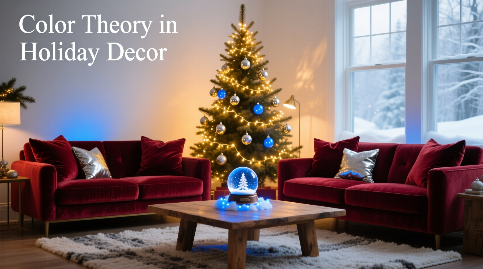
Crucially, avoid “accidental complements.” A common pitfall: pairing warm white (2700K–3000K) lights with cool-toned decor like silver, icy blue, or white-washed wood. The yellow-orange bias of warm white visually dulls cool elements, muting their crispness. Instead, match light temperature to decor temperature: cool whites (4000K–5000K) with silvers and blues; warm whites with brass, copper, and cream.
A Step-by-Step Process for Intentional Pairing
Follow this sequence to build a lighting-decor palette rooted in color theory—not guesswork:
- Assess Your Existing Decor Palette: Lay out all ornaments, ribbons, textiles, and structural elements (tree, wreaths, mantel pieces). Identify the dominant hue, two supporting hues, and primary neutrals. Note their values (light/mid/dark) and saturation (vibrant/muted).
- Determine Desired Mood: Is it cozy tradition (warm, low-contrast, rich values)? Modern elegance (cool, high-value contrast, desaturated)? Whimsical celebration (high saturation, triadic energy)? Mood dictates harmony choice and temperature range.
- Select Light Temperature First: Choose based on decor’s temperature bias. Warm decor? Max 3000K. Cool decor? Min 4000K. Mixed? Use tunable-white lights or separate zones (e.g., warm white on tree, cool white on staircase railing).
- Choose Hue(s) Using Harmony Rules: Apply the table above. For beginners, start with analogous or monochromatic. If using colored lights, ensure at least one hue appears in your physical decor to anchor the scheme.
- Refine with Value & Saturation: Match light brightness (lumens) to decor value. Low-value (dark) decor pairs best with medium-brightness lights to avoid glare; high-value (light) decor needs lower-brightness lights to prevent washing out. Prioritize lights with CRI (Color Rendering Index) >90 for accurate color representation on surfaces.
- Test & Iterate: Install one section. View at dusk and full dark. Adjust saturation down if colors feel aggressive; add a neutral light strand (e.g., warm white) to soften high-contrast areas.
Mini Case Study: The “Nordic Forest” Living Room Transformation
When interior designer Lena Rossi redesigned a client’s Minneapolis living room for the holidays, the brief was clear: “Scandinavian calm meets woodland depth—no red or green clichés.” Existing decor included pale oak floors, dove-gray linen sofa, charcoal wool rug, and foraged birch branches in a black iron floor vase. The client owned a set of cool white (4500K) fairy lights and deep emerald glass ornaments—both felt “wrong” together. The cool white washed out the warmth of the wood; the emerald looked artificially saturated against the muted grays.
Ross applied color theory systematically. She identified the dominant hue as neutral gray, with supporting undertones of cool wood (taupe-beige) and charcoal. The mood goal was serene, grounded, and textural—not festive-bright. She swapped the cool white lights for tunable-white LEDs set to 3500K—warm enough to enhance the oak’s honey tones but cool enough to preserve the gray’s clarity. She replaced the emerald ornaments with hand-blown glass orbs in varying values of sage (light), moss (mid), and forest (deep)—all sharing the same green base but differing in value. Finally, she added a single strand of amber micro-lights woven into the birch branches, creating an analogous trio: amber (light value), sage (mid), forest (dark). The result was a layered, dimensional space where light didn’t compete with decor but revealed its subtleties. As Ross notes: “Light should be the curator of texture, not the star. Color theory taught me to ask: ‘What does this surface *want* to say in this light?’—not ‘What color do I want to shine on it?’”
“Most lighting failures stem from treating bulbs as standalone objects. Light is relational—it exists only in dialogue with surfaces, textures, and adjacent colors. Master that relationship, and you master ambiance.” — Dr. Aris Thorne, Professor of Environmental Design, Rhode Island School of Design
Common Pitfalls & How to Avoid Them
Even with theory, execution stumbles. These recurring issues have straightforward fixes:
- The “White Light Trap”: Assuming all “white” lights behave identically. A 2200K vintage filament bulb casts a buttery glow; a 6000K daylight LED feels clinical. Always check Kelvin rating—not just “warm white” marketing copy.
- Overlooking Material Interaction: Metallic finishes (copper, brass, silver) reflect light temperature strongly. Matte fabrics absorb it. A single light strand may look harmonious on glass but clash on velvet. Test on multiple surfaces.
- Saturation Mismatch: Pairing highly saturated RGB lights with naturally muted decor (linen, wool, unfinished wood). Solution: Dial saturation down to 40–60% or choose lights with “pastel” or “vintage” modes.
- Ignoring Ambient Light Pollution: Streetlights, neighbor’s displays, or even your own recessed ceiling lights spill unwanted color. Use blackout curtains during testing, or install smart lights that auto-adjust based on ambient light sensors.
FAQ
Can I mix different color temperatures in one room?
Yes—but intentionally. Zone by function: warm white (2700K–3000K) for seating areas to encourage relaxation; cooler white (4000K–4500K) for entryways or staircases to promote alertness. Avoid mixing within a single focal point (e.g., don’t use both on the same tree). Use dimmers to blend transitions smoothly.
My ornaments are mostly clear glass. What lights work best?
Clear glass acts as a prism, refracting light. Warm white (2700K–3000K) creates golden highlights; cool white (4000K+) yields icy sparkle. For maximum versatility, choose tunable-white lights and adjust based on your other decor: warmer for wood/cream schemes, cooler for silver/gray schemes. Avoid highly saturated colored lights—they’ll dominate rather than enhance the glass’s inherent clarity.
Do LED color temperatures change over time?
Yes, gradually. Lower-quality LEDs experience “color shift” as phosphors degrade, often drifting cooler (e.g., 3000K becoming 3500K after 2–3 seasons). Invest in reputable brands with LM-80 testing data and replace strands every 3–4 years for consistent results. Store in cool, dry, dark conditions to slow degradation.
Conclusion
Using color theory with Christmas lights isn’t about rigid rules or artistic elitism—it’s about reclaiming agency over your holiday environment. It transforms decoration from accumulation to curation, from obligation to expression. When you understand how a 3200K light deepens the warmth of aged leather ornaments, or how a desaturated teal strand makes raw wood grain sing, you stop decorating by checklist and start designing by feeling. You notice how light bends around a velvet bow, how value contrast makes a simple garland feel substantial, how temperature alignment turns a doorway into a threshold of calm. These aren’t abstract concepts; they’re tools you wield daily, whether choosing a light strand online or arranging ornaments on a branch. Start small: pick one area—a mantel, a wreath, a tabletop centerpiece—and apply just one principle from this guide. Observe the difference. Then expand. Your home doesn’t need more lights. It needs more intention.


 浙公网安备
33010002000092号
浙公网安备
33010002000092号 浙B2-20120091-4
Comments
No comments yet. Why don't you start the discussion?