
Bold prints command attention—floral explosions, geometric patterns, animal motifs, abstract swirls—they’re vibrant, expressive, and often the centerpiece of a fashion-forward wardrobe. But for many, wearing them comes with hesitation: Will this oversized leopard print make me look swallowed by fabric? Does that neon paisley shirt draw too much focus? The truth is, bold prints don’t have to overwhelm your silhouette. With thoughtful styling, proportion control, and strategic pairings, you can wear dynamic patterns confidently, no matter your size or shape.
The key isn’t avoiding boldness—it’s mastering balance. Fashion is less about rules and more about harmony between volume, color, scale, and personal presence. When approached intentionally, even the most daring prints can enhance your frame rather than dominate it.
Understand Print Scale and Body Proportion
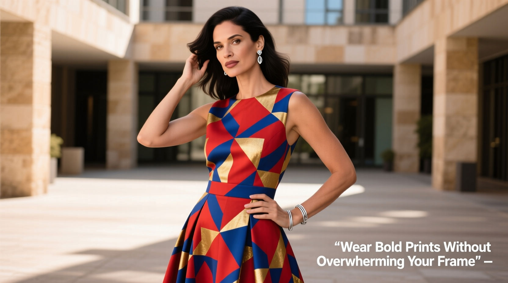
One of the most overlooked aspects of print styling is scale—the size of the pattern relative to your body. A large-scale print on a petite frame can easily overpower, just as a tiny micro-print might get lost on someone with broader shoulders. Matching print size to body type is foundational.
For individuals under 5’4”, small to medium-scale prints are generally more flattering. Think ditsy florals, subtle stripes, or tightly spaced geometrics. These maintain visual cohesion without fragmenting the eye line. Those over 5’7” can carry larger motifs with ease—think wide tropical leaves, dramatic animal prints, or oversized abstract designs—because their height provides natural balance.
But height isn’t the only factor. Shoulder width, torso length, and hip proportion all influence how a print interacts with your form. If you have a shorter torso, avoid busy prints that cut across the midsection; instead, opt for vertical patterns or bolder designs placed above or below the waist.
Balance Volume with Solid Tones
When introducing bold prints into an outfit, counterbalance is essential. Pairing a high-impact piece with neutral, solid-colored items grounds the look and prevents sensory overload.
For example, a vibrant printed blazer works best with plain black trousers and a crisp white tee. The eye has resting points—areas of simplicity—that allow the print to shine without dominating. This principle applies whether you're wearing a maxi dress, statement skirt, or graphic turtleneck.
Use the “one hero piece” rule: Let one item in your outfit carry the print. Keep everything else minimal. This doesn’t mean boring—texture, fabric quality, and silhouette can add depth—but avoid competing patterns or bright colors elsewhere.
Strategic placement also matters. If you’re wearing a printed top, pair it with dark-wash jeans or charcoal pants. If the print is on the lower half, like a bold printed midi skirt, keep the upper body simple with a tucked-in black shell or neutral sweater.
“Bold prints aren’t the enemy of proportion—they’re tools. It’s how you frame them that determines success.” — Lena Moretti, Stylist & Founder of Form & Fabric Studio
Master Color Coordination and Palette Control
A bold print often contains multiple colors. To avoid looking cluttered, pull one dominant hue from the print and echo it in your accessories or complementary garments.
For instance, if your dress features emerald green, cobalt blue, and mustard yellow, choose shoes or a handbag in emerald. This creates continuity and signals intentionality. Your outfit feels curated, not accidental.
Stick to a maximum of three core colors in your overall ensemble—including the print. Beyond that, visual fatigue sets in. Neutral tones like beige, gray, navy, or black serve as excellent buffers, especially when used in outerwear or footwear.
| Print Type | Best Complementary Neutrals | Colors to Avoid Pairing |
|---|---|---|
| Tropical Leaf | Cream, Sand, Denim Blue | Bright Pink, Neon Orange |
| Animal Print (Leopard) | Black, Camel, White | Other Animal Prints |
| Geometric Abstraction | Charcoal, Navy, Off-White | Clashing Primary Colors |
| Ditsy Floral | Blush, Taupe, Light Gray | Overly Dark Bottoms (can unbalance) |
Fit and Structure: Tailoring Makes All the Difference
No amount of color theory can compensate for poor fit. A well-cut garment enhances any print, while a baggy or ill-fitting piece distorts both the pattern and your silhouette.
Ensure printed clothing follows your natural lines. A loose, boxy printed blouse may hide your shape entirely, making you appear larger or shapeless. Instead, opt for tailored fits—slightly fitted waists, structured shoulders, or gently cinched silhouettes—that define your form beneath the print.
For dresses and jumpsuits, look for built-in shaping: belts, seams at the natural waist, or darting. These details anchor the print and prevent it from drifting aimlessly across your body.
Layering also plays a role. A structured blazer over a printed dress adds definition. A longline vest in a neutral tone can vertically elongate the body while containing a busy pattern within a clean frame.
Mini Case Study: Maya’s Printed Jumpsuit Transformation
Maya, 5’2” and curvy, loved a vibrant, wide-striped printed jumpsuit she found online. When she first wore it, however, she felt overwhelmed—like the horizontal bands were cutting her in half.
After consulting a stylist, she made two changes: First, she had the jumpsuit altered to emphasize her waist with a self-tie belt. Second, she paired it with a long, open black cardigan and nude heels to create a vertical line.
The result? The print remained bold and joyful, but now framed her shape instead of flattening it. By adding structure and elongation, the outfit celebrated her figure rather than obscuring it.
Step-by-Step Guide to Wearing Bold Prints Confidently
Follow this five-step process to integrate bold prints into your wardrobe with confidence:
- Assess the print scale. Hold the garment at a distance. Does the pattern feel cohesive or chaotic? If individual elements are larger than your hand, it may be too bold for your frame unless balanced carefully.
- Choose your hero piece. Decide whether the top, bottom, or dress will carry the print. Commit to only one per outfit.
- Select supporting neutrals. Pick solid-colored pieces in shades that appear in the print or classic neutrals (black, white, beige, gray).
- Focus on fit. Ensure the garment skims or follows your shape—not too tight, not too loose. Tailor if necessary.
- Add finishing touches. Use accessories in a dominant print color. A clutch, belt, or shoes in one hue from the design unify the look.
Common Mistakes to Avoid
- Mixing multiple bold prints. Even if colors match, clashing patterns create visual noise. Stick to one statement print per outfit.
- Ignoring contrast levels. High-contrast prints (black-and-white zebra) are inherently more aggressive. Wear them sparingly and with softening elements like draped fabrics or rounded silhouettes.
- Over-accessorizing. Bold prints already draw attention. Skip chunky jewelry or loud bags—let the clothing lead.
- Wearing busy prints on ill-fitting cuts. A wrinkled, stretched-out printed shirt distracts from the design and undermines your appearance.
Checklist: Ready to Wear Bold Prints?
- ☐ I’ve chosen only one bold print piece for this outfit.
- ☐ The print scale suits my height and build.
- ☐ My supporting pieces are solid-colored and neutral.
- ☐ The garment fits well and enhances my shape.
- ☐ I’ve pulled a color from the print for my accessories.
- ☐ I feel confident and comfortable in this look.
FAQ: Common Questions About Wearing Bold Prints
Can petite women wear large-scale prints?
Yes, but with strategy. Choose large prints that flow vertically—like long-stemmed florals or diagonal stripes—and pair them with monochromatic layers. Avoid horizontal or clustered patterns that cut the body. Tailored fits help contain the print within a defined silhouette.
How do I know if a print flatters my skin tone?
Look at the undertones in the print. Warm-based prints (reds, oranges, yellows, browns) tend to complement warm skin tones (golden or olive). Cool-based prints (blues, purples, pinks, grays) work better with cool undertones (pink or blue hues). Test by holding the garment near your face in natural light—does your complexion look brighter or duller?
Is it okay to wear bold prints to work?
Absolutely, if styled professionally. Opt for subtler bold prints—a pinstripe with a pop of color, a sheath dress with a modern abstract motif—and pair with structured blazers and closed-toe shoes. Avoid overly flashy or cartoonish designs in conservative environments.
Final Thoughts: Own Your Print, Own Your Presence
Wearing bold prints isn’t about minimizing yourself—it’s about amplifying your presence with intention. Confidence isn’t derived from playing it safe; it grows when you express yourself authentically, supported by smart choices in proportion, color, and cut.
You don’t need to shrink to wear something large. You need to balance, define, and believe. Whether it’s a fiery red kimono with gold dragon embroidery or a cobalt-blue dress blooming with fuchsia orchids, let the print speak—but ensure your silhouette speaks back with equal strength.
Fashion should uplift, not intimidate. And when bold prints are worn with awareness and care, they don’t overwhelm—they empower.


 浙公网安备
33010002000092号
浙公网安备
33010002000092号 浙B2-20120091-4
Comments
No comments yet. Why don't you start the discussion?