
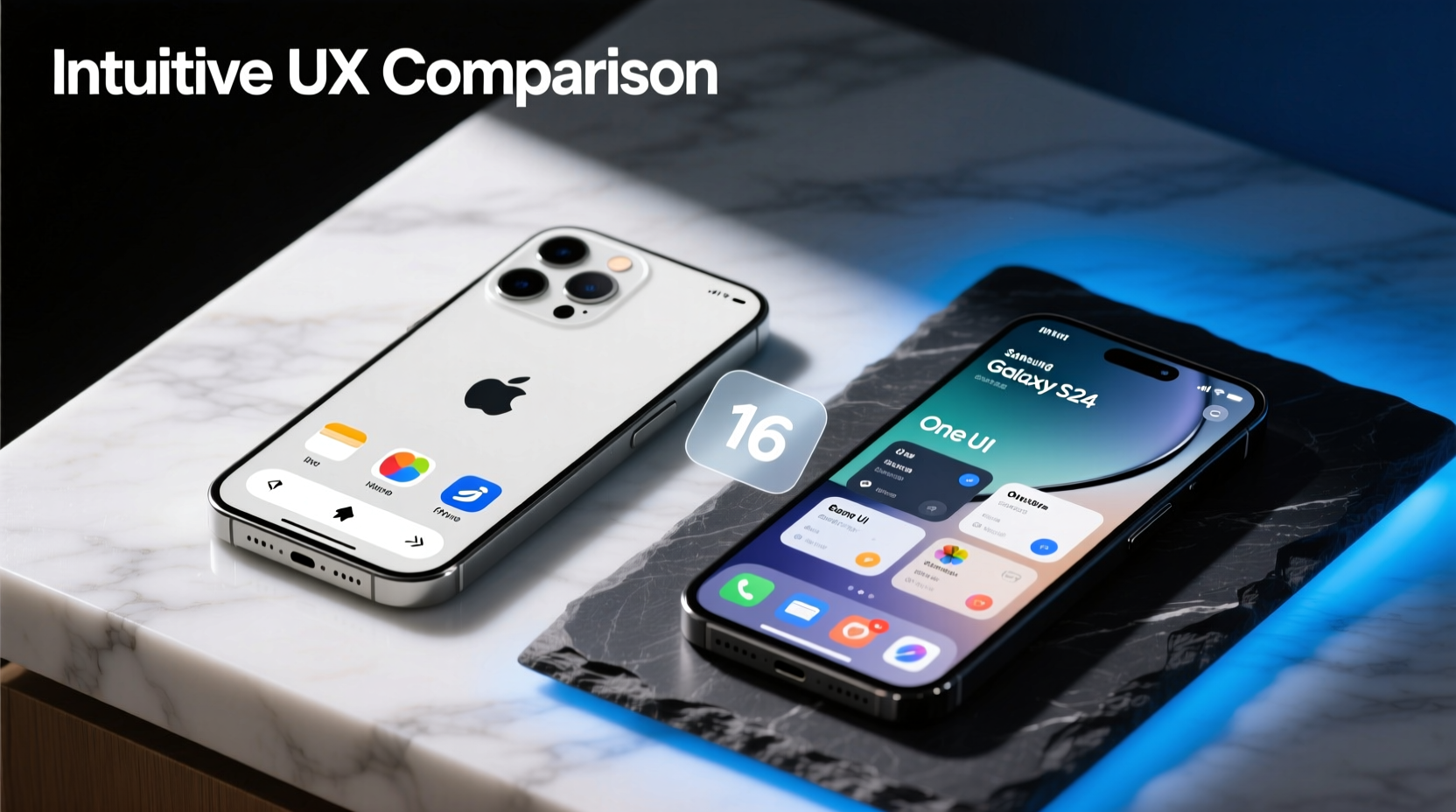
When choosing between the iPhone 16 and the Galaxy S24, technical specs often dominate conversations—processor speed, camera resolution, battery life. But for most users, the deciding factor comes down to something less quantifiable: how easy it is to use. The user interface (UI) shapes every interaction, from unlocking your phone to editing a photo or switching apps. While both devices represent the pinnacle of their respective ecosystems, they approach intuitiveness differently—one through consistency and simplicity, the other through customization and flexibility.
This isn’t just about preference; it’s about design philosophy, cognitive load, and long-term usability. Whether you're upgrading from an older device or switching platforms, understanding how each interface supports—or hinders—daily tasks can make all the difference in your experience.
Design Philosophy: Simplicity vs. Customization
Apple’s iOS, as seen on the iPhone 16, follows a minimalist, human-centered design language. Every element—from icon shape to animation timing—is standardized across devices and apps. This uniformity reduces decision fatigue. Users don’t need to relearn navigation patterns when opening a new app because the back button is always top-left, settings are consistently labeled, and gestures follow predictable logic.
In contrast, Samsung’s One UI on the Galaxy S24 embraces adaptability. It builds on Android’s open architecture, allowing deeper personalization. You can change launchers, default apps, icon packs, and even system-wide themes. Widgets are more dynamic, and multi-window functionality enables split-screen workflows without third-party tools. However, this flexibility introduces complexity. New users may struggle with overlapping menus or inconsistent behaviors between stock and third-party apps.
“Intuitive doesn’t mean feature-rich—it means predictable. The best interfaces feel invisible because they align with user expectations.” — Dr. Lena Torres, Human-Computer Interaction Researcher, MIT Media Lab
Apple prioritizes learnability: once you know one part of iOS, you can navigate most of it. Samsung emphasizes empowerment: if you’re willing to invest time upfront, you can tailor nearly every aspect of the experience. For casual users, Apple’s approach lowers the barrier to entry. For power users, Samsung offers greater control.
User Experience Across Core Tasks
To evaluate true intuitiveness, consider how effortlessly each phone handles everyday actions:
- Unlocking and accessing notifications: Both phones support facial recognition and fingerprint sensors. The iPhone 16 uses Face ID with adaptive attention detection, requiring minimal user adjustment. The Galaxy S24 offers ultrasonic fingerprint scanning under the display, which works reliably but sometimes requires precise finger placement.
- Switching between apps: iOS uses a card-style multitasking view accessed by swiping up and holding. It’s clean but limited to two recent apps unless using iPadOS. One UI provides a horizontal scrollable list of recent apps with thumbnails, making it easier to identify and return to a specific task.
- Adjusting settings: Control Center on iPhone 16 gives quick toggles for Wi-Fi, Bluetooth, brightness, and focus modes—all customizable but confined to a single panel. The Galaxy S24’s Quick Settings tray spans multiple swipeable panels, offering more at-a-glance controls like refresh rate, sound quality, and DeX mode.
- Searching within the OS: Spotlight Search on iPhone is fast but restricted mainly to apps, messages, and web results. Samsung’s search bar (accessible from the home screen) indexes files, settings, apps, and even settings buried deep in menus—making it faster to find obscure options.
Consistency vs. Flexibility: A Feature-by-Feature Comparison
| Feature | iPhone 16 (iOS 18) | Galaxy S24 (One UI 6.1) |
|---|---|---|
| Home Screen Layout | Rigid grid; widgets optional but limited in size/behavior | Highly customizable: resizable widgets, freeform placement, folder options |
| App Drawer | No app drawer; all apps on home or search | Yes; optional toggle to hide apps from home screen |
| System Navigation | Gesture-based only (swipe up); consistent across apps | Three options: gesture, buttons, or hybrid; some apps override defaults |
| Settings Organization | Hierarchical, text-heavy lists; logical grouping | Categorized with icons; predictive suggestions based on usage |
| Voice Assistant | Siri: deeply integrated but slower response | Bixby: improving, but Google Assistant recommended for reliability |
| Customization Depth | Low: wallpaper, fonts, accessibility features | High: themes, icon packs, lock screen edits, font styles |
| Learning Curve | Shallow: easy for first-time smartphone users | Steeper: more options require initial setup effort |
The table highlights a fundamental trade-off: iOS minimizes choice to reduce confusion, while One UI maximizes optionality for those who want precision. Neither is inherently better—but the definition of “intuitive” depends on who’s using it.
Real-World Usability: A Mini Case Study
Sarah, a 68-year-old retiree upgrading from an iPhone 7, tested both devices over two weeks. Her goal was simple: stay in touch with family, manage prescriptions, and browse news without frustration.
On the iPhone 16, she found calling her grandchildren effortless. FaceTime integration with Contacts, large text options, and straightforward message threading made communication smooth. She appreciated that the camera opened quickly with a swipe, and photos automatically backed up to iCloud. However, she occasionally missed notifications because she didn’t realize she had to swipe down from the top right for the full Control Center.
With the Galaxy S24, Sarah struggled initially. The dual swipe-down gesture for notifications versus quick settings confused her. She accidentally changed her display mode trying to adjust brightness. Yet, after a week—and with help from Samsung’s built-in tutorial mode—she grew fond of the larger tap targets and voice-guided accessibility menu. She especially liked being able to pin her medication reminder widget front-and-center.
By the end, Sarah preferred the iPhone 16—not because it had fewer features, but because she never felt lost. “I don’t want to think about my phone,” she said. “I just want it to work.”
Actionable Tips for Choosing Based on Intuitiveness
Whether you're tech-savvy or value plug-and-play simplicity, these guidelines can help you decide which interface suits your lifestyle:
- Assess your daily routines: If you mostly use messaging, calls, email, and media, iOS’ streamlined flow will likely feel more natural.
- Consider long-term adaptability: Do you plan to keep the phone for four years or more? iOS updates maintain interface consistency year-over-year, reducing relearning.
- Test gesture navigation: Spend 10 minutes using each device. Notice where you hesitate. Are back gestures reliable? Can you reach controls comfortably?
- Evaluate accessibility needs: Both platforms offer robust tools, but iOS leads in screen reader polish and hearing aid compatibility. Galaxy excels in visual customization and motor assistance.
- Think about ecosystem ties: If you already use a Mac or iPad, continuity features like AirDrop, Handoff, and Universal Clipboard make iPhone interactions feel seamless.
Checklist: Is the Interface Right for You?
- ☐ Can I perform core tasks (call, message, take photo) within 30 seconds of picking up the phone?
- ☐ Are menus organized logically, or do I have to hunt for settings?
- ☐ Does the system remember my preferences (e.g., dark mode, volume levels)?
- ☐ Are gestures consistent across apps, or do some behave differently?
- ☐ Can I customize the layout enough to reflect my habits without overwhelming me?
Frequently Asked Questions
Is iOS easier to learn than Android?
Generally, yes—especially for first-time smartphone users. iOS enforces strict design guidelines across apps, resulting in predictable behavior. Android allows variation between manufacturers and developers, which can lead to inconsistent navigation patterns. However, users familiar with computers or technology may adapt quickly to Android’s flexibility.
Can I make the Galaxy S24 feel as simple as an iPhone?
You can get close. Enable “Easy Mode” in Settings to simplify the home screen, enlarge icons, and hide advanced features. Use a minimalist launcher like Nova or Microsoft Launcher to mimic iOS aesthetics. Disable unnecessary widgets and animations. While it won’t replicate iOS exactly, you can create a cleaner, more focused experience.
Does the iPhone 16 introduce any new interface changes?
iOS 18 brings minor refinements: customizable Control Center layouts, enhanced Siri with on-device processing, and improved contextual suggestions in Spotlight. The overall structure remains unchanged, preserving familiarity. Notably, Apple now allows greater lock screen customization, narrowing a key gap with Android.
Conclusion: Intuitiveness Is Personal—But Principles Matter
The question isn’t whether the iPhone 16 or Galaxy S24 has the objectively better interface, but which one aligns with how you think and interact with technology. The iPhone 16 wins on coherence and ease of mastery, delivering a frictionless experience out of the box. Its strength lies in what it omits—unnecessary choices, conflicting pathways, visual clutter. For users who prioritize reliability and simplicity, it remains unmatched.
The Galaxy S24 shines for those who want ownership over their digital environment. Its interface rewards exploration and adapts to specialized workflows. However, that power comes with a cost: occasional inconsistency and a steeper learning curve.
In the end, intuitiveness isn’t just about how something looks or functions—it’s about whether it disappears into the background so you can focus on what matters. If you value peace of mind and seamless integration, the iPhone 16 is likely the better fit. If you crave control and personal expression, the Galaxy S24 offers a richer canvas.


 浙公网安备
33010002000092号
浙公网安备
33010002000092号 浙B2-20120091-4
Comments
No comments yet. Why don't you start the discussion?