
Many iPhone users have experienced a moment of confusion: glancing at their phone, trying to unlock it, only to realize they’re already on the home screen—or vice versa. This subtle but persistent issue stems from Apple’s increasingly minimalist design language, which blurs the visual distinction between the lock screen and home screen. As iOS has evolved, both screens now share similar wallpapers, widgets, fonts, and layout styles, making it harder than ever to distinguish one from the other at a glance. For some, especially older users or those with visual sensitivities, this lack of contrast leads to frustration and repeated unlocking attempts.
The problem isn’t just aesthetic—it impacts usability. Misidentifying your current screen state can lead to unnecessary swipes, wasted battery from waking the device, or even accidental app launches. Understanding the functional differences and learning how to customize your iPhone for better clarity is essential to regaining confidence in daily use.
Understanding the Functional Differences
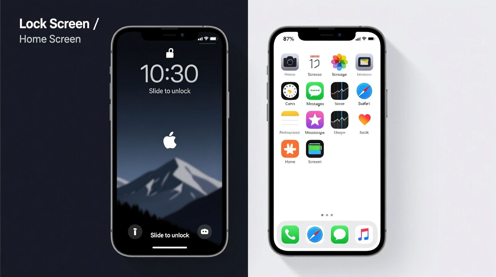
Despite their visual similarities, the lock screen and home screen serve entirely different purposes in iOS. The lock screen acts as a security gate, preventing access to apps and personal data until authentication occurs via Face ID, Touch ID, or passcode entry. It displays time, date, notifications, and widgets—but interactions are limited. You cannot open apps directly from the lock screen unless using Quick Actions or notification shortcuts.
In contrast, the home screen is fully interactive. Once unlocked, it grants full access to all apps, widgets, folders, and settings. Gestures like tapping, swiping, and long-pressing behave differently here compared to the lock screen. For example, a swipe up on the lock screen triggers unlock; the same gesture on the home screen opens the App Switcher.
This functional divide is clear to the system—but not always to the user. Without obvious visual cues, the brain struggles to parse context quickly, especially when relying on muscle memory or quick glances.
“Good UX doesn’t just work—it communicates its state clearly. When interfaces become too uniform, cognitive load increases.” — Dr. Lena Torres, Human-Computer Interaction Researcher, Stanford University
Why the Confusion Happens: Design Trends and User Impact
Apple’s shift toward seamless, immersive experiences has led to a reduction in visual hierarchy between interface states. Starting with iOS 16, users gained the ability to customize the lock screen with fonts, colors, and layered widgets—features previously exclusive to the home screen. While this personalization is popular, it erodes the traditional cues that once made the lock screen feel distinct.
Before iOS 16, the lock screen typically featured:
- A prominent clock at the top or center
- Notification shade below
- Camera and Siri shortcuts at the bottom corners
- Different wallpaper dimming or blur effects
Now, with customizable fonts, widget stacks, and dynamic backgrounds, many users apply nearly identical layouts to both screens. A weather widget on the lock screen mirrors one on the home screen. The same photo appears behind both interfaces. The result? Contextual ambiguity.
Customization Checklist: Make the Screens Distinct
You don’t need to abandon personalization to regain clarity. With intentional adjustments, you can keep your style while improving usability. Follow this checklist to differentiate your lock screen from your home screen:
- Use different wallpapers – Choose contrasting images or apply filters (e.g., black-and-white on lock screen, color on home).
- Vary widget types – Place time-sensitive widgets (like Calendar or Reminders) only on the home screen.
- Adjust font styles – Use bold, large fonts on the lock screen; minimal or small fonts on the home screen.
- Leverage focus modes – Pair specific lock screens with Focus modes (e.g., Work, Sleep) to reinforce context.
- Limit lock screen widgets – Keep only essential ones (Time, Weather) to reduce visual noise.
- Add a subtle indicator – Use a small text widget with “Locked” or a symbol like 🔒 if supported by third-party tools.
Step-by-Step Guide to Creating Visual Separation
Follow these steps to reconfigure your iPhone for clearer screen differentiation:
- Open Settings > Wallpaper and tap “Add New Wallpaper.”
- Select “Lock Screen” and choose a new image or modify an existing one with increased contrast or tint.
- Customize the clock style—pick a bolder font (e.g., “Big” or “Numerals”) to emphasize lock screen status.
- Add one simple widget, such as Weather or Date, but avoid stacking multiple layers.
- Tap the Home Screen thumbnail at the bottom to switch customization mode.
- Apply a different wallpaper or use the same base image with less saturation.
- Arrange home screen widgets freely, including multi-layer stacks or app-integrated ones (e.g., Music, Fitness).
- Press “Done” and test the transition by locking your phone and observing the difference.
Repeat this process for additional lock screen configurations tied to Focus modes, ensuring each serves a unique visual identity.
Comparison Table: Lock Screen vs Home Screen Features
| Feature | Lock Screen | Home Screen |
|---|---|---|
| App Access | Restricted (via Quick Actions only) | Full access |
| Widget Interactivity | Limited (view-only or basic controls) | Interactive (tap to open apps) |
| Wallpaper Customization | Filters, depth effect, font overlay | Standard display |
| Notification Behavior | Stacked, banners at top | Delivered to Notification Center |
| Gesture Response | Swipe up = unlock | Swipe up = App Switcher |
| Default State | Active when device is asleep/locked | Active after successful authentication |
Real Example: Sarah’s Morning Routine Fix
Sarah, a 58-year-old teacher, found herself repeatedly swiping her iPhone in the morning, thinking it was locked when it wasn’t. She’d grab her phone to check the time, see the clock and weather widget, and instinctively swipe up—only to trigger the App Switcher. Frustrated, she assumed her phone was glitchy.
After reviewing her setup, she realized both screens used the same mountain landscape wallpaper and nearly identical widget layouts. By changing her lock screen to a grayscale version of the photo and switching to a larger digital clock font, she instantly regained confidence. Now, she knows at a glance whether she needs to authenticate or can dive straight into her calendar.
Frequently Asked Questions
Can I make the lock screen look completely different from the home screen?
Yes. Use different wallpapers, fonts, and widgets. iOS allows multiple lock screen configurations linked to Focus modes, giving you flexibility to create strong visual distinctions.
Why does my iPhone sometimes show apps behind a darkened screen?
That’s the lock screen overlay. Even if you see app icons faintly through the wallpaper, you’re still locked out until you authenticate. The dimming effect is intentional but can be confusing if the background is too bright or detailed.
Does disabling widgets help reduce confusion?
For some users, yes. Removing widgets from the lock screen simplifies it to core elements: time, date, and notifications. This creates a cleaner, more traditional lock screen experience that’s easier to distinguish.
Conclusion: Clarity Through Intentional Design
The line between iPhone lock screen and home screen doesn’t have to be blurry. While Apple’s design choices prioritize aesthetics and continuity, users hold the power to restore clarity through thoughtful customization. By embracing contrast—through wallpaper, typography, and widget strategy—you transform confusion into confidence. Your iPhone should feel intuitive, not puzzling.


 浙公网安备
33010002000092号
浙公网安备
33010002000092号 浙B2-20120091-4
Comments
No comments yet. Why don't you start the discussion?