
For over a decade, smartphone home screens have evolved from static grids of app icons into dynamic dashboards. At the heart of this transformation are widgets—compact tools that deliver real-time information without opening apps. While both iPhone and Android support widgets, their approach to functionality, design, and customization diverges sharply. For users who care about personalization and aesthetics, the choice between iOS and Android often comes down to how freely they can shape their device’s interface. This article breaks down the widget ecosystems of both platforms, comparing ease of use, visual appeal, flexibility, and long-term usability.
The Evolution of Widgets: From Clunky Tools to Design-Centric Features
Early mobile widgets were functional but visually inconsistent. They often disrupted the look of the home screen with mismatched fonts, clashing colors, and awkward sizes. Over time, both Apple and Google refined their approaches. Android embraced openness and developer freedom, while Apple prioritized cohesion and polish. The result is two distinct philosophies: Android offers breadth and control; iOS emphasizes elegance and integration.
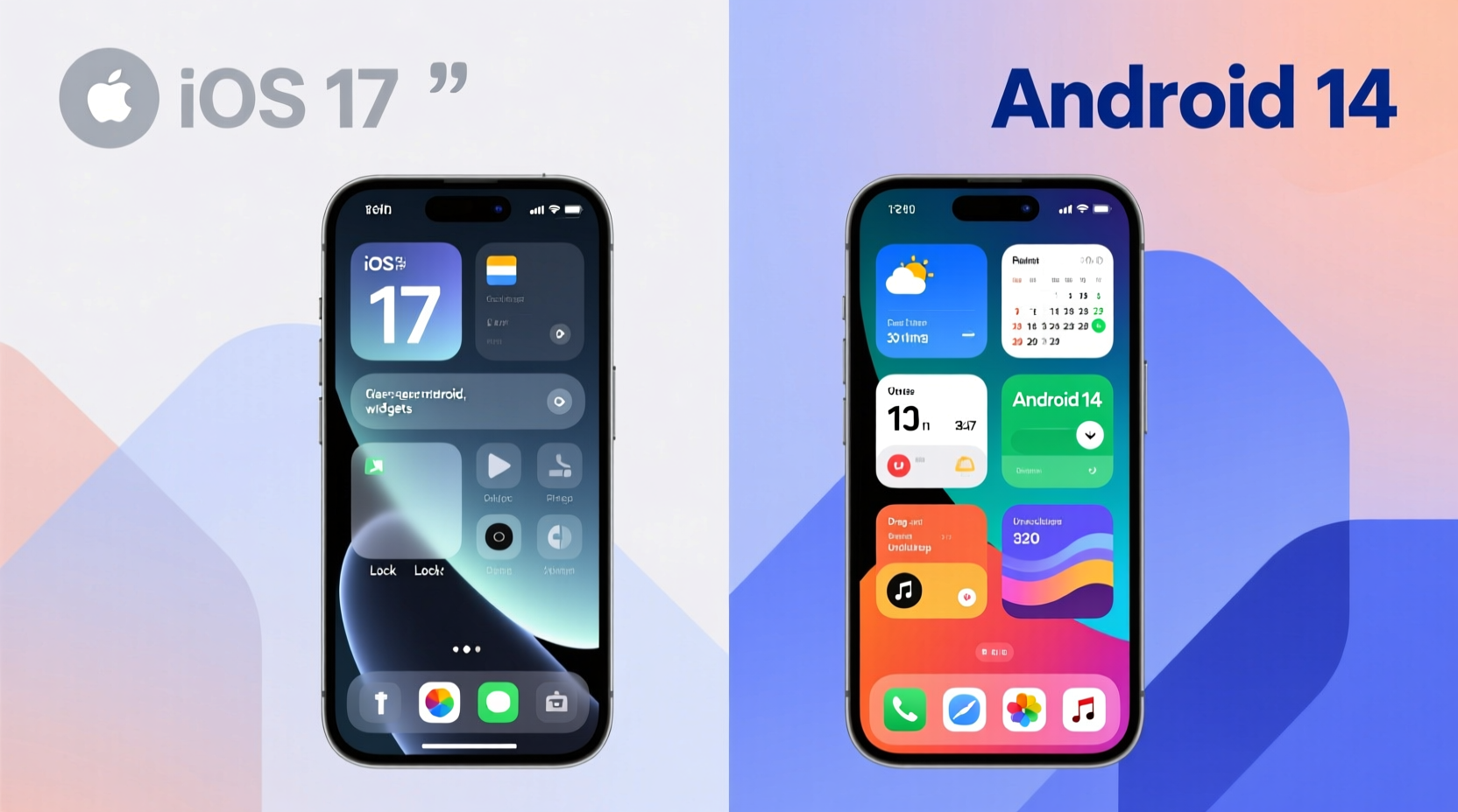
Apple introduced widgets with iOS 14 in 2020, arriving years after Android had already established its widget culture. Despite the late start, iOS widgets quickly gained popularity due to their clean design language and seamless integration with the system. Android, on the other hand, has supported widgets since its inception, allowing third-party developers extensive access to create everything from minimalist clocks to full-featured fitness trackers.
“Widgets should enhance, not dominate, the user experience. The best ones feel like natural extensions of the phone.” — Linus Bennett, UI Designer at Material Labs
Customization Flexibility: Who Gives You More Control?
When it comes to raw customization power, Android remains unmatched. Users can resize widgets vertically and horizontally across multiple grid units, place them anywhere on the home screen—even overlapping icons (depending on the launcher)—and apply custom fonts, transparency levels, and icon packs through third-party tools like Nova Launcher or KWGT.
iOS takes a more restrained approach. Widget sizes are fixed: small (1x), medium (2x), and large (3x). You cannot freely resize a weather widget to fit an odd space or stretch a calendar across four columns. Placement is also constrained by Apple’s grid system, which snaps widgets into predefined slots. While this ensures visual consistency, it limits creative freedom.
Another key difference lies in data sources. Android allows widgets to pull from nearly any app or service, including those running in the background. Third-party developers can build deeply integrated widgets that interact with sensors, notifications, or even automation platforms like Tasker. iOS restricts widget interactivity due to security and performance concerns. Widgets are primarily informational, not interactive—tapping usually opens the parent app rather than triggering actions inline.
Design & Aesthetic Appeal: Clean Simplicity vs. Creative Freedom
If you value visual harmony and minimalist design, iOS widgets may feel more appealing. Apple enforces strict design guidelines through its WidgetKit framework, ensuring uniform corner radii, typography, and color treatments. Most native and App Store widgets adopt a translucent, “vibrant” aesthetic that blends with wallpapers and dark/light mode settings.
Android offers greater variety but less consistency. Stock Pixel widgets follow Google’s Material You design language, using dynamic color extraction from your wallpaper to generate matching palettes. However, third-party apps vary widely in quality. Some deliver sleek, modern interfaces; others appear outdated or cluttered. Without centralized oversight, the visual experience depends heavily on individual app developers.
That said, Android excels when users want to craft a truly unique look. With tools like KWGT (Kustom Widget Engine), you can build pixel-perfect widgets from scratch—embedding live data, animations, gradients, and even music visualizers. These creations can span entire home screen panels, turning your phone into a personalized dashboard.
“I built a single widget that shows my step count, next meeting, battery level, and Spotify track—all animated and synced to my wallpaper colors. That kind of depth isn’t possible on iOS.” — Rajiv Mehta, Android Power User
Comparison Table: Key Widget Features Across Platforms
| Feature | iOS | Android |
|---|---|---|
| Widget Resizing | Limited to 1x, 2x, 3x sizes | Freeform resizing (varies by launcher) |
| Placement Freedom | Grid-based, no overlap | Anywhere on screen (launcher-dependent) |
| Visual Customization | Moderate (limited tinting, font scaling) | Extensive (colors, transparency, fonts, shapes) |
| Third-Party Development Access | Restricted by WidgetKit | Open API with deep system access |
| Live Interaction | No inline controls (tap opens app) | Buttons, sliders, toggles within widgets |
| Integration with System Themes | Strong (Dynamic Type, Dark Mode) | Material You support on newer devices |
| Performance Impact | Optimized, low refresh rates | Can be high if poorly coded |
A Real-World Example: Two Users, Two Approaches
Consider Sarah, an iOS user who values simplicity. She uses the default Today View and places one medium-sized widget stack on her home screen: Weather (top), Calendar (middle), and Notes (bottom). All match her light gray wallpaper and activate subtle parallax effects when she swipes. She appreciates that everything looks cohesive and doesn’t require tweaking.
Now meet Diego, an Android enthusiast. His home screen features a custom-built KWGT widget that displays air quality, commute time, unread emails, and a circular battery indicator—all styled in neon green with animated transitions. He uses Niagara Launcher to hide most app icons behind a swipe-up gesture, keeping the screen uncluttered. His setup took hours to perfect but reflects his personality and workflow exactly.
Neither approach is objectively better. Sarah gains peace of mind from predictability; Diego enjoys mastery and self-expression. The ideal platform depends on what you prioritize: effortless beauty or limitless customization.
Step-by-Step: Building a Personalized Home Screen Experience
Whether you’re on iPhone or Android, crafting a functional and attractive widget layout follows a logical process. Here’s how to do it effectively:
- Assess Your Daily Needs: Identify the three pieces of information you check most—weather, messages, fitness stats, etc.
- Choose Reliable Apps: Pick apps known for stable, well-designed widgets (e.g., Fantastical, Carrot Weather, Google Keep).
- Start Minimal: Place only essential widgets initially. Avoid overcrowding.
- Group by Function: Cluster related widgets (e.g., productivity tools together, health metrics on another page).
- Refine Visually: Adjust colors, opacity, and spacing to align with your wallpaper and theme.
- Test Over Time: Use the setup for a week. Remove underused widgets and replace inefficient ones.
- Automate Updates (Android Only): Use apps like Tasker or MacroDroid to refresh widgets based on triggers like location or time.
Common Pitfalls to Avoid
- Overloading the Home Screen: Too many widgets drain battery and reduce readability.
- Ignoring Performance: Animated or frequently updating widgets consume resources. Monitor usage in Settings > Battery.
- Using Outdated Widgets: Some older apps haven’t updated for modern OS versions, leading to lag or crashes.
- Mismatched Aesthetics: Mixing glossy, flat, and skeuomorphic styles creates visual noise.
- Forgetting Accessibility: Ensure text size and contrast meet readability standards, especially for vision-impaired users.
FAQ: Answering Common Questions About iPhone and Android Widgets
Can I make iPhone widgets look like Android ones?
Not natively. iOS doesn’t allow freeform resizing or deep styling changes. However, some apps like Widgetsmith let you simulate Android-style layouts with layered widgets and custom backgrounds. It’s a workaround, not true parity.
Do Android widgets drain battery faster?
Potentially, yes. Widgets that refresh every few seconds—especially those pulling data from the internet or GPS—can increase CPU and network activity. Well-coded widgets update intelligently (e.g., only during daylight hours), but poorly optimized ones should be avoided.
Why can’t I add interactive buttons to iOS widgets?
Apple restricts interactivity to maintain stability and security. Widgets run in a separate process from apps and cannot execute complex logic. This prevents crashes but limits functionality compared to Android, where widgets can include buttons that trigger actions directly.
Checklist: Optimizing Your Widget Setup
Use this checklist to ensure your widget configuration enhances—not hinders—your experience:
- ✅ Selected only the most-used data points (max 5–7 widgets total)
- ✅ Grouped similar functions together (e.g., work, fitness, home)
- ✅ Verified all widgets update reliably and don’t freeze
- ✅ Matched widget colors to wallpaper/theme
- ✅ Disabled unnecessary animations or live updates
- ✅ Tested readability in bright sunlight and low light
- ✅ Removed any widget unused in the past 7 days
Final Verdict: Easier vs. Prettier—Which Wins?
Declaring a single winner between iPhone and Android widgets depends on your definition of success. If “easier” means intuitive setup, consistent behavior, and plug-and-play reliability, iOS wins. Its curated environment reduces friction and delivers polished results with minimal effort. For casual users or design purists, this streamlined experience is ideal.
If “prettier” implies expressive potential and artistic freedom, Android takes the crown. With the right tools, you can transform your phone into a moving canvas—dynamic, responsive, and uniquely yours. But that power demands time, technical comfort, and ongoing maintenance.
In essence: iOS makes it easy to achieve good-looking results quickly. Android empowers you to reach exceptional results—if you're willing to invest the effort.
Conclusion: Shape Your Phone, Reflect Your Style
Your smartphone isn’t just a tool—it’s a reflection of how you live, work, and express yourself. Widgets sit at the intersection of utility and identity, offering a rare opportunity to blend function with form. Whether you prefer Apple’s elegant restraint or Android’s boundless creativity, the goal remains the same: building a digital space that feels truly yours.


 浙公网安备
33010002000092号
浙公网安备
33010002000092号 浙B2-20120091-4
Comments
No comments yet. Why don't you start the discussion?