
Choosing the right blanket isn’t just about warmth—it’s a subtle act of self-expression, comfort engineering, and environmental design. The debate between patterned and plain blankets often comes down to personal preference, but deeper factors like sensory sensitivity, room aesthetics, and even sleep hygiene play critical roles. For some, bold patterns energize a space; for others, they disrupt relaxation. Meanwhile, solid colors may feel safe but risk appearing sterile. The real answer lies not in choosing one over the other, but in understanding context, function, and individual needs.
The Psychology of Pattern and Color in Sleep Environments
Our surroundings influence our mental state, especially in spaces dedicated to rest. According to environmental psychologists, visual stimuli in the bedroom should support calmness and cognitive disengagement. Busy patterns—especially those with high contrast, geometric shapes, or chaotic motifs—can activate the visual cortex, making it harder to unwind. This is particularly true for individuals with sensory processing sensitivities or anxiety disorders.
On the flip side, completely monotonous environments can lack emotional resonance. A study published in the *Journal of Environmental Psychology* found that moderate visual interest in sleeping spaces improved mood upon waking, provided the stimuli were not overly stimulating. This suggests a “Goldilocks zone” exists: not too busy, not too bland.
“Your bedding should invite stillness, not demand attention.” — Dr. Lena Pruitt, Environmental Psychologist and Sleep Environment Researcher
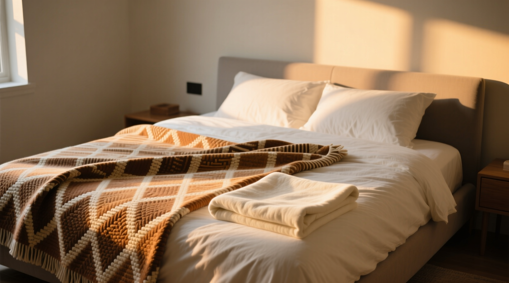
Function vs. Aesthetic: Where Your Blanket Lives Matters
A blanket on a guest bed has different requirements than one used nightly. Context determines whether pattern enhances or hinders the experience.
- Nightly use: Opt for softer patterns (like subtle textures or tonal prints) or solids in calming hues such as soft gray, sage, or warm beige.
- Decorative throws: This is where bold patterns shine. Use them on sofas or at the foot of the bed to add personality without compromising sleep quality.
- Children’s rooms: Patterns can be comforting if they reflect familiar themes (animals, stars, etc.), but avoid flashing or overly bright color combinations near bedtime.
Patterned vs. Plain: A Comparative Breakdown
| Factor | Patterned Blanket | Plain Blanket |
|---|---|---|
| Visual Impact | High – draws attention, adds character | Low – recedes, supports other elements |
| Sleep Friendliness | Varies – depends on pattern complexity | Generally better – promotes visual calm |
| Versatility | Lower – ties strongly to decor theme | Higher – matches any style |
| Dirt Visibility | Lower – hides stains and lint well | Higher – shows wear more clearly |
| Emotional Tone | Energetic, playful, nostalgic | Calm, minimalist, serene |
How to Strike the Right Balance
The most effective approach blends both styles through layering. Start with a plain duvet or base blanket in a soft, neutral tone to anchor the bed. Then, introduce a patterned throw at the foot or folded across the side. This allows for visual interest without overwhelming the space.
Consider these strategies:
- Use a solid-colored fitted sheet and flat sheet to create a clean foundation.
- Add a quilt or coverlet with a gentle, repeating pattern (e.g., small florals, ticking stripe).
- Incorporate texture through knits, waffles, or cable weaves—even in solid colors—to avoid flatness.
- Limit dominant patterns to one textile per bed to prevent visual competition.
- Choose patterns with a unifying color from the room’s palette to ensure harmony.
Mini Case Study: The Overstimulated Bedroom Makeover
Sarah, a graphic designer in Portland, struggled with insomnia despite good sleep hygiene. Her bedroom featured a vibrant tribal-print blanket, multicolored pillows, and an eclectic mix of wall art. After consulting a sleep coach, she simplified her bedding to a slate-gray linen duvet and added a single indigo-dyed throw with a subtle wave motif. Within two weeks, she reported falling asleep 25 minutes faster and feeling more rested. “I didn’t realize how much my eyes were working at night,” she said. “Now, the room feels like a retreat, not a gallery.”
Expert Tips for Choosing the Right Blanket
- For sensitive sleepers: Stick to tonal patterns (same color family with slight variation) or textured solids.
- For maximalists: Contain bold patterns within defined zones—like a reading nook or daybed—away from the main sleeping area.
- For small spaces: Large patterns can make a room feel busier; opt for fine-scale prints or solids to maintain openness.
- For shared beds: Compromise with reversible blankets—one side patterned, one solid—so both partners can choose their view.
Checklist: Choosing Your Ideal Blanket
- ✅ Assess the primary function: sleep aid or decorative accent?
- ✅ Evaluate your room’s existing color scheme and visual load.
- ✅ Consider your sensitivity to visual stimuli (do busy spaces stress you?)
- ✅ Choose materials that support breathability and comfort (cotton, linen, wool).
- ✅ Test drape and weight—light layers allow for flexibility in styling.
- ✅ Plan for rotation—seasonal changes can justify both patterned and plain options.
Frequently Asked Questions
Can I use a patterned blanket if I have anxiety or trouble sleeping?
Yes, but choose wisely. Opt for low-contrast, organic patterns (like watercolor dots or leaf silhouettes) rather than sharp geometrics or neon colors. Position it as a throw rather than the main cover to reduce visual dominance.
Won’t a plain blanket make my bed look boring?
Not if you layer thoughtfully. Combine different textures—think a nubby knit throw over a smooth sateen duvet—or add depth with pillows in varying shades of the same hue. A well-layered neutral bed feels curated, not empty.
Are there patterns that are universally calming?
Research suggests that nature-inspired motifs—such as gentle waves, soft clouds, or abstract forest scenes—tend to have broad appeal and promote relaxation. These fall under “biophilic design,” which leverages our innate connection to nature for psychological benefit.
Conclusion: It’s Not Either/Or—It’s Both/And
The question isn’t whether a patterned blanket is too distracting or a plain one too boring—it’s about intentionality. Every bedroom serves multiple purposes: sanctuary, storage, sometimes workspace. Your blanket should align with its primary role. For deep rest, lean toward simplicity. For self-expression, embrace pattern—but strategically.
The most satisfying interiors don’t follow rigid rules; they evolve with the inhabitant. You might start with a plain blanket for better sleep, then introduce a vintage quilt on weekends when you want comfort and nostalgia. Flexibility, not perfection, defines lasting design.


 浙公网安备
33010002000092号
浙公网安备
33010002000092号 浙B2-20120091-4
Comments
No comments yet. Why don't you start the discussion?