
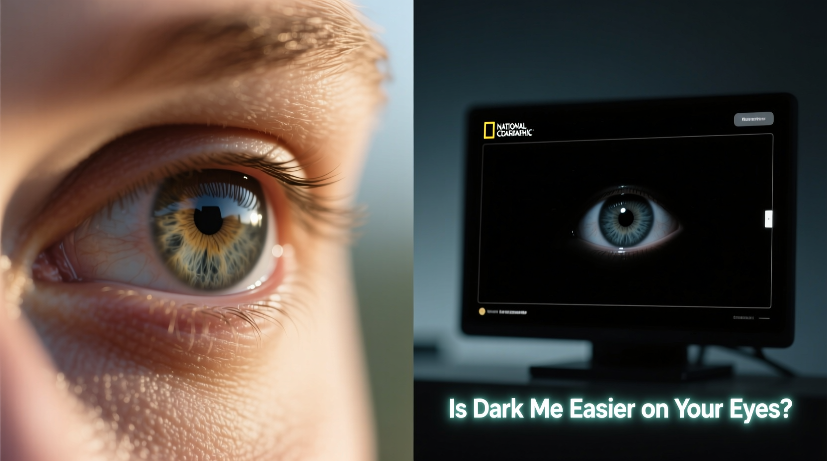
In an era where screens dominate our daily lives—phones, laptops, tablets—we’re constantly searching for ways to reduce fatigue, improve focus, and protect our vision. One of the most widespread digital adjustments in recent years has been the adoption of dark mode: swapping bright white backgrounds for deep blacks and grays. But beyond aesthetics, does dark mode truly benefit eye health? Or is it simply a stylistic trend favored by night owls and design enthusiasts?
The answer isn’t as straightforward as many assume. While some users report immediate relief from eye strain when switching to dark mode, others find it harder to read or even more fatiguing under certain conditions. The reality lies at the intersection of physiology, environment, and individual visual needs.
How Our Eyes Respond to Light and Contrast
To understand whether dark mode helps, we need to examine how human vision works in different lighting environments. The retina contains two primary types of photoreceptor cells: rods and cones. Rods are responsible for low-light vision and motion detection, while cones manage color and detail in brighter settings.
In well-lit environments, our pupils constrict to limit light intake, enhancing clarity and depth perception. In dimmer conditions, they dilate to capture more available light. When you view a bright screen in a dark room, your pupils remain constricted due to the high luminance of the display—even though ambient lighting is low. This mismatch can cause discomfort known as \"visual stress.\"
Dark mode reduces overall screen brightness and emits less blue light, especially when paired with warm color filters. For this reason, many users experience reduced glare and improved comfort during nighttime use. However, contrast plays a crucial role. Poorly implemented dark mode—such as light text on very dark backgrounds without proper anti-aliasing or font smoothing—can increase cognitive load and make reading more difficult.
“While dark mode may reduce screen-induced glare, it doesn't automatically equate to better readability or long-term eye protection.” — Dr. Lena Torres, Optometrist and Vision Researcher
Situational Benefits: When Dark Mode Helps (and When It Doesn’t)
Dark mode isn’t universally beneficial. Its effectiveness depends heavily on context: time of day, ambient lighting, screen type, and user age or visual condition.
Where Dark Mode Excels
- Nighttime device usage: Reading in bed or checking messages after lights out benefits from lower screen luminance.
- OLED/AMOLED displays: These screens turn off individual pixels for black areas, reducing power consumption and emitting no light in dark regions—making true black possible.
- Reduced blue light exposure: Many dark themes come with warmer color palettes, which may support melatonin production and sleep quality.
- User preference with light sensitivity: People with migraines, photophobia, or post-concussion syndrome often report greater comfort with darker interfaces.
Where Dark Mode Can Backfire
- Bright, well-lit rooms: High contrast between a dark screen and bright surroundings forces the eyes to constantly adjust, increasing strain.
- Poor text rendering: Thin fonts or insufficient contrast ratios (e.g., gray text on dark gray) create “halation” effects, making letters appear fuzzy.
- Extended reading tasks: Studies suggest that light-on-dark text requires slightly more effort to process over long periods due to reduced edge definition.
- Aging eyes: Older adults often have reduced contrast sensitivity and may struggle more with dark themes than younger users.
Scientific Evidence: What Research Says About Eye Strain and Dark Mode
Despite its popularity, empirical research on dark mode’s impact on eye health remains limited. A 2021 study published in *Ergonomics* examined reading performance across light and dark interfaces under various lighting conditions. Participants showed no significant difference in eye fatigue but reported higher subjective comfort with dark mode in low-light settings.
Another key factor is accommodation—the eye’s ability to maintain focus. Bright screens cause slight pupil constriction, improving depth of field and focus stability. Dark screens, particularly those with glowing text on black backgrounds, can lead to minor defocusing because the pupil opens wider, potentially reducing sharpness perception.
Additionally, a review by the American Academy of Ophthalmology notes that while screen brightness adjustments help mitigate discomfort, the root cause of digital eye strain—often called computer vision syndrome—isn’t screen color but rather prolonged near-focus activity, infrequent blinking, and poor posture.
In short: dark mode may ease symptoms for some, but it doesn’t address the underlying causes of eye strain. It’s a helpful tool, not a cure-all.
Design Quality Matters More Than Color Scheme
One overlooked truth is that implementation matters far more than the choice between light and dark. A poorly designed dark theme can do more harm than good. Consider these principles of effective interface design:
| Factor | Good Practice | Poor Practice |
|---|---|---|
| Contrast Ratio | Text/background ratio ≥ 4.5:1 (WCAG standard) | Faint gray text on dark gray (#CCCCCC on #333333) |
| Font Weight | Bold or medium-weight fonts for legibility | Thin or hairline fonts in small sizes |
| Background Uniformity | Consistent dark background without gradients | Striped or textured backgrounds behind text |
| Adaptive Transitions | Auto-switch based on ambient light or time of day | Rigid manual toggle with no automation |
For example, Apple’s iOS and macOS systems dynamically adjust contrast and tint in dark mode, preserving readability. Meanwhile, third-party apps that merely invert colors without optimizing typography often degrade the user experience.
Real-World Example: Sarah’s Late-Night Workflow
Sarah, a freelance writer in her early 30s, began experiencing headaches after working on her laptop past midnight. She switched to dark mode across all devices, expecting instant relief. Initially, she felt better—the screen seemed less harsh. But within a week, she noticed new issues: lines of text blurred together, and editing became mentally taxing.
After consulting an occupational therapist specializing in digital ergonomics, she learned her problem wasn’t the lack of dark mode—but its poor execution. Her word processor used a default dark theme with low-contrast gray text and a glossy screen that reflected overhead lighting. By switching to a matte-screen external monitor, enabling a high-contrast dark theme (white text on #1E1E1E), and adding bias lighting behind her desk, her symptoms resolved.
This case illustrates that environmental factors and software quality often outweigh the simple binary of light vs. dark.
Personalization Over Prescription: Finding Your Optimal Setting
Given the variability in human vision and usage patterns, the best approach is customization—not dogma. Here’s a practical checklist to determine whether dark mode suits your needs:
✅ Dark Mode Suitability Checklist
- Do you frequently use devices in dim or dark environments? → Likely beneficial.
- Is your screen OLED or AMOLED? → Dark mode saves battery and improves image quality.
- Can you adjust text size and weight independently of theme? → Essential for comfort.
- Does the app/OS use proper contrast ratios in dark mode? → Check if text feels crisp, not hazy.
- Are you sensitive to bright light or diagnosed with photophobia? → Strong candidate for dark mode.
- Do you spend most of your screen time in daylight or brightly lit offices? → Light mode may be preferable.
If you answered “yes” to the first five, dark mode is likely a smart choice. If the last applies, consider reserving dark mode for evenings only.
Step-by-Step: Optimizing Your Display Settings
- Assess your environment: Note typical lighting levels where you use devices.
- Enable system-level dark mode: Start with OS defaults (iOS, Android, Windows, macOS).
- Test readability: Read a full article or document. Does your focus waver? Do words blur?
- Adjust contrast and font size: Increase text size or switch to a bolder font if needed.
- Add ambient lighting: Place a soft lamp behind your monitor to reduce screen-to-room contrast.
- Use scheduling tools: Set automatic toggles (e.g., dark mode from 8 PM to 7 AM).
- Re-evaluate weekly: Track any changes in eye comfort, headaches, or sleep quality.
Frequently Asked Questions
Does dark mode reduce blue light?
Partially. Dark mode lowers overall screen brightness, which reduces emitted blue light. However, unless combined with a blue light filter (like Night Shift or f.lux), the spectral composition remains similar. True reduction requires software or hardware filtering, not just color inversion.
Can dark mode improve battery life?
Yes—but only on OLED, AMOLED, or microLED displays. These technologies illuminate pixels individually; black pixels are turned off completely. On traditional LCD screens, backlight remains constant regardless of content, so battery savings are negligible.
Is dark mode better for people with astigmatism?
Not necessarily. Some individuals with astigmatism report worse visual clarity in dark mode due to light scattering around bright text (known as halation). Testing both modes under real conditions is the best way to determine personal suitability.
Conclusion: Functionality Over Fashion
Dark mode is neither a universal solution nor a mere aesthetic fad. Its value depends on thoughtful implementation, environmental context, and individual physiology. For nighttime use, OLED devices, and light-sensitive users, it offers tangible benefits. In bright environments or with subpar design, it can exacerbate visual strain.
Rather than defaulting to one mode permanently, embrace adaptability. Use automation features to shift between light and dark based on time of day. Prioritize high-contrast, well-designed interfaces over trendy appearances. And remember: no display setting replaces the fundamentals of eye health—regular breaks, proper ergonomics, and conscious screen habits.


 浙公网安备
33010002000092号
浙公网安备
33010002000092号 浙B2-20120091-4
Comments
No comments yet. Why don't you start the discussion?