
The holiday season invites experimentation—especially when it comes to decorating. Among the most polarizing trends in recent years is the combination of a flocked Christmas tree with matte black ornaments. At first glance, it appears dramatic: snow-dusted branches adorned not with traditional reds and golds, but with sleek, dark accents that seem more suited to a modern art gallery than a festive living room. Yet, while some designers hail it as avant-garde elegance, others warn it borders on visual dissonance. So where does this look truly land? Is it a courageous expression of personal style or an aesthetic error?
To answer that, we need to move beyond surface-level reactions and examine the interplay of texture, contrast, intention, and context. This pairing isn’t inherently right or wrong—it depends on execution, environment, and emotional resonance.
The Visual Language of Flocked Trees
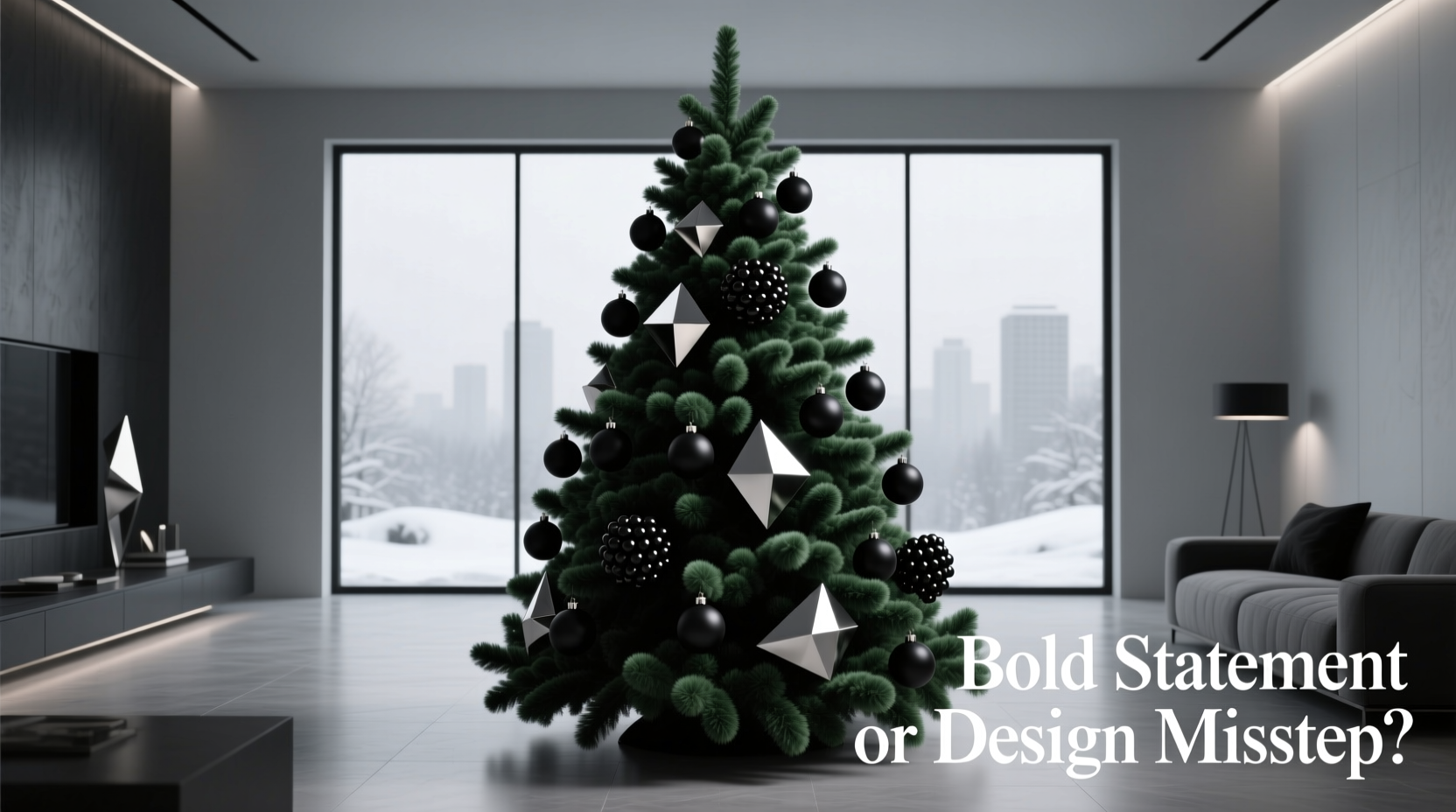
Flocking—a process that coats tree branches in a fine, powdery substance to mimic snow—has long been associated with nostalgia. It evokes vintage department store displays, 1950s suburban Christmases, and cinematic scenes from classic films like Miracle on 34th Street. The effect is soft, diffused, and highly textured. Light bounces gently off the flocking, creating a warm, ambient glow when paired with incandescent bulbs.
But flocking also introduces complexity. Unlike a glossy artificial tree or a natural fir, a flocked tree already carries visual weight. Its surface is busy; every branch reflects light differently. That means ornament selection becomes critical—not just for color harmony, but for tonal balance.
Matte black ornaments, by contrast, absorb light. They don’t sparkle or shimmer. Instead, they create pockets of depth, drawing the eye inward rather than reflecting outward. When placed on a flocked tree, this creates a push-pull effect: one element scatters light, the other swallows it.
Design Principles at Play: Contrast vs. Cohesion
The success of any decor scheme hinges on two competing priorities: contrast for interest, and cohesion for harmony. A flocked tree with matte black ornaments leans heavily into contrast. The extreme difference in tone (white versus near-black) generates immediate visual tension. But whether that tension reads as exciting or jarring depends on how well the rest of the design supports it.
Interior designer Lena Torres explains:
“High contrast isn’t risky—it’s intentional. The danger lies in treating it as a default rather than a decision. If you’re going to pair extremes, you must control everything else: scale, spacing, secondary colors, and lighting.”
In practice, this means avoiding clutter. A flocked tree already has high textural saturation. Adding too many ornaments—even if carefully chosen—can overwhelm. Black ornaments should be used strategically, like punctuation marks in a sentence: deliberate, spaced, and meaningful.
Do’s and Don’ts of High-Contrast Tree Styling
| Action | Recommended? | Reason |
|---|---|---|
| Use only matte black ornaments | No | Creates a flat, heavy appearance; lacks dimension |
| Pair with warm white lights | Yes | Softens contrast and enhances flocking’s glow |
| Add silver or mercury glass accents | Yes | Introduces reflective balance without clashing |
| Hang large black spheres close together | No | Breaks up the tree’s form; looks like damage |
| Include natural elements (pinecones, twine) | Yes | Grounds the look and adds organic warmth |
When It Works: Contextual Success Stories
Consider a real-world example: a mid-century modern home in Portland, Oregon, where interior stylist Mara Chen was tasked with designing a holiday display that honored tradition without feeling dated. The living room features exposed beams, slate flooring, and floor-to-ceiling windows overlooking evergreen forest. The client wanted “cozy but not kitschy.”
Chen chose a narrow, pencil-style flocked tree to fit the space, then curated a palette of charcoal gray, cream, and antique brass. She selected six matte black ornaments—three large globes, two abstract shapes, and a hand-blown raven—to serve as focal points. The rest of the tree was dressed in woven twig stars, dried orange slices, and warm white LED candles. The result? A tree that felt both wintery and contemporary, where the black ornaments didn’t dominate but punctuated.
“We treated the black pieces like sculpture,” Chen said. “They weren’t decorations; they were statements. And because the rest of the tree was so soft and natural, they didn’t feel out of place—they felt inevitable.”
This case underscores a key principle: the flocked tree with black ornaments works best when it’s part of a broader narrative, not a standalone gimmick.
Avoiding Common Pitfalls
Many attempts at this look fail not because the concept is flawed, but because of execution errors. Here are the most frequent missteps:
- Overloading the tree with black – Using more than 20% black ornaments can make the tree appear scorched or diseased, especially under bright lighting.
- Ignoring light temperature – Cool white LEDs enhance the starkness of black-on-white, often tipping it into clinical territory. Warm white bulbs maintain warmth.
- Mismatched scales – Large black balls on delicate flock-covered branches create imbalance. Ornament size should correspond to branch density.
- Forgetting the backdrop – A dark wall behind the tree can merge with the ornaments, eliminating contrast. A light or neutral wall helps define the silhouette.
Step-by-Step Guide: Styling a Flocked Tree with Matte Black Ornaments
If you’re ready to try this look, follow this methodical approach to ensure balance and impact:
- Start with lighting – String warm white mini lights evenly throughout the tree. Focus on inner branches to create depth.
- Assess flock distribution – Ensure the flocking is even. Patchy areas can make black ornaments look misplaced.
- Select 3–6 matte black ornaments – Choose varying shapes (sphere, teardrop, geometric) but consistent finish.
- Place focal ornaments first – Position the largest or most unique piece near the top third of the tree, slightly off-center for dynamism.
- Build around with neutral tones – Add cream, beige, or wood-toned decorations to buffer the contrast.
- Incorporate reflective elements – Include a few mercury glass, brushed brass, or frosted clear ornaments to bounce light.
- Finish with texture – Wrap sections with linen ribbon, tuck in dried botanicals, or hang fabric garlands for tactile contrast.
- Review in natural and evening light – Observe how the tree changes from day to night. Adjust spacing if needed.
Expert Perspectives: What Designers Say
Opinions among professionals are divided—but thoughtfully so. Some embrace the pairing as a sign of evolving holiday aesthetics; others urge caution.
“Black ornaments on a flocked tree can work, but only if you treat the tree like a canvas, not a checklist. It’s about editing, not adding.” — Daniel Park, Interior Architect & Author of *Modern Holiday Design*
“I’ve seen this trend go wrong more than right. The problem isn’t the black—it’s the lack of intention. People see a photo on Pinterest and replicate it without considering their space, scale, or story.” — Simone Reed, Set Designer for Lifestyle Brands
What unites these experts is the emphasis on purpose. As Park notes, “Decorating isn’t decoration. It’s communication. What are you saying with your tree?”
FAQ: Your Questions Answered
Can I use shiny black ornaments instead of matte?
Shiny black ornaments introduce a different dynamic—they reflect light like patent leather or obsidian. While they can work, they risk looking costumey or Halloween-like on a flocked tree. Matte finishes integrate more naturally by maintaining a soft, cohesive texture.
Will this look feel too dark or gloomy?
It can—if not balanced. To prevent a somber mood, ensure at least 60% of your tree includes light-reflective or warm-toned elements. Incorporate flickering candle-style lights or fiber optics to animate the space.
Are there cultural or symbolic concerns with black Christmas ornaments?
In Western traditions, black hasn’t historically been a Christmas color, though it’s gaining acceptance as a modern neutral. In some cultures, black symbolizes mourning, so consider your audience if hosting gatherings. Pairing black with gold or ivory can shift its connotation toward luxury and sophistication.
Checklist: Before You Hang the First Ornament
- ☐ Choose warm white lights (not cool or multicolor)
- ☐ Limit matte black ornaments to 3–6 key pieces
- ☐ Mix in at least two complementary textures (wood, linen, glass)
- ☐ Test the tree’s silhouette against your wall color
- ☐ Step away and view from across the room
- ☐ Ask: Does this feel intentional, or just trendy?
Conclusion: A Statement Worth Making—If Done Right
The pairing of a flocked tree with matte black ornaments is neither a guaranteed triumph nor an automatic misstep. It is, fundamentally, a design gamble—one that pays off only when grounded in awareness, restraint, and authenticity. When executed with care, it can be a powerful expression of individuality: a nod to winter’s duality, where frost meets shadow, and light dances at the edges of darkness.
But when done without thought, it risks becoming a caricature—an attempt to be bold that ends up looking confused. The difference lies not in the ornaments themselves, but in the vision behind them.
If you're drawn to this combination, don’t shy away. But don’t rush in, either. Plan deliberately. Edit ruthlessly. And above all, decorate not for likes or trends, but for meaning. A Christmas tree should reflect who you are—not just what you’ve seen.


 浙公网安备
33010002000092号
浙公网安备
33010002000092号 浙B2-20120091-4
Comments
No comments yet. Why don't you start the discussion?