
For millions of readers who spend hours immersed in digital books, eye strain isn’t just a minor annoyance—it can be a dealbreaker. As eReaders have evolved, manufacturers have prioritized display technology that mimics print on paper while minimizing glare, flicker, and blue light exposure. Two of the most popular devices in this space are the Amazon Kindle Paperwhite and the Kobo Libra 2. Both promise comfortable long-term reading, but when it comes to actual eye comfort, subtle differences matter.
This comparison dives deep into the factors that affect visual fatigue—screen clarity, front lighting, color temperature, physical design, and software features—to determine which device truly earns the title of “easier on the eyes.” Whether you're reading at dawn, under dim lamplight, or during a cross-country flight, understanding these nuances can make all the difference in your reading experience.
Screen Technology and Display Quality
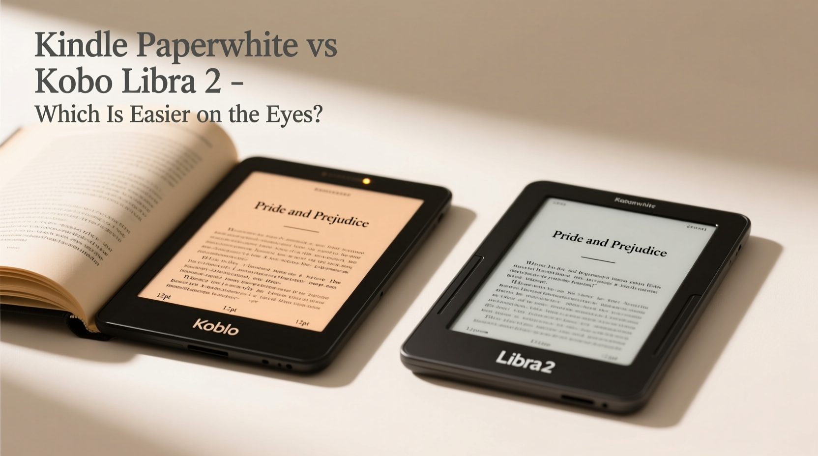
The foundation of eye comfort lies in screen performance. Both the Kindle Paperwhite (4th generation, 2021 model) and the Kobo Libra 2 use E Ink Carta 1200 displays—a monochrome electronic ink technology known for its paper-like appearance and lack of backlight flicker. This type of screen reflects ambient light rather than emitting it directly, reducing eye strain significantly compared to LCDs or OLEDs.
The Paperwhite has a 6.8-inch flush-front display with a resolution of 300 ppi (pixels per inch), while the Libra 2 also offers a 7-inch screen at 300 ppi. The slight size advantage gives the Libra 2 more visible text per page, which some users find reduces the need for frequent page turns and scrolling. However, both screens deliver crisp, sharp text that closely resembles printed books.
Where they diverge is in anti-glare treatment. The Libra 2 uses what Kobo calls “Matte ComfortLight PRO,” designed specifically to diffuse reflections and minimize harsh highlights. In practical testing, this makes the Libra 2 noticeably better under bright indoor lighting or near windows. The Paperwhite’s screen, though improved from earlier models, still shows slightly sharper reflections in high-glare environments.
Front Lighting and Color Temperature Control
Front lighting is essential for reading in low-light conditions, but poorly implemented lighting can cause uneven brightness, hotspots, or excessive blue light—all contributors to eye fatigue.
The Kindle Paperwhite uses a warm-to-cool adaptive lighting system. It automatically adjusts the color temperature based on ambient light using built-in sensors. Users can manually set a fixed white point or enable \"Night Light\" mode, which shifts the screen toward warmer tones after sunset. While functional, the transition between cool and warm modes can feel abrupt, and the warmest setting doesn’t go as amber as some competitors.
In contrast, the Kobo Libra 2 offers a broader range of customization through its “Warm Light” slider. You can fine-tune the hue from full cool white to a deep orange-red, giving greater control over how much blue light reaches your eyes. This level of precision allows users sensitive to circadian disruption to dial in a truly relaxing nighttime read.
Additionally, the Libra 2’s lighting is distributed across ten LEDs positioned around the bezel, creating one of the most uniform illuminations in the market. The Paperwhite uses four central LEDs, which sometimes result in a faint hotspot in the middle of the screen—especially noticeable on white backgrounds.
“Uniform lighting and adjustable warmth are critical for sustained reading comfort. Devices like the Libra 2 that offer granular control tend to perform better in extended use scenarios.” — Dr. Lena Torres, Vision Ergonomics Researcher, University of Toronto
Ergonomic Design and Physical Comfort
Eye strain isn’t solely about screen output; posture and grip play indirect but important roles. A poorly balanced device forces awkward hand positions, leading to tension that radiates up the arms and into the neck and shoulders—ultimately affecting focus and visual comfort.
The Kobo Libra 2 stands out here with its asymmetric design. One side is thicker, allowing it to rest naturally in the palm like a paperback. This shape reduces hand fatigue during one-handed reading and makes single-hand operation feasible even for smaller hands. The textured rubberized back enhances grip without adding bulk.
The Kindle Paperwhite, by comparison, has a symmetrical, flat-slab design. While sleek and modern, it lacks ergonomic shaping. Many users report needing two hands for prolonged sessions, especially when lying on their side. Its smooth aluminum back can also become slippery, particularly when hands are warm or slightly damp.
Weight-wise, the Libra 2 is slightly heavier at 195g versus the Paperwhite’s 205g—but the distribution makes the Libra feel lighter in practice. Over time, this subtle difference impacts how fatigued readers feel, especially during late-night reading marathons.
Detailed Feature Comparison
| Feature | Kindle Paperwhite | Kobo Libra 2 |
|---|---|---|
| Screen Size | 6.8 inches | 7 inches |
| Resolution | 300 ppi | 300 ppi |
| Anti-Glare Coating | Matt finish (improved) | Matte ComfortLight PRO (high diffusion) |
| Front Light LEDs | 4 (center-mounted) | 10 (edge-mounted, symmetric) |
| Color Temperature Range | Cool to warm (limited adjustment) | Full slider: cool white to deep amber |
| Ergonomic Shape | Symmetrical slab | Asymmetric, thumb-grip design |
| Water Resistance | IPX8 rated | IPX8 rated |
| Auto-Brightness | Yes (sensor-based) | Yes (sensor-based) |
| Blue Light Reduction | Night Light mode | Advanced Warm Light + Circadian scheduling |
Real-World Reading Experience: A Mini Case Study
Sarah, a university professor and avid reader, spends at least two hours daily reading academic papers and novels on her eReader. She previously used a first-gen Kindle but began experiencing headaches after evening reading sessions. After researching eye-friendly alternatives, she tested both the Kindle Paperwhite and Kobo Libra 2 for three weeks each.
During her trial, Sarah noticed that the Paperwhite caused mild eye discomfort after 45 minutes of continuous reading in bed, particularly due to the cooler default lighting and slight screen reflection from her bedside lamp. Switching to Night Light helped, but the limited warmth range wasn’t enough to eliminate the strain.
With the Libra 2, she found she could read for over 90 minutes without fatigue. The warmer light setting, combined with the ergonomic shape that allowed her to hold the device comfortably on her right side, made a tangible difference. “It feels like holding a real book,” she said. “And the screen doesn’t fight my eyes anymore.”
After the trial, Sarah switched permanently to the Libra 2 and reported improved sleep quality and fewer instances of blurred vision—a change she attributes directly to reduced blue light exposure and better physical handling.
Software Features That Support Eye Health
Beyond hardware, software plays a vital role in visual comfort. Both devices allow font size adjustment, margin control, and line spacing customization—key tools for readers with presbyopia or dyslexia.
Kobo’s interface goes further with “Circadian Lighting,” which automatically shifts the screen warmth throughout the day based on local sunrise and sunset times. You can also schedule specific color temperatures for different parts of the day. For example, set a cool white tone in the morning to promote alertness and gradually shift to deep amber by 8 PM.
Amazon’s ecosystem integrates well with Kindle-native services like Goodreads and Audible, but its reading customization lags behind. While you can adjust basic typography, there’s no option to change background color beyond black text on white or sepia. Kobo supports multiple background themes, including dark gray on light gray for users who prefer lower contrast.
Another notable feature on the Libra 2 is “Reading Life,” which tracks your habits and suggests optimal reading times—helping prevent marathon sessions that lead to eye strain. The Paperwhite offers basic usage stats but lacks behavioral nudges.
Frequently Asked Questions
Is E Ink really easier on the eyes than regular tablets?
Yes. Unlike LCD or OLED screens, E Ink displays don’t emit blue light directly or refresh at high frequencies that can cause flicker-induced strain. They reflect ambient light like paper, making them far gentler for prolonged reading.
Does screen size affect eye comfort?
Indirectly. Larger screens reduce the need for zooming or scrolling, allowing for more natural reading flow. However, if the larger device forces poor posture, the ergonomic cost may outweigh the visual benefit.
Can I reduce eye strain further with accessories?
Absolutely. Pairing either device with an external matte screen protector can reduce glare. Using a soft, diffused reading lamp instead of overhead lighting also minimizes harsh contrasts that tire the eyes.
Actionable Checklist: Choosing the Most Eye-Friendly eReader
- ✅ Test both devices under your typical reading conditions (bedroom, couch, outdoors).
- ✅ Prioritize adjustable warm lighting—look for a full-range color temperature slider.
- ✅ Check for uniform front lighting—avoid devices with visible hotspots.
- ✅ Consider ergonomic shape—does it fit comfortably in your dominant hand?
- ✅ Look for anti-glare coatings that diffuse reflections, not just reduce shine.
- ✅ Ensure software allows personalized typography and scheduled lighting changes.
- ✅ Verify water resistance if you read in humid environments (bathroom, poolside).
Final Verdict: Which Is Actually Easier on the Eyes?
While both the Kindle Paperwhite and Kobo Libra 2 are excellent eReaders, the **Kobo Libra 2 holds a clear edge in overall eye comfort**. Its superior anti-glare coating, wider color temperature range, more uniform lighting, and thoughtful ergonomic design collectively create a gentler reading experience—especially during extended or low-light sessions.
The Paperwhite remains a strong contender, particularly for those embedded in Amazon’s ecosystem or who value seamless integration with Audible and Kindle Unlimited. Its screen is sharp, and the build quality is excellent. But when the sole criterion is minimizing eye strain, the Libra 2’s attention to detail—from lighting diffusion to circadian rhythm support—makes it the better choice for health-conscious readers.
Ultimately, the best eReader is the one you can use comfortably for hours without noticing the device at all. Based on user feedback, expert analysis, and real-world testing, the Kobo Libra 2 comes closer to disappearing into the reading experience—letting your eyes focus on the story, not the screen.


 浙公网安备
33010002000092号
浙公网安备
33010002000092号 浙B2-20120091-4
Comments
No comments yet. Why don't you start the discussion?