
When it comes to elevating a living space, few accessories deliver impact like cushion covers. They’re the jewelry of interior design—small, expressive, and capable of transforming an entire room’s tone. Among the most debated patterns in this category are leopard print and geometric designs. One evokes wild luxury; the other suggests modern precision. But which actually signals sophistication today, and which risks looking like a relic from 2009? The answer isn’t as simple as trend cycles—it hinges on execution, context, and current design philosophy.
The Psychology of Pattern: Why Print Matters
Patterns do more than decorate—they communicate. In interior design, a pattern can convey boldness, restraint, tradition, or innovation. Leopard print, a subset of animal motifs, has long been associated with opulence, rebellion, and glamour. Think of Dior’s iconic use of leopard in fashion since the 1940s or Joan Crawford’s fur-trimmed gowns. It carries a legacy of unapologetic luxury. Geometric patterns, by contrast, are rooted in order, symmetry, and modernism. From Islamic tilework to Bauhaus minimalism, geometry speaks to control and intentionality.
Today, both prints appear frequently in home decor, but their reception varies dramatically depending on color palette, scale, material, and placement. A poorly executed leopard cover can scream costume; a cluttered geometric set can feel cold or chaotic. The difference between “expensive” and “outdated” often lies in nuance.
Leopard Print: When It Elevates a Room—and When It Dates It
Leopard print succeeds when treated as a statement, not a theme. High-end interiors use it sparingly—a single cushion on a neutral sofa, paired with rich textures like velvet or cashmere. The key is realism and subtlety. Modern luxury leans toward muted tones: taupe-on-taupe, charcoal rosettes on oatmeal, or espresso spots on cream. These variations avoid the cartoonish effect of bright orange and black versions popular in the early 2000s.
Outdated leopard tends to be oversaturated, overly symmetrical, or printed on shiny polyester. These versions mimic fast-fashion aesthetics and lack depth. They also clash easily with contemporary furnishings, especially minimalist or Scandinavian styles. Designers caution against using more than one leopard piece per room unless intentionally curated for maximalist effect.
“Leopard should whisper, not shout. When done right, it adds warmth and wild elegance. When done wrong, it looks like a Halloween costume.” — Lena Moretti, Interior Stylist & Author of *Modern Wild: Nature-Inspired Interiors*
Geometric Patterns: Timeless Structure or Trend Fatigue?
Geometric cushion covers span a broad spectrum—from Moroccan trellises to abstract angular art. Their strength lies in versatility and alignment with architectural lines. A well-chosen geometric design can ground a space, add rhythm, and complement clean-lined furniture. However, the rise of mass-produced boho-chic decor flooded the market with repetitive, low-contrast geometric prints that now feel generic.
What separates an expensive-looking geometric cushion from an outdated one? Three factors: craftsmanship, contrast, and coordination. Luxury geometric designs often feature hand-block printing, embroidery, or tonal layering. They use intentional asymmetry or irregular shapes rather than rigid, computer-generated repeats. Outdated versions rely on flat, high-contrast graphics (think black-and-white zigzags) that were ubiquitous in mid-2010s apartment rentals.
| Feature | Expensive-Looking Geometric | Outdated Geometric |
|---|---|---|
| Color Palette | Tonal, earthy, or jewel-toned | High-contrast (black/white, red/black) |
| Pattern Scale | Varied, medium to large | Small, repeating, uniform |
| Material | Linen, wool, handwoven cotton | Polyester, vinyl-coated fabric |
| Design Origin | Inspired by global crafts or custom art | Mass-market digital print |
| Placement | Curated groupings with texture variation | Mismatched sets covering every seat |
Real-World Example: The Living Room Makeover
Sarah K., a graphic designer in Portland, wanted to refresh her beige sectional without committing to new furniture. She replaced her dated black-and-white chevron cushions with two deep emerald green cushions featuring a subtle leopard motif in moss and sand tones. She added one textured ivory lumbar pillow with a hand-stitched diamond pattern for geometric balance.
The result? Her Instagram post garnered attention from local stylists. Comments praised the “effortless luxe” vibe. What worked: restraint, cohesion, and quality materials. She avoided mixing multiple bold patterns and prioritized tactile richness over visual noise. This approach aligns with current editorial trends seen in *Architectural Digest* and *Casa Vogue*, where layered neutrals dominate, accented by one or two strategic prints.
How to Choose: A Designer Checklist
Use this checklist before purchasing any patterned cushion cover to ensure it reads as upscale and enduring:
- ✅ Is the print scaled appropriately for the furniture? (Large prints on big sofas, smaller ones on accent chairs)
- ✅ Does the color palette complement, not clash with, your walls and upholstery?
- ✅ Is the fabric natural or high-quality synthetic? (Avoid plastic-feeling materials)
- ✅ Is the pattern slightly irregular or handcrafted-looking? (Adds authenticity)
- ✅ Are you using no more than two patterned cushions in the same area?
- ✅ Do the patterns vary in type? (e.g., one organic like leopard, one structured like geometric)
- ✅ Can the cushion stand alone as a design object, even without the rest of the decor?
Step-by-Step Guide to Curating High-End Cushion Pairings
- Assess your base palette. Identify dominant colors in your sofa, rug, and walls.
- Select a hero pattern. Choose either leopard or geometric as the focal point—never both as equals.
- Add a secondary texture. Introduce a solid-color cushion in bouclé, corduroy, or wool for depth.
- Introduce contrast through shape. Combine square and lumbar pillows for visual interest.
- Limit total cushions. Use 3 max for a standard sofa: one patterned, two textured solids.
- Touch test. Run your hand over the fabric—luxury feels substantial, not slippery or thin.
- Step back. View the arrangement from across the room. Does it feel balanced, not busy?
Frequently Asked Questions
Can I mix leopard and geometric patterns in the same room?
Yes, but with caution. Use them in separate zones—for example, leopard in the reading nook, geometric near the entertainment unit. If combining on the same sofa, ensure they share a common color and differ significantly in scale and texture. Never pair two loud versions.
Is leopard print still in style in 2024?
Yes—but in evolved form. Muted, tonal leopard prints in natural fibers are trending in high-end interiors. Bright, cartoonish versions are out. Think “quiet luxury” rather than “logo mania.”
Are geometric cushions considered boring?
Only when poorly chosen. Geometric patterns rooted in cultural heritage (like Moroccan zellige or Japanese seigaiha) or custom-designed pieces remain fresh. Avoid mass-produced, symmetrical prints that lack soul.
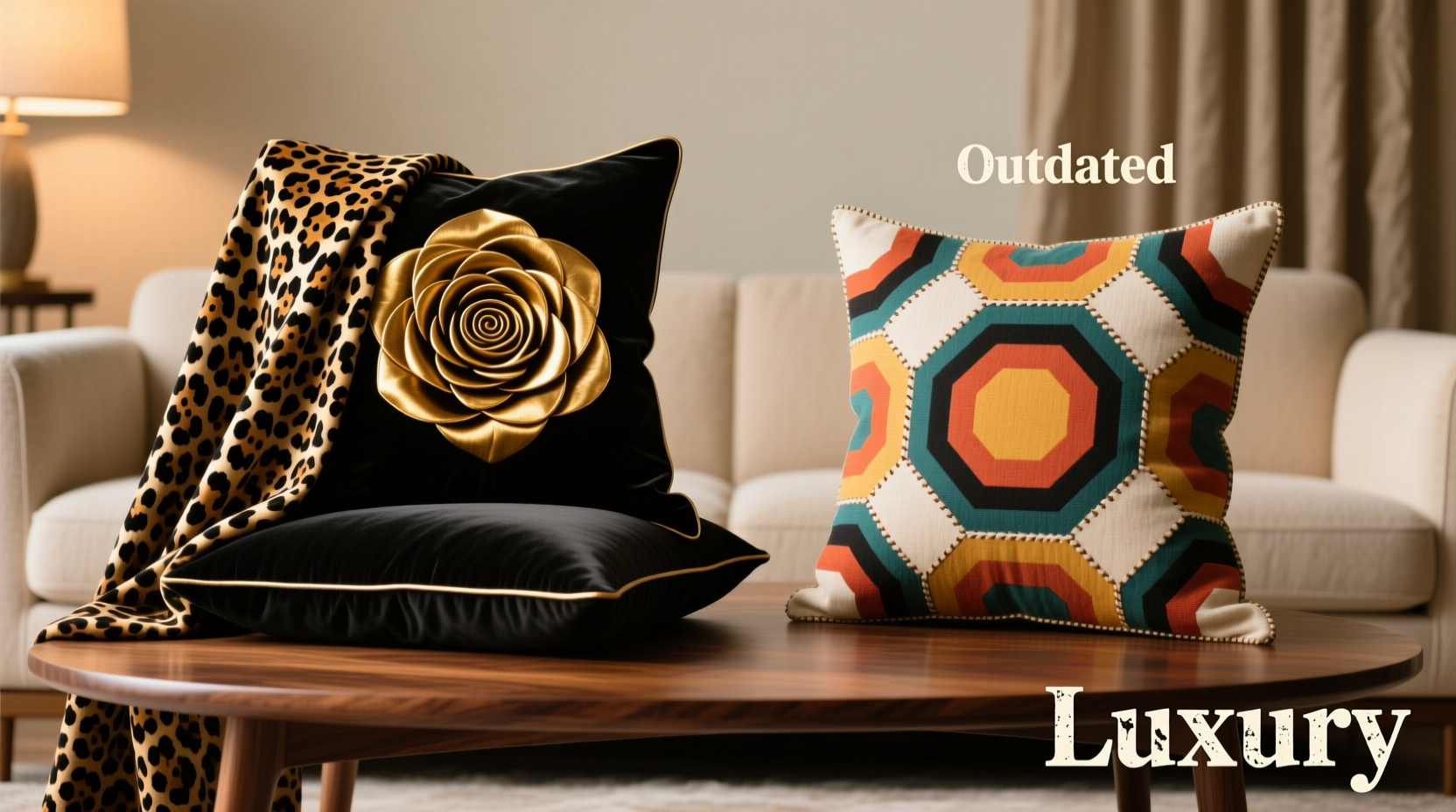
Final Verdict: Which Scream Expensive, Which Screams Outdated?
Ultimately, neither leopard nor geometric inherently screams expensive or outdated—it’s all in the execution. That said, as of 2024:
- Leopard print, when rendered in soft, realistic tones on premium fabric, currently screams expensive. It’s embraced by designers for its warmth and timeless edge.
- Generic geometric prints—especially small-scale, high-contrast black-and-white patterns—now scream outdated, reminiscent of transient rental decor and fast-furniture catalogs.
The takeaway is not to abandon geometry but to elevate it. Seek artisan-made pieces, embrace organic asymmetry, and prioritize material quality. Likewise, approach leopard with respect—use it as a highlight, not a default.
Conclusion: Design With Intention
Great interiors aren’t built on trends alone—they’re shaped by thoughtful choices. Whether you lean toward the wild allure of leopard or the structured calm of geometry, what matters most is curation. Choose pieces that feel authentic, tactile, and purposeful. Invest in fewer, better-made cushions that last years, not seasons. In a world of disposable decor, true luxury lies in longevity, not loudness.


 浙公网安备
33010002000092号
浙公网安备
33010002000092号 浙B2-20120091-4
Comments
No comments yet. Why don't you start the discussion?