
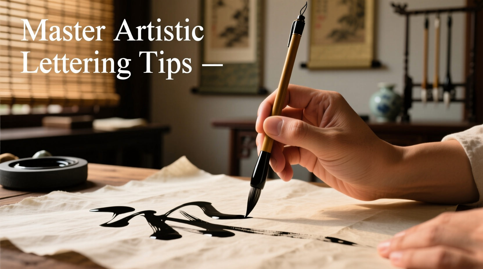
Artistic lettering is more than writing—it’s an expressive craft that blends rhythm, pressure, and intention into every stroke. Whether you're creating wedding invitations, journal spreads, or standalone art pieces, the foundation lies in mastering your tool: the calligraphy pen. While modern tools have made calligraphy more accessible, true elegance comes from disciplined technique and nuanced understanding of how the pen interacts with paper. This guide breaks down the essential principles, habits, and advanced practices that elevate amateur strokes into professional-quality script.
Understanding Your Calligraphy Pen
Before producing graceful flourishes, it's crucial to understand the anatomy and mechanics of your calligraphy pen. Most dip pens—favored for their responsiveness—consist of a nib, holder, and ink reservoir. Nibs vary in flexibility, tip width, and spring tension, directly affecting line variation. For example, a flexible nib like the Nikko G produces dramatic thick-and-thin contrasts, ideal for pointed pen scripts such as Copperplate or Spencerian.
Fountain pens with italic or stub nibs offer convenience and consistent ink flow but less dynamic range. Brush pens, though not traditional, are excellent for faux calligraphy and modern styles due to their soft, responsive tips.
Mastering Pressure and Angle Control
The hallmark of skilled calligraphy is controlled line variation. Thick downstrokes and hairline upstrokes are achieved through precise modulation of pressure and consistent pen angle.
Hold the pen at a 45-degree angle to the baseline for most formal scripts. This ensures even ink distribution across the nib tines. Too steep an angle can cause one tine to dig in; too shallow may result in uneven splitting of ink.
Apply firm, deliberate pressure during downward strokes. The tines should spread slightly, allowing more ink to flow and create the desired thick line. Release pressure completely on upstrokes and connectors to maintain delicate hairlines.
“Precision in calligraphy isn’t about perfection—it’s about consistency. A steady hand and repeatable motion build authentic style.” — Lila Chen, Master Scribe & Lettering Instructor
Step-by-Step Guide to Developing Muscle Memory
Consistency doesn't come overnight. It develops through structured drills that train both hand and mind. Follow this daily practice routine to build reliable muscle memory:
- Warm up with basic strokes (5–10 minutes): Focus on vertical shades, compound curves, and ascending loops. Repeat each stroke 10 times with attention to angle and pressure.
- Practice on lined paper: Use guidelines with a 5mm x-height and slant lines at 55 degrees. These visual cues keep letters aligned and uniform.
- Trace exemplars: Trace over master alphabets to internalize stroke order and proportions before freehand work.
- Write full alphabets slowly: Prioritize form over speed. Aim for identical ovals in 'o', 'e', and 'c'.
- Review and correct: Circle inconsistencies and re-practice problem letters immediately.
Practice for 15–20 minutes daily rather than marathon sessions once a week. Short, focused repetition builds neural pathways faster.
Choosing the Right Materials for Precision
Your tools define your results. Even flawless technique will falter with poor materials. Select supplies that complement your goals.
| Material | Recommended Choice | Avoid |
|---|---|---|
| Paper | Tomoe River, Rhodia, or HP Premium 32lb | Textured watercolor paper, thin notebook sheets |
| Ink | Schneider Blue Black, Higgins Eternal, or Sumi ink | India ink (can clog nibs), homemade inks |
| Nib | Nikko G, Brause EF66, Leonardt Principal | Rusty or bent nibs, overly stiff models |
| Pen Holder | Oblique (for right-handers) or straight (for left-handers) | Short plastic holders with poor grip |
Test new combinations on scrap paper first. Some nibs feather on certain papers, while others skip if the ink is too viscous.
Developing Personal Style with Intentional Flourishes
Once foundational skills are secure, begin exploring stylistic expression. Flourishes—ornamental extensions of ascenders and descenders—add drama and individuality. But they must enhance, not overwhelm, the text.
Start by adding subtle entry and exit swashes to capital letters. Keep them proportional: no longer than two x-heights. Practice flourished 'L', 'T', and 'Y'—they offer natural extension points.
Use flourishes to guide the reader’s eye. In a quote layout, let the final word trail upward, suggesting uplift. For formal pieces, limit flourishes to initials or drop caps.
Mini Case Study: From Clumsy to Confident Script
Sophie, a graphic designer, began learning calligraphy to enhance her branding projects. Her early attempts were shaky—uneven baselines, blotchy ink, and inconsistent spacing. She committed to 20 minutes of drill practice five days a week, focusing solely on compound curves and oval shapes. After three weeks, she transitioned to lowercase alphabets using a Nikko G nib and Rhodia pad. By week six, she was writing full words with even spacing and confident contrast. Her breakthrough came when she started using a lightbox to trace vintage exemplars, which helped her internalize proportions. Today, she offers custom lettering services and credits her progress to disciplined fundamentals over flashy shortcuts.
Essential Checklist for Every Calligraphy Session
- ✅ Check nib alignment in the holder—no wobbling
- ✅ Secure paper with tape to prevent shifting
- ✅ Position paper at a comfortable tilt (30–45 degrees for right-handers)
- ✅ Load nib properly—wipe excess ink on bottle neck
- ✅ Maintain relaxed grip—tension causes shaky lines
- ✅ Work under bright, natural-feeling light to see ink flow clearly
- ✅ Clean nib and holder post-session to extend tool life
Common Pitfalls and How to Fix Them
Even experienced artists face recurring issues. Recognizing and correcting these quickly keeps practice productive.
- Nib catches or skips: Likely due to dried ink or burrs on the tip. Soak in warm water and gently wipe with a microfiber cloth. Test on scrap paper.
- Inconsistent stroke thickness: Often caused by variable pressure or incorrect pen angle. Recheck your grip and return to basic strokes.
- Ink bleeding or feathering: Paper is too absorbent. Switch to smoother, fountain-pen-friendly stock.
- Shaky lines: Could indicate tension in the hand. Try writing larger forms or switch to a weighted pen holder for stability.
FAQ
How do I prevent my ink from drying out during long sessions?
Cover your ink bottle when not in use and dip frequently. If using a well or palette, add a few drops of water to maintain fluidity. Avoid leaving the nib in ink for extended periods.
Can left-handed people do traditional calligraphy effectively?
Absolutely. Left-handers often benefit from a straight pen holder and rotating the paper clockwise. Use quick-drying inks and consider a slanted writing surface to minimize smudging.
Why does my ink pool at the start of each stroke?
This usually happens when too much ink is loaded. Wipe the nib lightly against the bottle rim after dipping. Also, allow a moment for ink to settle before touching the paper.
Conclusion
Mastery in artistic lettering emerges not from talent alone, but from attentive practice, thoughtful tool selection, and a commitment to refinement. Each stroke with your calligraphy pen is a dialogue between intention and execution. With consistent attention to pressure, angle, and rhythm, you’ll develop not just legible script, but a personal voice expressed through line and form. The elegance of calligraphy lies not in flawlessness, but in the harmony of discipline and creativity.


 浙公网安备
33010002000092号
浙公网安备
33010002000092号 浙B2-20120091-4
Comments
No comments yet. Why don't you start the discussion?