
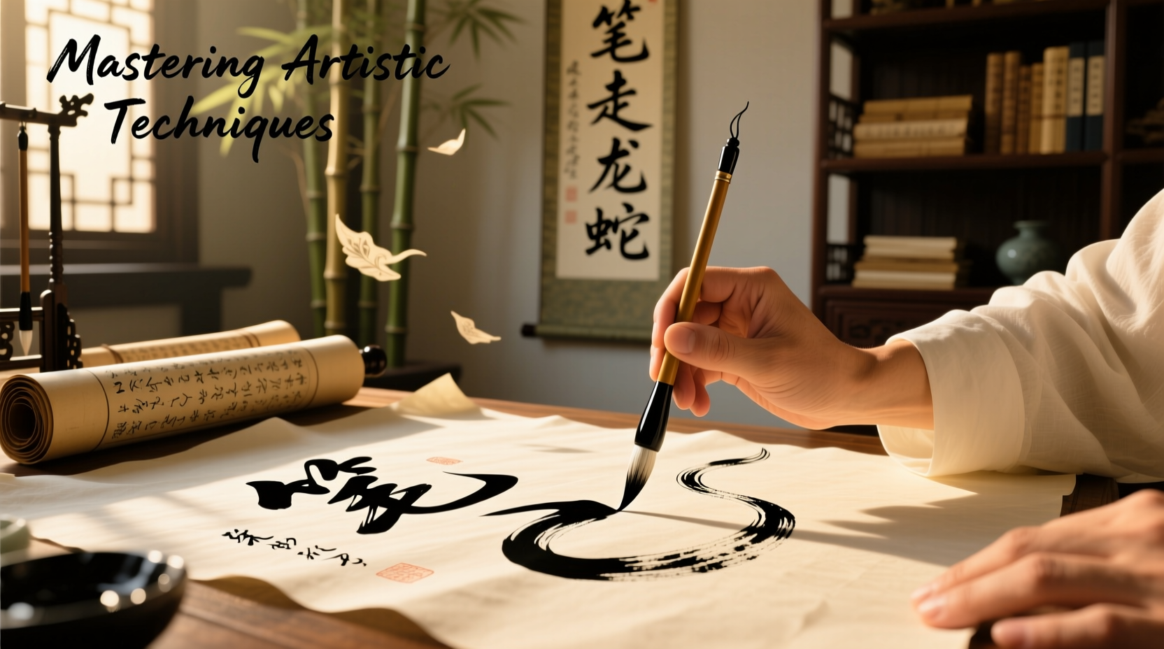
Calligraphy is more than just beautiful handwriting—it’s an expressive art form that blends precision, rhythm, and personal style. With the right tools and techniques, a simple calligraphy pen can transform blank paper into visual poetry. Whether you're drawn to elegant wedding invitations, meditative brushwork, or modern lettering designs, mastering this craft begins with understanding its core principles. This guide walks you through the essential skills, practical exercises, and creative strategies to help you produce truly stunning artwork using a calligraphy pen.
Understanding Calligraphy Pens and Tools
Before creating art, it's crucial to understand your instrument. Calligraphy pens come in several types—dip pens, fountain pens, brush pens, and marker-style pens—each offering distinct textures and levels of control. Dip pens, for example, allow maximum variation in line width but require frequent ink refills. Brush pens are beginner-friendly and ideal for fluid strokes, while fountain pens offer consistent ink flow with minimal maintenance.
The nib determines stroke contrast. A flexible nib creates dramatic thick-and-thin lines based on pressure, while a stub nib offers subtle variation. Ink choice also matters: waterproof pigmented inks work well for archival pieces, whereas water-based inks blend beautifully in layered artworks.
Foundational Techniques for Expressive Lines
Stunning calligraphy art relies on mastery of basic strokes. Begin by practicing downstrokes (applying pressure) and upstrokes (light touch). These movements build muscle memory and control. Use guidelines at a 55-degree angle for traditional scripts like Copperplate, or experiment freely for modern styles.
Angle consistency defines character shape. Hold your pen at a steady incline—typically between 30° and 55°—to maintain uniformity across letters. Practice drills such as ovals, compound curves, and ascending/descending lines to develop fluency.
“Control isn’t about rigidity—it’s about intentional movement. The best calligraphers make precision look effortless.” — Lena Torres, Master Penman & Calligraphy Instructor
Step-by-Step: Building Letterforms from Basic Strokes
- Start with a light pencil guideline sheet at your chosen slant.
- Practice isolated strokes: thick downstrokes, hairline upstrokes, entry and exit flourishes.
- Combine strokes into lowercase letters, focusing on 'i', 'u', 'n', and 'm' first.
- Move to uppercase forms, emphasizing balance and proportion.
- Link letters smoothly, adjusting spacing so each word breathes evenly.
- Add decorative elements like serifs, swashes, or shaded strokes for artistic flair.
Selecting the Right Paper and Layout
Paper quality directly impacts your results. Smooth, bleed-resistant papers like Rhodia, Clairefontaine, or Canson Marker Paper prevent feathering and allow crisp lines. For larger compositions, consider layout planning: sketch a rough grid to position text, borders, and illustrations harmoniously.
| Paper Type | Best For | Avoid If |
|---|---|---|
| Smooth Bristol | Detailed script work | You need texture for shading |
| Watercolor Paper (300gsm) | Mixed media with ink washes | You want ultra-fine lines |
| Tracing Paper | Transferring designs | Creating final display pieces |
| Layflat Sketchbook | Practice and experimentation | Using wet inks that may bleed |
From Script to Art: Elevating Calligraphy Beyond Writing
True mastery emerges when calligraphy becomes part of a broader visual language. Consider integrating your lettering into illustrated quotes, abstract compositions, or typographic portraits. Use negative space creatively—let the emptiness around words speak as loudly as the ink itself.
One powerful method is “word painting,” where the form mirrors the meaning. For instance, write \"rise\" with ascending letters that grow taller and bolder, or render \"whisper\" in delicate, fading strokes. This transforms text into emotional expression.
Mini Case Study: Creating a Quote Illustration
Rina, a graphic designer learning calligraphy, wanted to illustrate Rumi’s line: “You were born with wings. Why prefer to crawl?” She began by sketching feather motifs framing the phrase. Using a dual-brush pen, she rendered “born” and “wings” in bold, sweeping strokes, adding ink-blended gradients to mimic flight. The word “crawl” was written low and narrow, almost buried beneath the others. After scanning, she enhanced shadows digitally, turning her piece into a shareable social media artwork that resonated with thousands.
This project succeeded because Rina combined technical skill with thematic intention—her choices reinforced the message, making the artwork memorable.
Creative Checklist: Steps to Build a Stunning Calligraphy Piece
- Choose a meaningful quote or phrase
- Select a pen and paper suited to your desired effect
- Sketch layout lightly in pencil, including margins and focal points
- Practice letterforms on scrap paper until confident
- Ink the final piece slowly, focusing on stroke consistency
- Add embellishments: borders, flourishes, or small illustrations
- Let dry completely before erasing guidelines
- Evaluate under natural light; touch up if needed
Common Challenges and How to Overcome Them
Even experienced artists face hurdles. Ink blobs often result from holding the nib too long in one spot—lift and reposition instead of pressing harder. Inconsistent spacing? Use measured grids during practice. If your hand tires quickly, check your grip: hold the pen loosely near the end for better control and reduced strain.
For those struggling with confidence, set small goals. Commit to one daily flourish or letter variation. Progress compounds over time.
Frequently Asked Questions
Can I use a regular pen for calligraphy practice?
While possible, standard pens lack the flexibility and ink flow needed for authentic stroke contrast. Invest in an affordable starter kit with a fountain pen or brush pen designed for calligraphy to see real improvement.
How long does it take to master artistic calligraphy?
Basic legibility can be achieved in 4–6 weeks with daily 20-minute practice. Mastery—where technique feels intuitive and style emerges distinctly—typically takes 6 months to 2 years of consistent work.
Is digital calligraphy considered real art?
Absolutely. Digital tools like tablets and styluses replicate traditional dynamics and open new creative possibilities. Many professional calligraphers now blend hand-inked originals with digital enhancements for print or animation.
Conclusion: Turn Discipline into Beauty
Creating stunning art with a calligraphy pen isn’t about perfection—it’s about presence. Each stroke carries the weight of your attention, the grace of your motion, and the uniqueness of your voice. By grounding yourself in technique, experimenting boldly, and expressing meaningfully, you transform a simple writing tool into an instrument of beauty.


 浙公网安备
33010002000092号
浙公网安备
33010002000092号 浙B2-20120091-4
Comments
No comments yet. Why don't you start the discussion?