
Data is only as powerful as its presentation. A well-designed bar graph can transform complex spreadsheets into intuitive visuals that communicate trends, comparisons, and insights at a glance. Google Sheets offers accessible, cloud-based tools to build professional-quality charts—no coding or design experience required. With the right approach, anyone can turn raw numbers into compelling stories.
Whether you're analyzing sales performance, tracking survey results, or comparing monthly expenses, bar graphs are among the most effective ways to visualize categorical data. This guide walks through every stage of creating and refining bar graphs in Google Sheets, from organizing your dataset to customizing colors and labels for maximum clarity.
Why Bar Graphs Work: The Psychology of Clarity
Bar graphs excel because they align with how humans process information. Our brains quickly interpret length and height as measures of quantity. When bars are aligned along a common baseline, comparisons become effortless—even across dozens of categories.
According to Edward Tufte, a pioneer in data visualization, “Graphical excellence consists of complex ideas communicated with clarity, precision, and efficiency.” A properly constructed bar graph achieves exactly that. It removes noise, highlights differences, and supports fast decision-making.
“Simple charts like bar graphs are not just beginner tools—they’re foundational instruments of insight.” — Dr. Naomi Karten, Data Communication Specialist
Google Sheets makes it easy to apply these principles without specialized software. By following best practices in structure and formatting, you can produce visuals suitable for executive reports, classroom instruction, or public dashboards.
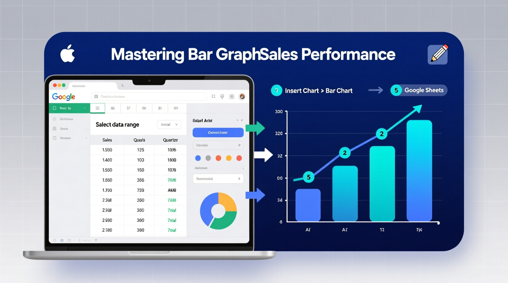
Step-by-Step: Creating Your First Bar Graph
Building a bar graph in Google Sheets follows a logical sequence. Follow these steps to generate a clean, accurate chart from any dataset.
- Prepare Your Data: Organize your information in two or more columns. The first should contain category labels (e.g., product names, months, regions), and adjacent columns should hold numerical values (e.g., units sold, revenue).
- Select the Data Range: Click and drag to highlight the cells you want to include. Include headers to ensure proper labeling.
- Insert the Chart: Go to the top menu and click Insert > Chart. Google Sheets will automatically suggest a chart type based on your data.
- Choose Bar Graph Type: In the Chart Editor panel (on the right), under \"Chart type,\" scroll to the \"Bar chart\" section. Select either vertical (column) or horizontal orientation depending on label length and readability.
- Customize the Axes: Under the \"Customize\" tab, adjust axis titles, scale ranges, and gridlines to improve legibility.
- Add Data Labels (Optional): Enable data labels if precise values are important for interpretation.
- Review and Refine: Double-check that all categories are correctly represented and no outliers distort the view.
Optimizing Design for Maximum Impact
A functional chart isn’t enough—you need one that communicates instantly. Poor color choices, cluttered labels, or inconsistent scales can undermine even accurate data.
Consider these optimization strategies:
- Simplify titles and labels: Use plain language. Replace “Q3 FY2024 Revenue Output” with “Third Quarter Sales.”
- Limit colors to three or fewer: Use one dominant color for primary data and contrasting shades only to highlight key categories.
- Sort bars logically: Arrange categories in ascending or descending order unless chronological sequence matters.
- Avoid 3D effects and shadows: These add visual weight without informational value and can distort perception.
- Use consistent number formatting: Apply currency symbols, comma separators, or percentage signs uniformly across all values.
Do’s and Don’ts of Bar Graph Formatting
| Do | Don't |
|---|---|
| Start the y-axis at zero to preserve proportionality | Truncate the y-axis to exaggerate minor differences |
| Use horizontal bars for long category names | Rotate text vertically—it reduces readability |
| Include source attribution below the chart | Omit context about where the data came from |
| Group related series using clustered bar charts | Overload the chart with more than four data series |
Real-World Example: Visualizing Monthly Website Traffic
Sarah manages digital marketing for a small e-commerce brand. Each month, she collects traffic data broken down by channel: organic search, paid ads, social media, email, and referrals. Previously, she shared this in a table during team meetings—but engagement was low.
She decided to switch to a horizontal bar graph in Google Sheets. After entering six months of data with clear headers, she selected the range and inserted a stacked bar chart to show both total volume and composition per month.
By sorting months chronologically and applying brand-consistent colors, her presentation became instantly clearer. Team members quickly spotted that social media growth had overtaken paid ads in May. This led to a strategic shift in budget allocation—driven entirely by improved data visibility.
The change wasn’t in the data itself, but in how it was seen.
Advanced Tips for Polished Results
Once comfortable with basics, explore these features to enhance professionalism and functionality:
- Dynamic Charts with Named Ranges: Define named ranges so your chart updates automatically when new rows are added.
- Conditional Formatting + Bars: Combine cell-based data bars with standalone charts for layered analysis.
- Link Charts to Slides or Docs: Embed live Google Sheets charts into Google Slides or Docs. They update whenever the source data changes.
- Use Sparklines for Mini-Trends: Insert tiny inline charts (
=SPARKLINE()) next to summary rows to show micro-trends within tables.
Checklist: Building an Effective Bar Graph
- ✅ Data is clean, labeled, and free of empty rows
- ✅ Categories are distinct and non-overlapping
- ✅ Values are numerical and consistently formatted
- ✅ Chart type matches the goal (comparison vs. trend)
- ✅ Axis starts at zero unless there's a strong reason not to
- ✅ Colors are accessible (avoid red-green combinations)
- ✅ Title clearly states what the chart shows
- ✅ Source and date are noted beneath the chart
Frequently Asked Questions
Can I make a bar graph from filtered data?
Yes. Apply filters to your sheet first, then select only visible cells before inserting the chart. Use Ctrl+Shift+L (or Cmd+Shift+L on Mac) to enable filtering, then select data and insert the chart while filtered.
How do I change the color of individual bars?
In the Chart Editor, go to \"Customize\" > \"Series.\" Scroll down to find \"Apply to\" and select a specific data point. Then choose a custom color. Repeat for each bar you want to differentiate.
Why does my bar graph look distorted?
This often happens when the y-axis doesn’t start at zero or when combining vastly different scales in one chart. Ensure proportional representation and avoid manipulating axes to mislead viewers—even unintentionally.
Conclusion: Turn Numbers Into Narratives
Mastering bar graphs in Google Sheets isn’t just about technical skill—it’s about storytelling with integrity. Every choice, from data arrangement to color selection, shapes how others understand your message. With deliberate practice, you can turn static spreadsheets into dynamic tools for insight and influence.
The barrier to entry has never been lower. No expensive software, no steep learning curve. Just organize your data thoughtfully, follow proven design principles, and let the bars speak for themselves.


 浙公网安备
33010002000092号
浙公网安备
33010002000092号 浙B2-20120091-4
Comments
No comments yet. Why don't you start the discussion?