
Data visualization is only as effective as its ability to reveal patterns, outliers, and distributions at a glance. Among the most insightful yet underutilized tools in Excel is the box and whisker plot—also known as a box plot. It provides a compact, statistical summary of data spread, central tendency, and potential anomalies. When used correctly, it transforms raw numbers into actionable insight. This guide walks through everything you need to know to build, interpret, and leverage box plots in real-world scenarios.
Understanding the Anatomy of a Box and Whisker Plot
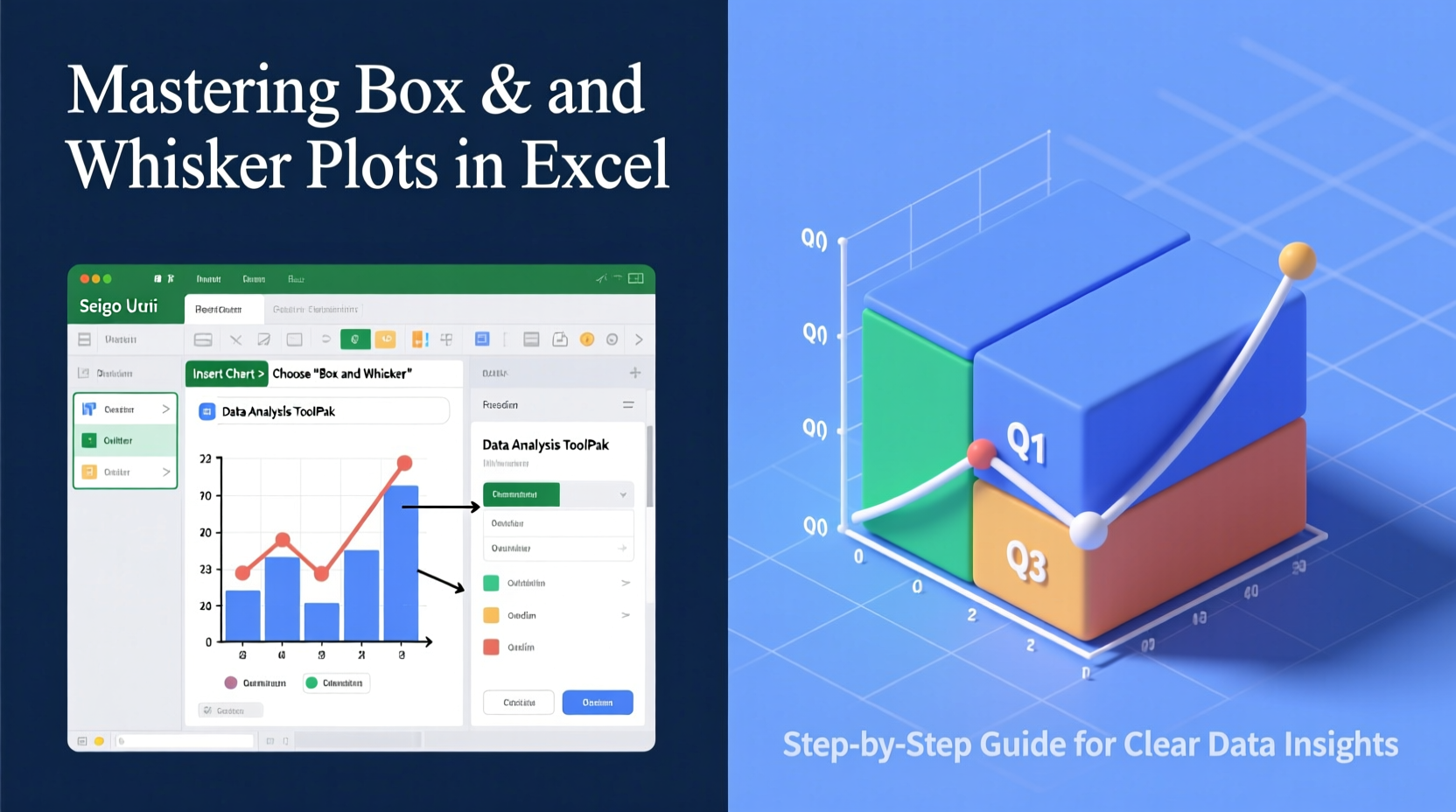
A box and whisker plot displays the five-number summary of a dataset: minimum, first quartile (Q1), median (Q2), third quartile (Q3), and maximum. These values are arranged into a compact visual format that highlights variability and skewness.
- Box: Represents the interquartile range (IQR), spanning from Q1 to Q3—the middle 50% of the data.
- Median line: A line inside the box showing the median value (Q2).
- Whiskers: Lines extending from the box to the minimum and maximum values within 1.5 × IQR.
- Outliers: Individual points beyond the whiskers, indicating extreme values.
This structure makes it easy to compare multiple datasets side by side, assess symmetry, and detect unusual observations without complex calculations.
Step-by-Step Guide to Creating a Box Plot in Excel
Starting with Excel 2016, Microsoft introduced native support for box and whisker charts, simplifying what once required manual workarounds. Follow this sequence to generate one efficiently.
- Prepare Your Data: Organize your numerical data in columns or rows, with each group in a separate column if comparing categories (e.g., sales by region).
- Select the Data Range: Highlight the cells containing your values, including headers if applicable.
- Insert Chart: Go to the “Insert” tab → “Insert Statistic Chart” → Choose “Box and Whisker.”
- Customize the Chart: Right-click on the plot to adjust outlier display, show mean markers, or change gap width between boxes.
- Add Titles and Labels: Use the Chart Elements button (+) to add axis titles, data labels, or legends where needed.
Excel automatically calculates quartiles using the exclusive method (similar to PERCENTILE.EXC). Be aware that older versions may require building the plot manually via stacked bar charts and error bars—a time-consuming process prone to error.
Interpreting Box Plots: What the Shapes Reveal
The true power of a box plot lies not just in creation but in interpretation. Small details in shape can signal important trends.
| Visual Feature | What It Indicates |
|---|---|
| Long box | High variability in the middle 50% of data |
| Short box | Data is tightly clustered around the median |
| Median off-center | Skewed distribution (closer to Q1 = right-skewed; closer to Q3 = left-skewed) |
| Long upper whisker | Potential positive skew or high-value outliers |
| Many outliers above | Extreme high values possibly requiring investigation |
For example, a box plot of customer wait times with a long upper whisker and several outliers suggests inconsistent service delivery during peak hours. This visual cue prompts deeper analysis into staffing levels or system bottlenecks.
“Box plots are like X-rays for your data—they don’t tell the whole story, but they highlight where you should look closer.” — Dr. Lena Patel, Data Visualization Researcher, MIT Sloan
Real Example: Comparing Product Performance Across Regions
A national retail company wanted to evaluate quarterly sales performance across four regions: Northeast, Southeast, Midwest, and West. Instead of reviewing spreadsheets, analysts created a single box plot comparing monthly revenue per store.
The results revealed something surprising: while average revenues were similar, the West region showed a much wider IQR and multiple high-value outliers. Further inquiry found that two flagship stores were driving disproportionate growth, masking underperformance in smaller locations.
In contrast, the Midwest had a short box and centered median, indicating consistent, predictable performance. Armed with this clarity, leadership adjusted resource allocation and launched targeted improvement programs in lagging areas.
Without the box plot, such nuanced differences might have remained hidden behind aggregated averages.
Best Practices and Common Pitfalls
To ensure accuracy and impact, follow these guidelines when working with box plots in Excel.
Do’s
- Use consistent scales when comparing multiple box plots.
- Display sample sizes if available, especially when groups vary in size.
- Combine with other visuals (like histograms) for fuller context.
- Enable mean markers in Excel to see how the average compares to the median.
Don’ts
- Assume symmetry just because the box looks balanced.
- Ignore outliers without investigating their cause.
- Use box plots for categorical or nominal data.
- Rely solely on Excel’s default settings—always verify quartile calculation methods.
Frequently Asked Questions
How does Excel calculate quartiles in a box plot?
Excel uses the PERCENTILE.EXC function by default, which excludes median values when calculating Q1 and Q3 in odd-numbered datasets. This differs slightly from inclusive methods (PERCENTILE.INC), so be cautious when comparing results across platforms.
Can I create horizontal box plots in Excel?
Not natively. Excel only supports vertical orientation. However, you can simulate a horizontal version by converting the chart to an image and rotating it externally, though this limits interactivity.
Why aren’t my outliers showing up?
Check your chart options. Right-click the plot → Format Data Series → ensure “Show inner points” or “Show outlier points” is enabled. Also confirm that your data actually contains values beyond 1.5 × IQR from the quartiles.
Conclusion: Turn Data Into Decisions
Box and whisker plots bridge the gap between raw statistics and strategic understanding. By mastering their creation and interpretation in Excel, you gain a reliable tool for spotting trends, questioning assumptions, and communicating findings clearly. Whether analyzing test scores, financial metrics, or operational KPIs, the box plot helps you move beyond averages and uncover the full story behind your numbers.


 浙公网安备
33010002000092号
浙公网安备
33010002000092号 浙B2-20120091-4
Comments
No comments yet. Why don't you start the discussion?