
Brown is one of the most versatile and widely used colors across art, design, fashion, and interior spaces. Despite its ubiquity, achieving the ideal brown—rich, balanced, and context-appropriate—can be surprisingly elusive. Many artists and designers struggle with muddy results, unintended warmth, or lack of depth. The truth is, mastering brown isn’t about guesswork; it’s about understanding color theory, precision in mixing, and knowing how environmental and material factors influence perception. This guide breaks down the science and artistry behind crafting the perfect brown, offering a repeatable process for consistent results.
The Science Behind Brown
Brown is not a spectral color found in the rainbow; it’s a low-saturation, dark orange or red-yellow mixture that our eyes interpret as earthy and neutral. In pigment-based media like paint, brown emerges when complementary colors are mixed—especially red and green, blue and orange, or yellow and purple. Because brown sits at the intersection of warmth and neutrality, small adjustments in hue, value, and chroma can shift its character dramatically.
In subtractive color systems (used in painting, printing, and textiles), brown forms when light wavelengths are absorbed rather than reflected. The more pigments you mix, the less light reflects back—leading to darker, desaturated tones. However, over-mixing often leads to \"mud,\" a common pitfall. The key is balance: use limited components, control saturation, and adjust gradually.
“Brown is never just a color—it’s a mood, a texture, a temperature. The best browns feel alive because they’re layered, not flat.” — Julian Hart, Color Theory Instructor at the Royal College of Art
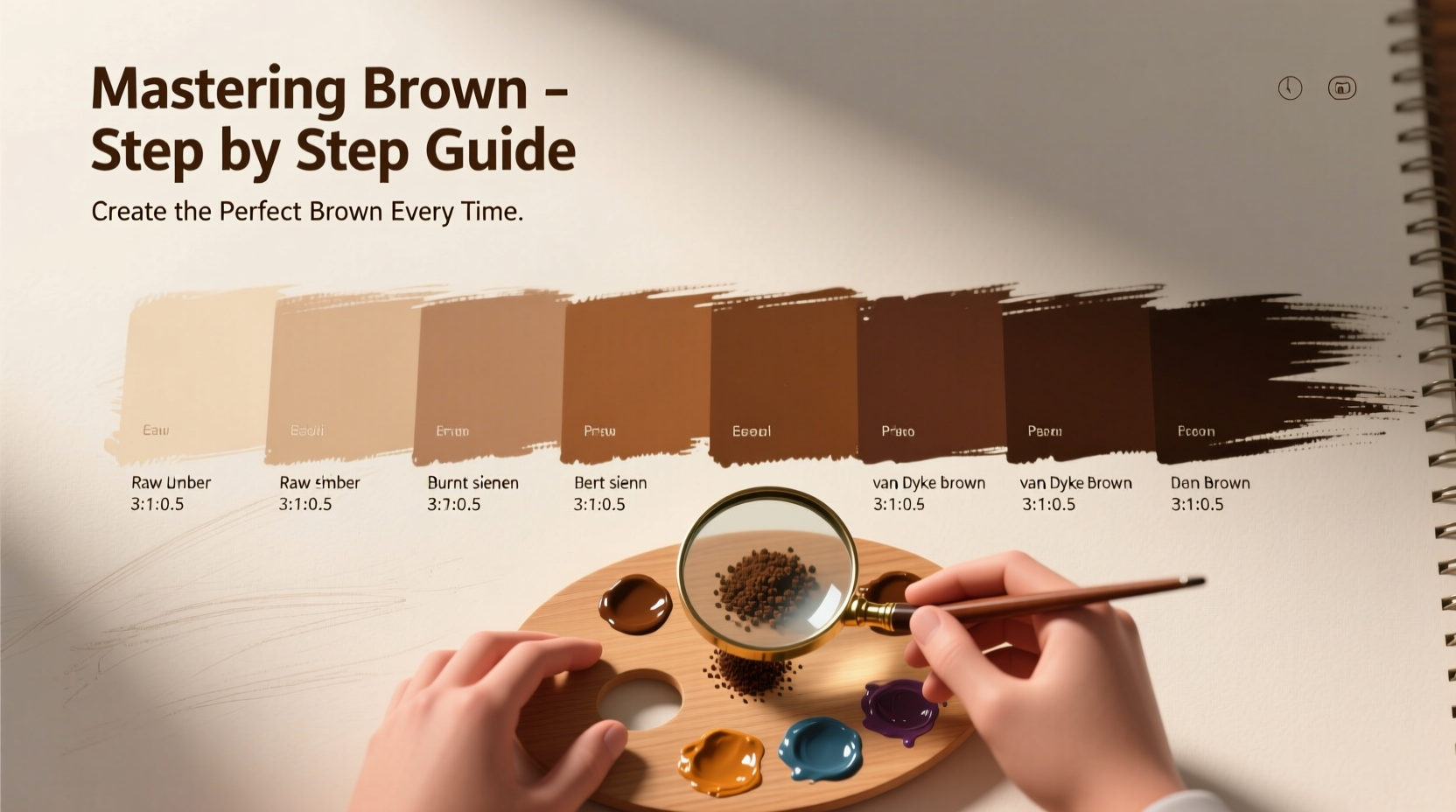
Step-by-Step Guide to Mixing the Perfect Brown
Follow this structured approach to create custom browns tailored to your project. Whether you're working with acrylics, oils, watercolors, or fabric dyes, these principles apply universally.
- Choose Your Base Hue: Decide if you want a warm (reddish or yellowish) or cool (greenish or grayish) brown. For wood tones, go warm; for shadows or stone, lean cool.
- Select Complementary Colors: Pair opposites on the color wheel. Try cadmium red + phthalo green, burnt sienna + ultramarine blue, or raw umber + a touch of its complement.
- Mix in Small Batches: Start with a dominant base—usually red or yellow—and add the complementary color drop by drop. Stir thoroughly after each addition.
- Adjust Value with Black or White: To darken, use a neutral black or payne’s gray sparingly. To lighten, add white cautiously—too much creates beige, not brown.
- Refine Saturation: If the brown feels too vibrant, mute it with a touch of its complement. If too dull, reintroduce a hint of the primary base.
- Test Under Final Lighting: View the color under the actual lighting conditions where it will be used. Natural daylight reveals truer tones than artificial bulbs.
- Record Your Formula: Note the ratio of pigments used. This ensures consistency for future batches.
Common Brown Formulas for Different Applications
Not all browns serve the same purpose. Here are tried-and-tested combinations for various uses:
| Application | Base Colors | Ratio | Resulting Tone |
|---|---|---|---|
| Wood Stain Simulation | Burnt Sienna + Ultramarine Blue | 4:1 | Warm, reddish-brown |
| Earth Tones (Landscapes) | Yellow Ochre + Cadmium Red + Phthalo Green | 3:1:0.5 | Natural soil brown |
| Neutral Fashion Dye | Russet + Navy Blue | 5:1 | Deep chocolate brown |
| Shadow Layering | Raw Umber + Payne’s Gray | 2:1 | Cool, ashen brown |
| Terracotta Effect | Red Oxide + Yellow Ochre + White | 2:2:1 | Pinkish-clay brown |
Avoiding Common Mistakes
Even experienced creators fall into traps when mixing brown. Recognizing these errors early prevents wasted materials and frustration.
- Over-mixing pigments: Combining too many colors reduces vibrancy and creates lifeless mud. Stick to two or three core pigments.
- Using black to darken too aggressively: Black can cool and flatten a brown. Opt for dark complements like payne’s gray or burnt umber instead.
- Ignoring drying shifts: Some pigments dry lighter (acrylics), others darker (oils). Test dried swatches before final application.
- Skipping the primer/base coat: On porous surfaces, unprimed material absorbs pigment unevenly, altering the final appearance.
- Not considering undertones: A brown may look neutral in isolation but clash in context due to hidden red or green undertones.
Real-World Example: Restoring a Vintage Furniture Piece
Interior designer Lena Tran was commissioned to refinish a 1940s walnut sideboard. The client wanted an authentic, aged brown that matched the original patina without looking artificially dark. Lena began by analyzing a hidden area of the existing finish under natural light. She identified a warm, medium-dark brown with subtle red undertones.
She started with a base of burnt sienna, then added tiny increments of ultramarine blue to neutralize excess warmth. After several tests, she landed on a 5:1 ratio, then deepened it slightly with raw umber. Before applying, she tested the stain on a scrap piece of walnut, allowing it to cure for 24 hours. The final result mirrored the original luster and depth, earning praise for its authenticity.
This case underscores the importance of observation, incremental adjustment, and real-material testing—key habits for mastering brown.
Essential Checklist for Perfect Browns
Before finalizing any brown mixture, run through this checklist:
- ✅ Defined the intended use (e.g., background, accent, realistic tone)
- ✅ Selected appropriate base and complement
- ✅ Mixed in small quantities to test
- ✅ Evaluated under final lighting conditions
- ✅ Checked for undertone harmony with surrounding colors
- ✅ Recorded the exact ratio for replication
- ✅ Allowed sample to dry completely before approval
Frequently Asked Questions
Can I make brown without using black?
Absolutely. Brown is best achieved by mixing complementary colors like red and green, or orange and blue. Black can dull the mixture; using natural dark earth pigments like burnt umber or raw umber gives richer results.
Why does my brown look muddy?
Muddiness occurs when too many pigments are combined, especially across wide color wheel distances. Limit your mix to two primaries and their complement. Also, avoid repeatedly stirring already-dry paint on a palette, which degrades pigment integrity.
How do I make a coffee-colored brown?
Start with a yellow ochre base, add a moderate amount of burnt sienna, and a very small touch of ultramarine blue to deepen and cool it slightly. Adjust with white for latte tones or more sienna for espresso richness.
Final Thoughts
Mastering brown is less about memorizing formulas and more about cultivating sensitivity to color relationships. With practice, you’ll develop an intuitive sense for balancing warmth and neutrality, saturation and depth. The perfect brown doesn’t hide in a tube—it emerges from deliberate choice, careful observation, and respect for context. Whether you’re painting a mural, designing a brand palette, or restoring heirloom furniture, the ability to craft precise, expressive browns elevates your work from competent to exceptional.


 浙公网安备
33010002000092号
浙公网安备
33010002000092号 浙B2-20120091-4
Comments
No comments yet. Why don't you start the discussion?