
In digital environments—whether web applications, mobile interfaces, or software dashboards—buttons are fundamental interaction points. Yet, poorly designed or inconsistently implemented buttons often go unnoticed, leading to user frustration, reduced engagement, and accessibility issues. Mastering button visibility isn't just about aesthetics; it's about usability, clarity, and inclusivity. This guide walks through practical strategies to identify, evaluate, and enhance button visibility across platforms and contexts.
Why Button Visibility Matters
Buttons serve as action triggers. When users can’t locate or recognize them, conversion rates drop, task completion slows, and trust in the interface diminishes. A 2023 Nielsen Norman Group study found that 68% of users abandon tasks when primary actions are not clearly visible within three seconds. This underscores the importance of intentional design and systematic identification methods.
Visibility extends beyond visual prominence. It includes semantic clarity (what the button does), spatial predictability (where it’s located), and technical detectability (how assistive tools perceive it). A truly visible button is one that any user—regardless of ability or device—can find, understand, and use confidently.
Step-by-Step Guide to Finding and Identifying Buttons
Whether auditing an existing interface or building a new one, follow this structured process to ensure no critical button goes unseen.
- Map All Interactive Elements: Begin by cataloging every clickable element on the page. Use browser developer tools (F12) to inspect the DOM and filter elements by
<button>,<a role=\"button\">, or divs with click handlers. - Classify Button Types: Categorize buttons into primary, secondary, tertiary, and utility (e.g., close, help). This helps prioritize visibility needs.
- Evaluate Visual Hierarchy: Assess color contrast, size, spacing, and typography. Ensure primary buttons stand out using bold colors and adequate padding.
- Test Keyboard and Screen Reader Navigation: Navigate the interface using only Tab and Enter keys. Confirm buttons are focusable, labeled correctly, and announce their purpose via screen readers.
- Conduct User Testing: Observe real users attempting common tasks. Note hesitation points where buttons were missed or misinterpreted.
Common Visibility Pitfalls and How to Fix Them
Even experienced designers fall into traps that compromise button discoverability. Recognizing these patterns is the first step toward prevention.
- Low Contrast: Gray text on white background fails WCAG standards. Always maintain at least a 4.5:1 contrast ratio for normal text and 3:1 for large text.
- Vague Labels: “Submit” or “Click Here” offer no context. Replace with action-oriented text like “Save Changes” or “Download Report.”
- Hidden Behind Menus: Critical actions buried in dropdowns reduce visibility. Promote high-frequency actions to main view.
- Inconsistent Styling: Using different shapes, colors, or sizes for the same button type confuses users. Establish a design system with clear rules.
- Overcrowding: Too many buttons compete for attention. Apply progressive disclosure—show only what’s needed at each step.
Checklist for Optimizing Button Visibility
Use this checklist during design reviews or audits to ensure all buttons meet visibility standards:
- ✅ Each button has a descriptive, action-based label
- ✅ Primary buttons use high-contrast colors (tested with contrast checker)
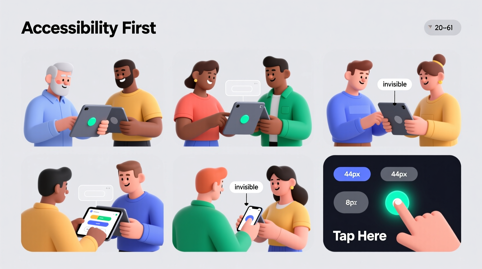
- ✅ Buttons are large enough (minimum 44x44px on touch devices)
- ✅ All buttons are keyboard-navigable and have visible focus states
- ✅ No critical action is accessible only via hover or gesture
- ✅ Icons used with buttons are paired with text or proper ARIA labels
- ✅ Button placement follows user flow (e.g., next/previous in forms)
- ✅ Disabled buttons are styled clearly but remain visible
Do’s and Don’ts of Button Design
| Do | Don’t |
|---|---|
| Use consistent styling for similar actions | Change button color or shape without reason |
| Place primary actions in natural reading paths (top-left to bottom-right) | Bury key buttons below the fold or behind menus |
| Add subtle animations on hover/focus to draw attention | Rely solely on animation to indicate interactivity |
| Ensure buttons are responsive and scale well on mobile | Shrink buttons too small on smaller screens |
| Test with real users, including those with disabilities | Assume visibility is sufficient based on designer preference |
Real Example: Improving a Checkout Flow
A mid-sized e-commerce platform noticed a 32% cart abandonment rate at the final checkout stage. Upon analysis, they discovered that the “Complete Purchase” button was styled as a faint outline with minimal padding, placed alongside four other similarly sized links. Users frequently missed it or assumed the form wasn’t ready to submit.
The team redesigned the button using a solid green fill, increased its size by 30%, added a slight shadow, and moved it to the far right of the action bar. They also updated the label from “Submit” to “Complete My Order – $48.99”. After implementation, the abandonment rate dropped to 19% within six weeks, and customer support inquiries about payment confirmation decreased by 41%.
“Button visibility isn’t just a design detail—it’s a conversion lever. One well-placed, clearly labeled button can change the entire user journey.” — Lena Patel, UX Lead at Interface Dynamics
Advanced Techniques for Developers
For developers, ensuring button visibility involves more than CSS. Semantic HTML and ARIA attributes play a crucial role in making buttons accessible and machine-readable.
Always prefer native <button> elements over divs with onClick handlers. Native buttons come with built-in accessibility features like keyboard support and role inheritance. If you must use a non-button element, apply role=\"button\", tabindex=\"0\", and handle key events (Enter and Space) manually.
Example of accessible button markup:
<button type=\"submit\" aria-label=\"Proceed to payment\">
  Continue to Payment >
</button>
Additionally, leverage automated testing tools like Axe or Lighthouse to scan for contrast violations, missing labels, or focus management issues. Integrate these checks into CI/CD pipelines to catch regressions early.
Frequently Asked Questions
How do I test button visibility for color-blind users?
Use simulators like Coblis or Color Oracle to preview your interface under various color vision deficiencies. Also, avoid relying solely on color to indicate interactivity—combine color with icons, borders, or text weight.
Can a button be too visible?
Yes. Overly aggressive styling (e.g., flashing animations, neon colors) can overwhelm users and create visual noise. Balance prominence with harmony. Only one primary action should dominate per screen.
What’s the ideal button size for mobile apps?
The W3C recommends a minimum target size of 44x44 pixels for touch interfaces. This ensures ease of tapping, especially for users with motor impairments. Maintain ample spacing between adjacent buttons to prevent mis-taps.
Conclusion: Make Every Button Count
Mastering button visibility is not a one-time fix but an ongoing practice of observation, testing, and refinement. Whether you're a designer, developer, or product manager, your responsibility is to ensure that every actionable element is not just present—but perceivable, understandable, and usable by everyone.


 浙公网安备
33010002000092号
浙公网安备
33010002000092号 浙B2-20120091-4
Comments
No comments yet. Why don't you start the discussion?