
Summer is the season of brightness—sunlight lingers longer, nature bursts into bloom, and fashion follows suit. As temperatures rise, so does the opportunity to experiment with bold hues and dynamic combinations. Color blocking isn’t just a trend; it’s a timeless styling technique that involves pairing solid blocks of contrasting or complementary colors to create visually striking outfits. When done right, it projects confidence, creativity, and intentionality. Yet many hesitate, fearing clashing tones or appearing too loud. The truth? With a few foundational principles and strategic choices, anyone can master color blocking and transform their summer wardrobe into a canvas of expressive style.
Understanding the Basics of Color Blocking
Color blocking originated in modern art, particularly with movements like De Stijl and Bauhaus, where artists used primary colors in geometric arrangements. Fashion adopted this aesthetic in the 1960s, championed by designers like Yves Saint Laurent, who saw clothing as wearable art. Today, it remains a powerful tool for self-expression.
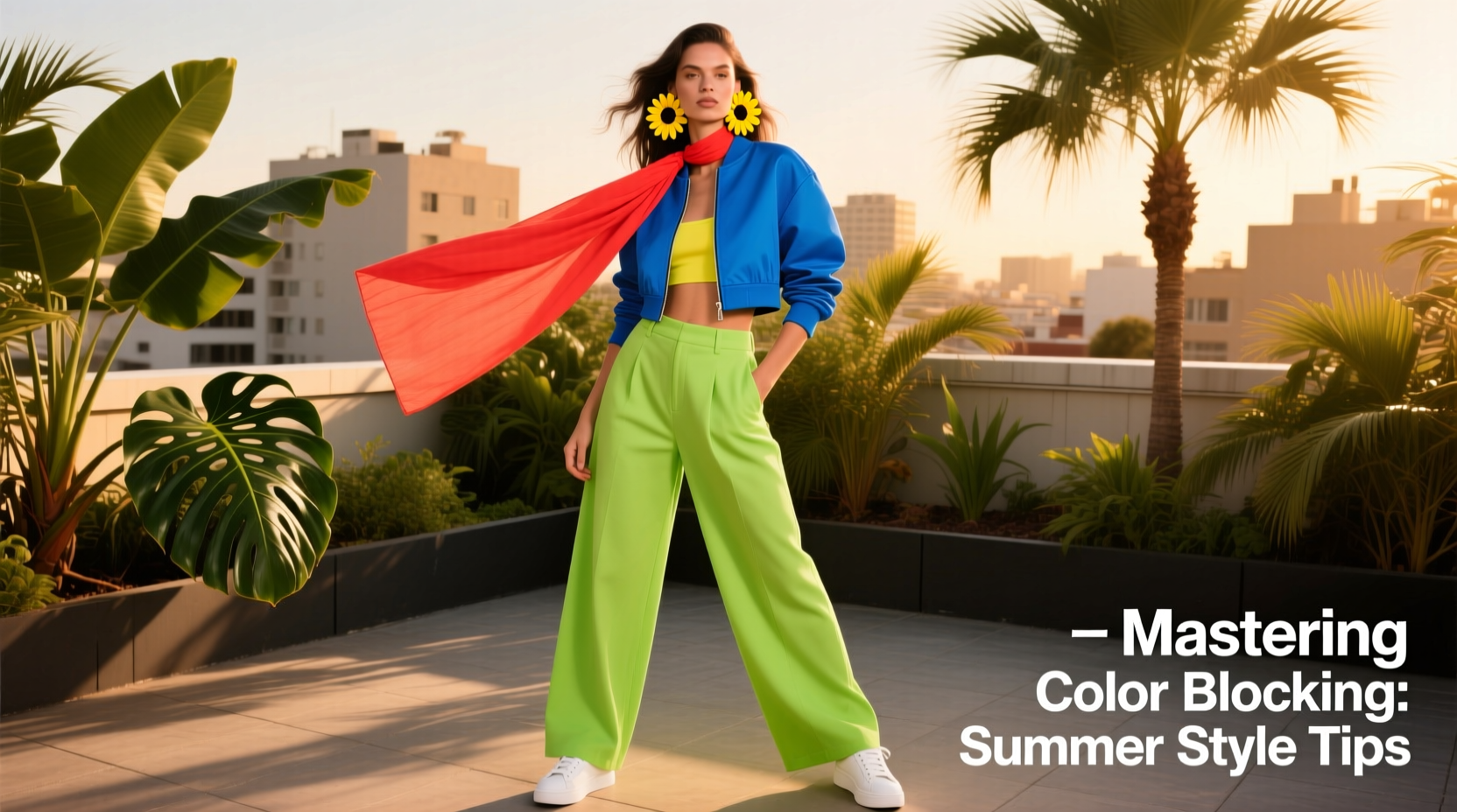
At its core, color blocking relies on deliberate contrast. Instead of blending shades subtly, you pair strong, saturated colors in distinct sections of an outfit—such as a cobalt blue top with cherry red pants or a lime green skirt paired with a tangerine blouse. The key is balance: no single color overwhelms, and each hue holds its own space.
The psychology of color also plays a role. Bright yellows convey energy, deep blues suggest calm, and fiery reds exude passion. By combining them thoughtfully, you’re not just dressing—you’re communicating.
Build a Summer-Ready Color Palette
Before assembling outfits, identify which colors harmonize. A useful starting point is the color wheel. Complementary colors—those opposite each other, like purple and yellow—create high-contrast drama. Analogous colors—neighbors on the wheel, such as teal and coral—offer softer, cohesive transitions. Triadic schemes use three evenly spaced hues (e.g., orange, green, and violet) for balanced vibrancy.
For summer, consider these seasonal-friendly combinations:
| Combination Type | Color Pairing | Ideal For |
|---|---|---|
| Complementary | Turquoise + Coral | Beach outings, daytime events |
| Analogous | Sunshine Yellow + Tangerine | Casual brunches, outdoor markets |
| Triadic | Lemon, Sky Blue, Magenta | Festivals, bold evening looks |
| Neutral Anchor | Emerald + White | Office-to-dinner transitions |
Limit your palette to three dominant colors per outfit. More than that risks chaos. Let one color dominate (say, 50% of the look), another play a supporting role (30%), and the third serve as an accent (20%). This creates rhythm and focus.
Step-by-Step Guide to Creating a Color-Blocked Outfit
Follow this five-step process to build a polished, intentional ensemble:
- Choose Your Base Color: Begin with a piece you already love—perhaps a fuchsia midi dress or electric blue trousers. This will be your foundation.
- Select a Contrasting or Complementary Hue: Use the color wheel to pick a partner shade. If your base is warm (red, orange), go cool (blue, green) for contrast, or stay warm for harmony. <3> Add a Neutral Element: Introduce white sandals, beige linen blazer, or black sunglasses to ground the look and allow the colors to breathe.
- Consider Proportion and Placement: Wear bolder colors on areas you want to highlight. A bright top draws attention upward; colorful pants emphasize legs. Avoid placing intense colors near unflattering cuts.
- Accessorize Strategically: Use bags, belts, or jewelry in one of the main colors to tie the look together. A mustard clutch with a navy-and-coral outfit reinforces cohesion.
Real Example: From Wardrobe Doubt to Confidence
Sophia, a graphic designer from Miami, once avoided anything beyond pastels. “I thought bright colors weren’t ‘me,’” she said. But after attending a friend’s rooftop party wearing a mismatched coral top and turquoise skirt, she received multiple compliments. Inspired, she studied color theory basics and built a capsule wardrobe around three core palettes: oceanic (navy, teal, white), citrus (lemon, tangerine, mint), and sunset (pink, peach, lavender).
Within weeks, she was mixing pieces confidently. Her go-to summer look? A seafoam green sleeveless jumpsuit with tangerine block-heel sandals and oversized white earrings. “It feels joyful,” she said. “And people notice me now—not because I’m loud, but because I look put-together.”
Common Mistakes and How to Avoid Them
Even seasoned stylists misstep. Here are frequent pitfalls and solutions:
- Mistake: Using too many saturated tones without breaks.
Solution: Incorporate at least one neutral or muted piece—like beige linen pants or a cream cardigan—to soften intensity. - Mistake: Ignoring skin undertones.
Solution: Warm undertones glow in golden yellows and corals; cool undertones shine in jewel tones like sapphire and fuchsia. Test swatches near your face to see what enlivens your complexion. - Mistake: Overlooking fabric texture.
Solution: Pair matte cotton with glossy silk or structured denim with fluid rayon. Texture variation adds depth even when colors dominate.
“Color blocking isn’t about randomness—it’s about calculated contrast. The most memorable looks are those where every hue has purpose.” — Lena Torres, Fashion Stylist & Creative Director
Checklist: Mastering Your Summer Color Block
Use this checklist before finalizing your next vibrant outfit:
- ☐ Chosen a maximum of three main colors
- ☐ Balanced proportions (one dominant, one secondary, one accent)
- ☐ Included a neutral element to anchor the look
- ☐ Verified color harmony using a digital color wheel app or physical swatch
- ☐ Coordinated accessories in one of the main colors
- ☐ Tested the outfit in daylight
- ☐ Ensured comfort and fit—style should never compromise wearability
FAQ: Your Color Blocking Questions Answered
Can I wear color blocking if I have a darker skin tone?
Absolutely. Vibrant colors often complement deeper complexions beautifully. Jewel tones like emerald, amethyst, and ruby enhance richness, while brights like cobalt and fuchsia create stunning contrast. Focus on saturation rather than shade—deep, vivid hues tend to work best.
Is color blocking appropriate for the workplace?
Yes, with moderation. Opt for tonal blocking—different shades of the same color family—or pair one bold piece (like a cobalt blazer) with neutral separates (white blouse, gray trousers). Avoid neon extremes in conservative environments.
How do I transition color-blocked outfits from day to night?
Swap footwear and accessories. Replace flat sandals with strappy heels, add metallic jewelry, and carry a sleek clutch in one of your outfit’s accent colors. A lightweight kimono in a complementary hue can also elevate the look instantly.
Conclusion: Own Your Palette, Own Your Style
Mastering color blocking is less about rules and more about courage—the willingness to step into the light, both literally and stylistically. Summer offers the perfect backdrop to experiment, refine, and celebrate individuality through color. Whether you're strolling through a farmers' market or dancing at an outdoor soirée, your wardrobe can reflect the season’s energy and your unique spirit.
Start small. Try a yellow top with pink culottes. Then layer in textures, silhouettes, and accessories. Over time, you’ll develop an intuitive sense of what works—and what makes you feel unstoppable. Fashion is personal, and color is your voice. Speak boldly.


 浙公网安备
33010002000092号
浙公网安备
33010002000092号 浙B2-20120091-4
Comments
No comments yet. Why don't you start the discussion?