
Brown is one of the most versatile yet elusive colors in any artist’s palette. Found everywhere in nature—from soil and bark to leather and stone—it plays a crucial role in grounding compositions and adding depth. Yet many artists struggle to mix the right brown, often ending up with muddy or flat tones. The truth is, mastering brown isn’t about using pre-made tubes; it’s about understanding color relationships, temperature, and balance. With the right techniques, you can create rich, vibrant browns that enhance your work rather than dull it.
The Science Behind Brown: Why It’s Not Just “Muddy Black”
Brown isn’t a primary or secondary color—it’s a tertiary tone born from the careful combination of complementary colors or an imbalance in warm and cool pigments. Unlike black, which absorbs light, well-mixed brown reflects subtle hues and adds warmth or earthiness depending on its undertones.
At its core, brown emerges when red, yellow, and blue are combined in varying ratios. But more precisely, it forms when complementary colors—those opposite each other on the color wheel—neutralize each other. For example:
- Red + Green = Brown (especially useful in acrylics and oils)
- Blue + Orange = Deep, cool brown
- Yellow + Purple = Warm, golden brown
The key is avoiding overmixing. Over-blending complementary pairs leads to flat, lifeless results. Instead, aim for optical mixing—letting colors blend slightly on canvas—for greater vibrancy.
“Brown is never passive. When mixed with intention, it becomes the soul of a painting.” — Diego Marquez, Muralist & Color Theory Instructor
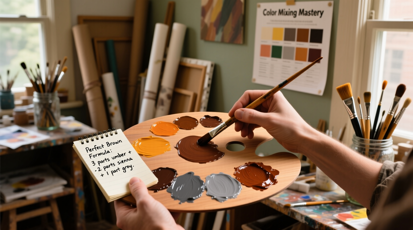
Step-by-Step Guide: Creating Custom Browns from Scratch
Relying on store-bought brown limits your creative control. By building your own, you gain precision over warmth, depth, and saturation. Follow this timeline to develop custom shades tailored to your project.
- Choose Your Base Complementaries: Start with two complementary colors. For warmth, try cadmium red and sap green. For cooler tones, ultramarine blue and burnt orange.
- Mix in Small Batches: Use a palette knife to combine equal parts. Observe the initial shift toward gray-brown.
- Adjust Temperature: Add a touch more red or yellow to warm it up; a hint of blue or green cools it down.
- Modify Value: Lighten with titanium white (sparingly) or darken with a touch of alizarin crimson or ivory black—though natural darkening via complements is preferable.
- Test on Scrap Surface: Let the paint dry slightly. Oil and acrylic shift as they cure; watercolor dries lighter.
- Refine Gradually: Make micro-adjustments. One drop of yellow can transform a cool brown into a sunbaked earth tone.
Do’s and Don’ts of Mixing Earth Tones
| Do’s | Don’ts |
|---|---|
| Use transparent and opaque pigments strategically (e.g., transparent alizarin with opaque yellow ochre) | Overuse black to darken mixtures—it deadens chroma |
| Layer thin glazes for depth instead of heavy mixing | Mix too many pigments at once—stick to 2–3 max |
| Experiment with earth pigments like raw sienna, burnt umber, and perylene maroon | Assume all browns are interchangeable—they vary widely by brand and base |
| Balance warm and cool versions across a composition | Ignore drying times—oil paints may shift hue after 24 hours |
Real Example: Restoring a Vintage Portrait’s Skin Undertones
An oil painter was commissioned to restore a 19th-century portrait where the subject’s skin had faded into a chalky pink. To recreate natural undertones without modernizing the look, she avoided standard flesh tones and instead built a series of warm browns using a base of cadmium red light and viridian green. She then added a whisper of yellow ochre to introduce luminosity, mimicking the original artist’s technique of layering transparent glazes over underpainting.
The result? A historically accurate complexion grounded in subtle brownish-red undertones, proving that intentional brown mixing can resurrect lost dimension in figurative work.
Essential Tips for Perfect Browns Across Mediums
Different media respond uniquely to color mixing. Tailor your approach accordingly.
- Oil Paint: Slow drying allows for extended blending. Build complex browns through wet-on-wet layering. Use linseed oil to enhance richness.
- Acrylic: Fast-drying nature means prep is critical. Pre-mix larger batches if needed. Retarders help maintain blendability.
- Watercolor: Rely on transparency. Mix complements on paper using backruns or blooms for organic texture. Avoid overworking.
- Digital Art: Use HSB sliders—lower saturation and adjust hue between 20°–40° for warm browns, 15°–25° for neutral ones.
Checklist: Achieving Professional-Quality Browns
Before finalizing your mixture, run through this checklist:
- ✅ Are only 2–3 pigments involved?
- ✅ Have I tested the dried swatch?
- ✅ Is the temperature aligned with my subject (warm wood vs. cool shadow)?
- ✅ Did I avoid black unless absolutely necessary?
- ✅ Does the brown have slight variation in tone to prevent flatness?
- ✅ Have I documented the recipe for future use?
Frequently Asked Questions
Can I make brown without using black?
Absolutely. In fact, it’s recommended. Combine complementary colors—red and green, blue and orange, or yellow and purple—to create nuanced browns naturally. This method preserves chromatic integrity better than adding black.
Why does my mixed brown look muddy?
Muddiness usually comes from overmixing or combining too many pigments. Stick to two strong complements and mix minimally. Also, ensure your brushes and palette are clean—residue can contaminate blends.
What’s the difference between burnt umber and raw umber?
Raw umber is a natural clay pigment with a greenish-brown, cool tone, ideal for underpainting. Burnt umber is roasted raw umber, resulting in a deeper, redder brown used for shadows and warmth.
Conclusion: Elevate Your Palette with Intentional Brown Mixing
Brown is far more than a background tone—it’s a dynamic, expressive color that anchors visual narratives. Whether you’re painting landscapes, restoring antiques, or designing digital illustrations, mastering brown gives you unparalleled control over mood, realism, and harmony. Move beyond the tube and embrace the complexity of handmade hues. Each variation tells a story: a sun-scorched desert, a weathered oak beam, the deep shadow beneath a chin.


 浙公网安备
33010002000092号
浙公网安备
33010002000092号 浙B2-20120091-4
Comments
No comments yet. Why don't you start the discussion?