
Color is one of the most expressive tools in any artist’s or designer’s arsenal. Among the most vibrant and emotionally charged hues are those in the yellow-orange spectrum—energetic, warm, and full of life. Whether you're painting, designing digital graphics, or working on a home decor project, understanding how to mix yellow and orange accurately can elevate your work from amateur to professional. While it may seem straightforward, achieving the perfect shade requires more than randomly blending two colors. It demands an understanding of pigment behavior, undertones, and mixing principles.
This guide breaks down the science and art behind creating flawless yellow-orange tones. From foundational color theory to practical mixing steps and real-world applications, you’ll gain the knowledge needed to consistently produce rich, balanced, and visually compelling shades.
The Science Behind Yellow and Orange
In traditional color theory, yellow and red are primary colors, meaning they cannot be created by mixing other hues. Orange, however, is a secondary color—formed when yellow and red are combined. This makes yellow-orange a tertiary color, sitting between yellow and orange on the color wheel. These transitional hues often carry subtle shifts in warmth, brightness, and saturation depending on the pigments used.
Pigment composition plays a crucial role. Not all yellows or reds behave the same way. For example, cadmium yellow leans warm and intense, while lemon yellow is cooler and more transparent. Similarly, alizarin crimson produces a cooler red compared to the fiery warmth of cadmium red. The choice of base colors directly affects the final yellow-orange outcome.
“Understanding pigment bias is the first step toward predictable color mixing. A cool yellow mixed with a warm red creates a different orange than a warm yellow with a cool red.” — Dr. Lena Torres, Color Theory Researcher, Royal College of Art
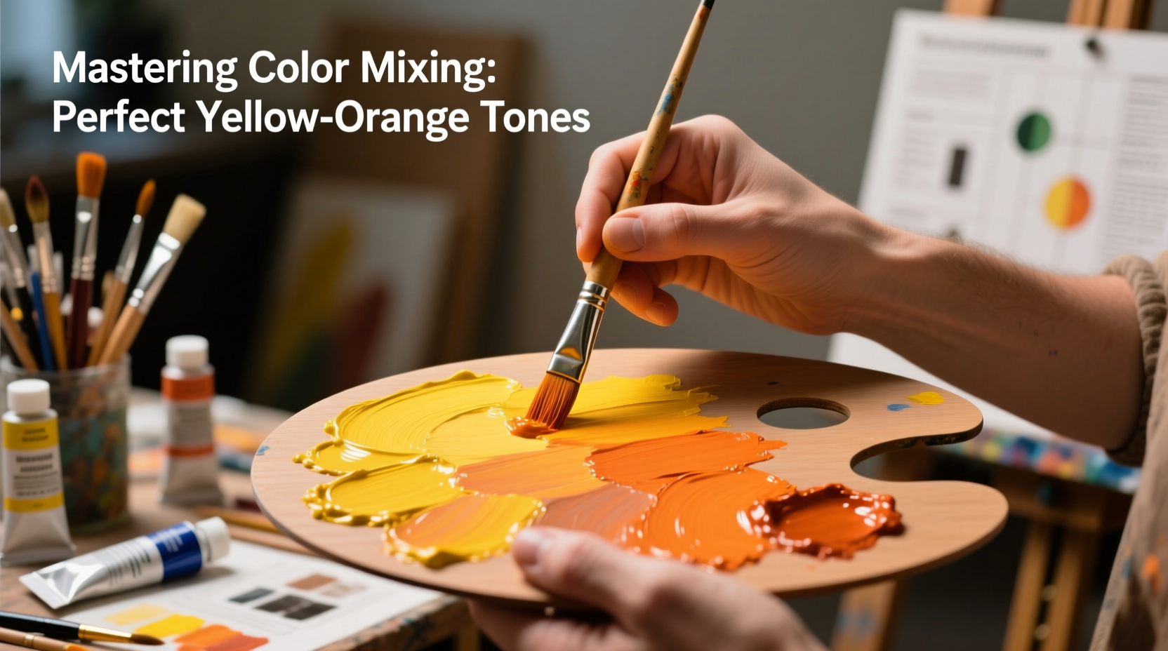
Step-by-Step Guide to Mixing Perfect Yellow-Orange Shades
Creating a consistent and appealing yellow-orange isn’t about guesswork—it’s about process. Follow this structured approach to achieve control and repeatability in your mixes.
- Select high-quality base pigments: Use artist-grade paints (acrylic, oil, or watercolor) for better consistency and pigment load.
- Start with a clean palette: Residue from previous mixes can skew your new blend.
- Begin with a dominant yellow: Choose a warm yellow like cadmium yellow medium as your base for richer results.
- Add red incrementally: Use a warm red such as cadmium red light. Add small amounts at a time, mixing thoroughly after each addition.
- Evaluate tone and adjust: If the mix appears too red, add more yellow. If it’s too dull, introduce a touch of white or a brighter yellow to restore vibrancy.
- Test on scrap paper or canvas: Colors appear differently on various surfaces. Always test before applying to your final piece.
- Record your ratios: Note the proportion of yellow to red (e.g., 3:1) for future reference.
Common Mistakes and How to Avoid Them
Even experienced artists can fall into traps when mixing warm tones. Awareness of common errors helps prevent frustration and wasted materials.
| Mistake | Why It Happens | Solution |
|---|---|---|
| Muddy or dull orange | Using complementary colors (e.g., blue-contaminated brushes) or overmixing | Clean tools thoroughly; avoid cross-contamination; use pure pigments |
| Too much red, not enough yellow | Adding red too quickly without measuring | Add red gradually; start with a 4:1 yellow-to-red ratio |
| Inconsistent batches | Failing to document proportions | Keep a mixing journal with notes on pigment brands and ratios |
| Color shifts when drying | Different drying rates between pigments (common in watercolors) | Allow swatches to dry completely before final evaluation |
Real Example: Creating a Sunset Gradient for a Landscape Painting
An illustrator working on a coastal landscape needed a smooth gradient transitioning from bright lemon yellow at the horizon to a deep amber-orange near the clouds. Initially, their first attempt resulted in a flat, unnatural band of color due to abrupt transitions and inconsistent mixing.
To fix this, they pre-mixed three distinct shades: a light yellow-orange (5 parts cadmium yellow, 1 part cadmium red), a mid-tone (3:1), and a deep orange (2:1). By layering these with wet-on-wet blending and allowing slight overlaps, they achieved a luminous, atmospheric effect that mimicked natural sunlight. The key was planning the gradient in advance and testing each mix under daylight conditions.
Pro Tips for Customizing Your Yellow-Orange Palette
Beyond basic mixing, fine-tuning your yellow-orange shades allows for greater creative expression. Consider these advanced techniques:
- Adjust temperature: To cool down a yellow-orange, add a tiny amount of green earth or raw sienna. To warm it up, incorporate a hint of burnt orange or cadmium scarlet.
- Modify value: Darken with burnt umber instead of black to retain warmth. Lighten with Naples yellow rather than titanium white to avoid chalkiness.
- Enhance saturation: Reinvigorate a dull mix by adding a drop of high-intensity yellow or fluorescent orange (use sparingly).
- Match lighting conditions: Warm yellow-oranges work best under incandescent light; slightly cooler versions suit natural daylight displays.
Checklist: Mastering Yellow-Orange Mixing in 7 Steps
Use this actionable checklist every time you prepare to mix yellow-orange hues:
- Choose warm yellow and warm red pigments (e.g., cadmium series).
- Clean palette and tools to prevent contamination.
- Start with a 4:1 ratio of yellow to red.
- Mix in small increments, adjusting gradually.
- Test the color on your intended surface and under final viewing light.
- Document the formula for consistency in future projects.
- Store leftover mix properly (sealed container for acrylics/oils; re-wettable pans for watercolors).
Frequently Asked Questions
Can I make yellow-orange with only two pigments?
Yes. Mix a warm yellow (like cadmium yellow medium) with a warm red (such as cadmium red light). Avoid cool or blue-based reds like alizarin crimson, which can create brownish tones.
Why does my yellow-orange turn brown when I mix it?
This usually happens when complementary colors interact—either from dirty brushes or using reds with blue undertones. Ensure your pigments are pure and tools are clean. Also, overmixing can deaden the vibrancy of the color.
How do I make a neon or bright yellow-orange?
Standard artist pigments have limits in intensity. For fluorescent effects, use specialty neon or opaque colors designed for high visibility. Alternatively, layer a transparent orange glaze over a bright yellow base to enhance luminosity.
Final Thoughts and Next Steps
Mastering yellow-orange shades is more than a technical skill—it’s an exercise in observation, precision, and artistic judgment. The ability to reproduce a specific golden glow or a fiery autumn hue on demand gives you control over mood, depth, and visual harmony in your work. With practice, thoughtful material selection, and systematic mixing, what once seemed unpredictable becomes second nature.
Don’t just rely on intuition. Experiment deliberately, keep records, and build a personalized palette of trusted combinations. Over time, your confidence in color mixing will grow, opening doors to more ambitious and expressive projects.


 浙公网安备
33010002000092号
浙公网安备
33010002000092号 浙B2-20120091-4
Comments
No comments yet. Why don't you start the discussion?