
A well-dressed sofa or bed can transform the mood of a room, and few elements contribute more instantly to that transformation than cushion covers. More than just decorative accents, they offer texture, color, and personality—without requiring a full interior overhaul. Yet, many hesitate to experiment, fearing clashing patterns or an unbalanced look. The truth is, mastering cushion cover combinations isn’t about rigid rules—it’s about understanding balance, rhythm, and intention. With a few strategic principles, anyone can mix and match styles with confidence.
Understand the Role of Cushion Covers in Interior Design
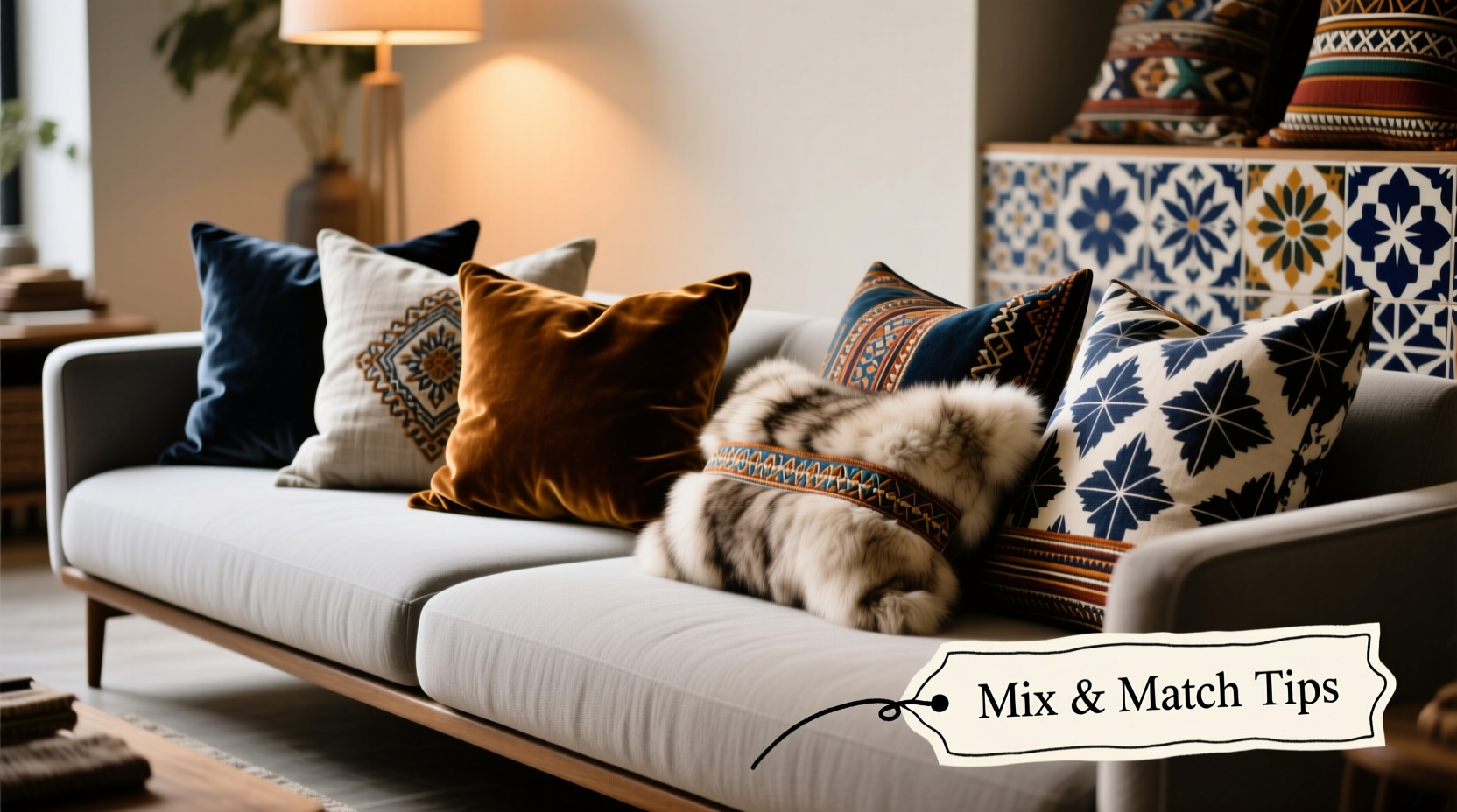
Cushion covers are functional art. They serve as tactile points of interest while providing comfort. Unlike permanent upholstery, they’re easily swapped, making them ideal for seasonal updates or evolving tastes. Their versatility allows homeowners to test new color palettes, introduce bold prints, or layer textures without long-term commitment.
The key is to treat your arrangement as a curated composition. Think like a designer: each cover contributes to the overall harmony of the space. A single statement cushion might anchor a neutral sofa, while a cluster of varied sizes and patterns can energize a minimalist room. The goal isn’t uniformity—it’s thoughtful contrast.
Build a Cohesive Color Palette
Color is the foundation of any successful combination. Start by identifying a base color—usually derived from your sofa or dominant furniture piece. From there, build a supporting palette using one of three approaches:
- Analogous: Colors adjacent on the color wheel (e.g., teal, blue, and navy) create a calm, harmonious effect.
- Complementary: Opposite hues (like mustard and gray-blue) add vibrancy and visual tension when balanced carefully.
- Monochromatic: Varying tones of a single color (navy, slate, powder blue) deliver sophistication through subtle contrast.
Incorporate neutrals—cream, charcoal, taupe—as anchors. These allow bolder choices to shine without overwhelming the eye. When in doubt, use a neutral base cover and introduce color through two or three accent cushions.
“Color sets the emotional tone of a room. A thoughtfully layered cushion arrangement can make a space feel warm, lively, or serene—all through hue and contrast.” — Lena Torres, Interior Stylist & Author of *Textured Living*
Create Visual Balance with Pattern Mixing
Mixing patterns elevates a look from predictable to dynamic—but only when done with proportion and scale in mind. Avoid pairing two large-scale patterns unless separated by a solid or textured buffer. Instead, follow this proven ratio:
| Pattern Type | Scale | Recommended Quantity (per seating area) | Tips for Use |
|---|---|---|---|
| Geometric | Large | 1–2 | Use as a focal point; pair with organic patterns for contrast. |
| Floral | Medium | 2 | Choose florals with at least one shared color from other cushions. |
| Striped | Small to Medium | 1–2 | Ideal for vertical or horizontal rhythm; avoid overly busy stripes. |
| Solid/Textured | N/A | 2+ | Linen, bouclé, or corduroy covers add depth without competing visually. |
The secret lies in repetition. If you use a coral floral cushion, echo that coral in a solid velvet pillow or a geometric print. This thread of continuity ties the ensemble together, even if styles differ.
Mini Case Study: Reviving a Neutral Living Room
Sarah, a homeowner in Portland, had a beige sectional she loved but found dull. She wanted warmth and character without reupholstering. Her solution? Four cushion covers: one large-scale rust-and-cream ikat (statement), two medium floral prints in terracotta and sage (support), and one nubby oatmeal-toned bouclé (texture anchor). By ensuring all patterns included at least one shared earth tone, the combination felt intentional. The result? A living room that felt both inviting and curated—without changing a single major furnishing.
Step-by-Step Guide to Curating Your Cushion Arrangement
Follow this five-step process to build a confident, balanced combination:
- Assess your space. Note the dominant colors, furniture style, and natural light. North-facing rooms benefit from warmer tones; south-facing ones can handle cooler hues.
- Choose a hero cushion. Select one with a bold pattern or rich color to serve as the centerpiece. Place it front and center on your sofa or bed.
- Add supporting patterns. Introduce one or two complementary designs—one medium scale, one small. Ensure they share at least one color with the hero cushion.
- Incorporate texture. Include at least one non-patterned cover made of linen, wool, faux fur, or woven fabric. This adds tactile interest and visual rest.
- Arrange and edit. Lay all cushions out on the floor. Step back. Remove anything that feels redundant or jarring. Odd numbers (3, 5, 7) often look more natural than even groupings.
Common Pitfalls and How to Avoid Them
Even experienced decorators misstep. Here are frequent errors and their fixes:
- Overcrowding: Too many cushions hinder usability. For a standard sofa, 3–5 cushions are sufficient.
- Ignoring scale: A tiny print next to a massive one can get lost. Vary scale gradually, not abruptly.
- Forgetting function: Silk covers may look luxurious but aren’t practical in homes with pets or kids. Consider washable fabrics for high-use areas.
- Skipping texture: An all-print lineup feels flat. Texture provides depth and dimension.
Checklist: Before You Finalize Your Combination
- ✅ Do all cushions share at least one common color?
- ✅ Is there a clear focal point (hero cushion)?
- ✅ Are different scales of pattern represented without clashing?
- ✅ Have I included at least one textured solid?
- ✅ Can the arrangement be comfortably used, not just admired?
- ✅ Are fabrics appropriate for the room’s use (e.g., durable for family rooms)?
Frequently Asked Questions
How many cushion covers should I use on a standard sofa?
For a three-seater sofa, three to five cushions create visual balance without overcrowding. Larger sectionals can accommodate five to seven, depending on configuration. Always leave room for sitting and movement.
Can I mix modern and traditional patterns?
Yes—this contrast often creates the most interesting arrangements. Pair a classic damask with a contemporary geometric, provided they share a color or tonal family. The juxtaposition adds character when grounded in cohesion.
What if I love bold colors but want a calming space?
Use bold hues as accents within a neutral-dominated scheme. A single cobalt cushion among greys and creams injects energy without disrupting serenity. Limit bold colors to 10–20% of the total arrangement.
Final Thoughts: Confidence Through Intention
Mastering cushion cover combinations isn’t about following trends—it’s about expressing taste with clarity and purpose. When you understand how color, pattern, and texture interact, you gain the freedom to experiment. Start small. Test combinations on the floor before placing them on furniture. Take photos in natural light to see how they truly look.
Remember, interiors evolve. What feels daring today might become your signature style tomorrow. The beauty of cushion covers lies in their impermanence—you can always change them tomorrow. But with these principles, you won’t need to. You’ll create combinations that feel right, look intentional, and reflect your unique aesthetic.


 浙公网安备
33010002000092号
浙公网安备
33010002000092号 浙B2-20120091-4
Comments
No comments yet. Why don't you start the discussion?