
Green is one of the most versatile colors in visual art and design, but achieving a rich, balanced dark green can be surprisingly elusive. Many artists and designers struggle with muddy results, oversaturation, or unintended warmth when attempting to deepen green. The key lies not in adding black indiscriminately, but in understanding color relationships, pigment behavior, and subtle tonal adjustments. Whether you're working with acrylics, oils, watercolors, or digital media, mastering dark green requires both technical knowledge and practiced intuition.
The Science Behind Deep Green
Green sits between yellow and blue on the color wheel, making it a secondary color formed by combining those two primaries. However, not all greens are created equal. The temperature, transparency, and undertone of your base green dramatically affect how it responds to darkening. For instance, a cool phthalocyanine green behaves differently than a warm sap green when mixed with darker pigments.
To darken green effectively, you must consider chroma (intensity), value (lightness/darkness), and hue (color family). Simply adding black reduces value but often dulls the chroma, resulting in a flat, lifeless tone. A more refined approach uses complementary colors or low-chroma darks to mute and deepen the green while preserving its character.
“Understanding color temperature and complementaries is the difference between a muddy mix and a luminous dark green.” — Diego Marquez, Fine Art Instructor at the Hudson School of Color
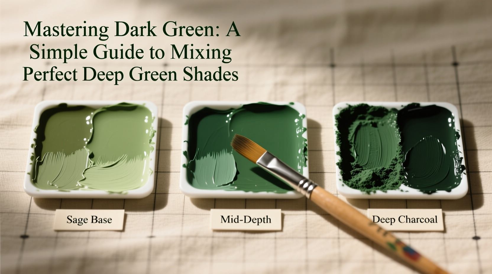
Step-by-Step: Building a Rich Dark Green
Follow this methodical process to create deep, vibrant greens that retain depth without losing their essence:
- Select a strong base green: Start with a high-quality green like Phthalo Green (blue shade) or Viridian for cooler tones, or Sap Green for warmer ones.
- Add a touch of its complement: Red is opposite green on the color wheel. Use a small amount of burnt umber, alizarin crimson, or quinacridone red to subtly neutralize and deepen the green.
- Incorporate a dark earth tone: Instead of black, try Payne’s Gray, Ivory Black, or Mars Black sparingly. These offer more nuance than pure black.
- Adjust temperature: If the green becomes too cool, add a hint of yellow ochre. If too warm, introduce a speck of ultramarine blue.
- Test and refine: Apply a swatch, let it dry, and assess under natural light. Adjust incrementally—dark greens evolve as they dry.
Pigment Pairings That Work
Not all pigments interact the same way. Some combinations yield clean, transparent dark greens; others turn chalky or opaque. The table below outlines proven pairings across common paint types:
| Base Green | Best Darkener | Resulting Tone | Best For |
|---|---|---|---|
| Phthalo Green (Blue Shade) | Burnt Umber | Cool, forest-like | Landscape shadows, foliage depth |
| Sap Green | Payne’s Gray | Muted olive-dark | Underpainting, moody scenes |
| Viridian | Alizarin Crimson + Ultramarine | Deep teal-green | Water effects, aquatic themes |
| Olive Green | Ivory Black | Near-black green | Industrial design, modern interiors |
| Hooker’s Green | Van Dyke Brown | Earthy, organic | Naturalistic rendering, botanical art |
Avoiding Common Mixing Mistakes
Even experienced artists fall into traps when trying to achieve the perfect dark green. Here are the most frequent errors and how to avoid them:
- Overusing black: This flattens the color and kills vibrancy. Reserve black for final tweaks, not primary darkening.
- Mixing too many pigments: Combining three or more darkeners increases the risk of muddiness. Stick to one or two additives.
- Ignoring drying shifts: Some greens (especially Phthalo) appear brighter wet and darken significantly when dry. Test mixes ahead of time.
- Forgetting opacity vs. transparency: Transparent darkeners like Paynes Gray work well in glazes; opaque ones like Mars Black suit solid layers.
Real-World Example: Painting a Forest Canopy
Consider an oil painter working on a dense woodland scene. Early attempts at shadowed treetops resulted in flat, grayish greens. By switching tactics—using a base of Phthalo Green mixed with a tiny amount of Alizarin Crimson and a touch of Ultramarine Blue—the artist achieved a deep, resonant green that felt alive and dimensional. The secret? The red subtly countered the green’s intensity without shifting the hue toward brown, while the blue cooled and deepened the value. Layered over a mid-tone green underpainting, the result was a canopy with believable depth and atmosphere.
This example illustrates that dark green isn’t just about darkness—it’s about context, contrast, and intentionality. The right shade enhances realism and emotional impact.
Checklist: Perfecting Your Dark Green Mix
Use this checklist before finalizing any dark green blend:
- ✅ Start with a clean, vibrant base green
- ✅ Choose a darkener based on desired temperature (warm or cool)
- ✅ Use complementary colors in small amounts to deepen, not overpower
- ✅ Avoid mixing more than three pigments unless necessary
- ✅ Test the mix on scrap paper or canvas and let it dry
- ✅ Compare against your reference or subject under consistent lighting
- ✅ Adjust saturation with white or medium if needed—never over-dilute
Frequently Asked Questions
Can I use black to make dark green?
Yes, but sparingly. Pure black can deaden a green’s vibrancy. For better results, combine black with a complementary color or use a low-chroma dark like Payne’s Gray instead.
Why does my dark green look muddy?
Muddiness usually comes from overmixing, using too many pigments, or combining opaque and transparent colors without layering intent. Try building depth in layers rather than one heavy mix.
What’s the best dark green for digital design?
In RGB, aim for hex codes like #014F31 or #0D5C3E—deep greens with slight blue bias hold up well on screens. Avoid oversaturated values that don’t translate to print.
Final Thoughts and Next Steps
Mastering dark green isn’t about memorizing formulas—it’s about developing an eye for balance and learning how pigments converse on the palette. The most compelling dark greens aren’t the darkest, but the ones that feel true to light, environment, and emotion. With practice, you’ll begin to see green not as a single color, but as a spectrum of possibility.
Start small: dedicate a session to mixing five variations of dark green using different bases and darkeners. Label them, observe them, and note which ones inspire you. Over time, you’ll cultivate a nuanced understanding that elevates every piece you create.


 浙公网安备
33010002000092号
浙公网安备
33010002000092号 浙B2-20120091-4
Comments
No comments yet. Why don't you start the discussion?