
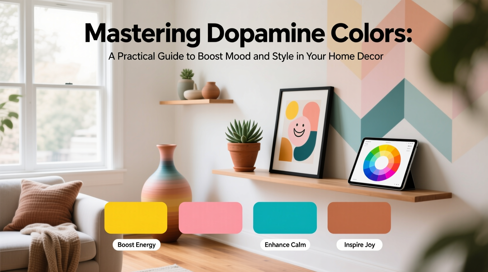
Color is more than decoration—it’s a psychological tool. In recent years, the concept of \"dopamine dressing\" has evolved into \"dopamine decor,\" where vibrant, emotionally uplifting hues are intentionally used to stimulate joy, energy, and mental well-being within interior spaces. Far from being a passing trend, this approach blends neuroscience with design to create homes that don’t just look good, but feel good too.
Dopamine, a neurotransmitter linked to pleasure, motivation, and reward, surges when we experience something enjoyable—like stepping into a sunlit yellow kitchen or running your fingers over a velvet emerald sofa. By understanding how color influences brain chemistry, you can curate environments that support emotional balance, creativity, and daily resilience.
The Science Behind Color and Mood
Research in environmental psychology consistently shows that color affects perception, emotion, and behavior. Warm tones like red, orange, and yellow trigger alertness and sociability by stimulating the nervous system. Cooler shades such as blue and green activate the parasympathetic system, promoting calm and focus. But dopamine-driven design isn't about extremes—it's about strategic bursts of color that spark delight without overwhelming the senses.
A 2023 study published in the *Journal of Environmental Psychology* found that individuals in brightly colored workspaces reported 32% higher levels of daily satisfaction compared to those in neutral-toned environments. The key wasn’t saturation alone, but personal resonance with the colors present. This underscores an essential principle: dopamine decor works best when it aligns with individual temperament and lifestyle needs.
“Color is one of the most accessible tools we have for shaping emotional experience at home. When chosen intentionally, it becomes therapy disguised as design.” — Dr. Lena Torres, Environmental Psychologist
Choosing Your Dopamine Palette: A Personal Approach
There is no universal “happy” color. While one person may find energizing joy in tangerine walls, another might feel anxiety under anything bolder than sage. Begin by reflecting on moments when color brought you genuine pleasure. Was it the cobalt tiles in a café? The mustard throw blanket at your grandmother’s house? These memories reveal your emotional color language.
To build your personalized palette:
- Spend a week noting which colors in clothing, nature, or public spaces draw your attention positively.
- Test paint swatches in different lighting throughout the day—colors shift dramatically from morning to night.
- Use digital apps or physical sample kits to visualize combinations before committing.
Strategic Application: Where and How to Use Dopamine Colors
Integrating bold hues doesn’t require repainting every room. Thoughtful placement ensures maximum impact with minimal disruption. Consider these zones:
- Entryways: A cheerful front door or vivid console table sets a positive tone from arrival.
- Kitchens: Bright cabinetry or backsplash tiles energize cooking routines, especially in gray or white-dominated layouts.
- Home Offices: A coral desk chair or teal bookshelf combats mental fatigue during long work sessions.
- Bedrooms: Use saturated accents sparingly—pillows, artwork, or a bench—in otherwise calming schemes to avoid overstimulation.
| Color | Emotional Effect | Best Room Applications | Pairing Suggestions |
|---|---|---|---|
| Citrus Yellow | Energy, optimism | Kitchen, home office, bathroom | With white, charcoal, or navy |
| Tomato Red | Motivation, warmth | Dining room, living room accent | With cream, black, or olive green |
| Turquoise | Creativity, clarity | Studio, reading nook, hallway | With sand, coral, or deep brown |
| Lavender | Balanced calm with soft energy | Bedroom, meditation space | With gray, blush, or natural wood |
Case Study: Reviving a Neutral Apartment with Intentional Color
When graphic designer Maya Chen moved into her all-gray rental apartment, she felt increasingly lethargic and uninspired. Despite loving minimalist aesthetics, the lack of visual stimulation dulled her creativity. Over six weeks, she introduced dopamine elements gradually:
- Replaced plain curtains with rust-orange linen panels.
- Added a hand-painted indigo rug in the living area.
- Mounted a gallery wall featuring her own artwork in primary colors.
- Swapped out task lighting for warm-toned bulbs behind a magenta lampshade.
Within a month, Maya reported improved morning motivation and greater enjoyment of time spent at home. Her solution didn’t abandon minimalism—it enhanced it with emotional depth. “I realized neutrality doesn’t have to mean emptiness,” she said. “Now my space feels quiet but alive.”
Step-by-Step Guide to Implementing Dopamine Decor
Follow this five-phase process to integrate dopamine colors thoughtfully:
- Assess Your Current Space: Walk through each room and note emotional reactions. Do any areas feel flat, draining, or unwelcoming?
- Identify Emotional Goals: Define what you want each space to support—energy, relaxation, focus, connection.
- Select 1–3 Target Colors: Choose hues that align with your goals and personal preferences, using sample boards for testing.
- Plan Application Points: Decide whether to use paint, textiles, furniture, or art. Prioritize high-visibility, low-commitment surfaces first.
- Install and Evaluate: Introduce changes over 2–4 weeks. Keep a short journal tracking mood shifts and usability.
Common Pitfalls and How to Avoid Them
Even well-intentioned color choices can backfire if misapplied. Here’s what to watch for:
- Over-saturation: Too much bold color leads to visual fatigue. Stick to the 60-30-10 rule: 60% dominant (neutrals), 30% secondary (complementary), 10% accent (dopamine pop).
- Ignores Lighting: North-facing rooms need warmer tones to compensate for cool natural light; south-facing spaces can handle deeper saturations.
- Disregards Flow: Abrupt color transitions between connected rooms disrupt harmony. Use a unifying neutral (e.g., baseboard trim) or repeating accent hue to link spaces.
Frequently Asked Questions
Can dopamine decor work in small or dark spaces?
Absolutely. Light-reflective colors like sunny yellow, peach, or soft coral can make compact areas feel airier and more inviting. Pair with mirrors and layered lighting to amplify the effect.
Is this approach suitable for shared homes?
Yes, but communication is key. Involve all residents in selecting shared-space colors. Use private zones (bedrooms, studies) for individual expression, and common areas for mutually agreeable, uplifting tones.
What if I prefer a minimalist aesthetic?
Dopamine decor complements minimalism when used selectively. A single richly colored object—a ceramic vase, a framed print, a wool throw—can serve as both focal point and mood enhancer without clutter.
Final Checklist: Launch Your Dopamine Decor Plan
- ☐ Reflect on colors that personally bring you joy
- ☐ Audit each room’s current emotional impact
- ☐ Choose 1–3 dopamine colors aligned with room function
- ☐ Test samples in real lighting conditions
- ☐ Start with removable accents (rugs, pillows, art)
- ☐ Balance vibrancy with neutral grounding elements
- ☐ Reassess after 2–3 weeks and adjust as needed
Design With Feeling
Your home should be more than aesthetically pleasing—it should actively support your well-being. Mastering dopamine colors isn’t about chasing trends or filling spaces with noise. It’s about making deliberate, personal choices that turn everyday environments into sources of quiet joy and sustained energy.
You don’t need a full renovation to begin. Pick one corner, one drawer front, one cushion, and infuse it with a hue that makes you pause and smile. That moment of delight is the essence of dopamine decor. Let your home become not just a place you live, but a place that lives with you.


 浙公网安备
33010002000092号
浙公网安备
33010002000092号 浙B2-20120091-4
Comments
No comments yet. Why don't you start the discussion?