
Typography shapes the way we read, feel, and interpret language. A well-designed typeface can elevate branding, enhance readability, and convey emotion without a single word. While many rely on existing fonts, mastering font design allows creatives to craft truly original voices in visual communication. Designing a custom typeface is both an art and a technical discipline—requiring patience, precision, and a deep understanding of letterforms. This guide walks through the essential stages of font creation, offering practical insights for designers at any level.
Understanding the Foundations of Type Design
Type design begins long before opening software. It starts with observation. Study historical and contemporary fonts—from Garamond’s elegance to Helvetica’s neutrality. Notice how stroke contrast, x-height, and spacing influence tone and legibility. Each letter is a balance of positive and negative space, rhythm, and proportion.
Before sketching, define your font’s purpose. Is it meant for headlines, body text, or display use? Will it be serif, sans-serif, script, or decorative? These decisions shape every subsequent step. A font designed for mobile screens needs larger counters and open apertures; one intended for luxury packaging might emphasize calligraphic flair.
“Type is the voice of writing. When you design a font, you’re not just drawing letters—you’re giving language a personality.” — Tobias Frere-Jones, Type Designer
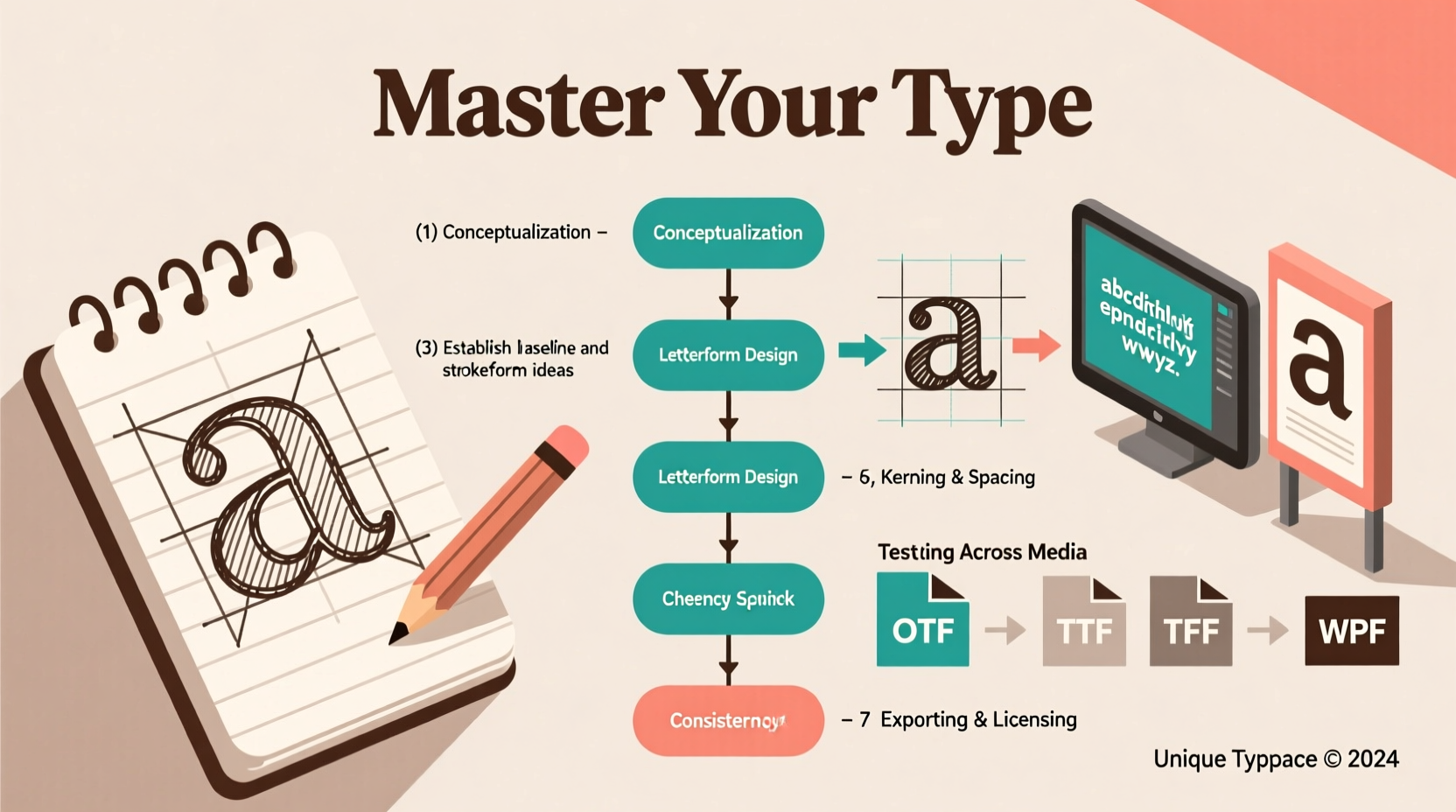
A Step-by-Step Process for Creating Your Typeface
Creating a functional, aesthetically cohesive font involves a structured workflow. Follow these phases to build a professional-grade typeface:
- Research & Inspiration: Gather references. Analyze similar styles. Identify gaps or opportunities for innovation.
- Sketching by Hand: Begin with pencil and paper. Focus on key characters: H, O, n, o, and a. These reveal structure, weight, and proportion.
- Digital Vectorization: Trace sketches using Bézier curves in software like Glyphs, FontForge, or Adobe Illustrator.
- Defining Core Metrics: Set baseline, x-height, cap height, ascender, and descender lines consistently across all glyphs.
- Expanding the Character Set: Build uppercase, lowercase, numbers, punctuation, and accented characters systematically.
- Kerning & Spacing: Adjust side bearings and kern pairs to ensure even visual rhythm between letters (e.g., “AV” often needs tighter spacing).
- Testing & Iteration: Print samples, view at different sizes, and test in real-world contexts like web pages or posters.
- Exporting & Distribution: Generate OTF, TTF, or WOFF files. Include proper licensing metadata.
Essential Tools and Software for Modern Font Design
The right tools streamline the design process and ensure technical accuracy. While pen and paper remain invaluable for ideation, digital execution requires specialized software.
| Software | Platform | Best For | Price Range |
|---|---|---|---|
| Glyphs (Mac) | macOS | Professional type designers, OpenType features | $129–$249 |
| FontLab 8 | Windows, macOS | Bridging illustration and font production | $399 (one-time) |
| RoboFont | macOS | Custom scripting, modular workflows | $299 |
| FontForge | Cross-platform | Budget-conscious designers, open-source users | Free |
| Illustrator + TransType | All platforms | Graphic designers transitioning into font work | Varies |
Regardless of tool choice, prioritize software that supports OpenType features, Unicode compliance, and hinting for screen rendering. Many professionals use a hybrid approach—sketching in Illustrator, refining in Glyphs, and testing via online font validators.
Common Pitfalls and How to Avoid Them
New type designers often underestimate the complexity of consistency. A single misaligned stem or uneven curve can disrupt the entire family. Below are frequent issues and solutions:
- Inconsistent Stroke Weight: Use guidelines and grid overlays to maintain uniform thickness across characters.
- Poor Spacing: Letters should feel evenly distributed, not mathematically equal. Use the “oi” and “AV” tests to evaluate optical balance.
- Overcomplicating Design: Start simple. A clean, functional core can later expand into bold, italic, or condensed variants.
- Neglecting International Characters: If targeting global use, include diacritics (é, ñ, ü) early to avoid retrofitting challenges.
- Skipping Testing Phases: View your font in context—on screens, in print, at small sizes. Poor hinting can make a font unreadable on low-resolution displays.
“In type design, perfection isn’t about symmetry—it’s about harmony. The eye forgives irregularity if the rhythm feels right.” — Eileen Tjan, Typography Educator
Case Study: Designing ‘Nova Serif’ for a Literary Magazine
A freelance designer was commissioned to create a custom serif face for a quarterly literary journal. The goal was warmth and readability for long-form reading, with subtle vintage touches.
The process began with studying early 20th-century book typefaces like Caslon and Electra. Initial sketches emphasized bracketed serifs and moderate stroke contrast. After digitizing the core 26-letter set, the designer tested printouts at 10pt size and noticed the ‘a’ and ‘e’ felt closed and heavy.
Adjustments included widening the aperture of ‘e’, lightening terminal strokes, and increasing x-height slightly for improved legibility. Kerning pairs were fine-tuned for common combinations like “To” and “Wa”. After six weeks of iteration, the final font included over 350 glyphs, supporting multiple languages and advanced ligatures.
The magazine reported a 22% increase in reader engagement, with feedback highlighting the “inviting texture” of the new typography. This case underscores how intentional font design directly impacts user experience.
Checklist: Launch-Ready Font Preparation
Before releasing your font publicly, ensure it meets professional standards:
- ✅ All basic Latin characters (A–Z, a–z, 0–9) are complete and consistent
- ✅ Accents and diacritics are properly aligned (é, ü, ñ, etc.)
- ✅ Kerning pairs cover common problematic combinations (e.g., “Ty”, “Vo”)
- ✅ Side bearings are balanced for even color and spacing
- ✅ Font has accurate metadata (family name, style, designer, license)
- ✅ Exported in multiple formats (OTF/TTF) and tested across platforms
- ✅ Includes a specimen sheet showing usage examples and character map
Frequently Asked Questions
How long does it take to design a full typeface?
Timeline varies by scope and experience. A basic monoweight font may take 3–6 weeks part-time. A complete family with multiple weights and italics can take 6 months to a year. Professional foundries often spend years refining a single superfamily.
Can I sell my custom font legally?
Yes, but only if you own the rights. Avoid basing designs too closely on copyrighted fonts. Originality is key. Always attach a clear license (e.g., SIL Open Font License or commercial EULA) when distributing.
Do I need to know coding to design fonts?
Not necessarily. Most font editors provide GUI-based tools for OpenType features. However, knowledge of Python (for Glyphs scripts) or XML (for feature files) can greatly enhance automation and functionality.
Final Thoughts: From Sketch to Signature Style
Font design is a journey of refinement—where craftsmanship meets expression. Every curve, angle, and space contributes to a distinct typographic identity. By following a disciplined process, leveraging the right tools, and embracing iterative feedback, you can create typefaces that stand out in a crowded visual landscape.
Your font could become the voice of a brand, the backbone of a publication, or a lasting contribution to design culture. Whether you're designing for clients, personal projects, or open-source sharing, the ability to shape letters is a powerful creative skill. Begin with a single glyph. Build with intention. And let your unique typographic vision take form—one character at a time.


 浙公网安备
33010002000092号
浙公网安备
33010002000092号 浙B2-20120091-4
Comments
No comments yet. Why don't you start the discussion?