
Converting a colour photograph to black and white is more than just removing hue—it’s an art form that emphasizes tone, contrast, texture, and emotion. Done well, a monochrome image can evoke depth and drama far beyond its original state. Yet many photographers fall into the trap of simply desaturating an image, missing the full potential of tonal control. This guide walks through advanced, practical techniques to transform your colour photos into compelling black and white masterpieces using purposeful editing decisions.
Why Not Just Desaturate?
While dragging the saturation slider to zero might seem like the quickest route to black and white, it often produces flat, lifeless results. Colour channels carry different luminance values—reds appear darker, blues lighter—and when converted without adjustment, these imbalances remain. A properly converted image accounts for how individual colours translate into shades of gray, allowing you to shape mood and focus.
Step-by-Step Conversion Process
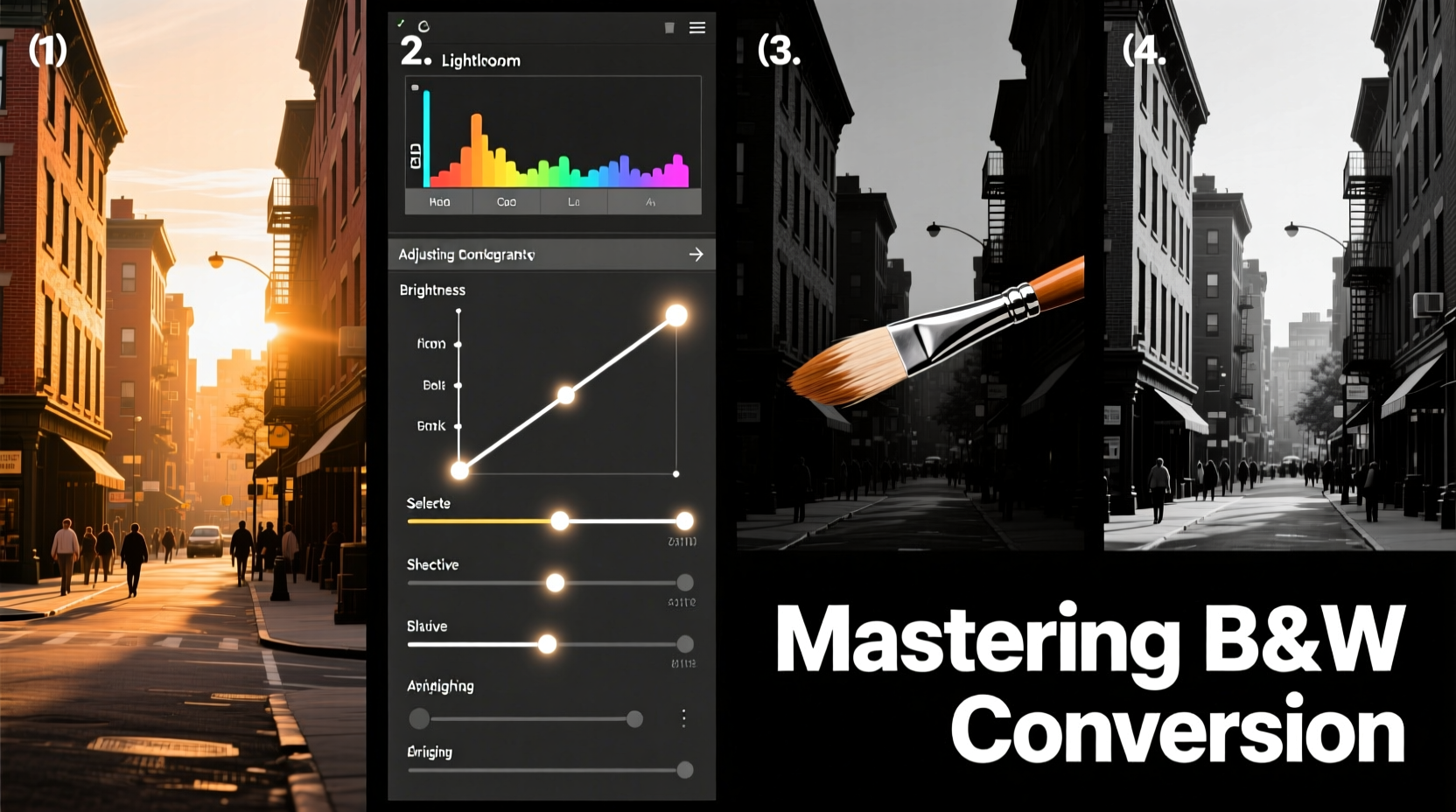
The following workflow applies to most photo editors, including Adobe Lightroom, Photoshop, and free alternatives like GIMP or Darktable. Each step builds upon the last to produce a dynamic, emotionally resonant image.
- Analyze the Original Image: Before converting, assess the scene’s composition, lighting, and emotional intent. Is it a portrait? A landscape? High contrast or soft light? Your approach will vary accordingly.
- Correct Exposure and White Balance: Even in monochrome, accurate exposure matters. Shadows should retain detail; highlights must not be blown out. Correct any white balance issues first—this affects how colours are interpreted during conversion.
- Use a Black & White Adjustment Layer (Photoshop) or B&W Panel (Lightroom): These tools allow selective control over how reds, greens, yellows, cyans, blues, and magentas render in grayscale.
- Adjust Individual Channel Sliders: For example, boosting the yellow channel can brighten skin tones in portraits, while reducing blue deepens skies in landscapes. Aim for natural-looking tonal transitions.
- Enhance Contrast Strategically: Apply a subtle S-curve in the tone curve panel to increase midtone contrast without crushing shadows or clipping highlights.
- Sharpen and Add Grain (Optional): Monochrome images often benefit from slight sharpening to emphasize texture. A touch of film-style grain can add authenticity and visual interest.
Real Example: Portrait Transformation
A wedding photographer shoots a bride outdoors under harsh sunlight. The original image has strong highlights on her veil and deep shadows under her chin. After basic exposure correction, she uses the Lightroom B&W panel to reduce yellow and green sliders slightly, preventing over-brightening of grass reflections on the dress. She increases reds moderately to preserve facial warmth and lifts oranges to soften skin tones. Finally, a gentle tone curve enhances dimensionality. The result is a timeless, emotive portrait where light sculpts form rather than distracts.
Tonal Control: The Key to Depth
In black and white photography, every element exists on a spectrum from pure black to pure white. Understanding how objects reflect light—and how those reflections translate into gray values—is essential. Consider this breakdown:
| Colour | Luminance Value (Approximate) | Effect When Brightened in B&W | Best Used For |
|---|---|---|---|
| Red | Medium-Dark | Softens skin, lightens brick/wood | Portraits, architecture |
| Yellow | Bright | Highlights skin, sand, foliage | Outdoor portraits, nature |
| Green | Medium | Can wash out leaves if overdone | Landscape foliage control |
| Blue | Dark | Deepens skies, cools shadows | Dramatic skies, moody scenes |
| Cyan | Medium-Light | Adds airiness to water or sky | Seascapes, architectural interiors |
“Black and white isn’t about absence of colour—it’s about presence of tone. Master the grays, and you master the image.” — Sarah Lin, Fine Art Photographer
Common Mistakes to Avoid
- Ignoring tonal separation: When adjacent areas become the same shade of gray, the image loses structure. Use channel adjustments to differentiate elements (e.g., make a red flower stand out against green foliage).
- Over-sharpening: While detail matters, excessive sharpening introduces halos and noise, especially in smooth areas like skin or skies.
- Forgetting the story: Technical perfection means little if the image lacks emotional impact. Ask: Does this conversion enhance the narrative?
- Applying presets blindly: Presets are starting points, not final solutions. Always fine-tune based on the specific image.
Advanced Techniques for Professional Results
Beyond basic conversion, consider these pro-level methods:
1. Dodging and Burning in Layers
Create separate layers set to “Overlay” or “Soft Light” and use low-opacity brushes to subtly lighten (dodge) or darken (burn) areas. This mimics darkroom techniques and adds three-dimensionality.
2. Using Infrared-Like Effects with Channel Swaps
In Photoshop, try swapping red and blue channels before conversion. This creates surreal, high-contrast foliage effects popular in artistic landscape work.
3. Selective Toning
Apply split toning to add warmth (sepia-like tones in shadows) or coolness (blue tints in highlights). Even in monochrome, subtle colour tints influence perception. Warm tones feel nostalgic; cool ones feel modern or austere.
Checklist: Black and White Conversion Workflow
- ✅ Start with a well-exposed, sharp image
- ✅ Correct white balance and exposure
- ✅ Use dedicated B&W conversion tool (not desaturation)
- ✅ Adjust individual colour channel sliders for tonal balance
- ✅ Refine contrast with tone curves
- ✅ Enhance texture with sharpening and optional grain
- ✅ Evaluate final output at multiple sizes and on different screens
Frequently Asked Questions
Can I convert JPEGs to black and white effectively?
Yes, but RAW files offer greater flexibility. JPEGs have already been processed and compressed, limiting recovery in shadows and highlights. Work with the highest quality source possible.
Should I shoot in black and white mode on my camera?
Only as a preview. Always shoot in colour. The in-camera monochrome view helps visualize composition, but actual conversion should happen in post-processing for maximum control.
How do I know when a photo works in black and white?
Look for strong shapes, textures, patterns, and contrast. If the image relies heavily on colour relationships (e.g., complementary hues), it may lose impact. Conversely, scenes with emotional lighting or graphic composition often thrive in monochrome.
Conclusion: Elevate Your Vision Through Intentional Editing
Converting colour images to black and white is not a technical afterthought—it’s a creative decision that redefines how viewers experience your work. By understanding tonal translation, mastering channel controls, and applying thoughtful enhancements, you turn ordinary photos into expressive, enduring images. Whether capturing street life, portraiture, or quiet landscapes, the power of monochrome lies in its ability to strip away distraction and reveal essence.


 浙公网安备
33010002000092号
浙公网安备
33010002000092号 浙B2-20120091-4
Comments
No comments yet. Why don't you start the discussion?