
A company’s logo is more than just a visual mark—it’s the cornerstone of its brand identity. It’s often the first impression customers have of a business, and when done right, it can communicate values, evoke emotion, and build instant recognition. From Nike’s swoosh to Apple’s bitten apple, iconic logos are simple, meaningful, and enduring. But behind every great logo lies a thoughtful process rooted in strategy, creativity, and clarity. Designing a powerful logo isn’t about trends; it’s about crafting an identity that lasts.
The Psychology Behind Effective Logo Design
Logos operate on both conscious and subconscious levels. A well-designed logo doesn’t just look good—it communicates trust, professionalism, and relevance. Color, shape, and typography all play psychological roles:
- Color: Blue conveys trust (used by Facebook, IBM), red suggests energy and passion (Coca-Cola, Target), while green often represents growth or sustainability (Starbucks, Whole Foods).
- Shape: Circles imply community and unity; squares suggest stability and reliability; triangles denote power and direction.
- Typography: Serif fonts feel traditional and authoritative; sans-serif fonts appear modern and clean; script fonts can suggest elegance or creativity.
The most effective logos use these elements in harmony to reflect the brand’s personality without relying on literal imagery.
“Design is not just what it looks like. Design is how it works.” — Steve Jobs
Core Principles of Memorable Logo Design
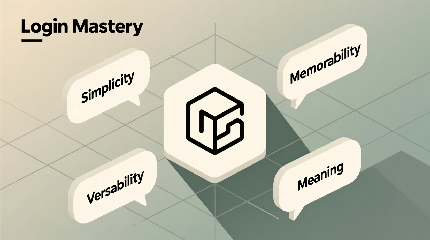
Timeless logos share common traits. These aren’t rules set in stone, but guiding principles that separate forgettable marks from iconic ones.
Simplicity
The best logos are instantly recognizable, even at small sizes. Think of the Twitter bird or the McDonald’s golden arches—simple shapes that convey meaning quickly. Avoid clutter, excessive detail, or too many colors.
Scalability
Your logo must be legible and impactful whether it's on a business card or a billboard. A scalable design maintains integrity across formats without losing clarity.
Uniqueness
Standing out matters. While inspiration is valuable, imitation dilutes credibility. Conduct thorough research to ensure your logo doesn’t resemble competitors’ too closely.
Versatility
A versatile logo works across mediums—digital platforms, print, embroidery, signage—and adapts to different backgrounds (light, dark, textured). Consider creating alternate versions (horizontal, stacked, icon-only) for flexibility.
Timelessness
Trends fade. Logos built on fleeting styles may require costly rebrands sooner than expected. Aim for longevity by focusing on core brand values rather than current aesthetics.
Step-by-Step Guide to Designing Your Company Logo
Creating a compelling logo requires more than graphic skill—it demands strategic thinking. Follow this structured approach to ensure your design aligns with your brand’s mission and audience.
- Define Your Brand Identity
Before sketching, clarify your brand’s purpose, target audience, tone, and core values. Ask: What do we stand for? Who are we speaking to? - Research Competitors
Analyze industry leaders and niche players. Identify patterns in color, style, and symbolism. Use this to find opportunities to differentiate. - Gather Inspiration
Explore design galleries like Dribbble, Behance, or LogoLounge. Save examples that resonate—but don’t copy. Focus on understanding why certain designs work. - Sketch Concepts by Hand
Start with pencil and paper. Rapid sketching encourages creative exploration without technical constraints. Generate 20+ rough ideas before refining. - Digitize Top Concepts
Select 3–5 promising sketches and recreate them digitally using vector software (Adobe Illustrator, Figma, Affinity Designer). - Refine and Iterate
Test variations in size, color, and layout. Solicit feedback from stakeholders—but avoid design by committee. Stay focused on your original intent. - Finalize and Deliver Assets
Export your final logo in multiple formats: SVG (for web), PNG (transparent background), EPS/PDF (print), and favicon size (32x32 px).
Do’s and Don’ts of Professional Logo Design
| Do’s | Don’ts |
|---|---|
| Use vector graphics for scalability | Use low-resolution images or raster files |
| Limit your palette to 2–3 colors max | Overuse gradients or neon shades |
| Ensure readability in all contexts | Choose overly decorative or thin fonts |
| Design with long-term goals in mind | Chase short-lived design fads |
| Test your logo in grayscale | Rely solely on color to convey meaning |
Mini Case Study: Rebranding a Local Coffee Roaster
“Bean Theory” was a small-batch coffee roaster struggling with inconsistent branding. Their original logo featured a detailed illustration of a steaming cup, intricate swirls, and three different fonts. It looked crowded and didn’t scale well on packaging or social media.
A redesign began with stakeholder interviews and customer surveys. The team discovered that customers valued authenticity, craftsmanship, and simplicity. Inspired by artisanal European roasters, they shifted toward minimalism.
The new logo used a custom serif font paired with a simplified coffee bean motif inside a circular badge. The monochrome version worked perfectly on espresso cups, while the full-color variant stood out on bags. Within six months, brand recall increased by 40%, and wholesale partners praised the professional upgrade.
This case illustrates how aligning visual design with brand essence leads to tangible results—not just aesthetic improvement.
Checklist: Pre-Launch Logo Review
Before finalizing your logo, run through this checklist to ensure quality and consistency:
- ✅ Is the logo legible at thumbnail size (e.g., app icons)?
- ✅ Does it work in black and white?
- ✅ Can it be easily described in words (verbalizable)?
- ✅ Is it distinct from competitor logos?
- ✅ Are vector source files saved and backed up?
- ✅ Have you secured trademark rights if applicable?
- ✅ Do all team members agree on the final version?
Frequently Asked Questions
How much should I expect to pay for a professional logo?
Pricing varies widely. Freelancers may charge $100–$500 for basic designs, while experienced designers or agencies typically charge $1,000–$5,000+. High-end corporate rebrands can exceed $50,000. Invest based on your business stage and long-term needs.
Should I design my own logo or hire a professional?
If you have design experience and time, DIY tools like Canva or Looka can help. However, hiring a skilled designer ensures originality, technical precision, and strategic alignment. For most businesses, professional design is worth the investment.
How often should a company update its logo?
There’s no fixed timeline. Some brands go decades without change (Coca-Cola), while others evolve every 5–7 years to stay relevant. Only rebrand when necessary—due to major shifts in audience, services, or market positioning. Frequent changes can confuse customers.
Conclusion: Build a Legacy, Not Just a Mark
A powerful logo is not created overnight. It emerges from deep understanding, deliberate choices, and artistic discipline. Whether you're launching a startup or refreshing an established brand, treat your logo as a long-term asset—not a one-time task. Every line, color, and letter should serve a purpose.
Now is the time to evaluate your current branding or begin shaping your visual identity with intention. Sketch, refine, test, and repeat until you arrive at something that feels authentic and enduring. The world remembers bold identities. Make yours unforgettable.


 浙公网安备
33010002000092号
浙公网安备
33010002000092号 浙B2-20120091-4
Comments
No comments yet. Why don't you start the discussion?