
Excel is more than just a tool for numbers—it's a powerful platform for organizing, visualizing, and presenting data effectively. One of the most common yet overlooked skills is knowing how to properly insert a line in Excel, whether you're adding new rows, applying cell borders, or drawing lines within charts. Mastering these techniques improves readability, enhances structure, and gives your spreadsheets a polished look. This guide breaks down each method with precision, offering actionable steps and expert insights.
Inserting New Rows: Adding Space Where You Need It
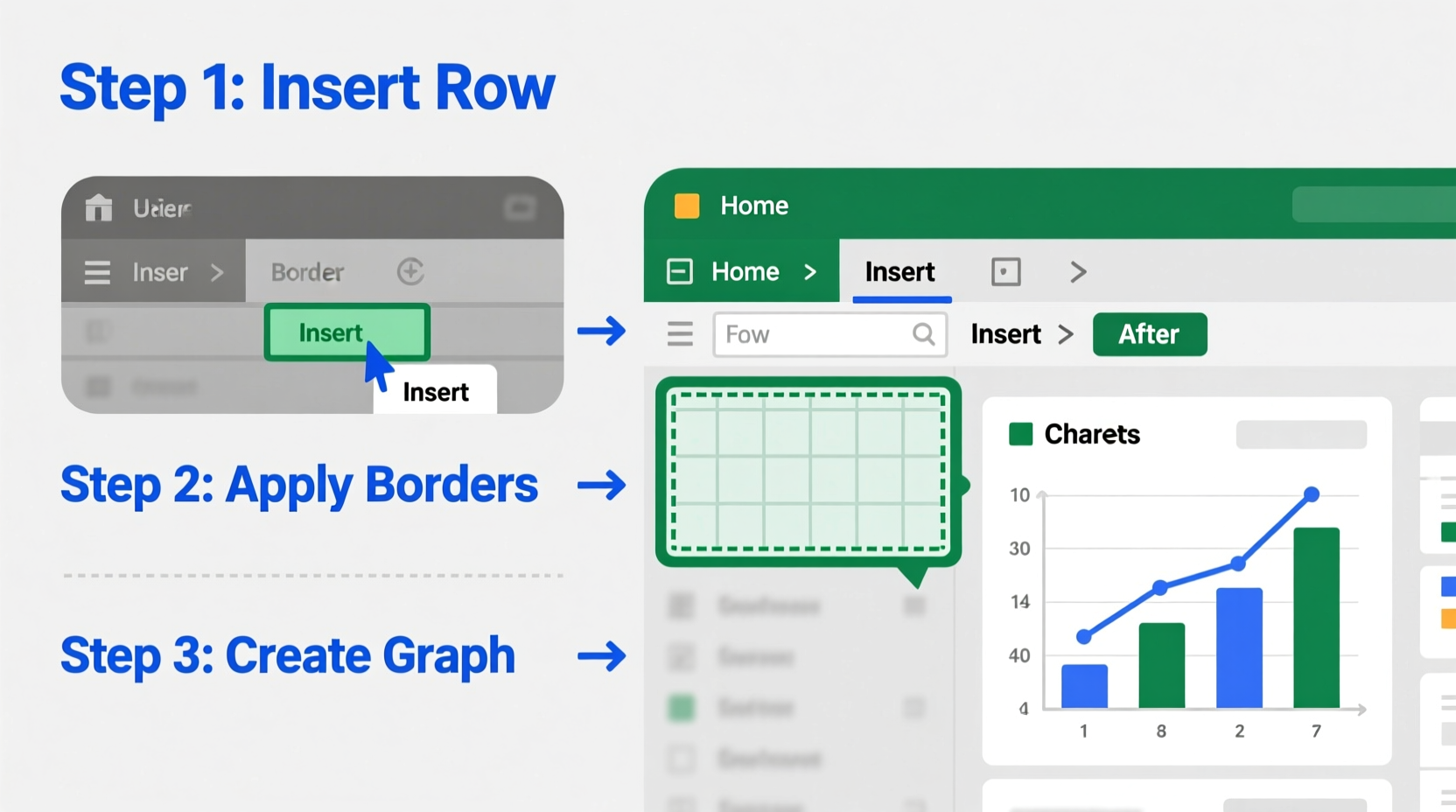
When working with growing datasets, inserting a new row is essential to maintain clarity and avoid overwriting existing information. Excel makes this simple, but knowing the correct method ensures consistency across your workbook.
- Select the row below where you want the new line to appear. For example, to insert a row between Row 5 and Row 6, click on the \"6\" on the left-hand side.
- Right-click on the selected row number.
- Choose “Insert” from the context menu. Excel will shift all existing rows downward and add a blank row above.
You can also use keyboard shortcuts: After selecting the target row, press Ctrl + Shift + + (plus sign) to insert a new row instantly.
Drawing Cell Borders: Creating Visual Separation
Borders act as lines that define sections, separate data categories, or highlight key figures. Unlike inserting rows, border lines don’t affect data placement—they enhance visual hierarchy.
To apply borders:
- Select the cells you want to format.
- Navigate to the Home tab.
- In the Font group, click the Border dropdown arrow.
- Choose a preset style such as “All Borders,” “Outside Borders,” or “Bottom Border.”
For custom borders, select “More Borders” at the bottom of the menu. This opens the Format Cells dialog box, where you can choose line style, color, and specific border positions (top, diagonal, etc.).
| Border Type | Best Use Case |
|---|---|
| Thick Outside Border | Highlighting totals or final results |
| Horizontal Line (Bottom Only) | Separating section headers from data |
| Dashed Internal Lines | Distinguishing optional or estimated values |
| No Border | Maintaining minimalism in dense tables |
“Proper use of borders reduces cognitive load when reviewing reports. A well-bounded table guides the eye naturally.” — David Lin, Data Visualization Consultant
Adding Lines to Graphs: Enhancing Chart Clarity
In charts, lines aren’t just decorative—they serve analytical purposes. Whether it’s a trendline, threshold marker, or reference line, inserting one correctly ensures accurate interpretation.
To add a reference line to a chart:
- Create your base chart (e.g., a column or line graph).
- Prepare a new data series representing the line value. For example, if you want a horizontal line at $50,000 across months, create a column filled with 50000 corresponding to each month.
- Select the chart, then click “Select Data” under the Chart Design tab.
- Add the new series and confirm. Excel will plot the constant value as a straight line.
- Format the line: Right-click the new data series, choose “Format Data Series,” and adjust color, width, and style (solid, dashed).
This technique works especially well for benchmark comparisons—like showing average sales versus individual monthly performance.
Using Shapes to Draw Freeform Lines
Sometimes, built-in options aren’t enough. When you need diagonal dividers, callout connectors, or artistic separation lines, Excel’s shape tools come into play.
To insert a freehand line:
- Go to the Insert tab.
- In the Illustrations group, click Shapes.
- Under “Lines,” select the straight line, curved line, or freeform tool.
- Click and drag on the worksheet to draw the line where desired.
- Use the formatting options to adjust weight, color, and arrowheads.
Note: Lines drawn via shapes are objects, not part of the cell grid. They float above cells and may shift if rows/columns resize unless anchored properly. To fix positioning, right-click the line, choose “Format Shape,” go to “Properties,” and select “Move and size with cells.”
Mini Case Study: Streamlining a Sales Report
A regional sales manager was compiling quarterly results across five teams. The initial spreadsheet lacked visual cues, making it hard to distinguish team sections. By inserting blank rows between each team and applying thick top and bottom borders, she created clear divisions. Additionally, she added a dashed red line across a bar chart to represent the company-wide sales target. These small changes reduced misinterpretation during leadership reviews and improved presentation clarity in meetings.
Common Mistakes and Best Practices
Even experienced users make errors when inserting lines. Here’s what to avoid—and what to embrace.
- Mistake: Using merged cells with borders to simulate section breaks. This disrupts sorting and filtering.
- Solution: Use consistent row spacing and border styles instead.
- Mistake: Overusing thick or colored borders, which can distract from actual data.
- Solution: Apply subtle, uniform styling focused on function, not decoration.
- Mistake: Forgetting to lock shape-positioning settings, leading to displaced lines after edits.
- Solution: Always set object properties to move and resize with underlying cells.
- ✅ Insert rows using right-click or Ctrl+Shift++
- ✅ Apply borders through the Home > Border menu
- ✅ Add reference lines to charts using helper data series
- ✅ Use Shapes for custom lines and annotations
- ✅ Set shape properties to “Move and size with cells”
- ✅ Keep border styles consistent and minimal
Frequently Asked Questions
Can I insert a diagonal line inside a single cell?
Yes. Select the cell, right-click, choose “Format Cells,” go to the Border tab, and click the diagonal line icon. This is often used in header cells to save space when labeling two dimensions (e.g., time vs. region).
Why isn’t my chart line appearing straight?
This usually happens if the reference data isn’t consistent. Ensure every point in the new series has the same value. Also, verify that the axis scale isn’t distorting perception—adjust minimum/maximum bounds if needed.
How do I remove an inserted line or border?
To remove a row, right-click the row number and select “Delete.” To erase borders, reselect the cells, go to Home > Border > Erase Border. For shape lines, simply click and press Delete.
Final Thoughts and Action Steps
Inserting a line in Excel goes beyond aesthetics—it’s about creating structure, improving communication, and supporting decision-making. Whether you’re inserting a row to accommodate new entries, applying borders for visual clarity, or embedding a trendline in a chart, each action contributes to a more effective document.
Take a moment to review your current Excel files. Identify one report that feels cluttered or unclear. Apply the techniques outlined here: insert a strategic row, refine borders, or add a meaningful line to a chart. Small improvements compound into significant gains in professionalism and usability.


 浙公网安备
33010002000092号
浙公网安备
33010002000092号 浙B2-20120091-4
Comments
No comments yet. Why don't you start the discussion?