
Great design begins with great structure. A well-crafted layout doesn’t just look good—it guides the eye, enhances usability, and communicates intent clearly. Whether you're designing a website, a brochure, or a mobile app interface, mastering layout creation is essential. This guide breaks down the process into actionable steps, combining timeless design principles with modern execution strategies.
Understanding Layout Fundamentals
A layout is more than the placement of elements on a page. It’s a deliberate arrangement that balances aesthetics, readability, and function. At its core, every effective layout relies on four foundational principles: alignment, proximity, contrast, and repetition.
- Alignment: Ensures visual cohesion by lining up text, images, and other components along consistent axes.
- Proximity: Groups related items together to establish hierarchy and reduce cognitive load.
- Contrast: Uses differences in size, color, or typography to highlight key elements.
- Repetition: Reinforces brand identity through consistent use of fonts, colors, and spacing.
These principles form the backbone of visual organization. Without them, even the most creative ideas can appear chaotic.
“Design is not just what it looks like. Design is how it works.” — Steve Jobs
The Step-by-Step Process to Crafting Effective Layouts
Creating a compelling layout isn’t guesswork—it’s a structured process. Follow these seven steps to move from concept to polished design.
- Define the Purpose: Begin by asking: What is this layout meant to achieve? Is it to inform, sell, entertain, or guide navigation? Your goal shapes every decision.
- Know Your Audience: A layout for a financial report will differ drastically from one for a children’s book. Consider age, preferences, and technical literacy.
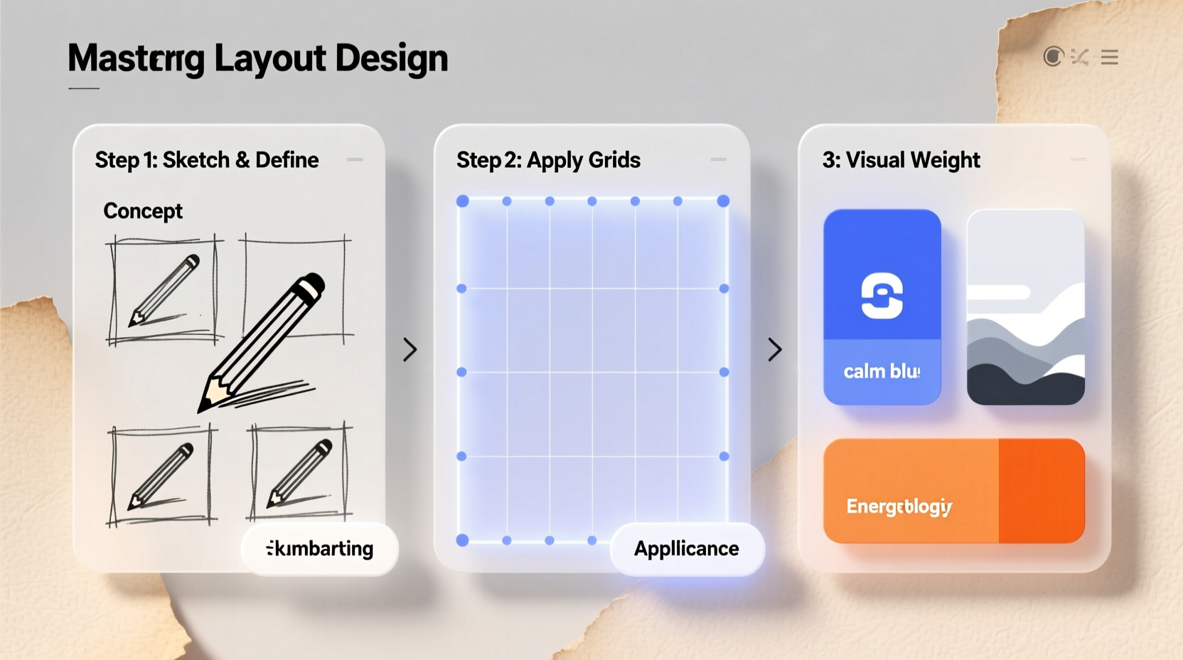
- Create a Wireframe: Sketch a low-fidelity version using boxes and placeholders. Focus on structure, not style. Tools like Figma, Adobe XD, or pen and paper work well.
- Establish a Grid System: Use columns and margins to bring order. Common systems include 12-column grids for web or modular grids for editorial design.
- Set Visual Hierarchy: Prioritize information by size, weight, and position. The most important element should be seen first.
- Add Content and Refine Spacing: Insert actual text and images. Adjust padding, line height, and margins until the layout breathes naturally.
- Test and Iterate: View your layout on different devices and gather feedback. Make adjustments based on real-world usage.
Choosing the Right Layout Type for Your Project
Different goals call for different structures. Here are five common layout types and when to use them:
| Layout Type | Best For | Key Characteristics |
|---|---|---|
| Single-Column | Mobile interfaces, long-form articles | Linear flow, minimal distractions |
| Grid-Based | E-commerce, portfolios, dashboards | Modular, scalable, highly organized |
| Z-Pattern | Websites with clear CTAs, landing pages | Follows natural eye movement (top-left to bottom-right) |
| F-Pattern | Blogs, news sites, documentation | Optimized for scanning; emphasizes headers and first lines |
| Magazine Style | Editorial design, digital publications | Dynamic, asymmetric, rich in imagery and typographic variety |
Selecting the right layout type ensures your design supports user behavior rather than fighting against it.
Real Example: Redesigning a Startup’s Homepage
A SaaS startup struggled with high bounce rates on their homepage. Their original layout crammed features, testimonials, pricing, and a signup form above the fold—creating visual noise. By applying a Z-pattern layout, we restructured the page to guide users from logo to headline, then to a primary CTA, followed by benefits and social proof below. Within three weeks, engagement increased by 47%, and conversion rates rose by 22%. The change wasn’t in content but in clarity of structure.
Essential Tools and Software
While principles remain constant, tools evolve. Choose software that matches your workflow and output needs.
- Figma: Ideal for collaborative, responsive web and app layouts. Offers real-time editing and prototyping.
- Adobe XD: Great for high-fidelity mockups and interactive prototypes, especially within the Adobe ecosystem.
- Sketch: Mac-only, popular among UI/UX designers for its simplicity and plugin support.
- Canva: Beginner-friendly for social media graphics and simple print layouts.
- Pen and Paper: Never underestimate sketching. Rapid ideation often starts best without a screen.
Common Mistakes and How to Avoid Them
Even experienced designers fall into traps. Recognizing these pitfalls early saves time and improves outcomes.
“The details are not the details. They make the design.” — Charles Eames
Here are frequent errors and their solutions:
| Mistake | Why It’s Problematic | Solution |
|---|---|---|
| Overcrowding | Reduces readability and overwhelms users | Apply the “less is more” rule. Use whitespace generously. |
| Poor Alignment | Creates visual disarray and confusion | Enable snap-to-grid and use alignment tools rigorously. |
| Inconsistent Typography | Undermines professionalism and brand identity | Limited to two typefaces: one for headings, one for body. |
| Ignoring Mobile View | Alienates over half of web traffic | Design responsively from the start, not as an afterthought. |
Checklist: Pre-Launch Layout Review
Before finalizing any layout, run through this checklist:
- ✅ All elements align to the grid
- ✅ Visual hierarchy is clear and logical
- ✅ Whitespace is balanced, not cramped
- ✅ Typography is consistent across all sections
- ✅ Call-to-action stands out without being jarring
- ✅ Layout functions on mobile, tablet, and desktop
- ✅ No orphaned headings or isolated text blocks
- ✅ Colors meet accessibility standards (contrast ratio ≥ 4.5:1)
FAQ
How do I choose the right font size and spacing?
Start with a base font size of 16px for body text on screens. Line height should be 1.5 times the font size for readability. Headings should scale proportionally—e.g., H1 at 2em, H2 at 1.5em. Always test on multiple devices.
What’s the role of whitespace in layout design?
Whitespace (or negative space) isn’t empty—it’s active design. It reduces clutter, improves comprehension, and draws attention to key elements. Crowded layouts fatigue the eye; generous spacing invites engagement.
Can I break the grid? When is it acceptable?
Yes—but only intentionally. Breaking the grid can create dynamic emphasis, such as a full-width image or off-center headline. Do so sparingly and ensure it serves a purpose, not just novelty.
Final Thoughts and Next Steps
Mastering layout design is a blend of discipline and creativity. It requires understanding human perception, respecting structure, and knowing when to innovate. The most stunning designs aren’t those with the most elements, but those where every piece has a reason to exist.
Begin with intention. Sketch freely. Refine relentlessly. Test broadly. Each project sharpens your instinct for balance and flow. Over time, layout creation becomes less about rules and more about rhythm.


 浙公网安备
33010002000092号
浙公网安备
33010002000092号 浙B2-20120091-4
Comments
No comments yet. Why don't you start the discussion?