
In today’s digital-first world, a website is more than just an online presence—it’s your brand’s voice, storefront, and first impression all in one. A poorly designed site can drive visitors away in seconds, while a well-crafted, intuitive interface keeps them engaged, builds trust, and drives conversions. Creating the best website isn’t about flashy animations or complex layouts; it’s about strategic clarity, seamless usability, and thoughtful execution. This guide breaks down the core principles and actionable steps to help you build websites that don’t just look good—they perform exceptionally.
1. Prioritize User-Centered Design
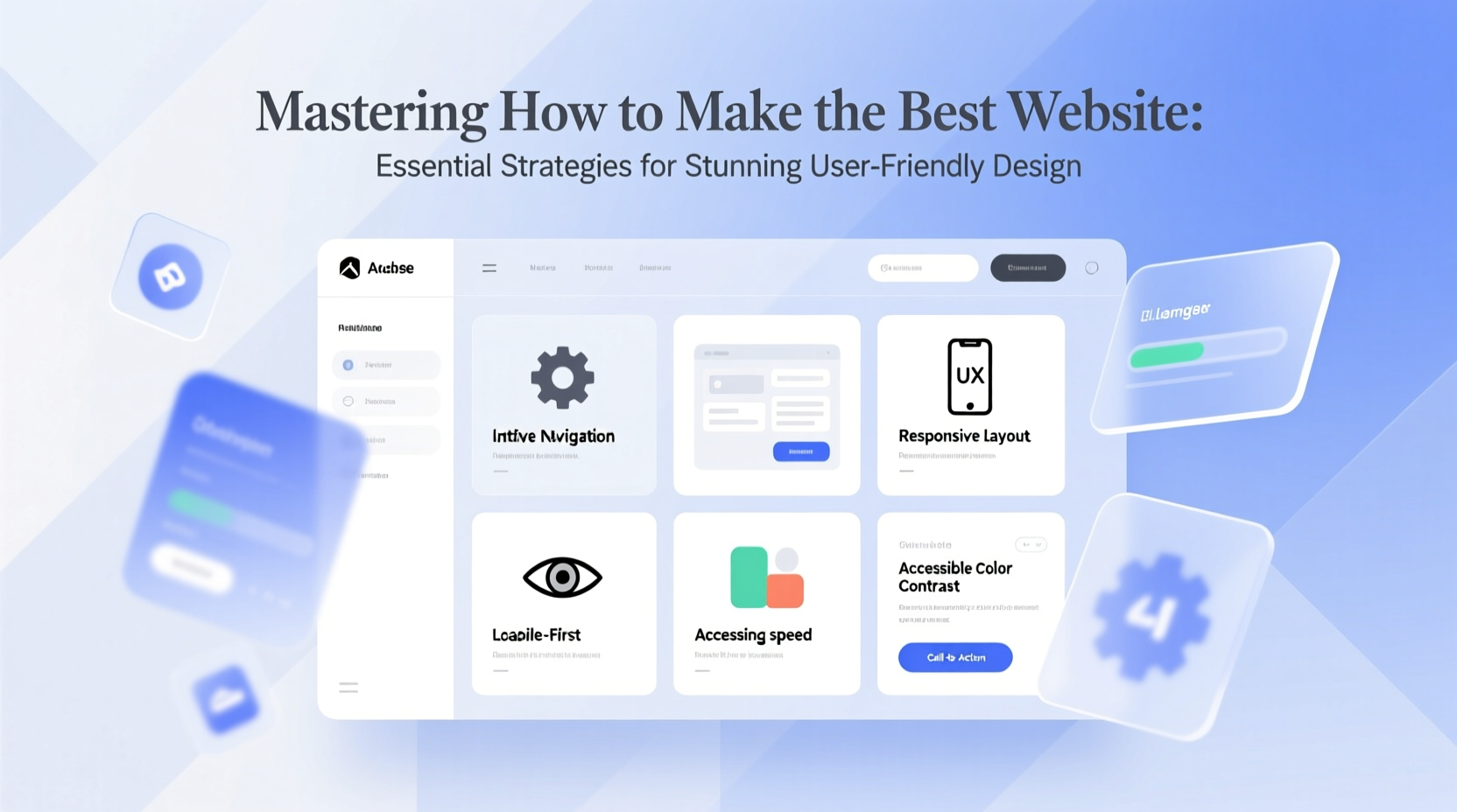
User experience (UX) should be the foundation of every design decision. A visually appealing website fails if users can’t find what they need. Begin by understanding your audience: their goals, behaviors, and pain points. Map out user journeys to anticipate how visitors will navigate from entry to conversion.
Design with empathy. Use clear headings, logical content hierarchy, and intuitive navigation menus. Avoid overwhelming users with too many choices—limit primary navigation items to five or six. The F-pattern and Z-pattern reading models suggest placing critical information along natural eye-scan paths, especially above the fold.
Key UX Principles to Apply
- Simplicity: Remove unnecessary elements that distract from core actions.
- Consistency: Maintain uniform typography, button styles, and interaction patterns across pages.
- Accessibility: Ensure readability for all users, including those using screen readers or navigating via keyboard.
- Feedback: Provide visual cues for interactions (e.g., button hover states, form validation).
“Design is not just what it looks like. Design is how it works.” — Steve Jobs
2. Optimize for Speed and Performance
No matter how beautiful your design, slow load times destroy user engagement. Google reports that 53% of mobile users abandon sites that take longer than three seconds to load. Performance isn’t optional—it’s a ranking factor and a business imperative.
To maximize speed, compress images without sacrificing quality, leverage browser caching, minify CSS and JavaScript, and use a reliable Content Delivery Network (CDN). Audit your site regularly using tools like Google PageSpeed Insights or Lighthouse.
| Performance Factor | Best Practice | Impact |
|---|---|---|
| Image Optimization | Use WebP format, lazy loading | Reduces page weight by up to 70% |
| Code Minification | Remove whitespace, comments | Faster parsing and rendering |
| Server Response Time | Choose fast hosting, enable Gzip | Improves Time to First Byte (TTFB) |
| Third-Party Scripts | Limit trackers, defer non-critical JS | Prevents render-blocking delays |
3. Craft a Responsive, Mobile-First Layout
Over 60% of global web traffic comes from mobile devices. A desktop-first approach no longer suffices. Adopt a mobile-first mindset: start designing for the smallest screens, then scale up. This ensures core content and functionality are prioritized and accessible on all devices.
Use flexible grids, fluid images, and CSS media queries to create responsive layouts. Test across real devices—not just emulators—to catch display inconsistencies. Touch targets should be at least 48x48 pixels, and forms must be easy to complete on mobile keyboards.
Responsive Design Checklist
- Test layout breakpoints at common screen sizes (320px, 768px, 1024px).
- Ensure font sizes are legible without zooming.
- Hide non-essential content on mobile using collapsible menus.
- Verify that buttons and links are spaced adequately.
- Optimize tap targets for fingers, not cursors.
4. Build Trust Through Visual Hierarchy and Branding
A strong visual hierarchy guides users naturally through your content. Use size, color, contrast, and spacing to emphasize key messages. Headlines should stand out, calls-to-action (CTAs) should pop, and supporting text should support—not compete.
Consistent branding reinforces credibility. Stick to a defined color palette, typography system, and tone of voice. Logos should be visible but not overpowering. White space is not wasted space—it improves readability and focus.
Real Example: A local bakery redesigned its website focusing on high-quality imagery of fresh pastries, simplified navigation, and a bold “Order Online” button. Within six weeks, online orders increased by 42%. The change wasn’t in product quality—it was in clarity and emotional appeal.
Do’s and Don’ts of Visual Design
| Do | Don't |
|---|---|
| Use one dominant CTA per page | Crowd the page with multiple CTAs |
| Align elements to a grid | Allow misaligned or floating components |
| Use contrasting colors for buttons | Use low-contrast text that blends into background |
| Leverage whitespace around key sections | Clutter the layout with excessive widgets |
5. Implement a Strategic Content and SEO Framework
Even the most beautiful site won’t succeed if no one can find it. Integrate SEO from the beginning. Use semantic HTML tags (like <h1>, <p>, <article>) to structure content for both users and search engines. Include relevant keywords naturally in headlines, meta descriptions, and image alt text.
Write for humans first, algorithms second. Break long paragraphs into digestible chunks. Use bullet points, subheadings, and short sentences. Update content regularly to maintain relevance and authority.
“Content is king, but distribution is queen and she wears the pants.” — Jonathan Perelman
SEO Best Practices at Launch
- Create unique, descriptive page titles under 60 characters.
- Write compelling meta descriptions (under 155 characters).
- Use clean, readable URLs (e.g., /web-design-tips instead of /page?id=12).
- Submit an XML sitemap to Google Search Console.
- Ensure robots.txt allows proper crawling.
FAQ
How important is website accessibility?
Extremely. Over 1 billion people live with disabilities. An accessible site ensures compliance with standards like WCAG, expands your audience, and improves overall usability. Use sufficient color contrast, provide text alternatives for images, and ensure keyboard navigability.
Can I build a high-performing site without coding knowledge?
Yes. Platforms like Webflow, Squarespace, and WordPress with modern themes allow powerful design and functionality without writing code. However, understanding basic HTML and CSS gives you greater control over customization and troubleshooting.
What makes a call-to-action effective?
An effective CTA is action-oriented, clearly worded, and visually distinct. Instead of “Submit,” try “Get Your Free Guide” or “Start Your Trial.” Place CTAs where users naturally pause—after benefits, testimonials, or pricing tables.
Conclusion
Creating the best website is not a one-time task—it’s an ongoing process of refinement, testing, and optimization. By centering your design on real user needs, optimizing performance, embracing mobile responsiveness, reinforcing trust through visuals, and integrating smart SEO practices, you lay the foundation for a site that attracts, engages, and converts.
The difference between a forgettable site and a standout one lies in attention to detail and commitment to excellence. Start applying these strategies today. Audit your current site, implement one improvement at a time, and measure the impact. Great design isn’t magic—it’s methodical, intentional, and achievable.


 浙公网安备
33010002000092号
浙公网安备
33010002000092号 浙B2-20120091-4
Comments
No comments yet. Why don't you start the discussion?