
Data surrounds us—in news reports, financial summaries, scientific studies, and even daily fitness tracking. One of the most common ways to visualize trends over time is through a line plot. Yet, despite its simplicity, misreading a line plot can lead to incorrect conclusions. Whether you're a student, analyst, educator, or curious reader, understanding how to interpret line plots accurately is a foundational skill in data literacy. This guide breaks down the process into actionable steps, equipping you with the tools to extract meaningful insights from any line plot you encounter.
Understanding the Basics: What Is a Line Plot?
A line plot—also known as a line graph or line chart—displays data points connected by straight lines on a two-dimensional grid. It’s particularly effective for showing changes over time, such as temperature fluctuations, stock prices, or population growth. The horizontal axis (x-axis) typically represents time or categories, while the vertical axis (y-axis) shows the measured values.
Each point on the graph corresponds to a pair of values: one from the x-axis and one from the y-axis. When these points are linked, they form a continuous line that reveals patterns like increases, decreases, peaks, and plateaus.
“Line plots turn abstract numbers into visual stories. The key is learning how to read between the lines.” — Dr. Lila Nguyen, Data Visualization Researcher, MIT Media Lab
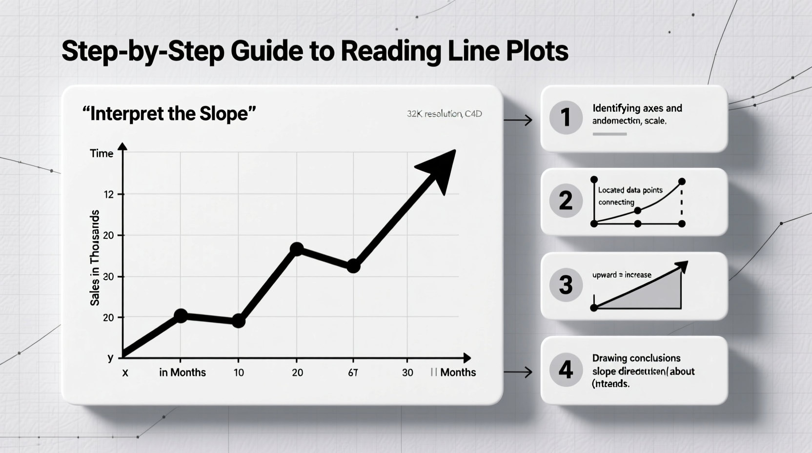
Step-by-Step Guide to Reading a Line Plot
Interpreting a line plot effectively requires a systematic approach. Follow these six steps to ensure clarity and accuracy in your analysis.
- Identify the Axes and Their Labels
Begin by reading the labels on both axes. What does the x-axis represent? Time, age, distance? What units are used? Similarly, examine the y-axis: Is it measuring quantity, percentage, temperature? Understanding these labels sets the context for everything else. - Note the Scale and Intervals
Check whether the scale is consistent. A sudden jump in intervals or a truncated y-axis can exaggerate trends. For example, a graph showing sales from $990 to $1,000 may look dramatic if the axis starts at $990, but the actual change is minimal. - Locate Data Points and Trends
Trace the line from left to right. Is it rising, falling, or fluctuating? Look for overall direction—this indicates the general trend. A steady upward slope suggests growth; a downward trend indicates decline. - Identify Peaks and Valleys
Mark significant highs (peaks) and lows (valleys). Ask: What caused them? Were there external events—like holidays, policy changes, or natural disasters—that might explain these shifts? - Compare Multiple Lines (if present)
Some line plots include multiple lines representing different groups (e.g., sales of Product A vs. Product B). Compare their trajectories. Do they move together? Does one consistently outperform the other? - Draw Conclusions Based on Evidence
Synthesize what you’ve observed. Avoid assumptions not supported by the data. Instead, state conclusions grounded in the visible patterns: “Sales increased steadily from January to June,” rather than “The marketing campaign was successful,” unless additional context supports that claim.
Common Pitfalls and How to Avoid Them
Even experienced readers can misinterpret line plots due to misleading design choices or cognitive biases. Awareness of these traps improves analytical rigor.
| Pitfall | Description | How to Avoid |
|---|---|---|
| Truncated Y-Axis | The y-axis doesn’t start at zero, making small differences appear large. | Check the full range of values. Calculate the actual percentage change. |
| Inconsistent Time Intervals | Data points are spaced irregularly (e.g., monthly, then quarterly). | Look for gaps in labeling. Confirm the frequency of measurements. |
| Overplotting | Too many lines or data points make the graph cluttered and unreadable. | Focus on one line at a time. Use color coding or legends carefully. |
| Correlation Mistaken for Causation | Assuming one variable causes another just because their trends align. | Ask: Is there evidence of a direct link? Consider third variables. |
Mini Case Study: Interpreting Monthly Website Traffic
A small business owner reviews a line plot showing website visits over 12 months. The x-axis lists months from January to December; the y-axis shows number of visits in thousands. The line rises gradually until July, spikes sharply in August, then drops in September before stabilizing.
At first glance, the owner assumes the August spike resulted from a new ad campaign launched that month. However, upon closer inspection, they recall a free webinar hosted in late July that gained traction through social media. The real driver wasn’t the ad campaign—but organic sharing following the event. By resisting the urge to assign immediate causation and instead cross-referencing internal records, the owner gains a more accurate understanding of what drives traffic.
Practical Tips for Clear Interpretation
- Use a ruler or straight edge to track values from the line to the axes for precise readings.
- Write brief annotations on printouts or digitally—note trends, anomalies, or questions.
- If possible, access the raw data behind the plot to verify observations.
- When presenting line plots, always include clear titles, labeled axes, and a legend if multiple lines are present.
Checklist: Can You Confidently Read This Line Plot?
Before drawing conclusions, run through this quick verification checklist:
- ✅ Are both axes clearly labeled with units?
- ✅ Is the scale consistent and appropriate?
- ✅ Are data points evenly spaced in time or category?
- ✅ Are there any abrupt jumps or missing data segments?
- ✅ If multiple lines exist, is the legend easy to follow?
- ✅ Does the title accurately reflect the data shown?
- ✅ Have I considered external factors that could influence the trend?
Frequently Asked Questions
What’s the difference between a line plot and a scatter plot?
A line plot connects data points in sequential order, emphasizing trends over time. A scatter plot displays individual points without connecting lines, used to identify correlations between two variables. While both use x-y axes, their purposes differ: line plots show progression; scatter plots explore relationships.
Can a line plot be used for non-time-based data?
Yes. While most common with time series, line plots can also display trends across ordered categories—such as age groups, income brackets, or distance intervals. The key is that the x-axis must have a logical sequence, not random categories.
How do I handle missing data on a line plot?
Missing data may appear as a gap in the line or an interruption in continuity. Be cautious when interpreting trends across such gaps. Some graphs interpolate (estimate) missing points, which should be noted. Always question whether missing data could bias the overall picture.
Conclusion: Turn Data Into Insight
Reading a line plot is more than identifying ups and downs—it’s about asking the right questions, recognizing context, and avoiding visual deception. With practice, you’ll develop a sharper eye for detail and a deeper understanding of the stories data tells. Whether you’re analyzing classroom performance, market trends, or public health statistics, mastering line plots empowers you to make informed decisions based on evidence, not assumption.


 浙公网安备
33010002000092号
浙公网安备
33010002000092号 浙B2-20120091-4
Comments
No comments yet. Why don't you start the discussion?