
Reports are among the most powerful tools in professional communication. Whether you're summarizing project outcomes, analyzing financial data, or presenting research findings, a well-crafted report can influence decisions, clarify complex issues, and establish your credibility. Yet many struggle not with gathering information, but with knowing how to begin—how to structure, frame, and deliver a report that truly works. This guide breaks down the essential steps to help you confidently start reporting with clarity, purpose, and impact.
Define Your Purpose and Audience
Before writing a single sentence, ask: Why does this report exist? Is it to inform, recommend, justify, or evaluate? A report without a clear objective becomes directionless, overwhelming readers with irrelevant details. Equally important is identifying your audience. Are they executives needing high-level insights? Technical teams requiring granular data? Tailoring tone, depth, and structure begins with understanding who will read it.
For example, a monthly sales performance report for leadership should emphasize trends, key metrics, and strategic implications—not raw transaction logs. Conversely, an internal operations team may need detailed breakdowns by region, product line, and agent performance.
Structure Your Report for Clarity and Flow
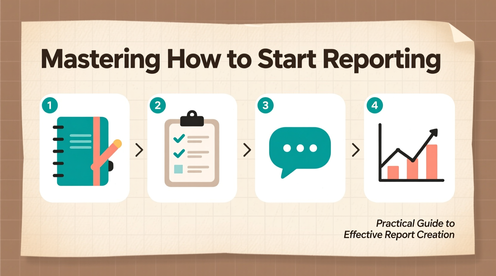
A logical structure transforms scattered data into a compelling narrative. While formats vary, most effective reports follow a consistent framework:
- Executive Summary – A concise overview of purpose, findings, and recommendations.
- Introduction – Context, objectives, and scope.
- Methodology – How data was collected or analyzed (if applicable).
- Findings / Analysis – Organized presentation of results, often using visuals.
- Conclusion – Synthesis of key takeaways.
- Recommendations – Actionable next steps.
- Appendices – Supporting data, charts, or references.
The executive summary is often written last, despite appearing first. It must stand alone—any decision-maker should grasp the full message within two minutes of reading it.
Step-by-Step Guide: Starting Your First Draft
Many writers stall at the blank page. Use this sequence to build momentum:
- Gather all relevant data and sources – Ensure accuracy and completeness.
- Create an outline based on your structure – Assign headings and bullet points under each section.
- Write the body first – Begin with findings or analysis where data is clearest.
- Move to introduction and conclusion – Now that you know what you found, framing becomes easier.
- Write the executive summary – Summarize the essence of the completed report.
- Review and refine – Trim redundancy, check logic flow, verify numbers.
This reverse approach prevents getting stuck on perfecting the opening before understanding the full scope of your message.
Present Data Effectively
Data alone doesn’t communicate; context does. Raw numbers, when unframed, confuse more than clarify. Transform statistics into insights by pairing them with interpretation.
| Weak Presentation | Strong Presentation |
|---|---|
| Sales increased from $180K to $210K. | Sales rose 17% month-over-month, driven primarily by new client acquisition in the Midwest region. |
| User engagement dropped by 12%. | User session duration declined 12% following the April app update, suggesting usability concerns in the new navigation layout. |
| Budget utilization: 89% | Budget utilization at 89% reflects delayed vendor payments due to contract renegotiations—expected to reach 100% by Q3. |
Use tables, bullet lists, and short paragraphs to enhance readability. Avoid long blocks of text. When possible, highlight trends, anomalies, and causal relationships.
Common Pitfalls and How to Avoid Them
Even experienced professionals fall into traps that weaken their reports. Recognizing these early improves quality significantly.
- Overloading with detail – Include only what supports your objective. Extra data distracts.
- Vague language – Replace phrases like “some improvement” with measurable terms: “a 14% increase.”
- Lack of focus – Stick to the stated scope. Tangents undermine authority.
- Ignoring counter-evidence – Acknowledge limitations or conflicting data to build trust.
- Poor formatting – Inconsistent fonts, misaligned tables, or unclear headings reduce professionalism.
“Clarity is kindness in business writing. A reader should never have to guess what you mean.” — Dr. Lena Patel, Organizational Communication Researcher
Mini Case Study: Turning Around a Failing Project Report
A mid-level manager at a logistics firm was tasked with reporting on a delayed warehouse automation rollout. Her initial draft listed delays, budget overruns, and technical glitches in chronological order—confusing leadership about root causes and next steps.
After restructuring, she began with a one-page summary highlighting three core issues: software integration flaws, vendor delays, and training gaps. She followed with a cause-effect analysis, supported by timeline charts and stakeholder feedback. The revised report concluded with prioritized recommendations: renegotiate vendor SLAs, accelerate internal testing, and revise training timelines.
Leadership approved immediate corrective actions. The key change wasn’t new data—it was clearer storytelling. By reorganizing the same facts around purpose and solution, the report shifted from a problem log to a decision tool.
Essential Reporting Checklist
Before submitting any report, run through this checklist to ensure completeness and effectiveness:
- ✅ Defined the primary objective in one sentence.
- ✅ Identified the target audience and adjusted tone accordingly.
- ✅ Structured the report logically (executive summary, intro, findings, etc.).
- ✅ Used headings and subheadings to guide the reader.
- ✅ Translated data into insights, not just summaries.
- ✅ Included only relevant supporting details.
- ✅ Reviewed for clarity, conciseness, and grammar.
- ✅ Verified all figures, dates, and sources.
- ✅ Added actionable recommendations where appropriate.
- ✅ Ensured consistent formatting (fonts, spacing, alignment).
Frequently Asked Questions
How long should a report be?
There’s no fixed length. A report should be as long as needed to fulfill its purpose—no longer. Executive summaries typically range from half a page to two pages. Full reports vary from 5 to 20+ pages depending on complexity. Prioritize precision over volume.
Should I include visuals in every report?
Yes, when they add value. Charts, graphs, and tables help illustrate trends and comparisons quickly. But avoid decorative graphics. Every visual should answer a question or support a point. Label axes clearly and reference visuals in the text (e.g., “See Figure 1”).
What if I don’t have complete data?
Transparency builds trust. State what’s missing, why, and how it affects conclusions. Use qualifiers like “preliminary,” “estimated,” or “based on available data.” Offer to provide updates when information is finalized.
Final Thoughts: From Information to Impact
Mastering how to start reporting isn’t about templates or jargon—it’s about intention. Every report is an opportunity to turn information into insight, confusion into clarity, and observation into action. The most effective reports aren’t the longest or most technical; they’re the ones that make decision-making easier.
Start small. Define your goal. Know your audience. Structure your thoughts. Let the data speak—but give it a voice. With practice, creating meaningful reports becomes second nature, positioning you not just as a recorder of events, but as a trusted advisor.


 浙公网安备
33010002000092号
浙公网安备
33010002000092号 浙B2-20120091-4
Comments
No comments yet. Why don't you start the discussion?