
The footer of a website is more than just a closing note—it’s a functional and design-critical component that enhances usability, supports navigation, and reinforces brand identity. A well-crafted HTML footer improves accessibility, boosts SEO through structured markup, and ensures users can find contact details, legal links, or social media connections with ease. Yet, many developers treat the footer as an afterthought, resulting in cluttered layouts or poor mobile performance.
This guide walks through the principles of modern HTML footer design, from semantic structure to responsive behavior. Whether you're building a personal blog, e-commerce site, or corporate platform, mastering the footer ensures your site ends on a strong, professional note.
Understanding the Role of a Footer in Web Design
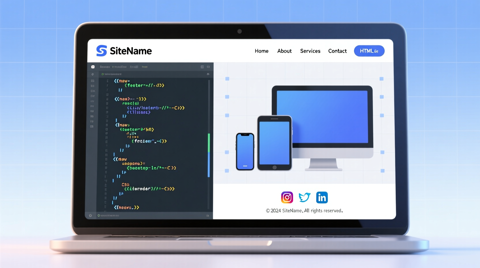
In web development, the <footer> element isn’t just decorative—it carries semantic meaning. According to the HTML5 specification, a footer typically contains information about its section, such as authorship, related documents, copyright notices, or navigation links. While often placed at the bottom of a page, it can also appear within articles or sections.
A strategic footer serves multiple purposes:
- Provides quick access to essential pages (Privacy Policy, Contact, FAQ)
- Displays copyright and legal compliance information
- Enhances site-wide navigation for returning users
- Hosts newsletter signups, social media links, or customer support options
- Improves SEO by reinforcing internal linking structure
“Don’t underestimate the footer. It’s one of the most visited areas on any webpage.” — Rachel Nguyen, Senior Frontend Architect at WebFlow Studios
Step-by-Step Guide to Building a Semantic HTML Footer
Creating a robust footer starts with clean, meaningful HTML. Follow these steps to build a foundation that supports customization and responsiveness.
- Use the <footer> tag appropriately: Wrap your footer content in a <footer> element, ideally as a direct child of <body> or inside a <main> container.
- Structure with logical sections: Use <section>, <div>, or <nav> to group related elements like links, contact info, or forms.
- Add accessibility attributes: Include aria-labels where needed, especially for navigation blocks.
- Link key pages: Add internal links to About, Terms, Privacy, and Contact pages.
- Include copyright notice: Dynamically generate the year using JavaScript or set it statically.
Example Basic Footer Structure
<footer role=\"contentinfo\">
<nav aria-label=\"Footer navigation\">
<ul>
<li><a href=\"/about\">About Us</a></li>
<li><a href=\"/privacy\">Privacy Policy</a></li>
<li><a href=\"/contact\">Contact</a></li>
</ul>
</nav>
<p>© <span id=\"year\"></span> Your Company Name. All rights reserved.</p>
</footer>
<script>
document.getElementById(\"year\").textContent = new Date().getFullYear();
</script>
Designing Responsive Footers with CSS
A responsive footer adapts gracefully across devices. On desktop, multi-column layouts improve readability; on mobile, stacked content prevents horizontal scrolling.
To achieve this, use CSS Flexbox or Grid with media queries. Here's how:
- Apply
display: flexordisplay: gridto organize columns - Set breakpoints at common device widths (e.g., 768px for tablets)
- Use relative units (%, rem) instead of fixed pixels
- Ensure touch targets are at least 44px tall for mobile usability
| CSS Technique | Best For | Mobile Behavior |
|---|---|---|
| Flexbox | Simple row/column switching | Stacks vertically on small screens |
| Grid | Complex multi-section layouts | Reflows using auto-placement |
| Floats | Legacy support (avoid if possible) | Requires explicit clearing |
Real-World Example: E-Commerce Footer Redesign
A mid-sized online apparel store noticed high bounce rates on mobile product pages. Analytics revealed that users were exiting instead of navigating to shipping or return policies—links buried in the footer but not visible without scrolling.
The team redesigned the footer with three key changes:
- Split into four responsive columns: Customer Service, Company, Policies, and Social
- Increased font size and spacing for mobile tap targets
- Added a sticky \"Need Help?\" button that linked directly to the footer on scroll
Within six weeks, footer link engagement rose by 68%, and support inquiries via chat increased by 41%, indicating better self-service navigation.
Common Footer Mistakes and How to Avoid Them
Even experienced developers make avoidable errors when implementing footers. Recognizing these pitfalls leads to cleaner, more effective designs.
| Mistake | Why It’s Problematic | Solution |
|---|---|---|
| Overloading with links | Creates visual noise and reduces usability | Group links under clear headings; limit to 8–10 total |
| Fixed height causing overflow | Text gets cut off on zoomed-in screens | Use min-height and allow vertical expansion |
| Poor color contrast | Fails WCAG accessibility standards | Test text/background contrast ratio ≥ 4.5:1 |
| Missing keyboard navigation | Inaccessible to screen reader users | Ensure all links are focusable and logical in tab order |
Essential Footer Checklist
Before launching any website, verify your footer meets these criteria:
- ✅ Uses the semantic <footer> element
- ✅ Includes copyright notice with current year
- ✅ Links to critical legal pages (Privacy, Terms, GDPR/CCPA)
- ✅ Organized into logical groups with headings
- ✅ Fully responsive across mobile, tablet, and desktop
- ✅ Accessible via keyboard and screen readers
- ✅ Loads quickly (no heavy scripts or images)
- ✅ Maintains consistent styling with the rest of the site
FAQ
Can I have more than one footer on a page?
Yes. The HTML5 spec allows multiple <footer> elements—one for the entire page and others within <article> or <section> elements. However, only the main page footer should contain global site information like copyright.
Should footers be fixed or static?
Static footers are standard and recommended. Fixed (sticky) footers that remain visible while scrolling can interfere with content and are generally unnecessary unless serving a specific function like a mobile action bar.
How do I keep the footer at the bottom of short pages?
Use CSS techniques like Flexbox with <body> as a flex container. Set the main content area to grow and push the footer down. Example:
body {
  display: flex;
  flex-direction: column;
  min-height: 100vh;
}
main {
  flex: 1;
}
Final Thoughts and Next Steps
A powerful footer is invisible when done right—users find what they need without thinking. But when neglected, it becomes a missed opportunity for engagement, trust-building, and retention. By applying semantic HTML, responsive design principles, and user-centered organization, your footer becomes a silent ambassador for your brand.
Now that you understand the components of an effective footer, revisit your current projects. Audit existing footers for accessibility, responsiveness, and clarity. Then, rebuild them with purpose. Small improvements compound into significant gains in usability and professionalism.


 浙公网安备
33010002000092号
浙公网安备
33010002000092号 浙B2-20120091-4
Comments
No comments yet. Why don't you start the discussion?